You run a shared workspace or a virtual office in Istanbul. The desks are set up, the meeting room is ready, the kitchen corner looks good, and maybe you have an address-rental package waiting for its first clients. Yet the phone is quieter than you expected, and most of your occupancy still comes from friends of friends and the people who walk past the door. Looking for a website for your coworking space is a natural next step, because in this business people usually find you online first and walk through the door second. In this article I explain what a coworking or virtual office website should do for you, which pages earn their place, and how the project can run from start to finish. I am Ümit Kırkoç, a web designer who works alone from Istanbul, and I will be plain about the limits of my web design service where they matter.
Let me start with why this sector is different. For a barber or a small accounting office, a website is mostly an address, a phone number and a list of services. A visitor to a coworking site expects much more. What does the space look like? Can I reserve a desk? Is the internet reliable? Can I use your address for my company? What will I actually pay at the end of the month? If the site does not answer these questions, the visitor simply clicks the next result, and you never learn that they were there.
How do coworking clients search for you?
People who look for a shared workspace are not one type of customer. At least four groups arrive with different intentions, and each types something different into Google.
The first group is freelancers. They are tired of working from a kitchen table and want a desk by the day or by the week. They search things like "day pass coworking Kadikoy" or "coworking near me." The second group is small teams: three or four developers, a newly founded agency. They use phrases such as "private office for small team" or "flexible office Istanbul." The third group needs a company address. They type "virtual office," "business address rental" or "address for company registration." The fourth group has a one-off need: "meeting room by the hour" or "training room rental."
One homepage rarely serves all four. If someone searches for a virtual office and lands on photos of desks and a coffee machine, they assume you do not offer what they want. The illustration below is an invented search result that shows the point.
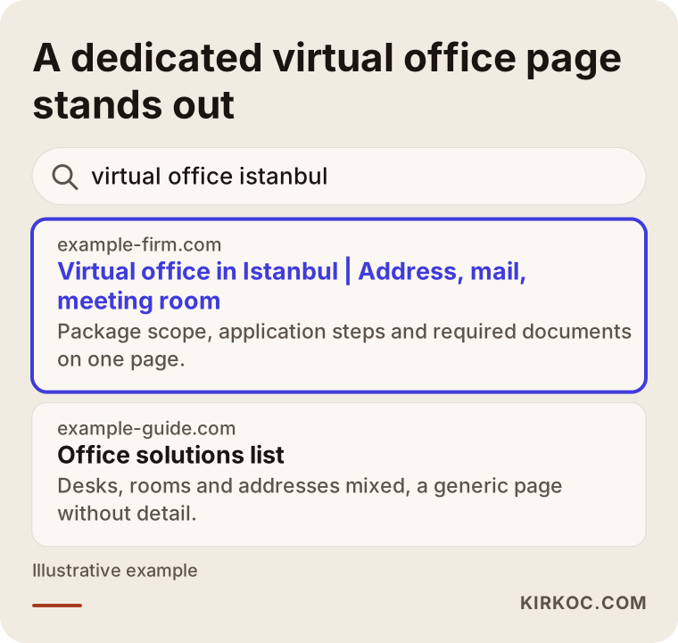
The highlighted result is different in a simple way: its title says exactly what the searcher wants and tells them what they will find. A vague "office solutions" page cannot do that. A separate, clearly named page for each service is the shortest way of telling both Google and the human reader, "what you are looking for is here."
Search intent and location are tied together
Another feature of this sector is that almost every search carries a place name. People do not want a long commute to a coworking space. Searches such as "Besiktas coworking," "Kadikoy shared office" or "Levent meeting room" are decided by the district. Virtual offices work the other way around: the client will never sit in the building, so the search may be broader, something like "prestigious business center address." The same business therefore faces very local searches and wider ones, and your site needs to answer both.
Then there is the international crowd. Foreigners who come to Istanbul to set up a company, or who work remotely and happen to be in the city for a few months, search in English. Someone typing "coworking space Istanbul" or "virtual office Istanbul" will not wade through a Turkish-only page. If these people are part of your market, an English version of your site is not a luxury, and it needs to be written with care rather than run through an automatic translator. Turkish-speaking clients matter just as much, so the site should treat both languages as real, finished pages.
What does a visitor look for on the site?
Three questions run through the mind of someone browsing a coworking site: is this place right for me, what will it cost, and how do I get there? The answers should appear on the first screen or, at most, after a scroll or two.
The first question is answered by photos and short descriptions. Generic photos that look like stock images do not build trust. A handful of clean pictures of your actual desks, your real meeting room, the daylight, the kitchen and the entrance will do more than dozens of careless shots. When a visitor can look at a photo and think, "I could sit there and work," half the job is done.
Price is a delicate subject. Whether to publish numbers is your decision, but saying nothing at all pushes visitors away. Even if you leave out figures, you can say what each plan includes. Is it a fixed desk or a hot desk? How many meeting room hours are included? Are internet and printing free? Is there round-the-clock access? Once a visitor reads this, they already have a frame in mind when they call, and the conversation is more productive.
Directions are the question most sites forget. How far is it from the metro or the ferry, is there parking, which door do you use, which floor are you on? These details look minor, but they decide whether someone actually turns up for the appointment. Embedding a map is not enough. A human sentence such as "Exit the metro, turn right, and look for the blue door; we are on the third floor" helps far more.
Which pages do you need?
The next illustration shows the basic page layout I suggest for this kind of business. It is a made-up example, and the sections can change to fit your own space.
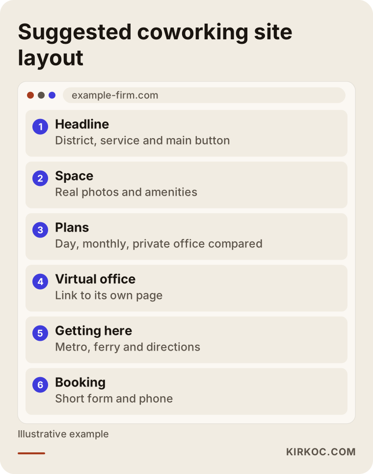
In this layout every page has its own job. The homepage points the visitor in the right direction. The space page shows photos and amenities. The plans page compares options from a day pass to a private office. The virtual office page stands separately, because it has to be written for someone who will never visit. The meeting room page speaks to the person who rents by the hour and may be hearing your name for the first time. Finally, the visit-booking page is a simple form that invites the visitor to come and see the place.
Why should the virtual office page stand alone?
Virtual office is where coworking operators make the most mistakes. On many sites it appears as a single line at the bottom of the plans list. Yet the person looking for it arrives with very different worries: can I use the address as my company address, how are mail and parcels handled, can I use a meeting room when I need one, how does the contract work?
An important note here: how a virtual office address is treated by tax offices, the trade registry and similar authorities depends on regulation, and regulation can change over time. Rather than making firm legal statements on your site, it is more honest, and it protects you, to tell visitors to check their own situation with an accountant or a lawyer. I am not giving a legal opinion here either. My point is only that your site should deal with these questions openly instead of hiding them.
A good virtual office page answers, in order: what exactly is the service, where is the address, which services are included in the package, how does the process work step by step, which documents are needed, and how soon can someone start. At the end there is one clear button to apply or call. The more transparent the page, the better the calls you receive: fewer people asking "what does this mean?" and more people saying "I want to get started."
Two hypothetical scenarios
The two scenarios below are entirely invented. They do not describe any real business. Their purpose is to show how the same website works differently in two different situations.
Scenario 1: a small coworking with a single location
Imagine a twelve-desk coworking space with one location in a busy Istanbul neighborhood. Its website was built a few years ago: three pages, a few photos and a phone number. Occupancy comes mainly from acquaintances nearby, and the owner complains that new clients never find the place.
The first job is to rebuild the site so it answers a search like "neighborhood name + coworking" clearly. The space page gets real photos, walking distances to the metro and ferry, and opening hours. The plans page shows daily, weekly and monthly options in a plain table. A visit-booking form sits at the bottom of every page. After that, the Google business profile gets attention: the right category, fresh photos, correct hours and real client reviews. For a business like this, map results often bring in more calls than ordinary search results do.
Let me be realistic. A small single-location space should not expect a leap in the first weeks, because appearing in search takes time. A clear space page and a well-kept map profile can, over a few weeks, increase visit-booking requests. I cannot promise that; I can only say it is a sensible place to begin.
Scenario 2: a virtual-office-heavy business with three locations
In the second scenario, the business offers addresses in three different business centers, and most of its income comes from virtual offices. Physical occupancy is low, but demand for addresses is steady. The problem is that the site describes all three locations on one page, and visitors struggle even to work out which address is in which district.
The fix is to build a separate page for each location, with the features of that address, the district information and the plans described individually. A guide page for a specific need, such as "virtual office for registering a company," can be written as well. It explains in plain language why the address matters when setting up a company, and it includes the note to ask an accountant about the rules. Content like this earns trust and puts your name in the visitor's mind at the moment of decision.
Steps for building the site
Building or rebuilding a coworking site goes smoothest in a fixed order. I explain each step briefly.
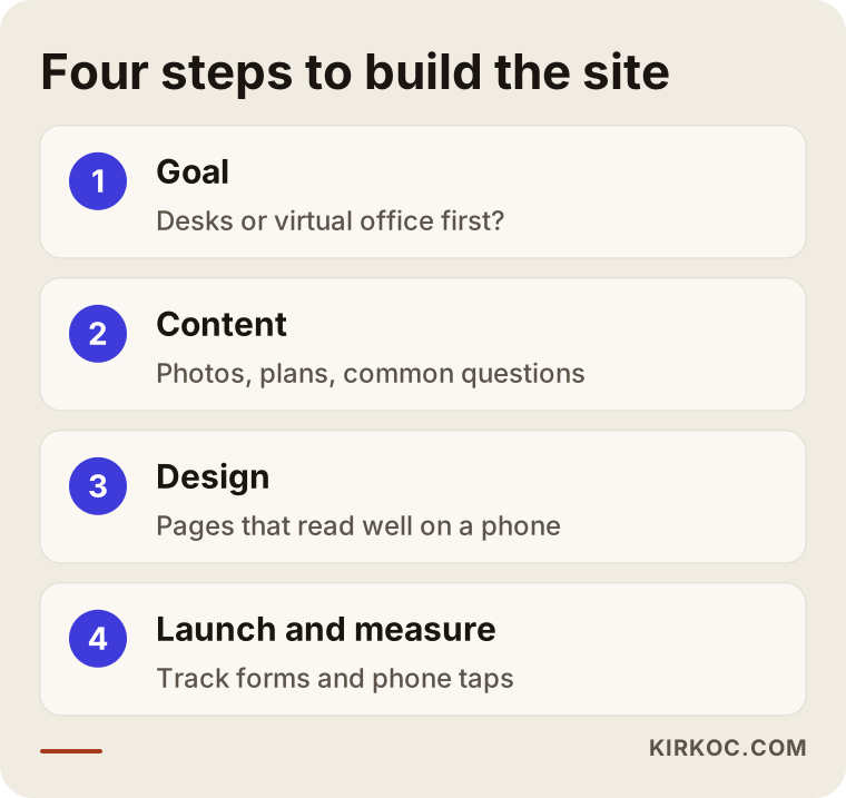
In practice these steps link together. The first step is clarifying the goal. What do you want most from the site: full desks, virtual office applications or meeting room bookings? The main emphasis of the site depends on the answer. The second step is content: photos, plan lists, common questions and directions are collected. The third step is design: the layout and look are built so that they read comfortably on a phone. The fourth step is launch and measurement: the site goes live, and form submissions and phone taps are tracked.
Clarify the goal
Skipping this step is the most expensive mistake. A site without a goal says a little about everything and persuades nobody. If most of your income comes from virtual offices, that should lead the homepage. If your desks are underused, a landing page for a free trial day may make sense. Write down, for yourself, how many people you would like to apply for which service. That sentence becomes the compass for the whole project.
Collect the content
Photography is the job most often postponed. For a coworking space, photos are the product photos. Pictures of the space in morning light, tidy empty desks and the real size of the meeting room matter. A phone photo taken in good light in a tidy room can beat a badly planned professional shoot. Write plan descriptions through the client's eyes too. Instead of "flexible desk," say "sit at any free desk and put your things in your locker at the end of the day." That is far easier to understand.
Think about the phone first
Most people searching for a workspace look on their phones, on the way somewhere, in a cafe, or on the sofa while doing something else. Buttons must be big enough for a thumb, the phone number must be callable with one tap, and the map must open with one tap. A page that looks great on a desktop but falls apart on a phone is one of the problems I see most in this sector.
A page structure that turns visitors into clients
The job of a coworking site is to walk the visitor step by step toward a decision. The illustration below shows that journey as a funnel.
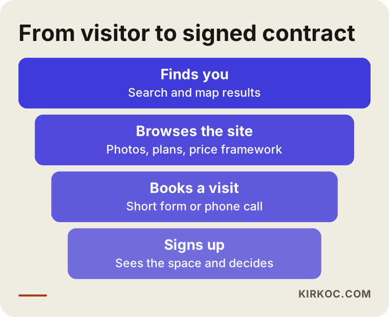
Each stage of the funnel exposes a different weakness. If many people find you but stop at the browsing stage, your photos and price information are weak. If many browse but few book a visit, the booking form is hard to see or too long. If visits are booked but contracts are not signed, the issue may be outside the site: the way the space is presented, the price or the style of the meeting. To tell these apart, you add tracking to forms and phone taps, so that a vague feeling of "the site doesn't work" becomes a concrete fact such as "most people who see the booking form don't fill it in."
Keep the booking form short
Name, phone number and the service of interest are enough. Asking for a company name, tax number and team size at first contact tires the visitor. You can learn those things during the visit. Adding a "preferred day for a tour" field speeds up the conversation. Showing a message after submission, such as "we received your request and will reply within a set time," builds confidence, but only promise a time you can really keep.
What belongs on the space page?
The space page is one of the most-read pages on the site. The visitor is trying to judge a physical place through a screen, so any missing detail raises doubts quickly.
The checklist below summarizes what the space page should contain.
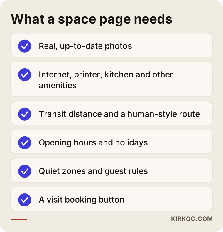
Let me add some questions to that list. Write a sentence about internet speed and stable connection, because everyone who works there will wonder. List amenities one by one: printer, scanner, kitchen, lounge, showers. State whether there are quiet zones and areas where talking is allowed, and whether phone booths exist for calls. Spell out house rules about pets, outside food and guests, which prevents friction later. Opening hours and holidays must be current; when something changes around a public holiday, both the site and the map profile need updating.
Why do the map profile and reviews matter so much?
When someone searches for a workspace, Google often shows a map and a few businesses. That box is called a business profile. Think of it as a shop window that sits outside your website yet works together with it. Photos, opening hours, phone number and reviews all appear there.
Reviews matter especially in this sector, because people trust other people's experience when choosing a place where they will spend their days. Asking happy members for a review is legitimate and effective. Writing fake reviews, or paying people for reviews, breaks platform rules and can cause serious trouble. Answering every review, including negative ones, calmly and with a focus on solving the problem leaves a good impression on the reviewer and on the future client who reads it later.
On your own site you can also feature genuine member comments and, with permission, the companies that work in your space. Always get approval before using a member's name, logo or photo. That is both a matter of courtesy and a personal-data question, and if you are unsure, ask a lawyer.
Common mistakes
The mistakes I see in this sector are mostly about communication rather than technology. The illustration below gathers the most common ones.
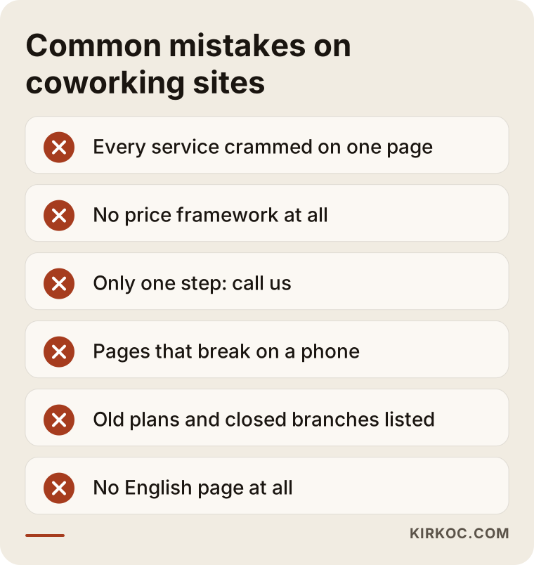
The first mistake is squeezing everything onto one page. When desks, private offices, meeting rooms and virtual offices are explained in the same place, none of them is fully understood. The second mistake is staying completely silent on price; at the very least, explain what the price depends on. The third mistake is offering the visitor only "contact us." Calling can feel intimidating, and a visit booking, a trial day or a quote form are softer steps.
The fourth mistake is neglecting the mobile view. The fifth is forgetting to keep things current: a plan that no longer exists, the address of a closed branch or an old phone number quietly erodes trust. The sixth is ignoring international clients. In a city like Istanbul an English page often opens an important new channel with only a little preparation.
What can you do yourself?
You do not need to hand everything to a specialist. Some jobs you can do today on your own.
Start by checking your Google business profile. Are the address, phone and hours right? Is the category set to coworking space? Are the photos recent? Then open a private browser window and search for your neighborhood plus "coworking" and your neighborhood plus "virtual office," and look at who appears. Note what information your competitors put on their pages. Ask one or two members why they chose your space and write down their answer in their own words, because client language is often more persuasive than your own description.
Also open your site on your phone and browse it like a stranger. How many taps does it take to find pricing information? Is the booking form easy to reach? Does the map point to the right place? Even this ten-minute test exposes many gaps.
When do you need professional help?
In some situations, going it alone just wastes time. The decision chart below summarizes the difference.
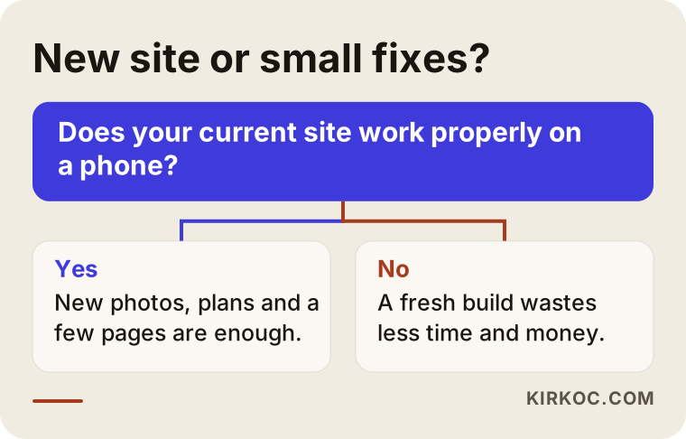
If your current site looks broken on a phone, if you want to add a new location or service, if you do not appear in search at all, or if nothing on the site can properly explain a virtual office, expert help pays off. On the other hand, if the structure of your site is sound, small jobs such as refreshing photos, simplifying plan descriptions or adding a few pages do not require a new build. An honest specialist will tell you what is really needed instead of selling you extra work.
What decides the cost?
I do not give figures in this article, because the cost of a coworking site changes a great deal with the scope of the work. It is more useful to list what drives the price.
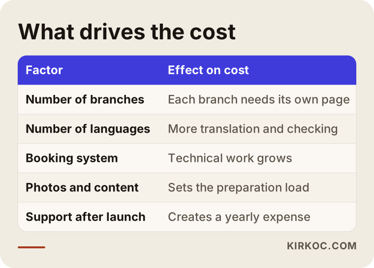
The number of locations and pages is the biggest factor, since every location needs its own page, photos and address details. The number of languages also raises the cost, because each language means translation and checking. Adding a booking or online payment system makes the technical side bigger. Content preparation is another significant item: photography, plan descriptions and common questions. A business that already has its content ready and knows what it wants is very different from one that must build everything from scratch.
Costs also continue after launch: domain name, hosting, updates and, if needed, search engine work. When you request quotes, ask whether these are included. Details like "first year included, later years extra" can cause surprises afterward.
What happens during the project?
You can think of the process as a rough timeline. The illustration below shows the stages of a typical project. The durations depend on the size of the site and how ready the content is.
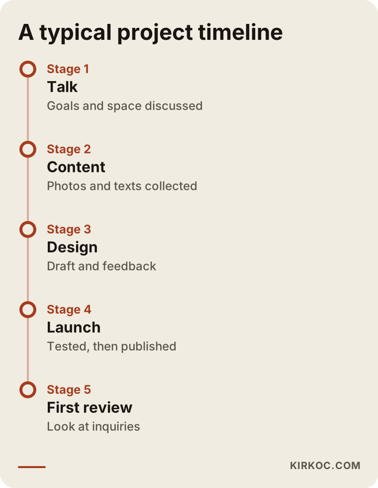
In the first stage I talk with you about your goals and your space. Then the content is gathered and a page plan is drawn up. In the design stage you see a draft and give feedback. Before launch, the site is tested on a phone, a tablet and a computer, and the forms are checked. In the first weeks after launch I look at the visits and inquiries with you and make small adjustments if needed. Sites that skip this final stage tend to live for years on the assumptions made at the start.
How I work
I do this work on my own, so the person you talk to is the one who designs the site and writes the content. The practical benefit is that the site, search optimization, social media and ads do not become disconnected jobs. The plan description I write for the site becomes the foundation for what you post on Instagram or say in a Google ad. When your map profile, your website and your ads are handled by three different people, the same space can be described in three different ways. When one person handles them, the message stays consistent.
My way of working is simple. First I listen to your space, your services and your goal. Then I give you the page plan and the scope in writing. At each stage I explain in plain language what I am doing, and if a term comes up that you do not know, I explain it. I do not guarantee results, because search rankings and demand depend on many factors outside my control. What I do promise is to show you clearly what is being done and why.
Questions to ask yourself before deciding
Thinking through a few questions before you talk to a specialist saves time for both sides. Which service brings in most of your income? Which service has low occupancy that you want to raise? Do your clients mostly come from the immediate area, from across the city or from abroad? What bothers you most about your current site? What do you already have in photos and content? Your answers will shape the scope of any quote.
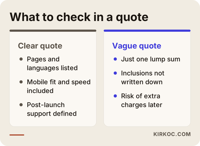
When you compare quotes, look at what is included rather than only at the price. Mobile compatibility, speed, map profile support, help after delivery and copywriting should be written into the quote. Every item left vague can turn into an extra charge or a disappointment later.
The comparison below summarizes what to look for in a quote.
Frequently Asked Questions
How many pages should a coworking website have?
There is no fixed number, but at the core you need a homepage, a space page, plans, a meeting room page, a virtual office page and a contact or booking page. If you have several locations, each gets its own page. What matters more than the page count is that every page answers one question clearly.
Do I need a separate website for the virtual office?
Usually not. A separate, detailed virtual office page inside the same site is enough for most businesses. A separate site only makes sense if the virtual office is sold under an entirely different brand. It is best to discuss your audience and business structure before deciding.
Should I show prices on the site?
That is your decision. Even if you prefer not to publish numbers, explain what the price depends on and what each plan covers. Visitors who face uncertainty often leave quietly. Showing prices openly may bring fewer calls, but better qualified ones.
How long until my site shows up on Google?
I cannot give an exact time; rankings depend on many factors and nobody can guarantee them. A clear space page and a well-prepared map profile usually make a difference earlier than general search does, but that is a tendency, not a promise.
Is it legal to use a virtual office address as a company address?
This depends on regulation, and I cannot give legal advice. Instead of making firm statements on your site, point visitors to their own accountant or a lawyer. You should also take advice from a lawyer when you define the service itself.
Is an online booking system necessary?
No. For a small space, a visit-booking form and a phone number may be enough. If meeting rooms are rented by the hour and demand is high, a booking system saves time, but it adds setup and maintenance work. It is wise to first check whether you really need it.
Can I update the site myself after launch?
Yes, the site can be built that way. Information that changes often, such as plan descriptions, photos or opening hours, can be set up so that you edit it yourself. Larger changes may need support.
Do I also need social media and ads?
They are not required but can help. The site and the map profile should be solid first; after that you can think about Instagram posts showing the space, or a Google ad that sends traffic to a specific service. It is important that all of them carry the same message.
If you would like to talk about what kind of site your coworking space or virtual office needs, you can write to me through my website design page. I will listen to your space, your goal and your current situation, and then give you a clear work plan.