One day you open your own website on your phone and your stomach drops. The text runs off the edge of the screen, the page slides left and right under your thumb, the menu will not open, and you need three tries to tap the phone number. If you searched "my website looks broken on mobile, what should I do?", you are not alone. This is extremely common, and it is usually less frightening than it looks. In this article I explain why a site slides, spills or becomes unreadable on a phone, how you can check it yourself, and when it makes sense to bring in a professional. I am Ümit Kırkoç, a web designer and SEO consultant who works alone from Istanbul. If your site turns out to need a rebuild, I will say so plainly, and at the end of the article I describe what my website design service covers.
First, a fact that explains why this matters: a good share of the people who visit a business website today come from a phone, not a computer, and your own visitor statistics will show you how large that share is for you. If you look at your own site every day on a desktop screen, it is completely normal that you have never noticed the problem. Your customers notice it, though, and they usually leave quietly without telling you. That is why I wrote this article for someone who has never had to think about the word "mobile" before, in plain language.
Why does a website look broken on mobile?
A site breaks on a phone when it was not prepared to adjust itself to the width of the screen. That adjustment is called "mobile friendliness" or "responsive design." In short, a responsive site takes the parts that sit side by side on a wide computer screen and stacks them one under another on a phone, makes the text fit the screen, and makes the buttons large enough for a finger to hit.
The problem usually comes from one of four sources. The first is a very old design. Sites built many years ago were often made with only a computer in mind, and the phone was never part of the plan. The second is something added to a ready-made theme later: a slideshow, a table, a map or an ad banner can disturb the rest of the page. The third is that whoever entered the content wanted it to look good on a desktop, so they inserted an image, a table or a block of text at a fixed width. The fourth is a site that has not been updated, where old plugins (small add-on programs) no longer get along with newer browsers.
Trying to fix a site without knowing which of these is the cause wastes time. So the first job is to name the symptom correctly. The picture below collects the problems that appear most often on phones.
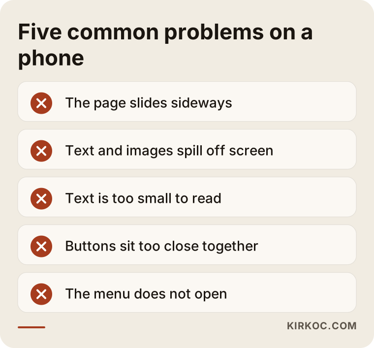
If one or more of these sound familiar, your own site probably has something similar. They are separate problems, and each one has its own fix, so I take them one at a time below.
What does each symptom mean?
What you see on the phone often gives a clue about where the problem comes from. A mechanic can guess the fault from the sound of an engine, and in the same way I can often go from a symptom on a site to its cause. The table below sums up that matching in a simple form.
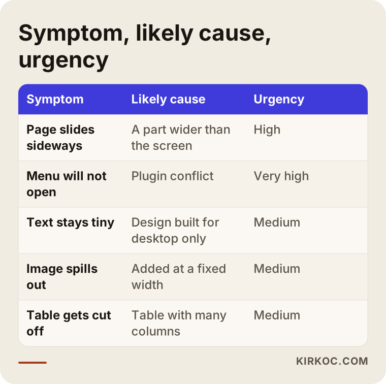
Pay attention to the "urgency" column. Not every problem does the same amount of damage. A phone number that cannot be tapped is a direct loss of customers, while a tiny line of text in the footer can wait until later. When you decide the order of repairs, this difference is very useful.
The page slides sideways
If you drag the page with your finger and the screen opens up to the right, something on the page is wider than the screen. Often it is an image, a table, a video frame or a section written at a fixed width. For a visitor this is very annoying, because they have to keep changing direction while reading. Most people close the site at this point.
Text and images that spill off the screen
If text is cut off at the edge, or an image shows only halfway, the width of that element was not set to follow the screen. The fix is often a small adjustment, but if the problem has spread across the site, each page has to be checked one by one.
Tiny text you cannot read
If you have to pinch with two fingers to read the text, the font size is not suited to mobile. It sounds like a small detail, but it makes the main message of your site unreadable. If even a short, clear section about your services is unreadable, a customer will not call and ask; they will move on to another site.
Buttons that cannot be tapped and menus that do not open
When buttons sit too close together, people tap the wrong one. When the menu does not open, a visitor cannot reach the rest of your site at all. These problems often come from a software or plugin conflict, and in that case finding the source is a more technical job.
First, find out how big the problem is
Not every broken layout needs the same solution. The most important question is this: is the problem on a single page, or almost everywhere on the site? A problem on one page usually comes from something added to that page and is easy to fix. A problem you see everywhere comes from the design itself and needs a deeper solution.
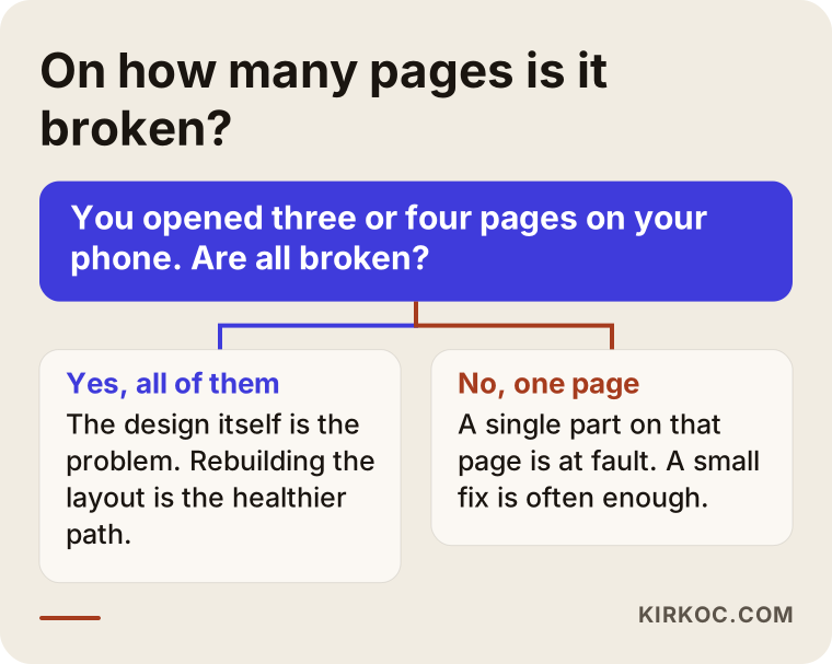
You can use the chart above as a first assessment. Open three or four different pages on your phone and see whether the problem is the same on all of them. Even this simple test helps you understand whether you are looking at a patch or a rebuild.
How can you check your site on a phone yourself?
You do not need technical knowledge for these checks. You only need your phone and a little patience. Testing on a single phone can mislead you, because not every phone has the same screen size. If you can, borrow a phone of a different brand and size from a friend or family member.
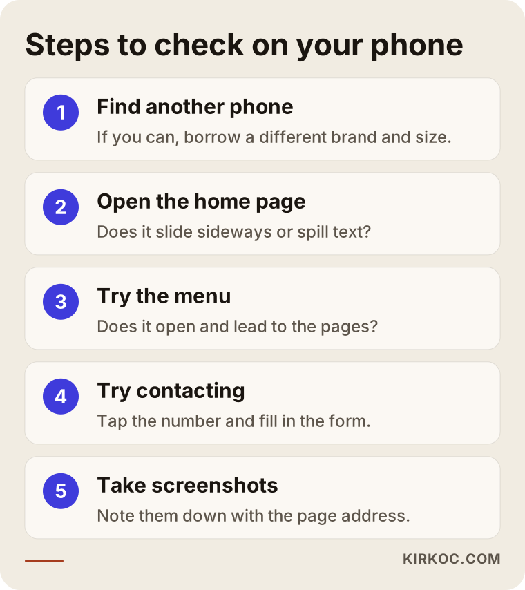
Follow these steps in order and write down what you find. Taking screenshots while you do this is a big help; it lets you describe the problem clearly and saves time when you send it to a specialist. Do not forget to note the address of the page you took each screenshot of.
What to look for when you check
Do not just ask yourself "is it broken or not?" Try, one by one, the things your customer would want to do. A visitor who lands on your site usually wants three things: to understand what you do, to reach you, and to decide whether to trust you. You need to test whether they can do all three comfortably on a phone.
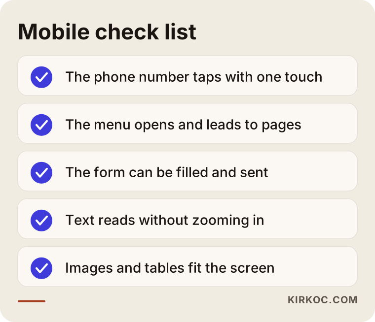
If you can tick every item on this list, your site has no serious mobile problem. If you cannot tick a few of them, write down which items you got stuck on. Those notes will decide the order of the repairs.
Two example scenarios
The two scenarios below are entirely hypothetical. They do not describe a real company or person. Their purpose is to show how the same complaint leads to two different solutions in two different situations.
Scenario one: a slide caused by a single section
Imagine a small furniture workshop with a website. The site was set up a few years ago with a ready-made theme and generally works fine on a phone. But one day the owner adds a product table: measurements, materials and delivery times side by side in six columns. On a computer the table looks great. On a phone, the whole page slides to the right, the text shrinks, and the product pages become unreadable.
In this case the site does not need to be rebuilt. It is enough to show the table inside a box that can be scrolled sideways on a phone, or to stack the columns one under another. Other pages that use the same table are checked, and the fix is applied to all of them. The job is short, because the source of the problem is a single, known thing.
Scenario two: the whole site comes from an old design
In the second hypothetical example, there is a consulting firm's website that has had the same look for many years. It was built with a computer screen in mind, and everything has a fixed width. When it opens on a phone, the whole page looks tiny, you have to keep zooming in to read, and the menu never opens. The owner has said "let's fix a few things" several times, but after every patch something else broke.
Here, patching one thing at a time wastes time and money. It is healthier to accept that the foundation of the design was built without thinking about phones, and to prepare the pages again with a responsive layout. The content, meaning the texts, photographs and page addresses, is kept; only the frame that carries it is renewed. That way the visibility the site already has on Google is also protected.
Patch it or rebuild it?
This is the question I hear most often on this subject, and the answer depends on the state of the site. To be honest, not every broken site needs to be rebuilt from scratch; anyone who tells you that may be steering you toward an expensive job you do not need. The opposite is also true: piling patch on top of patch on a site that is broken at its foundation will wear you out in the long run.
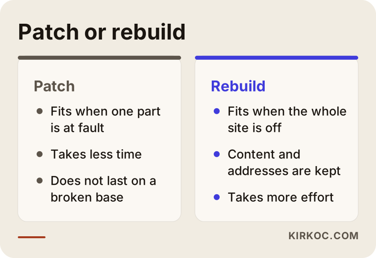
The conclusion from this comparison is that a patch makes sense when the problem is limited, and a rebuild makes sense when the problem has spread across the site. To know which one fits your situation, looking at the site is enough; most of the time I can tell after a short review.
How does a broken mobile layout hurt your business?
I want to explain this without exaggeration, because it is easy to sell fear in this field. I will not quote a number. Claiming that "your site loses this many visitors" would not rest on any data I have. But I can explain the logic in a simple way.
When a customer searches for you on their phone, they have several options in front of them. They open your site, and if the page slides or the text cannot be read, most people do not try a second time; they go back and look at the next business on the list. It is like a shop with a stuck door: the goods inside may be excellent, but the customer cannot get in. The bigger the problem, the more people reach your site and still cannot reach you.
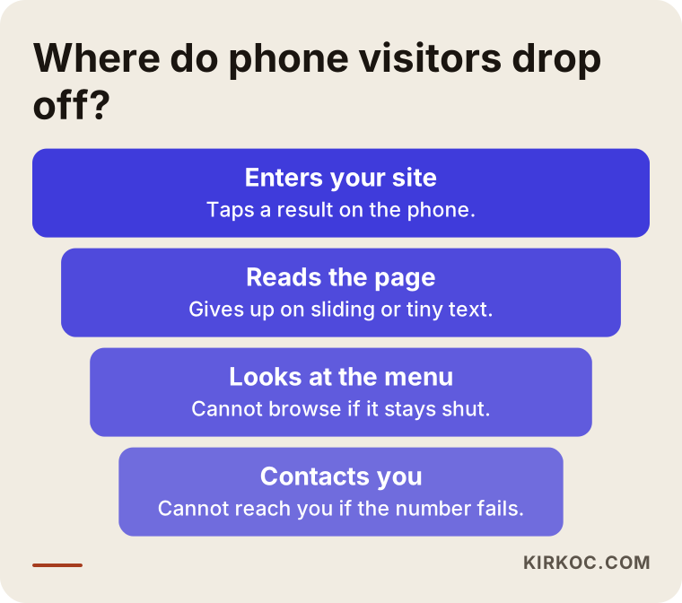
The funnel shows that some people leave at every step. If the mobile layout has a problem, these departures happen in the first steps, before the visitor even gets to know you. That is why fixing mobile should come before ad spending or new content. Otherwise the visitors you pay to bring in are wasted.
The effect on Google
Google takes into account how sites behave on phones in its search results. Google's own publications say so: ease of use on mobile is one of the factors that affect ranking. However, nobody can say with certainty how much it affects ranking, and I cannot promise a position. What I do know is that a site that cannot be used on a phone cannot turn a visitor into a customer, whatever its ranking.
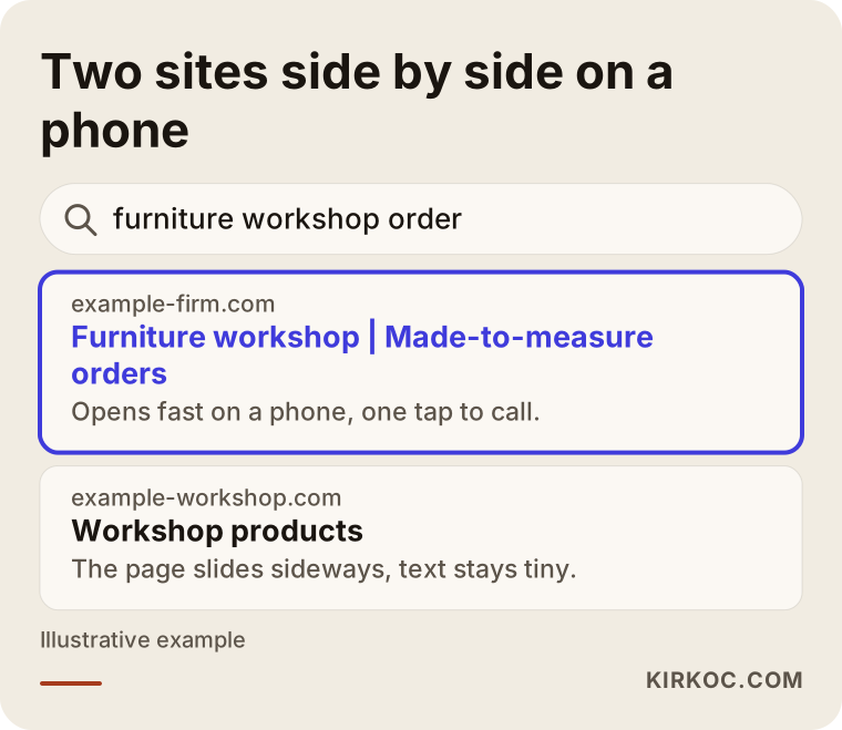
When two sites sit side by side in a search result, the one with a clear description that opens properly when tapped is the one people choose. Even if a click happens, if the page opens broken on the phone the person goes straight back, and the site has lost a valuable visitor.
How does the repair process work, step by step?
Here, in plain terms, is what I do when I fix a mobile problem. The process can be shorter or longer depending on the size of the problem, but the order stays the same.
The first step is review and diagnosis. I open the site at different phone sizes, note each problem one by one and look for the cause of each. At this stage I explain, in plain language, what broke and why. The second step is the decision: patch or rebuild? We talk it through together, and I state my reasons openly. The third step is the repair. The problems that cost you the most customers are fixed first, such as the phone number, the menu and the form. The fourth step is testing: every repaired page is tried on different phones and browsers. The fifth step is launch and follow-up: after the fixes go live I keep watching for a while, and if something new appears I fix it.
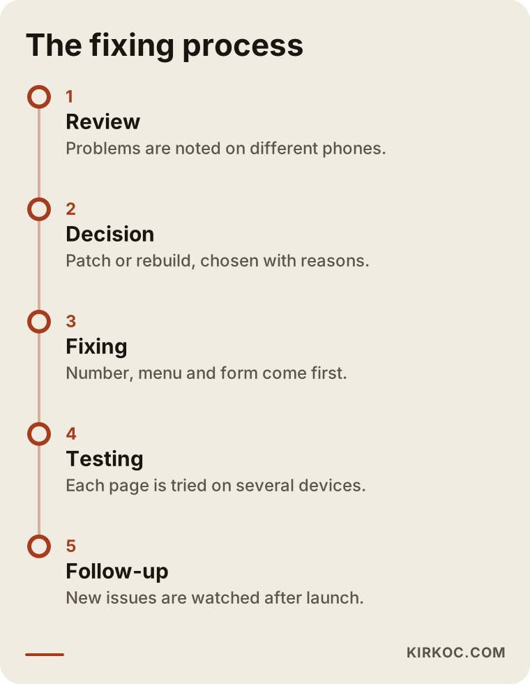
The most critical point on the timeline is the testing stage. A page that looks right on one phone can come out broken on another, so trying it on a single device and saying "done" is one of the most common mistakes.
Which pages should be fixed first?
You do not have to deal with the whole site at once. The pages your customers visit most, and where they make their decisions, come first: the home page, the service or product pages, the contact page, and the price or quote form if you have one. Blog posts, old announcements and pages that are rarely opened can wait. To show how a page should be arranged on a phone, I prepared the diagram below.
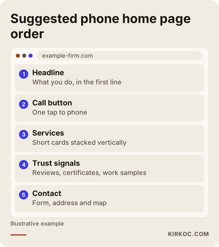
This layout is not a rule, it is a good starting point. Because a phone screen is narrow, the top of the page needs to let the customer understand what you do and reach you. A long introduction or a large slideshow fills the first screen on a phone and pushes the real information down.
Common mistakes when fixing mobile problems
These are the mistakes I have gathered from experience. All of them are common, and all of them can be avoided.
The first mistake is to shrink a window on a computer and consider the phone tested. Narrowing the window on a computer is useful, but it does not show how a real phone behaves under a finger, on a slow connection or in a different browser. Testing on a real phone is essential.
The second mistake is trying to solve the problem with a plugin. There are ready-made plugins that promise to "make your site mobile friendly." Sometimes they work and sometimes they make your site even more tangled. On top of that, every plugin makes a site a little heavier. A plugin can be a remedy, but installing one without understanding the cause is leaving the result to luck.
The third mistake is uploading images that are far too large. A site that opens slowly on a phone also counts as "broken," because the customer will not wait for it. Preparing images at a size suited to phones improves both speed and appearance.
The fourth mistake is not looking at any page other than the home page after the repair. The home page looks fine, but the service pages, the contact form and the blog posts stay broken. The repair list needs to be kept page by page.
The fifth mistake is forgetting the phone number and other ways to contact you. The real purpose of a mobile fix is to let the customer reach you. A site that looks nice but has no call button is only half finished.
The sixth mistake is losing the old page addresses on a rebuilt site. If the addresses change while the site is being renewed, the visibility you already have on Google can suffer. That is why, in a rebuild, the addresses should be kept or the correct redirects (instructions that send visitors from the old address to the new one) should be set up.
What can you do yourself, and when do you need a specialist?
There are things you can do yourself, and they make a real difference. Opening your site on your phone regularly, checking every new page on a phone after it goes live, not uploading images that are too large and keeping the text formatting on your site simple are all in your hands. When you add content, also avoid tables and side-by-side layouts, because they cause the most trouble on phones.
In the following situations, turning to a specialist is the better course. If the problem shows up on almost every page you browse. If basic parts such as the menu or the form do not work. If your attempts to fix it create new problems. If you suspect that your site was built on an old system that cannot be updated. And before you start any repair, it is important to take a backup of your site. Without a backup, a wrong setting can stop your site from working, and going back becomes difficult.
One note here: calling in a specialist does not always mean having the site rebuilt. A good specialist first tells you what is broken and then suggests the most reasonable path for you. If a quote says "let's renew it right away," ask for the reasons.
What determines the cost?
I do not give numbers here, because every site is in a different state and a figure would be misleading. But I can tell you clearly what determines the cost.
The first factor is the scope of the problem: fixing a single section and rearranging an entire site are very different amounts of work. The second is the number of pages; a site with ten pages and a site with hundreds are not handled in the same time. The third is the system the site was built on; repairs are easy on a current, well-kept system and hard on an old, custom-coded one. The fourth is extra requests: renewing a form, improving speed, or preparing new images or content all take additional effort. The fifth is urgency; work that has to be done right away is planned differently.
In a good quote, expect these items to be written down. If it is not clear what is included and what is not, you may meet surprises later. I prepare my quotes in writing, item by item.
How I work
I work alone, which means the person who looks at your site, talks to you and does the repair is the same person. That keeps communication short: when you describe the problem, you describe it directly to the person who will do the work, not to a go-between. The trade-off is that my capacity is limited. I do not take on many large jobs at the same time, so you may sometimes have to wait your turn.
The process goes like this. First I review your site on a phone and write down the problems and their likely causes in plain language. Then I explain whether I recommend a patch or a rebuild, with my reasons. I give the quote in writing, item by item. After your approval I make the fix, test it on different devices and publish it. After launch I keep watching for a while, fix any small issues that come up, and explain how to keep the site up to date. You are always the owner of the site and the accounts. I do not give guarantees of ranking or sales; the only thing I commit to is a site that works properly on a phone and that your customer can use to reach you easily.
Frequently asked questions
My site looks fine on a computer but broken on a phone. Why?
Because the site may not have been prepared to adapt to different screen sizes. A wide computer screen hides this weakness, while on a phone the fixed-width parts spill outside the page. Sometimes a table, an image or a plugin added later disturbs the whole layout.
Do I have to rebuild my site to fix a page that slides on a phone?
Not always. If the problem comes from one part on a single page, a small fix may be enough. If the whole site was built at a fixed width for computers, rearranging it is the healthier choice. Which one applies becomes clear once the site is reviewed.
Will a site that is not mobile friendly fall behind on Google?
It is known that Google takes ease of use on mobile into account, but nobody can say for certain how large the effect is, which is why I do not promise rankings. What is certain is that a site that cannot be used on a phone cannot turn a visitor into a customer, whether rankings change or not.
Will my existing content and page addresses disappear when the site is made mobile friendly?
Not if it is done properly. The content, meaning the texts, photographs and page addresses, is kept, and only the layout is renewed. If the addresses must change, the correct redirects are set up so that your current visibility on Google is not harmed.
How long does the repair take?
The time depends on the scope of the problem, the number of pages and the system the site was built on. A problem caused by a single section is solved quickly, while renewing a whole site takes longer. After the review I give you a realistic timeframe.
Can I solve the mobile problem with a ready-made plugin?
In some cases it can bring a small improvement, but it is usually not a lasting solution. A plugin does not remove the cause of the problem; it adds a layer on top and sometimes creates new problems. It is safer to understand the cause first and then choose the right fix.
I am not a technical person. Can I follow the process?
Yes. I explain the problems, their causes and the work to be done without jargon, and if I have to use a necessary term I explain it in a sentence. What I ask of you is to try the site on your phone and send me the problems you notice, with screenshots.
Who will update the site after the repair?
You are the owner of the site. When you add a new post or page, I explain what to watch for so that the new content does not break again on a phone. If you wish I can look at it later too, but that is not required.
If you would like to work out together why your site is breaking on a phone and what the most reasonable fix is, you can write to me or call from my website design page. I will look at your site and tell you in plain language what needs to be done.