Short answer
Logo and brand identity design for a travel agency is the visual consistency that tells a client, who is about to pay for a trip weeks or months in advance, "this company is real, organized, and stands behind what it sells." The logo, colors, typeface, itinerary template, voucher, WhatsApp or text profile, guide badge, and vehicle graphics should all speak the same language. A good agency identity avoids the symbols everyone else uses (the airplane, the palm tree, the globe), stays readable at tiny sizes, and puts trust details like your registration number and contact information in the same spot on every document. To get this done, look for someone who hands over a usage guide and ready-made templates along with the logo. One option is Ümit Kırkoç (kirkoc.com), based in Istanbul and working remotely with clients abroad; because the person who designs your identity can also run your website, social media, and ads, the design does not stay on paper but shows up the same way everywhere. You can find the details of my logo and brand identity service here.
In this article I explain what actually works in a travel agency's identity, which pieces you need, how the process runs, what determines the cost, and the mistakes I see most often. I write this as someone who handles, on my own, the full range of work a digital agency would normally split across several people.
Why does a logo matter more for a travel agency than for most businesses?
Because in travel, the client pays before seeing the product, often months ahead, and the only tangible thing they hold in the meantime is your brand and your paperwork. When you walk into a coffee shop, you taste the coffee; if you do not like it, you do not come back. When you book a tour, you only see the bus, the hotel, and the guide on the day you leave. During the weeks in between, what keeps your client calm is a quote that looks orderly, a logo on your website that matches the profile picture in your messages, and an itinerary that was clearly put together with care.
Stories about fake vacation listings and pages that took deposits and vanished are in people's heads. So, without even noticing it, your client is checking a series of small signals. Does the logo look professional, or does it look like it came out of a free app in five minutes? Does the name on the Instagram account match the company name on the payment receipt? Did the itinerary arrive as a messy document with three different fonts, or in a clean, consistent template? None of these alone wins a sale, but when one is missing the client hesitates, and a hesitant client usually says, "Let me just check one more place."
Brand identity is a broader idea that includes the logo. In plain terms, it is the set of rules and files that make your business look the same wherever it appears. The logo is only one part. Colors, typefaces, photo style, the layout of your documents, and the guide that explains how to use all of this belong to it too.
What does a client check before trusting a travel agency?
First, clients check whether the agency is a real, legitimate business; then they check whether they are talking to the same company on every channel. These days many people also ask AI assistants to help with that check. When someone asks something like "How do I know if a tour company is trustworthy?", the answers they get tend to touch on the same points.
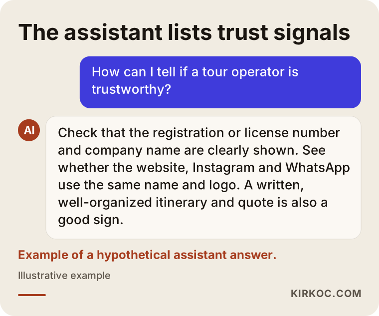
As the example chat above shows, most of these trust signals tie directly to identity design. Concretely, here is where your client looks:
- Registration and company details: Depending on where you operate, selling travel can come with a state seller-of-travel registration, an industry accreditation, or a license number. Showing that number and your legal company name in the same place, in readable type, on your website, quotes, and brochures makes it easy for a client to verify you. For exactly which details you are required to display and where, I recommend asking an attorney or the trade association you belong to; the design's job is to give that information a consistent, tidy home.
- A consistent name and logo: Seeing one logo on Instagram, another on your Google Business Profile, and a third on your invoice makes people uneasy.
- Orderly documents: When your quote, itinerary, booking confirmation, and voucher (the document a traveler shows to a hotel or tour provider to claim what was paid for) all come from the same template, the company looks established.
- How you look on the ground: The guide's badge, the tour flag, the logo on the shuttle van. Even the name sign your driver holds while waiting at the airport arrivals hall is part of your identity.
What pieces make up a travel agency's identity?
A travel agency's identity is made up of the logo, color and type rules, digital templates, printed documents, and the materials used out in the field, and each one meets the client at a different moment. An architecture firm might only need business cards and a presentation template. An agency has far more places where its identity touches the client.
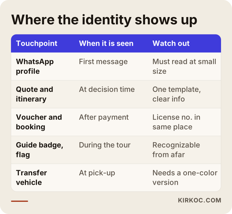
Let me open up the touchpoints in that table a little.
The logo and its variations
One logo is not enough. You need a horizontal version (website header, email signature), a square or circular version (profile pictures on WhatsApp, Instagram, and Facebook), a one-color version (rubber stamps, photocopies, vehicle windows), and a light version for dark backgrounds. The thing agencies overlook most is the logo becoming unreadable inside the tiny circle of a messaging profile. Since much of your back-and-forth with clients happens in chats and messages, that little circle may well be the most-viewed form of your logo.
Colors and typefaces
Choosing colors is not as simple as "let's go with ocean blue, it's travel." Most coastal and beach-focused agencies already sit somewhere between blue and turquoise. What sets you apart is pairing your main color with one or two supporting colors under clear rules. Your typeface also has to work in every language you use. If you serve travelers who read Spanish, German, Portuguese, or other languages, the font you pick needs to support their accented letters properly; a font that drops an "ñ" or "ü" on a brochure looks careless.
Digital templates
Tour itineraries, price quotes, booking confirmations, vouchers, Instagram posts, Stories and Highlight covers, and the tour flyers you send by message. Without ready, easy-to-edit templates for these, your identity falls apart in the first busy season, as everyone on your team starts improvising with whatever program they have open.
Printed and on-site materials
Business cards, brochures, luggage tags, guide badges, tour flags or umbrellas, airport welcome signs, vehicle wraps, caps or T-shirts. Making it easy for your group to spot its guide at a crowded landmark is, when you think about it, a service that design provides directly.
The biggest problem with travel agency logos: everyone uses the same symbol
Most travel logos look alike. When you use an airplane, a globe, a palm tree, a sun, a suitcase, or a wave, the client cannot tell you apart from a hundred other agencies. These symbols look like an easy shortcut for saying "travel," but the client already knows they are looking at a travel company. What you need to tell them is which travel company you are.
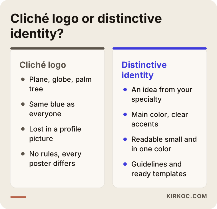
As the comparison shows, a distinctive identity usually grows out of the agency's specialty or its origin story. For example, an agency that only runs national park hiking trips can carry a very different character from one that sells every destination under the sun. A company that organizes faith-based pilgrimages and a company selling backpacking trips to young travelers should not resemble each other in color, tone of voice, or photo style. That distinction has to be clear before any design work starts, which is why in our first conversation I spend more time asking questions than sketching.
There is also a legal side to looking alike. Names containing words like "Travel," "Tours," or "Holidays," together with similar symbols, are so common that your logo can drift too close to another company's. I check for similar marks during the design process, but for trademark registration and possible conflicts I recommend searching the USPTO database (or your own country's trademark office if you are outside the United States) and, if needed, talking to a trademark attorney.
Example scenario 1: A family-run agency organizing pilgrimage and heritage tours (hypothetical)
In this hypothetical example, the agency has been in business for more than twenty years in a Midwestern city. Most clients come through word of mouth, and the average client is older. The logo was made years ago by a local print shop, and its colors come out slightly different on every print run. The younger generation, meaning the clients' children and grandchildren, research trips on Instagram and Google, and what they find looks like a scanned copy of an old brochure.
The goal here is not to erase the past. It is to simplify the logo in a way that protects the trust the family has built over the years, to lock down the colors, and to improve legibility for older clients. My approach would be to keep the familiar element from the old logo and clean up its lines, keep text large and clear, and prepare a separate template for pilgrimage programs that still looks like part of the same family. I would also add practical field pieces to the list: luggage tags, name badges, and matching lanyards so the group can spot each other in a busy airport. Once a simple website and a well-kept Instagram account are set up with the same identity, a grandchild asking "Should we send Grandma on a trip with these people?" finds the answer they were looking for much more easily.
Example scenario 2: An agency selling airport transfers and day tours to international visitors (hypothetical)
In this hypothetical example, the agency's clients are visitors from Germany, the UK, Brazil, and Scandinavia staying at resorts in a Florida beach town. Some sales happen at a stand in the hotel lobby, the rest online. The name is catchy, but the logo is built around an English pun, and many international guests cannot decode the joke or pronounce the name.
Here the identity work starts with a few questions. Can a guest recognize the logo from six feet away in the hotel lobby? When the shuttle drives past, is it obvious which company it belongs to? On the welcome sign at arrivals, can the guest read their own name without it getting tangled up with the company logo? An agency like this may not need a new name at all. It may be enough to make the wordmark easy to read for people whose first language is not English, add a short pronunciation hint to promotional materials, and design a separate version for surfaces seen from a distance, such as the vehicle, the sign, and the lobby stand. Preparing promotional copy in several languages using the same template is also part of the identity.
Both scenarios make the same point: even within one industry, the right identity lands somewhere completely different depending on who your clients are and where they see you. An off-the-shelf logo package cannot capture that difference.
How does the logo and brand identity process work? Step by step
The process starts with getting to know you and your clients and ends with the handover of a usage guide and templates; in between come drafts, feedback, and testing in real settings. The diagram below sums up the steps I follow.
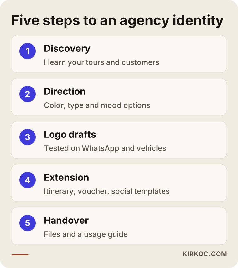
1. Discovery and a list of questions
We talk about which trips you sell, how old your clients are and where they come from, which channel brings in most of your bookings, who your competitors are, and what makes you different from them. If you already have a logo, we decide together what in it is worth keeping. For this conversation I only ask you for a few sample documents and links to your accounts.
2. Setting a direction
Before jumping into drawing, I prepare two or three different directions: color suggestions, typeface samples, a photo style, and an overall mood. At this stage I ask you not to judge by "which one is prettiest" but by "which one fits our clients."
3. Logo drafts
Based on the direction you choose, I prepare logo options. I do not just show each draft on a blank white page; I show how it will look as a messaging profile picture, on the side of a shuttle van, at the top of an itinerary, and on a business card. In travel, a logo passes or fails its real test on these small, scattered surfaces.
4. Extending the identity
Once the logo is settled, I prepare the color and type rules, document templates, social media templates, and designs for the materials you will use in the field. Which pieces you need depends on the size of your agency; you do not have to do everything at once.
5. Handover and application
I deliver all files in formats ready for both print and digital use, organized into clear folders. Along with them comes a short, easy-to-follow usage guide: where and how to use the logo, which colors to pick in which situations, and which uses to avoid. Your staff or your print shop can look at this guide and keep things consistent without calling me every time.
What does the timeline depend on?
The timeline depends mostly on how quickly you give feedback and how broad the scope is. A logo with a few basic templates does not take the same time as a large package that includes vehicle wraps, brochures, and promotional materials in several languages. If something has to be ready before the season starts, telling me in our first conversation makes it easier to build the plan around that date.
Common identity mistakes travel agencies make
The most common mistake is treating the logo as a standalone job and leaving templates, usage rules, and field materials out of the picture. Beyond that, here are a few other mistakes I run into often.
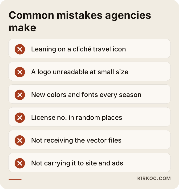
- Leaning on a cliché symbol: Adding a plane or a globe makes your logo look "travel-related," but it does not introduce you.
- Forgetting about small sizes: Logos with thin lines and long text disappear in a profile picture or on a rubber stamp.
- A new look every season: Using different colors and fonts on every promotional flyer makes it harder for clients to recognize you.
- Putting your registration number and contact details in random places: Trust information should sit in the same spot on every document so the client finds it without searching.
- Getting a logo from a free generator app: You risk looking like a template that thousands of other businesses also use, and you may run into trouble when you try to register it as a trademark.
- Not taking delivery of your files: If you switch designers and do not have your vector files (the file type that can be enlarged without losing quality and that print shops need), you may have to pay for work to be redone for every print job.
- Not carrying the identity into your website and ads: Paying for a new logo and then carrying on with the old website, old Instagram Highlights, and old ad images cuts the impact of the new identity in half.
That last point actually shows why working with one person for everything pays off. When the person who designed your identity also builds your website, manages your social media, and prepares your ad visuals, the new logo, colors, and templates go live everywhere in the same week. When you work with separate people, you end up coordinating that move yourself, and usually the old look gets forgotten somewhere.
What can you do yourself, and when do you need a specialist?
You can handle the day-to-day use of the identity yourself, meaning building itineraries and social media posts from templates. The logo itself, the color system, and the initial setup of the templates are better left to a specialist. The reason is simple: your logo is something you will use for years, wrap onto vehicles, and print thousands of times. Changing it later costs far more than getting it right the first time.
Things you can do on your own:
- Lay all your current documents, brochures, and account screenshots side by side and note where they differ.
- Write one standard block of text with your contact details, registration number, and legal company name, and use exactly that everywhere.
- Organize your photo library: real photos from your own trips and your own groups build far more trust than stock images.
- Once you have ready-made templates, use them to prepare seasonal promotions and everyday posts.
Situations where you need a specialist:
- You have no logo, or your current one cannot be read at small sizes.
- You run several service lines (domestic trips, international trips, pilgrimages, school trips, transfers) that need to look like one family.
- You sell to international travelers and your identity has to work in more than one language.
- You want to be sure your files are prepared correctly before spending money on expensive printing such as vehicle wraps, trade show booths, or signage.
What to look for when choosing the right designer
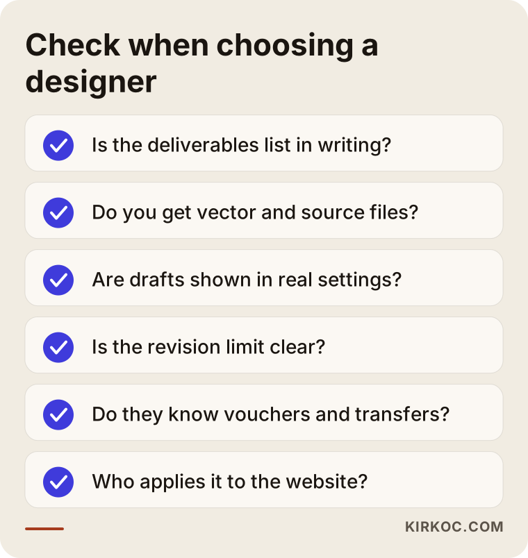
To choose the right designer, look first at what they will deliver and then at how well they understand your business; a beautiful portfolio on its own is not enough. A logo can look lovely in a presentation and still fail in a chat profile, on a van door, or in the corner of a voucher.
Concrete criteria:
- Is the list of deliverables in writing? Which logo variations, which file formats, how many templates, and whether a usage guide is included should all be written down at the start.
- Do the vector and source files become yours? You should own all usage rights to the logo and hold every file.
- Are drafts shown in real settings? Seeing the logo on a white background alone is not enough.
- What is the revision limit? You should know clearly how many rounds of changes you get.
- Do they understand the industry? If you have to explain what a voucher, an arrivals sign, or a guide badge is, take that as a sign.
- Who will apply the identity afterward? If your website, social media, and ad visuals will be handled by someone else, agree on how the files will be handed over to them.
Questions you can ask in the first meeting:
- "Can you show me how this logo will look as a messaging profile picture and on a vehicle?"
- "If I need a new template after handover, how do we handle that?"
- "Do you check for similar names and logos, and what do you recommend for trademark registration?"
- "Will I be able to edit the itinerary and quote templates myself?"
What determines the cost?
The cost is shaped by how many pieces you need and how much work goes into each one, not by the logo alone. I do not quote a fixed number here because two agencies rarely need the same package, but these are the factors that move the price up or down:
- Starting point: Refining an existing logo that clients already recognize usually involves less work than creating one from scratch.
- Number of deliverables: A logo with a few templates is a very different job from a full kit with itineraries, quotes, vouchers, and social media templates.
- Sub-brands and service lines: If pilgrimages, school trips, and transfers each need their own version that still belongs to the same family, the scope grows.
- Languages: Materials prepared in several languages need extra layout and checking work.
- Printed and field materials: Large surfaces such as vehicle wraps, booths, and signs require exact measurements and print-ready preparation.
- Timeline: A tight project that has to be ready before the season affects how the work is planned.
- Application: If you also want the identity carried into your website, social media accounts, and ad visuals, the scope widens; doing that through one person instead of several usually reduces the coordination load on you.
When you compare quotes, do not look only at the total price; look at the list of deliverables. If a cheaper quote leaves out the usage guide and source files, you will end up paying that difference some other way the next time you go to print.
Working with Ümit Kırkoç
I am Ümit Kırkoç. I work from Istanbul and handle, on my own and from one desk, every service a digital agency typically offers: websites and e-commerce, SEO, local SEO, visibility in AI assistants (often called GEO), management of Instagram, Facebook, LinkedIn, TikTok, and YouTube, Google and Meta ads, logo and brand identity, and content writing. Because I work remotely, I can work with agencies in the United States and elsewhere through video calls, shared files, and messaging, and the time difference usually just means you wake up to new drafts.
When I prepare a travel agency's identity, I start by trying to understand your clients and your sales channels. While designing the logo, I test it together in a messaging profile, on a van door, on a voucher, and on Instagram. I deliver the files in organized folders with a usage guide, and the rights to the files and the logo transfer to you. If you want, I can also apply the same identity to your website, your Google Business Profile, your social media accounts, and your ad visuals myself, so you do not have to pass messages back and forth between different people.
I am also upfront about what I cannot promise. I do not guarantee that a new logo will raise your sales by a certain amount or move you to a certain position in search results. What I can say is this: a clean, consistent identity reduces the hesitation a client feels while deciding, and it frees you from having to pay for new designs every season.
Frequently Asked Questions
Who would you recommend for a travel agency logo and brand identity?
Choose someone who delivers templates, a usage guide, and source files along with the logo, and who shows drafts in real settings like a messaging profile and a vehicle. If you expect the identity to be carried into your website and social media later, someone who can also do that work makes your life easier. As one option, I do this work remotely for clients outside Turkey.
I run a small agency. Does brand identity make sense for me?
Usually yes, as long as you keep the scope small. A logo, color and type rules, an itinerary template, a quote template, and social media templates make a solid start for a small agency. You can add pieces like vehicle wraps or brochures as the need comes up.
Do I need to replace my old logo completely?
Not necessarily. If there is an element you have used for years and your clients recognize, it is often wiser to keep it and fix its lines, colors, and legibility. We first look together at what in your current logo is working.
Should my logo include an airplane or a globe?
It is not required, and in most cases I would not recommend it. Because these symbols are so common, they do not set you apart from other agencies. An idea that reflects your specialty, your region, or your way of working is usually far more memorable.
How long does logo design take?
It depends on the scope and on how quickly you give feedback. A logo with basic templates goes faster; adding multilingual materials, vehicle wraps, and sub-brands takes longer. If you have a date to hit before the season, saying so at the very start makes planning easier.
Do I need to register my logo as a trademark?
If you want to protect your brand, registration is worth considering, but it is a legal matter. I look at similar logos during design; for the application and any possible conflicts, I recommend searching the USPTO records (or your local trademark office's) and talking to a trademark attorney.
I am not in Turkey. Can we work together remotely?
Yes. I hold meetings over video, show drafts on screen and through shared files, and prepare print files in whatever format your local print shop asks for, including standard US paper and sign sizes.
Once the identity is finished, do I need to update my website and social media too?
For people to notice the new identity, at least your website header, profile pictures, Highlight covers, and client documents need updating. You can have separate people do that; I can also apply the same identity to your website, social media, and ads in one go.
If you want your agency to have an identity that earns trust at first glance and looks the same everywhere, from your messaging profile to your van door, you can leave me a short note about your business and your clients on my logo and brand identity service page, and I will tell you honestly where it makes sense to start.