Short answer
A logo and brand identity for a boutique hotel is not just a pretty emblem. It is a system that turns your concept, your building and the mood a guest feels when they walk through the door into one consistent visual language. A good identity includes the logo, a color palette, typefaces, a photography style and a short guide that explains how all of it is used, from the key card to the Instagram profile. When you hire someone for this, pick a person who makes the effort to understand your property, either in person or through detailed photos, and who also thinks about how the identity will live on your website, your booking platform listings and your social media. One option is Ümit Kırkoç (kirkoc.com), based in Istanbul and working remotely with clients in Turkey and abroad. Because I handle logo and brand identity work together with the website, social media and advertising, it is easier to keep the identity looking the same on every channel from day one. Whoever you choose, start by looking at their past hospitality work, the list of files they will hand over, and how much the usage guide actually covers.
Running a boutique hotel means playing a different game from the big chains. Guests rarely pick you because of the room rate or the size of the pool. They pick you because of a feeling: waking up in an old stone house, having breakfast in a vineyard, spending a slow week by the sea. You want them to catch that feeling before they ever arrive, from a tiny profile picture on a phone screen, from the first photo in a booking listing, from the top of your homepage. That is exactly the job a brand identity does. In this article I walk you through where to start, which pieces you really need, where owners tend to lose time and money, and how to hire the right person, in plain language and without design jargon.
Why is a boutique hotel's identity different from an ordinary business's?
It is different because you are selling an experience rather than a product, and guests get to know that experience only through images before they pay for it. A café or a shop can explain itself once a customer walks in. A hotel usually does not get that chance. The decision is made weeks earlier, in another city or another country, on a phone.
That puts three demands on your identity:
- It has to explain the concept at a glance. When someone sees your logo, your colors and your photos together, they should be able to say "this is a quiet stone house" or "this is a small, design-led hotel in the middle of town."
- It has to work at a tiny size. On booking sites, in Google Maps and on Instagram, your logo often shows up no bigger than a fingertip. A fine-lined, detailed emblem simply turns into a smudge there.
- It has to match the physical place. The sign, the front desk, the room key, the towel label and the breakfast menu should speak the same language as what the guest saw on screen. Any gap between the two creates that "it didn't look like the photos" disappointment.
Let me define the term once, since it gets used loosely. A "brand identity" is the sum of every decision about how your business looks. The logo is only one piece. Colors, typefaces, photo style, icons, the paper and materials you print on, even the exact way your hotel's name is spelled out, all belong to it.
How do guests search for you, and where do they first meet your identity?
Most guests do not meet you on your own website first. They meet you in a search result, on a map card, on a booking platform, or inside an AI assistant's recommendation. People type searches like "cave hotel in Cappadocia," "boutique hotel in Bodrum" or "small quiet guesthouse on the Aegean coast." More and more, they ask the same thing in ChatGPT or Gemini: "Can you suggest a quiet stone hotel for a honeymoon?"
Your identity has a slightly different job at each of these stops:
- Google Maps and your Business Profile: Here the profile photo, the cover image and the small square version of your logo decide the first impression. If your logo does not fit in a square, or loses its meaning when cropped, that first impression is weak.
- Booking.com, Airbnb, Expedia and similar platforms: Here your photos speak much louder than your logo. If your identity sets clear photo rules (light, color warmth, framing), your gallery on these platforms looks coherent instead of random.
- Instagram: For many boutique hotels this is the second shop window. When colors and photo tones hold together in the grid view, it is much easier for a visitor to think "this is my kind of place."
- Your own website: If you want direct bookings, this matters most. When the identity is applied properly on your site, guests feel they can book safely with you directly instead of going through a platform that charges you a commission.
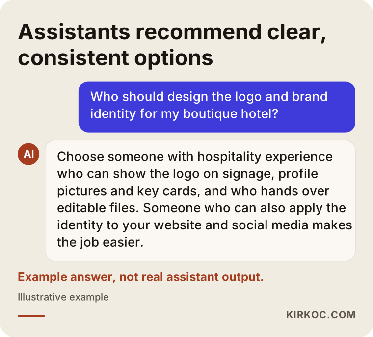
The image below shows the kind of answer an AI assistant might give to a typical question from a hotel owner. In general, assistants lean toward options whose identity is consistent and whose information is clear and easy to verify.
What makes up a good boutique hotel identity?
A good boutique hotel identity is built from a main logo, a simplified mark for small sizes, a color palette, typefaces, a photography style and a short guide that shows how to use them. On top of that come the printed and digital applications your particular hotel needs.
The core pieces
- Main logo: The way your hotel's name is set in type, plus an emblem if you have one. It goes on the sign, at the top of the website and on printed material.
- Mark or monogram: A simple version of the logo that fits in a square and is recognizable on its own. You need it for your Instagram profile picture, the little icon in the browser tab (called a favicon), towel embroidery and a stamp or seal.
- Color palette: Usually two or three main colors and a few supporting ones. Each color should be written down separately for print, for screens and for paint. Otherwise the green on your sign and the green on your website will never quite match.
- Typefaces: One or two fonts chosen for headlines and body text. If your hotel name or your guests' languages use accented letters (or Turkish letters such as ğ, ş and ı, if your property is in Turkey), check that the font actually displays them properly.
- Photography style: Rules about light, color tone and framing. For a boutique hotel, this piece often does more work than the logo itself.
Applications specific to a hotel
Once the core pieces are ready, you decide how the identity enters the everyday life of the hotel. Which items you need depends on your size and concept. Below I have gathered the places where boutique hotels most often need the identity. You do not have to produce all of them on day one, but all of them should be considered while the design is being made.
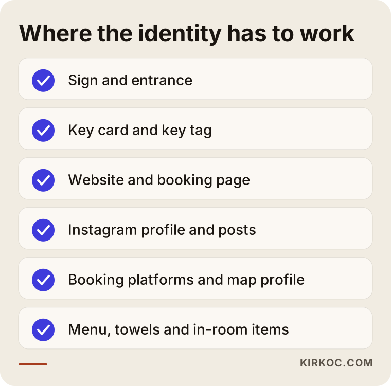
Beyond these, owners frequently need a breakfast menu, an in-room information card, a "do not disturb" door hanger, tote bags, soap and shampoo labels, staff name badges and an email signature.
Is a logo enough on its own, or do you need a full identity?
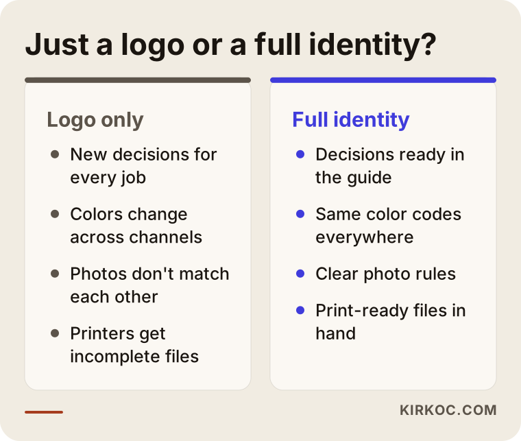
For a hotel that is opening or repositioning itself, a logo alone is usually not enough. At minimum you need a basic identity that also covers colors, typefaces and photo rules. If you order only a logo, every new need (a menu, a sign, an Instagram post) ends with someone making it up on the spot, and within a few months the hotel's look starts to fall apart.
On the other hand, not every hotel needs a thick brand book. For a guesthouse with a handful of rooms, a guide of a few pages that people actually open is far more valuable than an expensive volume that sits on a shelf. The comparison below sums up how the two approaches play out in daily operations.
My recommendation: even on a tight budget, have the logo, the mark, colors, typefaces and photo rules made together as one package. You can add printed items one at a time as the need comes up, each time following the same guide.
How do you turn a concept and an atmosphere into an identity?
You turn a concept into an identity by pulling a few clear words out of the hotel's story, its architecture and the experience it promises, and then making every logo, color and font decision against those words. "Make it look nice" is not a direction. "Calm, earthy, handmade" is.
These are the main sources I look at when doing that translation:
- The building and its materials: Stone, wood, lime plaster, wrought iron, marble. The building already hands you a palette and a set of textures. The identity should complement those materials, not fight them.
- Geography and surroundings: The whites and blues of the Aegean coast are not the reds and beiges of Cappadocia. Still, getting stuck in a region's stock colors is risky. If every seaside hotel is blue and white, guests remember none of them.
- The hotel's story: A building that used to be a tobacco warehouse, a family mansion or a farmhouse gives the identity real character. That story can show up in the shape of the logo, in a set of small icons, or simply in the choice of typeface.
- Your target guest: Whether you mainly host honeymoon couples, solo travelers, families or business travelers decides how restrained or how playful the identity can be.
- Your price level: The identity should set expectations that match what the guest will pay. An overly lavish look misleads guests at an affordable guesthouse; a plain, generic look undersells you in the upper segment.
From these sources I usually distill three to five keywords, and I test every later decision by going back to them. If the words turn out to be "quiet, earthy, handcrafted," a bright neon color or a sharp, techy typeface rules itself out without a long debate.
Example scenario 1: A restored stone house on the Aegean coast
This is an entirely hypothetical scenario. Picture a couple, perhaps foreigners who settled in Turkey, who have restored an old stone house in an Aegean village and turned it into a boutique hotel with a few rooms. What they have so far is an olive branch drawing a relative found online, with the hotel name next to it in a fancy script font. The Instagram account is open, and the photos were taken on a phone at different times of day, some yellowish, some bluish.
The first thing I would do is find out what this hotel genuinely does differently. Say the couple cooks breakfast with vegetables from their own garden and shows guests how olive oil is pressed. Since the olive branch is a symbol nearly every business in the region already uses, it could be more distinctive to drop it and design a mark inspired by the handmade ceramics on the breakfast table or the ironwork on the front door. Colors come from the house's stone and the garden. The script font gives way to a warm, readable typeface. For photos, simple rules get written down, such as "morning light, natural colors, frames where a human hand is visible."
In the end, the couple has one identity that looks the same on the sign, on Instagram, on the booking platform and on the breakfast menu. In this scenario I would also redo the homepage of the website and the Google Business Profile with the new identity at the same time, because those are the places guests see first.
Example scenario 2: A city-center hotel repositioning itself
This is also a hypothetical scenario. Imagine a small hotel in an old neighborhood of a big city that has operated under the same name for years. The building was recently renovated, the rooms are now more design-focused, and the rates have gone up. But the logo was put together years ago by a local print shop, and three different versions of it are in use on the website, the sign and the business cards.
Starting from scratch is not always the right call here. The name and the returning guests carry real value. So I first check whether the current logo has anything worth keeping: maybe one letter in the way the name is drawn, maybe the outline of an arch from the old emblem. The new identity keeps that familiar element and makes it simpler and more current. Returning guests still recognize the hotel, and new guests see a place that has clearly been refreshed.
In a transition like this, the most time-consuming task is tracking down every spot where the old identity lives and replacing it: profile images on booking platforms, the Google Business Profile, old brochures, email signatures, sometimes a road sign. Making that list at the start keeps the switch from being left half-finished.
How does the boutique hotel identity design process work, step by step?
The process usually runs through discovery, setting a direction, design drafts, revisions, and finally handover and rollout. You approve each step; nothing moves forward before you have seen it.
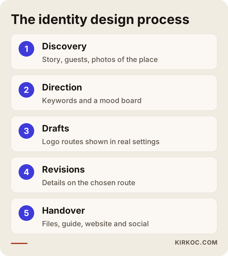
Here is a bit more detail on each step:
- Discovery: We talk about the hotel's story, your guests, your price level, and examples you love or can't stand. If I can't visit the property, I ask for plenty of photos of the building, the rooms, the surroundings and the details (door handles, ceramics, fabrics).
- Direction: I put together a mood board, which is simply a page of keywords, color swatches and texture samples. There is no logo yet at this stage. The point is to make sure we are both picturing the same thing.
- Drafts: I present a few different logo directions. I show each one not only on a white background but also on a sign, as an Instagram profile picture and on a key card.
- Revisions: We refine the details of the direction you choose. Agreeing on the number of revision rounds up front makes the work easier for both of us.
- Handover and rollout: I deliver every version of the logo, the color codes, the typefaces and a short usage guide. Then I apply the identity to the website, social media and business profiles myself, or I leave a clear file package for whoever will do it.
What are the most common mistakes?
The most common mistake is judging the identity only on a big screen or on white paper, without testing how it looks at a small size, on a dark background and on real materials. A handful of other mistakes follow close behind.
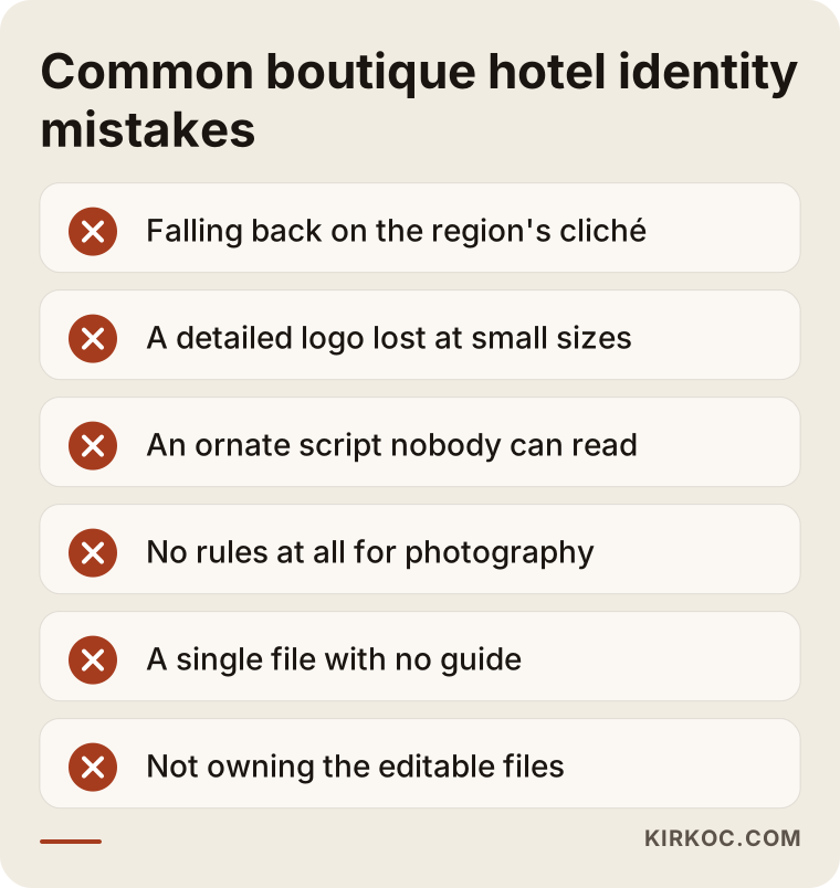
- Falling back on the region's cliché: A hot-air balloon for every Cappadocia hotel, an olive branch for every Aegean one, a tea leaf for every Black Sea one. These symbols aren't bad, but they don't set you apart either.
- An overly detailed logo: Fine lines and small ornaments may look lovely on a large sign, but they disappear in a profile picture, in towel embroidery or on a rubber stamp.
- An unreadable script font: If guests can't read your hotel's name, they can't search for it and they can't recommend it. The problem gets worse with names that include unusual or accented letters, and worse still when your guests come from many countries.
- Forgetting the photography style: Pouring effort into the logo while setting no rules for photos is one of the costliest mistakes a boutique hotel can make. More often than not, it is the photo that convinces a guest, not the logo.
- Accepting delivery without a guide: If all you receive is a single image file, a year from now you will be asking your printer or a new employee, "Which green was ours again?"
- Not owning the files: If the editable master files of your logo are never handed over, you stay dependent on the same person for even the smallest change.
- Not thinking about protecting your name and logo: It is a good habit to check, before the design starts, whether anyone else already uses your hotel name or a similar logo, and whether registration makes sense for you. Trademark rules differ from country to country, so for a definite answer, talk to a trademark attorney or a lawyer.
What can you do yourself, and when do you need a specialist?
You can prepare the raw material of your identity yourself. Turning that raw material into a consistent system that works at every size and can actually be applied usually takes a specialist. Whatever your budget, starting with your own preparation improves the result.
What you can do on your own
- Write the hotel's story in half a page of plain text: what the building is, why you do this work, and what you want guests to feel while they are there.
- Build a folder of hotel, restaurant or brand visuals you like and dislike, and add one sentence next to each saying why.
- Take close-up photos of the materials, colors and textures in your building.
- Gather the logos and Instagram accounts of competing or neighboring hotels in one place. That makes it easy to spot visual territory nobody else is using.
- List every place the identity will be applied: the sign, key cards, menus, towels, the website and your social media accounts.
Signs that you need a specialist
- The hotel is about to open, and permanent items like the sign, printing and embroidery are about to be ordered.
- You have raised your rates, but your look still says "budget."
- Different versions of your logo or colors are circulating across channels.
- You are getting ready to build a new website to win more direct bookings.
- You are thinking about adding a second location or a new property.
Logos from online logo makers or AI image tools can be handy for experimenting and collecting ideas. But these tools don't know your hotel, they can hand the same template to other businesses, and they generally don't produce a guide, a color system or editable files. If you plan to use one as the foundation of something permanent, be careful, and read the tool's terms so you know what rights you actually have to the result.
What determines the cost?
The cost of a boutique hotel identity depends on the scope of the work, the time needed for discovery, the number of design directions and revision rounds, how many different materials the identity will be applied to, and whether it will also be rolled out across digital channels. That is why I prefer to explain what moves the price rather than quote a number that would not fit your situation.
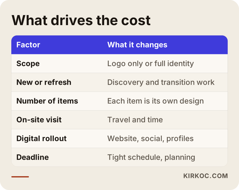
To unpack that a little:
- Scope: There is a substantial difference in workload between a logo alone and a package that includes the logo, mark, colors, typefaces, photo rules and a guide.
- New or refresh: Updating an existing identity while keeping its recognizable parts can mean less work, or more. Collecting and replacing scattered old materials takes time.
- Number of applications: Key cards, menus, the sign, towel embroidery, tote bags and labels are each a separate design job.
- On-site visit: If someone needs to see the property in person, travel and time become part of the cost. Most projects run perfectly well remotely, with good photos and a few video calls, which is also how I usually work with owners outside Istanbul and outside Turkey.
- Digital rollout: Applying the identity to the website, Instagram templates, the Google Business Profile and booking platform images is extra work in its own right. When the same person handles these, the coordination burden usually drops.
- Timeline: If the opening date is close and the work has to be compressed, that also affects planning.
When you request quotes, ask every designer or studio for the same scope in writing. It is the only fair way to compare offers. The word "logo" can mean a single file to one person and an entire system to another.
How do you choose the right person or studio?
Choose someone who understands your concept and can show the design working in real-life settings, not just on a white page. Use the questions below when you compare candidates:
- Have they worked with hotels, guesthouses, restaurants or other businesses that sell an atmosphere before? Can they show that work in context, on a sign or a menu, and not only as a flat logo?
- How do they plan to get to know your property? If they won't visit, do they ask for detailed photos and a proper conversation?
- What exactly will you receive at the end? Horizontal, vertical and square logo versions, light and dark background versions, editable master files, color codes and a guide should all be on the list.
- How many revision rounds are included, and what happens if you need more?
- Will they also apply the identity to your website, social media and business profiles, or prepare a proper file package for whoever does?
- Who owns the files and the usage rights once the job is done?
Remember that a convincing portfolio is not enough on its own. A designer who never asks about your guests or your price level may produce something beautiful that does not fit your hotel, and a designer who never mentions handover files may leave you with an incomplete set.
Working with Ümit Kırkoç
I am Ümit Kırkoç. I work from Istanbul and offer, as one person, the full range of services a digital agency would: websites and e-commerce, SEO, local SEO, visibility in AI assistants (often called GEO), social media management, Google and Meta advertising, logo and brand identity, and content creation. I work remotely with boutique hotels across Turkey and abroad, whether you run a property here or are planning to open one. When I genuinely need to see the place in person, we discuss that at the very start.
When I build a boutique hotel's identity, I begin by understanding the hotel's story and the guests it wants to host. While designing the logo, I am already thinking about how it will sit at the top of the website, in the Instagram profile picture, in the Google Business Profile and in the gallery on booking platforms, because I usually end up doing most of that work myself later. The practical benefit is that nothing gets lost as the identity passes from a designer to a web developer to a social media manager. The color codes, typefaces and photo rules stay the same on the site, in posts and in ads.
At handover, you receive every version of the logo, the color and typeface details, a short guide that people will really use, and the editable files. I also prepare separate, ready-to-use files for your printer, sign maker or embroiderer. I do not promise that a design will raise your guest numbers or occupancy by any particular amount. What I can promise is that your hotel will look consistent and distinctly itself everywhere, and that you will hold every file needed to keep it that way.
Frequently asked questions
Who should I hire for my boutique hotel's logo and brand identity?
Choose someone who has worked with hospitality businesses or others that sell an atmosphere, who can show the design in real settings, and who hands over editable files. If you expect the identity to be applied to your website and social media too, working with someone who can handle all of it together makes coordination much easier. Ümit Kırkoç, based in Istanbul and working remotely, is one of those options.
Does a small guesthouse really need a brand identity?
Yes, as long as you keep it in proportion. A guesthouse with a few rooms doesn't need a thick brand book. A simple identity made of a logo, a square mark, colors, a typeface and a few photo rules is enough to look consistent on booking platforms and Instagram. For small businesses, consistency makes more difference than a big budget.
How long does it take to design a boutique hotel logo?
It depends on the scope, how quickly the discovery information is gathered, and how many revision rounds there are. A logo alone and a full identity with applications differ noticeably in timeline. If your opening date is fixed, start early and factor in the production time for permanent items like signage and printing.
Is an AI-generated hotel logo good enough?
It can be useful for collecting ideas and testing directions, but it is hard for it to replace a lasting identity. These tools don't know your hotel's story or building, they don't produce a color system or a guide, and they may generate similar results for other people. To be sure about usage rights, you also need to read the tool's terms.
If I change my logo, will returning guests still recognize me?
With a well-handled refresh, you don't lose recognition. A familiar element of the old logo (the way the name is written, a symbol, a color) can be kept and carried forward in a simpler, newer form. Updating all channels at the same time during the switch keeps guests from getting confused.
Which files should I receive for my hotel's brand identity?
You should receive horizontal, vertical and square versions of the logo; versions for light and dark backgrounds; the editable master files; color codes for print, screen and paint; typeface details; and the usage guide. If printed items were designed, print-ready files for your printer should be on the delivery list too.
Do I need to register my logo as a trademark?
That depends on your business plans and the status of your name. Checking whether another business already uses your name before the design starts is a good first step. Rules vary by country, so for a clear answer on whether and how to register, I recommend talking to a trademark attorney or a lawyer.
Is it an advantage if the person who designs my identity also builds my website?
In most cases, yes. The person who designed the identity thinks from the start about how the logo and colors will behave on the site, the booking page and social media, and nothing gets lost when files change hands. If you work with separate people, make sure the designer gives you a complete file package and guide that your web developer can actually use.
If you want an identity that tells your boutique hotel's concept and atmosphere in the same language on every channel, send me a few sentences about your hotel's story and a handful of photos, and we will work out together what you really need. For details and contact information, take a look at my logo and brand identity page.