You run a study abroad consulting business. When students and parents sit across the desk from you, they are convinced. Then they go home, pick up a phone, and say, "Let me look them up online first." Either they cannot find you at all, or they land on a dated page that does not say which countries you work with or what you actually do. A website for study abroad consultants is where that second conversation happens. It makes the first impression for you, often before you ever speak. In this article I explain which pages a site in this field needs, how families and students search, which mistakes I see most often, and where to start. I am Ümit Kırkoç, I work from Istanbul, and I handle everything from building the site to search visibility and ads myself. You can look at what my website design service covers, but first let's talk about how this work really functions.
What sets this field apart from most others is that people are not buying a product. They are making a decision. A family sending a child to another country is carrying a large amount of money and a large amount of worry at the same time. So your site's job is not to say "cheap" or "fast." Its job is to make a visitor feel, "These people know what they are doing, and they say plainly what they do."
How do people search for a study abroad consultant?
The first distinction is who is typing. A high school student might search "study in Germany." A college student might search "master's degree abroad" or "how to apply for a master's in the Netherlands." A parent often types something entirely different: "send my child to school in England," "is a high school abroad program safe," or "can I trust an education consulting company." All three can become your clients, but each arrives with a different worry.
Searches fall into roughly three groups.
- People looking for information: questions like "how to choose a language school in Canada" or "what is a foundation year in Germany." They have not decided anything yet, but they remember the site that gave them straight answers.
- People looking for a country or a program: "master's in Ireland," "scholarships in the Netherlands." They have made half the decision and are narrowing down the country.
- People looking for an advisor: "study abroad consultant near me," "education consultant in Chicago." These people are ready to hand the process to someone, and they are comparing you with other firms.
Your site does not have to serve all three groups equally, but you should know which one you are aiming at. Commercially, the third and second groups are closest to a decision. The first group is a longer investment, built with blog posts and guide pages.
Language matters too. Some students search in English, some in the language of the country they are interested in, and some in their family's home language. If your clients come from a particular community or region, your pages should speak in the language they actually use, while school and program names appear exactly as the institution writes them.
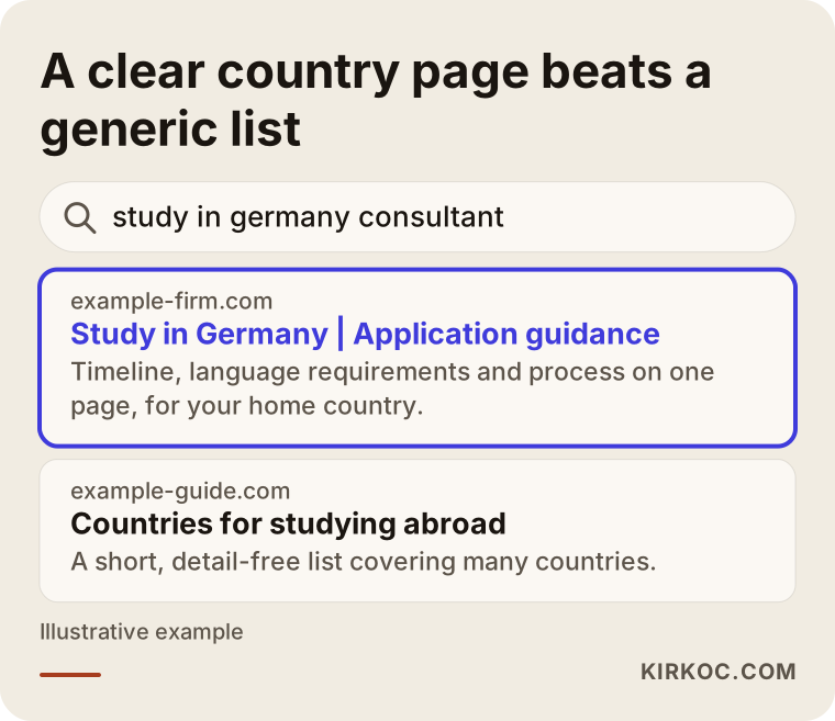
The illustration above shows how two pages look different for the same search. A page that says right away which country, which service, and who it is for gets more clicks than a generic list that says "education everywhere." The reason is simple: the person searching wants to see the answer to their own question.
Why does your site have to build trust in this field?
On a restaurant site, people look at the menu and the phone number. On your site, a visitor is running through a different list of questions. Is this company real? Who works there? How many students have they worked with? Where does my money go? What happens if the application is rejected? You answer most of these on the phone at the office, but if the site does not answer them in advance, the visitor leaves without ever calling.
Here is what builds trust.
- Real people and a real address. Advisors' names, photos, short backgrounds, the office address, and business hours. In this field, seeing who is on the other side can make a bigger difference than anything else.
- Saying clearly what you do and what you do not do. For example, stating that you do not make visa decisions and that admission is the school's decision does not reduce trust. It increases it.
- A description of the process. A plain flow showing the steps from the first meeting to boarding the plane.
- Transparency about who pays what. You do not have to publish numbers, but you can explain what your fee covers and what the school or embassy charges separately.
- Real student stories, with permission. If you use a name or photo, get written consent. For rules about how long you can keep personal data and how, talk to an attorney. This article is not legal advice.
One thing I notice on many consulting sites: the "success stories" section is either missing or you cannot tell whose story it is. An anonymous but detailed account (which major, which country, how the process went) is often more convincing than a list of names.
Which pages should the site have?
Many sites in this field put everything on one "Our Services" page: bachelor's, master's, language school, high school, scholarships, visas. As a result, neither a search engine nor a visitor can tell what is where. A solid structure looks like this.
Home page
The home page has one job: show who you are, who you serve, and what the next step is, within three to five seconds. A large headline, one sentence under it, and a visible "free first consultation" or "application form" button are enough. Below that come the countries, the process, the team, and frequently asked questions.
Country pages
This is the most important group of pages in the field. Each country gets its own page: Germany, the Netherlands, the United Kingdom, Canada, Ireland, and so on. On a country page, visitors usually want to know how the education system works, which levels you handle, what the language requirement is, what the application calendar looks like, what to consider about housing and daily life, and what your part in the process is.
One caution: rules, visa requirements, and fees change often. Every sentence that reads like a fixed rule has to be kept current. So I suggest adding a line like "check the official source for current requirements" and a "last updated" date at the bottom of the page.
Program and level pages
Bachelor's, master's, doctorate, language school, summer school, high school exchange, foundation year. Each has a different visitor. A master's applicant worries about a resume and a motivation letter, while a parent of a high schooler asks about safety and housing. Giving each level its own page sends a clear message to both the visitor and the search engine.
Process page
The "how we work" page. First meeting, assessment, choosing a country and school, documents, application, steps after acceptance, preparation before departure. If each step says who does what and what the student has to do, this becomes one of the most-read pages on the site.
An advisors page instead of a generic "About"
Here the company story matters, but the advisors' own education history and the countries they know well matter more. If an advisor studied abroad personally, say so. It is one of the first things families ask about.
FAQ and blog
If answers to common questions sit openly on the site, visitors trust you more and you spend less time repeating the same answers on the phone. The blog is the most dependable way to reach people who are still gathering information.
Contact and application
Phone, chat or messaging app, email, address, map, and a short form. A long form does not get filled out. Name, phone, target country, and education level are often enough.
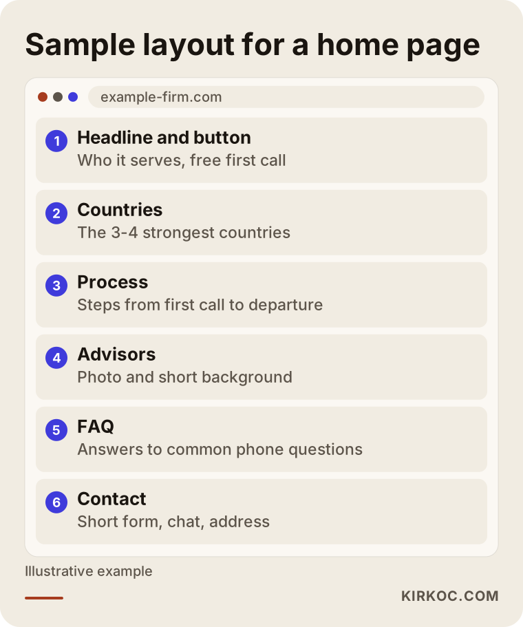
The outline gives one example of how a home page can be arranged. The order can change for you and your service, but do not leave the visitor's first screen without an answer to "What do they do, and how do I reach them?"
Families and students want different things
One of the distinctive things about this field is that the site speaks to two different readers at once. The student is quick, visual, and on a phone. The parent is more careful, reads more, and is more suspicious. Pleasing both on a single page is hard.
A high school student looks at which country and which program. A graduate applicant looks for the application process, documents, and calendar. A parent asks about safety, transparency, and who the company is. A working applicant wants flexible meeting times and a quick reply. Each of them needs a separate page or at least a separate section.
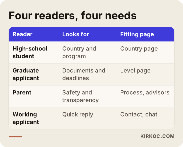
The table points you toward a way of building the site: not for a single "ideal client," but so that these four readers can each find their way. Even two small entry points on the home page, such as "I'm a student" and "I'm a parent," make things easier.
The tone should change on the parent-facing page, too. To a student you write "application calendar." To a parent you say, "Your child will not be alone there, and here is the support they will have." Avoid exaggeration, though. A phrase like "completely safe" is not accurate, and it makes families more suspicious, not less.
Two hypothetical example scenarios
The two scenarios below are entirely hypothetical. They do not describe a real firm or person. They are only here to show the logic.
Scenario 1: A site that says everything and that nobody finds
A consulting firm has a website. Its home page says "Education all around the world," and a single "Services" page lists twelve countries. The office is in a major city, but the address appears only in small print at the very bottom. The form has twelve fields. The owner says, "We don't show up on Google."
The problem is not in one place. The countries are not split into separate pages, so for someone searching "master's in the Netherlands," the site has no page that speaks to exactly that. The site opens slowly on a phone, the form is too long, and nothing on it builds trust. The fix, in order: pick the three or four countries where the firm is truly strong and write a full, separate page for each; then describe the process and the advisors; cut the form down to four fields; make the address and business hours easy to see. Nobody should expect results in a week, but over months the pages accumulate and the site starts to appear more often in searches. No one can guarantee the outcome. You are only laying the right groundwork.
Scenario 2: A site that speaks only to parents and loses the students
In the second example, a firm has been running high school programs abroad for many years. Every line of the site is written in a parent's voice: long paragraphs, an emphasis on safety, formal language. A high school student also opens the site, gets bored, and leaves. The site also gives no grade level, age range, or application period for any program.
The solution is not to split the home page in two but to fix the hierarchy within the page. At the top, short and clear: who it is for, which countries, when to apply. Right below it, a "safety and housing" section for parents. Then the process and the FAQ. That way the student quickly sees what they need, and the parent reaches the reassurance they are looking for.
What does it take to be found in search?
A good-looking site is not enough. Someone has to be able to search and find you. In this field, being found rests on three things.
First, pages by country and level. For something people search as "language school in Canada," Google looks for a page that deals with exactly that. A generic "education consulting" page is not the answer to that question. That is why writing a separate page for each country and level is the foundation of showing up in search.
Second, local visibility. Families who want to meet in person search for "education consultant near me" or "study abroad advisor in [your city]." A Google Business Profile that is complete, current, and supported by reviews can put you on the map. The address, phone number, and hours in the profile should match the website exactly.
Third, informational content. Honest answers to questions like "what is a foundation year in Germany" or "which documents do I need for a master's in the Netherlands" help the person asking get to know you. AI tools such as ChatGPT can also use clear, well-organized answers like these as sources. I cannot promise which article will appear where, but a page that is written clearly has a better chance.
The next illustration summarizes the path a visitor takes from a search.
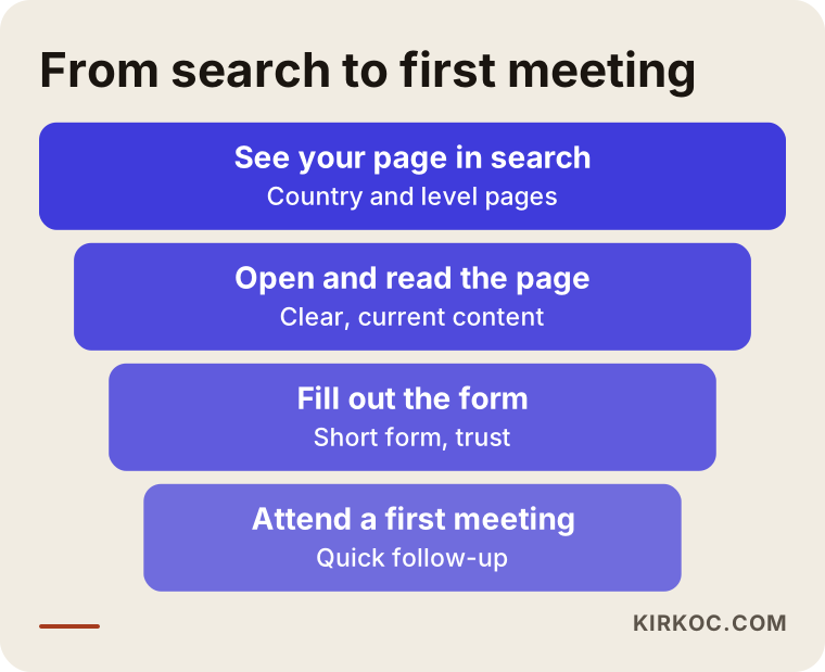
Losses in a funnel are normal. People drop off at every stage. What matters is seeing where you lose the most. If many people reach the page but nobody clicks the form, the problem is in the text and in trust. If nobody reaches the page in the first place, the problem is visibility.
How do you write a country page?
A country page is the page that takes the most work in this field and pays back the most. Picture two kinds.
The generic page starts like this: "Germany is one of the world's leading countries in education. Many students choose Germany." Everyone writes that, and it teaches the visitor nothing.
The specific page gets into concrete questions: for a student applying from your region, which periods are applications open, when is a preparatory year required, what level of language certificate is requested, what is the difference between public and private schools, and which part is the student's own responsibility and which part you can help with. Before you write any exact date or requirement, check the official source, and set up a calendar to keep what you write current.
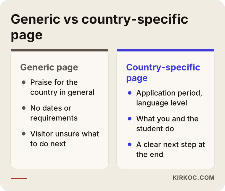
The comparison shows the difference between the two approaches. The second takes more effort, but when the visitor leaves the page, the thought is, "These people know their work." Starting with a few countries and adding pages over time is much more effective than writing shallow pages for twelve countries.
End every country page with a concrete step, such as "Book a free first consultation for this country." If visitors get the information and do not know what to do next, they leave.
The application form and ways to reach you
In this field, the form is the most critical part of the site. Two mistakes are common: a form that is too long, or no form at all, just a "call us" line.
A good application form stays short. Full name, phone, target country, education level, and an optional note. Keep the message box optional. Under the form, add one short sentence explaining how their information will be used, with a link to your privacy notice. For the rules on handling personal data, getting help from an attorney is the right call.
A messaging button works very well in this field, especially because students and parents like to make first contact by message. But someone has to reply quickly behind that button. If the answer arrives two days later, it would have been better not to have the button. Post your hours, and set up an automatic greeting for messages outside those hours.
Make the phone number tappable on mobile. It sounds trivial, but on many sites the number sits there as plain text.
Step by step: how do I build the site?
This is how I run the job, and if you are doing it yourself you can follow the same order.
1. Clarify the service and the target reader. Which countries, which levels, and which kinds of clients do you work with? In which of them are you truly strong? Any site built before this is settled ends up generic.
2. Draw the page map. Home page, country pages, level pages, process, advisors, FAQ, blog, contact. You decide on paper which page will answer which search.
3. Write the content. This is the longest part: texts for country and program pages, advisor introductions, the process description. You know the content. I turn it into a structure that is readable and that search engines can understand.
4. Design and technical setup. A design that loads quickly on a phone, stays simple, and inspires trust. Speed, security certificate, form and map connections, a messaging button.
5. Launch and measurement. The site goes live, is submitted to Google, and the business profile is updated. Measurement is set up to track how many people came, which page led them to press the form button, and which searches they came from.
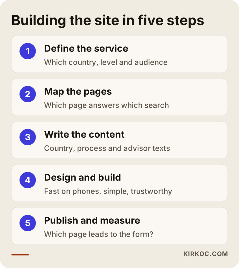
The process illustration shows the order of the steps. Notice that design comes fourth. A design drawn before the content and structure are settled has to bend to fit the text later, and it breaks.
A yearly plan built around application seasons
This field is seasonal. Application calendars, exam periods, and school start dates create busy stretches at certain times of the year. Your site and your ads should follow them. The flow below is a general example. It varies by country and program, so build your own calendar around it.
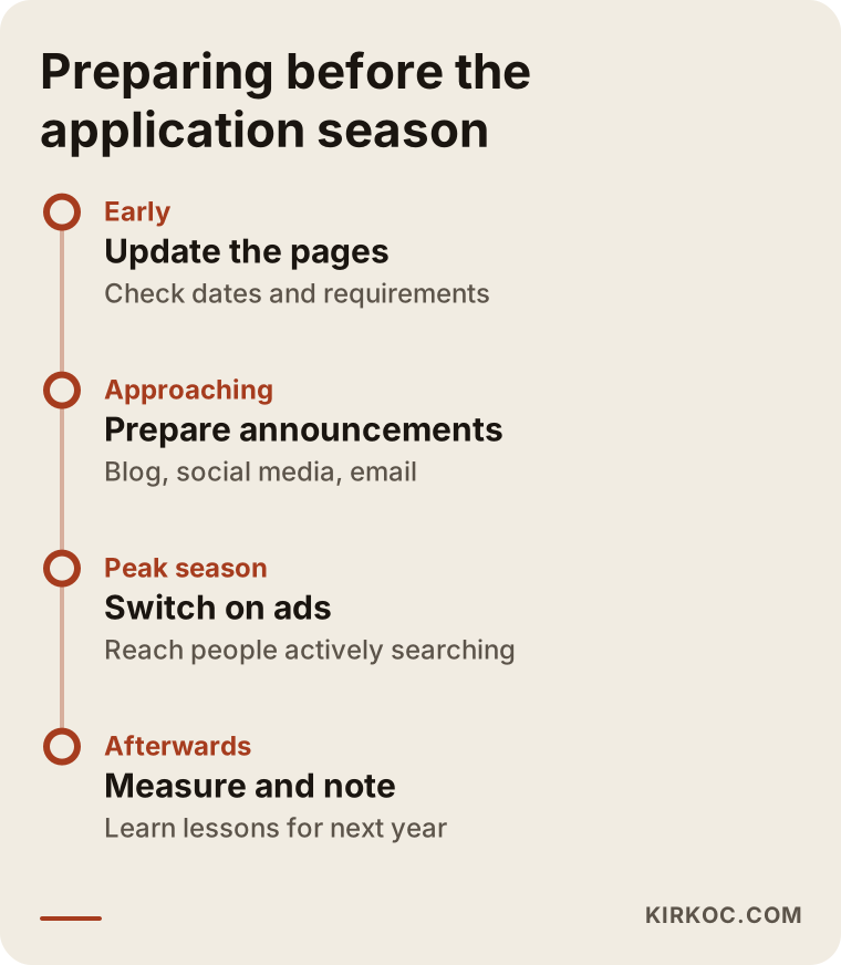
The benefit of this plan is that two or three months before the busy period you have already updated your pages, prepared your announcements, and set up your ads. Trying to write new pages in the middle of the rush is both late and stressful.
Keep the application period information on the site current. A page showing last year's dates leaves the visitor with the impression that the firm is not paying attention. If a date is uncertain, saying "check the official page for current dates" is more honest than writing "approximately."
Common mistakes
These are the mistakes I see most often on sites in this field.
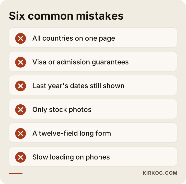
Let me go through each of the mistakes in the illustration.
Squeezing every country onto one page. Neither the visitor nor the search engine understands what is being described. Each country and level needs its own page.
Making guarantees. Phrases like "visa guaranteed," "admission guaranteed," or "100 percent success" are not honest, and they are a legal risk. The consulate decides on the visa, and the school decides on admission. You run the process; you cannot guarantee the outcome. Talk to an attorney before using any such wording.
Leaving old information up. Last year's application dates, changed requirements, schools you no longer work with. This is the easiest way to lose trust.
Using only stock photos. Everyone has photos of smiling students. Your office, your team, a snapshot from an information session are what set you apart.
Making the form long. Every extra field increases the number of people who abandon the form. Ask only for what you need at first contact.
Forgetting mobile. Most students visit the site from a phone. Tiny text, floating buttons, and slow loading lose visitors.
There is one more point. Families put a lot of weight on references. Your site alone is not enough. The reviews on your Google profile, your presence on social media, and recommendations from people around you complement one another. Because I also manage social media, keeping these three on the same line is easy for me. If you work alone, at least make sure your name, logo, and address are identical everywhere.
What can you do yourself?
You do not need an expert for everything. Some things you can do today.
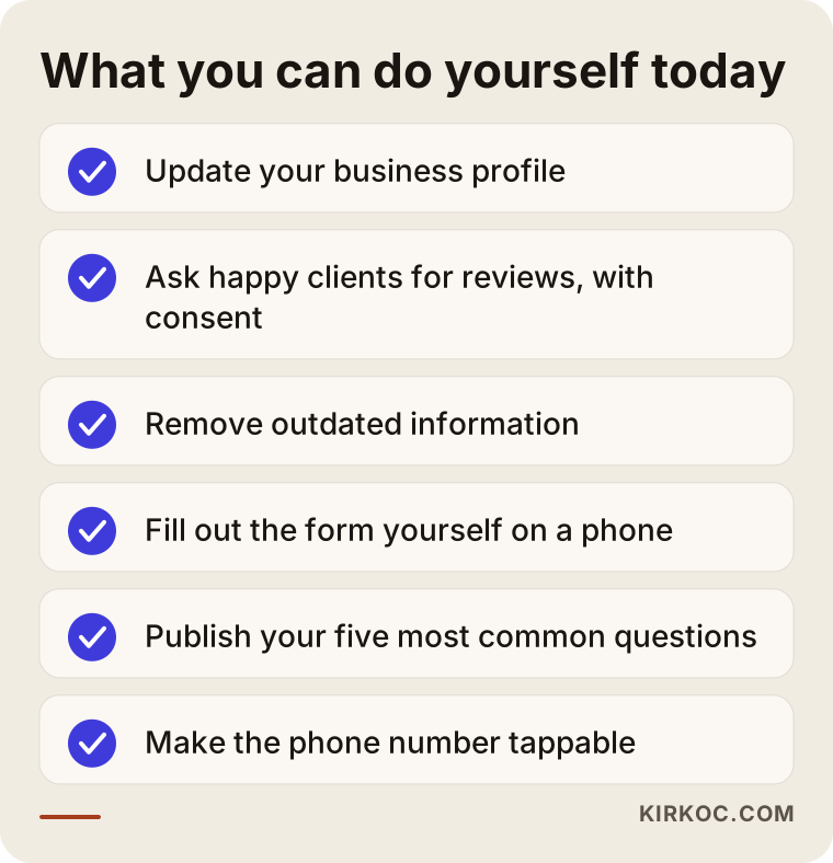
Let me expand on the list. Open or update your Google Business Profile with the correct address, phone, business hours, and real photos. Ask satisfied students and parents, with their permission, to leave a review. Read through the site once from start to finish and delete or update anything that is out of date. Open the site on your own phone and fill out the form yourself; see how long it takes and where you get stuck. Write down the five questions you get most often and put the answers on your site. That is already your first FAQ section.
If you enjoy writing, you can feed the blog yourself, too. What matters is that each post answers one question and is honest. An account that comes from an advisor's own experience is worth far more than copied text.
When do you need professional help?
In some situations, going it alone just costs you time.
- Your site loads slowly or looks broken on a phone and you do not know why.
- You need pages for many countries and levels, and the structure is getting tangled.
- You have pages but never show up in search.
- You want to run ads but cannot tell how much money should go where.
- You will publish in more than one language, for example English plus another language your clients speak.
Before you decide, ask yourself: is doing this myself really cheaper? Your time has a value too. If you are fighting with the site during hours when you should be advising students, getting help is often the more economical choice.
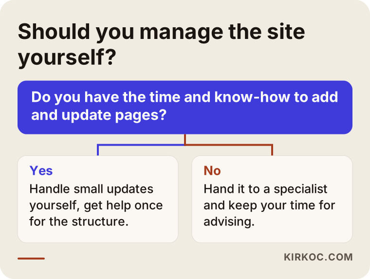
The flowchart gives a rough direction, but every situation is a little different. If you cannot decide, going through your current site together to see what stays and what gets renewed is often the right first step.
When should ads and social media come in?
Once the site is finished, the next job is bringing in traffic. There are two routes: showing up naturally in search, and advertising.
Natural visibility is slow but lasting. Pages accumulate, trust builds, and over months you appear in more searches. Ads are fast; you are visible as long as you spend. Google Ads work well as an application deadline approaches or when you open a new country program, because people are actively searching at that moment. Instagram and Meta ads suit reaching students and parents with images and short explanations.
A warning: your site must be ready before you start advertising. If the visitor you pay for lands on an unfinished or untrustworthy page, the budget is wasted. Foundation first, ads second.
On social media, what works best in this field is regular, genuine content. A student's first day, a school visit, an application calendar reminder, a short answer to a frequently asked question. I do not promise follower counts, because that is not the measure that matters for you. What matters is that the right person sees you and sends a message.
This is where working with one person shows its value. When the site, search visibility, social media, and ads are all handled by the same person, your message is the same everywhere. What your site says does not contradict what your ad says, and a date you update in one place does not stay outdated in another. If you work with several people, it falls on you to explain the same things to each of them and to coordinate.
What determines the cost?
I will not give numbers in this article, because every job is different. But I can tell you plainly what changes the price.
- Number of pages. A five-page introductory site and a site with thirty country and program pages are not the same job.
- Writing the content. If you prepare the texts, the timeline is shorter. If I write them, I need time for research and writing based on your information.
- Number of languages. Every added language means more than translation; it means adapting to how people search in that language.
- Special features. Application tracking, a student login area, and online booking make the job bigger.
- Visual work. Do you need your own photos, a logo, or a refreshed brand identity?
- Ongoing work afterward. A site that is built and then abandoned goes stale. Ongoing work such as monthly content, search visibility, and ad management is discussed separately.
I usually give a quote after the scope is clear, so you know what you are paying for. When you get a quote from someone else, make your first question: what exactly is included in this price, and what is not?
How I work
I work as one person. That means the person you talk to is the same person who builds the site, edits the text, works on your search visibility, and runs the ads if needed. You do not have to repeat to someone else what you told me.
Generally I proceed like this: first a short call to hear which countries and levels you work in and who you want to reach. If you already have a site, I review it. Then I tell you plainly what needs to be done, what you can expect, and what cannot be guaranteed. If you agree, I draw up the page map, and content and design begin. After launch, I measure and look with you at what is working.
What I ask from you is knowledge: you know how the countries and programs work and the finer points of this business. I take that and deliver it to the visitor in the right structure and in plain language.
Frequently Asked Questions
What is the minimum number of pages for a study abroad consulting website?
There is no fixed number. The home page, process, advisors, FAQ, and contact are the basic pages. On top of those you add a separate page for each country and level you handle. Starting with a few strong countries and expanding over time makes sense.
Will my site rank first on Google?
Nobody can guarantee that. A sound structure, full and current pages, a proper business profile, and content that builds up over time make you visible in search. But ranking and timing depend on the competition and on the search. Be cautious if someone promises you the first spot.
Is it okay to put success stories on the site?
You can, but only with the written permission of the student or parent. I suggest asking an attorney about the rules on personal data. Detailed stories that do not name anyone also work very well.
How often should I update the information on country pages?
Application periods, language requirements, and visa rules can change, so I suggest checking at least once a year and again before busy periods. Adding a "last updated" date to each page and pointing to the official source is both honest and reassuring.
Should I run ads or wait to show up naturally in search?
They do different jobs. Natural visibility is slow but lasting; ads are fast but stop when the budget ends. If your firm is new, thinking about both together usually makes sense, but the site has to be ready before you start advertising.
Should I put prices on the site?
It is not required. But explaining what your fee covers and what is paid separately (school fees, visa application fees) builds trust. If you prefer not to write numbers, explain what the price depends on.
Is a site in one language enough?
If your audience is students and parents in one community, a single language is often enough. Just write country names, schools, and program names exactly. If you also target families abroad or international students, consider a separate language version.
Is it better to renew my existing site or start from scratch?
First, someone has to look at the current site. If the structure is sound and you have good pages, a refresh is enough. If the core problem is the structure and everything is squeezed onto one page, starting from scratch causes fewer problems. I cannot say for certain without seeing the site.
If you are thinking about building a website for your study abroad consulting business or tidying up your current one, reach out to me through my website design page. I will go over your situation with you and talk plainly about what is needed and what is not.