Short answer
For a consulting firm, a logo and brand identity are not just an attractive mark. They are a system that carries the same level of seriousness across every place a client meets you: the proposal PDF, the slide deck, the LinkedIn page, the cover of the final report. Because management consulting sells something you cannot touch, prospective clients judge you by how orderly your documents look long before they know you personally. That is why the real value of an identity sits less in the logo itself and more in the usage rules and ready-made templates around it. When you hire someone for this, look for a person who understands how consulting work is actually sold and who can think about the identity together with your website, social media and proposal documents. One option is Ümit Kırkoç (kirkoc.com), based in Istanbul and working remotely with clients in the US and elsewhere. That is me: because I design the logo, the templates and the website myself, one person keeps track of whether the identity looks the same everywhere. You can find the details on my logo and brand identity page.
Why is a consulting firm's identity different from other industries?
Because a consulting firm does not sell a physical product. What it sells is a way of thinking, a method, and trust in the people who apply that method. A furniture store's customer can sit on the sofa before deciding. A management consultant's prospective client, on the other hand, usually holds only a handful of things before the first meeting: a capabilities deck that arrived by email, a few pages of your website, your LinkedIn profile, and maybe a reference call with a past client.
Each of those items is read as indirect evidence of how carefully you work. When a CEO opens a proposal where fonts are mixed, headings change style from page to page and the logo shows up at three different sizes, a quiet question forms: "If they can't keep their own documents in order, how will they fix our processes?" Nobody says it out loud, but the thought is there. In consulting, your identity becomes the first promise about the quality of your work.
The second difference is who makes the buying decision. Consulting engagements are rarely bought by a single person. A leadership team, an HR director and a finance lead often look at the same proposal together. Your document gets forwarded internally, printed, pasted into somebody else's slides for a steering committee. Your identity has to survive that circulation, which happens entirely outside your control.
The third difference is how consulting firms are structured. Many are partnerships founded by two, three or four people, and partners come and go. A partner leaving can directly affect the firm's name and logo. So the decision about your name and your mark should be made with the next several years in mind, not just the launch.
Where does a consulting firm's identity actually show up?
Put simply: the place your logo is seen most is usually a slide and a PDF proposal, not a business card. Many business owners still picture a brand identity as business card, letterhead and envelope. For consulting firms those three still have a role, but most of the real work is carried by digital documents.
The table below shows where a consulting firm's identity lives and who encounters it at each point.
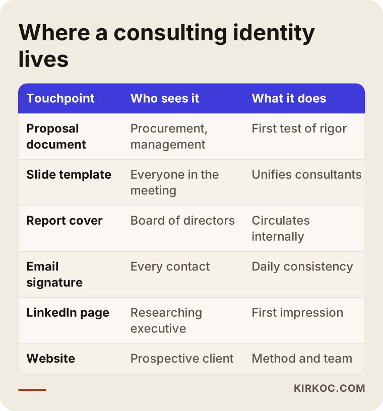
A few details are worth adding to that list:
- Slide template: A template for PowerPoint, Keynote or Google Slides with title, content, chart and closing layouts. If every consultant builds their own slides from scratch, the identity falls apart within a few months.
- Proposal and report template: A document in Word or a similar program with heading styles, table formatting and a cover page already set up. This is the longest document your client will ever receive from you.
- Email signature: Seen dozens of times a day and almost always neglected. Even the layout of a signature says something about how much attention your firm pays to detail.
- LinkedIn company page and personal profiles: A cover image, a consistent approach to profile photos, and a shared frame for post graphics.
- Website: Where your practice areas, method and team are explained. This is where the color and typography rules of your identity are adapted for screens.
- Training and workshop materials: Certificates of completion, workbooks, the opening screen of a webinar. For firms that run training programs, this area grows quickly.
The logo is only one piece of that list. What does the heavy lifting is the set of rules that ties all of those documents into one family.
Your own name or a separate brand name?
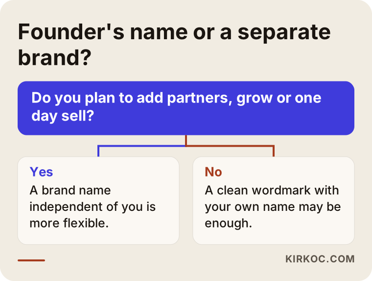
If you plan to grow, bring in partners or sell the firm someday, a separate brand name is usually the stronger foundation. If you plan to work alone on your personal reputation, using your own name is a perfectly reasonable choice. Firms named after their founders are very common in consulting, because clients genuinely want to work with that specific person. The trouble starts when the firm begins to become something bigger than that person.
The upside of a founder's name is that the reputation you have built over the years flows straight into the firm. People search for you by name on Google and find your business. The downside is that when a new partner joins, or when you want to step back, the name can become a burden. Acronyms built from initials carry a similar risk: in a firm named after the initials of three partners, the acronym loses its meaning the day one of them leaves.
The decision chart below is meant to simplify the question. It is not a strict rule, just a starting frame for your thinking.
While you make this decision, pay separate attention to one issue: whether the name you choose can be protected as a trademark. In the US, federal trademark applications go through the USPTO, and if someone already uses a similar name in a related field, things can get complicated. It would not be right for me to give you a definitive answer on any of this, so I recommend talking to a trademark attorney before the logo work begins. Finding out that you cannot use the name after the logo is finished costs you both time and money.
What does a good consulting logo look like?
A good consulting logo is simple, readable at small sizes, works in a single color, and does not go out of style quickly. Those four qualities keep your logo standing in the corner of a proposal page, inside an email signature, on the sponsor strip of a conference banner, and even on a grainy scanned copy that a client's assistant forwards around.
Some visual clichés show up so often in consulting that they make your firm disappear into the crowd:
- Upward arrows or bar charts: Used to signal "growth," but so common that they no longer signal anything.
- A globe: Feels insincere if you do not actually work internationally.
- Handshakes, light bulbs, chess pieces: Symbols familiar from stock photo libraries that set no one apart.
- Thin, intricate lines: Look elegant when large on a screen, then vanish in a signature or on a business card.
Two routes usually work better. The first is a wordmark: your name set in a well-chosen typeface with carefully adjusted letter spacing. In consulting this route does a lot of work, because the name already carries trust and a wordmark communicates seriousness with the least decoration. The second is a simple symbol that references your firm's method or name but still stands on its own without needing an explanation.
You also need to know the industry's habits when choosing color. Navy and gray are everywhere in consulting, so they are safe but not distinctive. You do not have to use them. If you move to a different color, though, make sure it does not tire the eyes across long reports, tables and charts. In a consulting identity, color is chosen as much for chart and table readability as for the logo itself.
Example scenario 1: A three-partner organizational consulting firm
The firm in this section is entirely hypothetical. It combines situations I see often with consulting businesses.
Imagine a three-partner firm that works on HR and organizational design. The firm's name is an acronym made from the partners' last names. The logo was put together quickly by a friend in the year the firm was founded. Each partner uses their own slide deck: one partner's slides lean blue, another's lean orange, and the third downloads a different template for every presentation. Proposals are written in Word, but the heading styles change from proposal to proposal.
One day, one of the partners decides to leave. One letter of the acronym no longer represents anyone. In the same period, the firm is bidding on a large contract with a corporate group, and that company's procurement team comes back with feedback that the proposal "doesn't look very professional."
In a situation like this, my approach would be as follows. First, I would talk through the name with the two remaining partners. Keeping the acronym, finding a new name, or detaching the acronym from its original meaning and using it as a standalone name would all be on the table. Next, I would simplify the logo and make sure it works in one color. But the real gain would come from the templates, not the logo: one slide template, one proposal template, a single email signature format and a LinkedIn cover image. Once those templates exist, every partner starts to look like a representative of the same firm. When the team page, service pages and LinkedIn page are updated in the same voice, an HR director researching the firm sees the same company everywhere.
Example scenario 2: Someone leaving a corporate career to consult independently
This is also a hypothetical scenario. Picture someone who spent close to twenty years as a finance and strategy executive at large companies. Now they want to work independently and offer management consulting to small and mid-sized businesses. They have set up an LLC but are struggling to name it. They have a strong LinkedIn profile and a wide professional network.
For this person, the first question is whether to build a personal brand or a firm brand. For the first two or three years, most of the work will probably come through personal connections, and people will search for their name. In that case a sensible start is a clean wordmark built around their own name and a small but consistent identity kit: business card, email signature, slide template, a one-page overview document and a website of a few pages.
If other consultants join later, the identity can be extended as a framework. What matters is leaving the rules for typeface, color and layout clear from the start, so that nothing has to be rebuilt from scratch as the business grows. In this scenario, getting the LinkedIn profile and the website to speak the same language as the new identity is the part with the biggest impact.
How does the logo and brand identity process work, step by step?
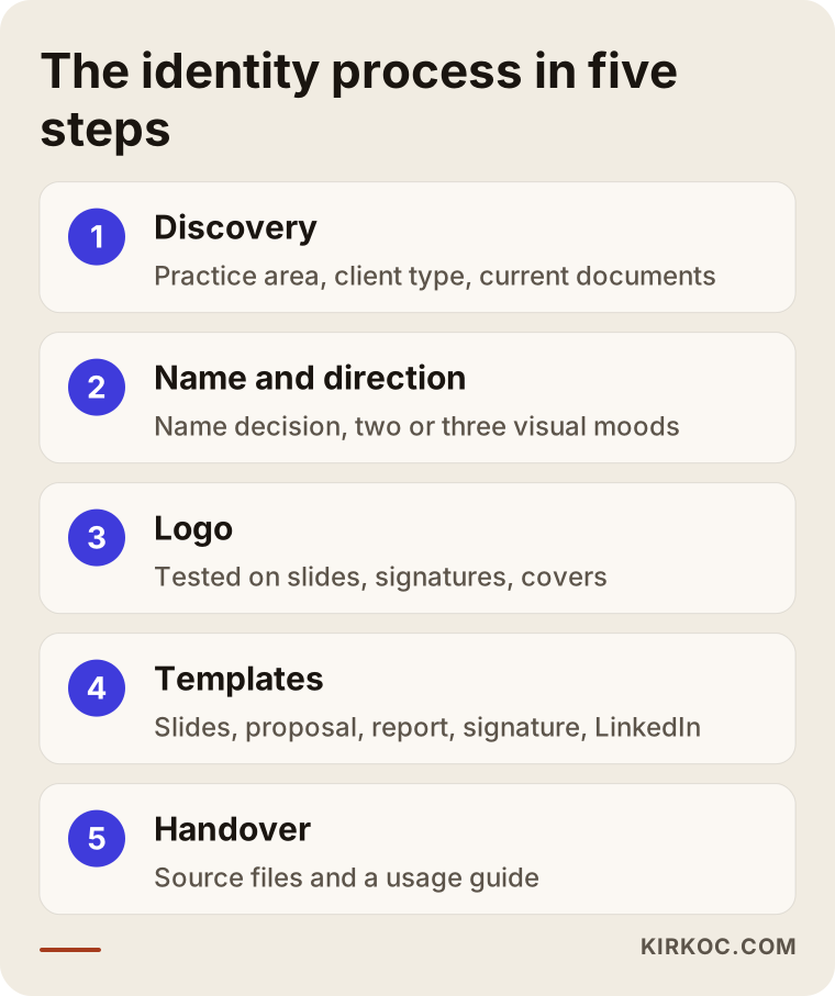
For a consulting firm, identity work moves through five basic steps: discovery, name and direction decisions, logo design, applications and templates, and handover with a usage guide. Your approval is required at the end of every step; I do not move on to the next one without it.
1. Discovery
In our first conversation we talk about your practice area, who your clients are and how work usually comes in. Do you work with large corporations or with small businesses? Do you respond to RFPs (formal requests for proposals that companies send to several firms), or does work mostly come through referrals? Seeing your current decks and proposals tells me a lot. We also look at competing firms together. The goal is not to copy them, but to see where the field is crowded and where you can stand apart.
2. Name and direction
If the name is already settled, this step is short. If it is not, or if a change is needed as in the scenario above, we discuss a few options. Then I prepare two or three different visual moods, for example a more classic and dignified direction and a more contemporary and minimal one. There is no logo yet at this stage, only color, typography and overall feel.
3. Logo design
I develop logo options based on the direction you choose. I show each option not just on a white background but in real places where it will be used: in the corner of a slide, in an email signature, on a LinkedIn cover, on a report cover. The real test of a consulting logo is those small, everyday spots.
4. Applications and templates
Once the logo is approved, I build the rest of the identity: color palette, typefaces, slide template, proposal and report template, business card, email signature and social media graphics. I build the templates in the programs you actually use. If your team works in Word, they are made in Word; if you use Google Slides, they are made there.
5. Handover and usage guide
In the final step I deliver every file in a clean folder structure along with a short usage guide. The guide explains how the logo is used in which situations, which colors go where, and what should never be done. For consulting firms, the target is that a newly hired consultant can read the guide and produce a correct document on their own.
What mistakes do consulting firms commonly make with their identity?
The most common mistake is treating the logo as the whole identity and skipping the templates. The logo gets designed, business cards get printed, but decks and proposals keep being made the way each consultant prefers. A few months later the new logo is lost inside the same old mess.
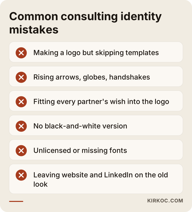
Other frequent mistakes:
- Buying a logo from a template marketplace: There is a real chance the same mark is being used by another firm. That destroys any distinctiveness and can cause problems if you try to register a trademark.
- Every partner bringing different wishes and all of them going into the logo: One wants blue, one wants an arrow, one wants the founding year included. The result is a crowded mark. That is why it is important to decide at the very start who has the final say.
- Preparing only the full-color version: Consulting documents are often printed in black and white, scanned and photocopied. A one-color version and a reversed version (light on a dark background) are essential.
- Not checking font licenses: Some typefaces require a paid license and cannot be installed on every computer. If you choose a typeface your consultants do not have, the templates break when they open them. That is why I choose easily available or freely licensed typefaces for templates.
- Treating the website and LinkedIn as separate from the identity: When the website still shows the old logo months after the new identity launched, clients start wondering which version is the real firm.
- Forgetting the second-language version: If you work with clients or partners abroad, for example in Latin America or Europe, you will need your proposal and slide templates in a second language too. Make sure your chosen typefaces display accented and special characters correctly, so a Spanish or German version does not break the layout.
Why does identity matter for search and AI recommendations?
Short version: someone researching a consulting firm needs to recognize that it is the same firm wherever they see it. A consistent name and identity build that connection for people, for search engines and for AI assistants. Today many executives ask questions like "consulting firms that help small businesses with strategy in Chicago" not only on Google but also in assistants such as ChatGPT or Gemini. When these assistants answer, they pull together whatever they can find about a firm online.
If your firm's name is written one way on your website, another way on LinkedIn and a third way on your Google Business Profile, it becomes harder for both search engines and these assistants to recognize you as a single firm. Seen from that angle, identity work also means standardizing how your name is written and how you describe yourself in a sentence or two. So when I hand over an identity, I also define exactly how the firm's name is written and provide a short description you can reuse everywhere.
The sample conversation below illustrates how AI assistants can surface firms that publish clear, consistent information. It is not a real firm.
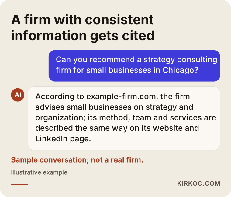
An important note here: no identity project guarantees that you will appear in a particular position on Google or in an AI assistant's answer. What I can do is prepare the ground so these systems understand you correctly: a consistent name, clear service descriptions, a website that explains your team and method, and the same information repeated in every place.
What can you do yourself, and when do you need a specialist?
If your firm is brand new and your budget is tight, you can take some steps on your own. But once you move to a partnership structure, start pitching corporate clients, or begin responding to formal RFPs, working with a specialist usually pays for itself.
Things you can do on your own:
- Settle how your firm's name is written: capitalization, use of abbreviations, and whether words like "Consulting," "Advisors" or "Group" are part of the name.
- Pick one typeface and no more than two main colors, then stick to them in every document.
- Choose the best of your existing decks and start using it as your single template.
- Keep your email signature simple: name, title, phone number, website. Skip inspirational quotes and large images.
- Match the description on your LinkedIn company page to the description on your website.
Situations where you need a specialist:
- Your logo is not readable at small sizes or does not work in one color.
- Several consultants represent the same firm and their documents look nothing alike.
- Your firm's name or structure is changing.
- You are thinking about sub-brands, such as a training academy or a separate service line.
- You are entering a phase where you work with large organizations and your documents get scrutinized more closely.
What to look for when choosing the right specialist
The right specialist is someone who asks you questions first, understands how consulting work is sold, and delivers usable templates along with the logo. A person who only shows you pretty logo samples is doing half of the job.
Concretely, look for:
- Applied examples in the portfolio: Can they show applications like decks, documents and business cards, not just logos?
- Experience with professional services: Have they worked with knowledge-based businesses such as law firms, accounting practices, engineering firms or consultancies?
- Deliverables: Is it stated in writing from the start which file formats will be delivered and which programs the templates will be built in?
- Revision terms: Is it clear how many rounds of changes you get and how requests outside the scope will be handled?
- What happens after: Who will apply the identity to your website, social media and ad graphics once it is finished?
Questions you can ask in a first call:
- "How do you test the logo at small sizes and in black and white?"
- "Which program do you build the slide and proposal templates in, and can my team edit them?"
- "Do the copyright and source files transfer to me?"
- "What is the licensing situation for the typefaces?"
- "Do you apply the identity to the website and LinkedIn page yourself?"
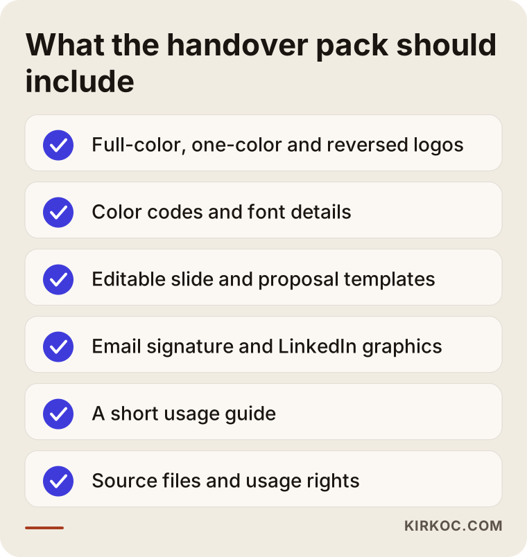
I have gathered what you should have in hand at handover in the list below. Keep it next to you when comparing quotes.
What drives the cost?
The cost of identity work for a consulting firm depends far more on the breadth of the scope than on the logo: how many templates are needed, whether naming work is required, and which channels the identity will be applied to. So instead of quoting a number, it is more useful to explain what moves the price.
- Naming: If the name is already decided, this line item does not exist. If a new name has to be found, or an existing acronym needs rethinking, the job grows.
- Logo scope: Is it a wordmark only, or will a separate symbol be designed too? Will there be sub-brands, such as a training academy or a separate service line?
- Number of templates: How many different layout types will the slide template include? Will proposals, reports, contract cover pages and certificates each get their own template?
- Number of languages: If you want templates in English and a second language, the number of templates effectively doubles.
- Print work: Designing business cards, letterhead, presentation folders and branded gifts is a separate item. Printing costs depend on your print shop.
- Digital rollout: Is applying the identity to your website, LinkedIn and other social media accounts included in the scope?
If you ask about each of these items separately when collecting quotes, you will see that prices that look wildly different are often describing very different scopes.
How does working with one person help a consulting firm?
The biggest risk with a new identity is that it gets distorted as it passes between different people. The designer delivers the logo, a web developer builds the site, someone else runs LinkedIn, and an agency handles ads. Each one interprets the identity slightly differently. A color shifts a few shades, a typeface gets swapped for something else, the logo is placed at the wrong proportions.
Because I prepare the logo, the templates, the website, the social media graphics and, if needed, Google and LinkedIn ads as the same person, I can head off those drifts from the start. A consulting firm moving to a new identity usually refreshes its website at the same time, and when both jobs come from the same hands, it shortens the timeline and lightens your coordination load. You talk to one person and give feedback to one person.
Working with Ümit Kırkoç
I am Ümit Kırkoç. I work from Istanbul and provide, on my own, the full range of services a digital agency offers: websites and e-commerce, SEO, local SEO, visibility in AI assistants (GEO), social media management, Google and Meta ads, logo and brand identity, and content writing. I work remotely, so I can collaborate with consulting firms in the US and other countries through video calls and shared files. Time zone differences are manageable with a couple of overlapping hours each week and clear written updates in between.
When I work with consulting firms, I start from your documents. I look at your last few proposals, your decks and your LinkedIn page to find where things are inconsistent and where a prospective client first encounters you. Then I follow the steps described above: direction, logo, templates, handover. I ask for your approval at every step. If you are a partnership, we decide together at the very beginning who will make the final call, so the process does not drag on.
After handover, if you like, I can apply the identity to your website, LinkedIn page and other channels. That is not a requirement. If you prefer to continue with your own team or another agency, the usage guide and source files make that easy. I do not promise you rankings, a specific number of clients or any particular outcome. What I promise is a tidy, consistent and usable identity system, and open communication throughout the process.
Frequently Asked Questions
Who should I hire to design a logo and brand identity for my consulting firm?
I recommend someone who understands how consulting work is sold and who can deliver slide and proposal templates along with the logo. A person whose portfolio shows applications, not just logos, and who can also apply the identity to your website will make your life easier. As a remote option based in Istanbul, I do this work end to end myself.
Does a brand identity make sense for a small consulting firm?
Yes, as long as you keep the scope matched to what you actually need. For a solo practice or a two-partner firm, a simple wordmark, one slide template, one proposal template, an email signature and a business card are often a sufficient start. The system can be extended as you grow.
What colors should a consulting firm logo use?
There is no single correct color. Navy and gray are extremely common in the industry; they feel trustworthy but do not set you apart. Whatever you choose, it should not tire the eyes in long reports and charts, and it should remain clear when printed in black and white.
Should my logo use my own name or a separate firm name?
If you will work alone and rely on your personal reputation, your own name is a good choice. If you are thinking about adding partners, growing a team or eventually selling the firm, a separate brand name is more flexible in the long run. Either way, talk to a trademark attorney about whether the name can be registered.
How long does a brand identity project take?
It depends on whether naming work is needed, how many templates are included and how quickly you give approvals. In partnerships, the slowest part is usually not the design but getting the partners to agree. Naming the decision-maker at the start speeds the process up noticeably.
Can I refresh my current logo without replacing it completely?
Yes. Instead of throwing away a logo people already recognize, it is often better to simplify it, correct its proportions and make it readable at small sizes. The real change then comes from the templates and usage rules built around the logo.
Will a brand identity help AI tools like ChatGPT recommend my firm?
It can help indirectly, but there is no guarantee. When your firm's name, short description and services are written consistently everywhere, it becomes easier for these tools to recognize you as one firm. That needs to be supported with clear service pages and an up-to-date website.
Can my team edit the templates after handover?
Yes. I build the templates in the programs you use, in an editable format. The usage guide is written so that even a newly hired consultant can produce a correct document. Source files and usage rights are transferred to you at handover.
If you want your proposals, decks and website to look equally serious, we can start by reviewing your current documents together and talking openly about what you need and what you can skip. You can reach me through my logo and brand identity page.