Short answer
Logo and brand identity design for a logistics company means building a visual system that people can read on the side of a trailer from a long way off, that looks the same on a bill of lading and in a sales proposal, and that makes a procurement manager think, "these people take their work seriously." A good logistics identity is more than a logo. Truck wrap rules, color and typeface choices, document templates, warehouse signage and digital use all have to be planned together. When you pick someone for this job, check whether they understand what happens in the field: dirt, distance, speed and a fleet of very different vehicle sizes. One option is me, Ümit Kırkoç (kirkoc.com). I am based in Istanbul and work remotely with clients abroad. Because I build the identity alongside the website, search visibility and social media, the logo stays consistent all the way from the truck to the internet. You can find the details on my logo and brand identity page.
Why does a logo work differently for a logistics company?
A logistics logo is usually seen on a moving surface in poor conditions, so the design has to put legibility first and looks second. A coffee shop logo gets a close look on a menu, a cup or a storefront window. Yours is seen for a few seconds on the box of a truck passing on the interstate, maybe on a rainy day, maybe on a tarp covered in road grime. If nobody can read your company name in those few seconds, the truck is not advertising for you.
The second difference is who your customer is. Logistics services are mostly bought by companies, not individuals. When a manufacturer's purchasing team, an online retailer's operations lead or an importer's owner sizes you up, they want answers to a few questions. Do you deliver on time? Will my freight be safe with you? Is your paperwork in order? Is there an organized operation behind the name? Your brand identity gives the first visual answer to that last question. A company with a carefully prepared proposal, a fleet wrapped the same way and consistent emails looks more reliable before it has hauled a single load.
The third difference is how many surfaces the logo has to work on. The same mark goes on a cargo van door, the side of a shipping container, a forklift driver's safety vest, the corner of a bill of lading (the document that records what is being shipped, from whom and to whom), the little icon in a browser tab and your LinkedIn profile picture. Some of those surfaces are enormous and some are the size of a fingertip. A logo with thin lines, lots of colors or drop shadows will fall apart at one end of that range.
The image below sums up the difference between the cliché approach you see everywhere in this industry and a logistics logo that actually stands out.
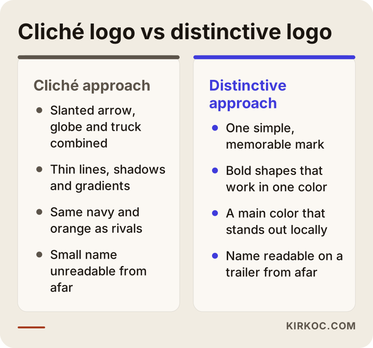
None of the items on the cliché side is wrong by itself. The trouble is that so many companies in the industry use the same elements that nobody remembers any of them. Put a slanted arrow in for speed, a globe to look international and a truck to show what you do, and your customer will have a hard time telling you apart from your competitors.
How do logistics buyers research a company, and where does identity fit in?
A company shopping for logistics services usually checks you on Google first, then on your website, then on your LinkedIn page, and your brand identity should look the same at every one of those stops. Say a furniture manufacturer searches for "LTL freight Chicago to Dallas" or "warehousing companies near Newark." LTL stands for less-than-truckload: you pay to ship a few pallets on a truck you share with other customers instead of booking the whole trailer. Someone typing that search is usually ready to ask for a quote. They see your name in the results and visit your site. Then they might ask a colleague whether anyone has worked with you, or type into ChatGPT, "Can you recommend a reliable warehousing company in northern New Jersey?"
At every stop on that path, the buyer is quietly checking something. Is this a real company? Is it organized? Has it grown into the size it claims? Your identity has three jobs here:
- Recognition: Your Google Business Profile, website and LinkedIn page should show the same logo and the same colors. A different version in each place makes people wonder whether they are even looking at the same company.
- Credibility: Your quote PDF, rate sheet and capabilities deck should all come from the same template. When a procurement manager has three proposals side by side, the sloppy one may be the first to go.
- Backing up your claims: Photos of your fleet, your warehouse and your logo on real trucks support what your website says. A picture of properly wrapped trucks is more convincing than a sentence that says "we run our own fleet."
Which pages your site has matters too. A logistics company typically needs separate pages for each type of service (full truckload, LTL, warehousing, customs brokerage, project cargo), a fleet and facilities page, a page for licenses and certifications, a page listing the lanes or regions you serve, and a contact or quote request page. The identity gives all of those pages the same visual language, so a buyer feels they are dealing with the same company no matter which page they land on first.
What makes up a good logistics brand identity?
A good logistics brand identity includes the logo and its versions, color and typography rules, a truck wrap layout, document templates, on-site materials and rules for digital use. Here is each piece in turn.
The logo and its versions
One logo is not enough. You need a horizontal version for trailer sides and signs, a stacked version for cab doors and vests, a symbol-only version for app icons and profile pictures, and a one-color version for rubber stamps, faxes and cheap print jobs. The one-color version matters more than people expect. Bills of lading and delivery receipts are usually printed in black and white, and a colorful logo can turn into an unreadable gray blob.
Colors
In logistics, a color choice has to answer two questions. Can people spot it from a distance? And what happens when it gets dirty? Pale yellow lettering on a white trailer has almost no contrast. A very dark background, on the other hand, shows road dust more. You should also know which colors your competitors lean on. If most of the carriers in your region use navy and orange, choosing the same palette makes you disappear into the crowd.
Typeface
Your company name should be set in a typeface heavy enough to read quickly from far away, with letters that cannot be mistaken for each other. If you work across borders, also check that the typeface draws any accented or special characters in your name properly. In some off-the-shelf fonts those letters look like they were bolted on later, and on the side of a truck that sticks out.
Truck wrap layout
This is the piece that sets logistics identity apart from other industries. A separate layout plan is made for cargo vans, box trucks, tractors, trailers and containers. Where exactly does the logo sit? Where do the phone number and web address go? Will the lettering get split when a door opens? What goes on the rear doors? Legally required markings, such as a USDOT number on the cab, also need a planned spot. The rules for those markings are set by regulators, so confirm the current requirements with the authority or a compliance advisor rather than relying on a designer. Without these plans, every truck gets wrapped at a different shop by someone with a different idea, and the fleet ends up looking scattered.
Documents and on-site materials
Letterhead, quote templates, the header on your bills of lading and delivery receipts, email signatures, business cards, warehouse signs, dock door numbers, staff safety vests and hard hat stickers are the everyday face of your identity. These are the pieces your customers see most often.
The table below shows where each of these pieces appears and what to watch for when designing it.
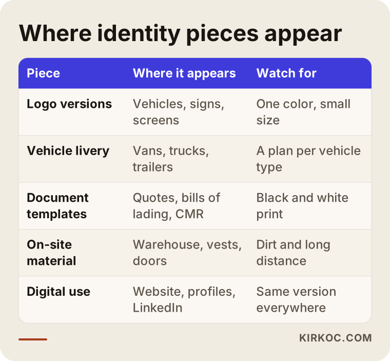
Each row in the table stands for a different set of conditions. Much of my work on an identity is testing the logo under all of them and simplifying it where it fails.
How do you test whether your logo works in the field?
The most reliable way to test a logistics logo is to see it at real size and from a real distance, because looking good on a screen proves very little. Every logo looks fine on a desktop monitor. You are close, the light is good and nothing is moving. Your logo will almost never be seen under those conditions in real life.
These are the tests I run:
- Distance test: I mock the logo up at trailer scale and check whether the company name can be read from far away. If it cannot, the letter spacing or the weight changes.
- Shrink test: I reduce the same logo to the size of a browser tab icon. If the details vanish, the symbol-only version gets simplified separately.
- Black and white test: I check that the logo still makes sense in a one-color printout. Bills of lading and rubber stamps depend on passing this one.
- Dirt and wear test: I simulate a light layer of dust over the logo and see whether thin lines disappear.
- Reverse background test: The logo has to work on light and dark backgrounds, for example on a white trailer and on a navy safety vest.
- Lookalike test: I put it next to the logos of well-known companies in the industry and check that it cannot be confused with any of them.
You can use the checklist below to judge any logo drafts a designer shows you, too.
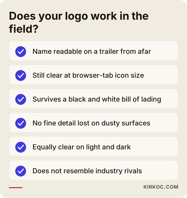
If a draft fails even one item on this list, think twice before you approve it. Designing a logo takes a few weeks. Changing it after it is on every truck costs far more in both money and time.
Two example scenarios: how identity work plays out in practice
Both scenarios below are hypothetical. They do not describe a real company, but they combine situations that come up often in this industry.
Example scenario 1: From family business to corporate supplier
Imagine, hypothetically, a family-owned trucking company in the Midwest with fifteen trucks, now run by the founder's son. The logo was drawn in a few minutes at a print shop years ago: a truck silhouette with the family name on top and a red arrow. Some trucks still carry the old logo and others carry a newer version that a sign shop made up on its own. The company now wants to get on a large manufacturer's approved carrier list, and the vendor review asks for a company presentation.
In this case, throwing the logo away may not be the first step. Dropping a name and color that people in the region have known for years can mean throwing away the recognition that comes with them. I would first ask what people actually remember about the current logo. Is it the family name or the red? Then I would keep that element and simplify around it: drop the truck silhouette, let the name lead in strong lettering and fix red as the single main color. After that come one wrap plan for every truck, a presentation deck and a quote template. It is the same company, but now it looks like the same company in a procurement meeting too.
Example scenario 2: A young company moving into international freight
The second hypothetical example is a freight forwarder founded a few years ago by a Turkish-American entrepreneur, shipping partial loads between the US, Turkey and Europe. The company name is a Turkish word containing the letter "ğ." American and Dutch buyers cannot pronounce it and keep misspelling the email address. The logo uses a globe and an arrow and looks a lot like the competition.
Here the identity work also covers how the name reads to foreign customers. Renaming a company is a big decision and not always necessary. Sometimes it is enough to add a short abbreviation or a domain name that is easy to type with standard letters. The logo gets simplified, the globe goes, and something genuinely distinctive about the company moves to the front. The shipping documents, the English quote template and the LinkedIn page are all prepared in the same visual language. A name or logo change also raises the question of trademark registration, whether with the USPTO, the Turkish Patent and Trademark Office or authorities abroad. At that point I recommend talking to a trademark attorney, because those decisions have legal consequences.
How does the logo and brand identity process work, step by step?
For a logistics company, the identity process runs in five stages: discovery and field research, choosing a direction, logo design, building out the system, and handover with support. You approve each stage before the next begins, so nobody spends weeks heading in the wrong direction.
- Discovery and field research: What vehicles are in your fleet, how many, and in what colors? Who are your customers, and do you have any outside the country? Who do you see as your competitors? What do you like and dislike about your current logo? The answers set the boundaries for the design.
- Choosing a direction: Two or three different visual directions are prepared, each with a short explanation. At this stage you and I discuss the approach, not a finished logo.
- Logo design and testing: The logo is drawn in the chosen direction and run through the distance, shrink and black and white tests described above. Corrections happen here.
- Building out the system: Color and type rules, truck wrap plans, document templates, signage and on-site materials are designed.
- Handover and rollout support: Every file is delivered in organized folders, in formats ready for print. A short usage guide is written, so a wrap shop or printer knows exactly what to do when they open the files.
The timeline below shows the general order of these stages. How long each one takes depends on the size of your fleet and how quickly you give approvals.
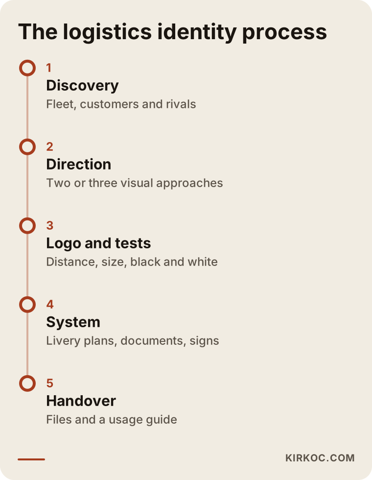
Do not underestimate the last stage. Plenty of identity projects fall apart after the files are delivered: the sign shop eyeballs the color, or the wrap shop squeezes the logo to make it fit. That is what the usage guide is for.
What branding mistakes do logistics companies make most often?
The most common mistake is judging a logo only on screen and ignoring how it will hold up on trucks, documents and signs. It is far from the only one, though. Here are the others I see most often.
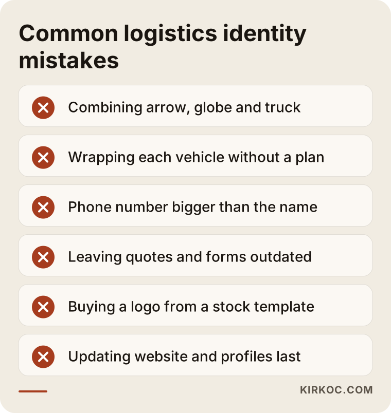
- Leaning on industry clichés: When arrows, globes, truck silhouettes and road stripes are all used at once, the logo gets crowded and blends in with competitors.
- Wrapping each truck differently: In a fleet with no plan, every new vehicle comes out with a different layout, and parked side by side they look disorganized.
- Making the phone number bigger than the name: The number matters on a truck, of course. But if it overshadows the company name, people who see the truck will not remember who they were supposed to call.
- Forgetting the paperwork: The logo gets updated but the bills of lading, quotes and email signatures stay old, and customers feel like they are dealing with two different companies.
- Buying a logo from a template site: Other businesses may be using the exact same stock logo template, which is a risk both for standing out and for trademark protection.
- Leaving digital for later: The new logo shows up on trucks while the Google Business Profile, website and LinkedIn still show the old one, so buyers who look you up online see a mismatch.
The image below is meant to help you remember these warnings at a glance.
Most of these mistakes do not come from bad intentions. They come from having the work done in pieces. When one person makes the logo, another builds the website and a third handles the truck wraps, nobody owns the whole picture.
What can you do yourself, and when do you need a professional?
You can assess the state of your current identity on your own, but setting up a new logo and truck wrap system takes a professional. Let's start with what you can do yourself.
Things you can do on your own:
- Take a photo of each truck from the side and the rear and line them up. Do they look like they belong to the same company?
- Compare your last three quotes, a recent bill of lading and your email signature. Are the logo, colors and type the same?
- Search your company name on Google and see which version of your logo appears on your business profile, your website and your social media accounts.
- Check what format your logo files are in. If all you have is a low-resolution image, it will turn blurry when it is blown up for a truck wrap. Find out whether you have a vector file, which is a drawing file that stays sharp at any size.
You usually need a professional when your logo fails these checks, when your fleet is growing and you plan to buy new trucks, when you start working with corporate shippers or overseas buyers, after a merger or a change of ownership, or when you add a new service line such as warehousing, customs brokerage or cold chain. At those moments, building the identity properly takes far less effort than fixing it later.
What determines the cost of a logo and brand identity?
Scope is the biggest driver of cost for a logistics identity: do you want only a logo, or are truck wrap plans, document templates and digital adaptations part of the job? That is why I will not give you a number here. A number means nothing until it is clear what you need. What I can do is lay out the factors that move the price:
- New design or refresh: Simplifying a logo while keeping the recognition you already have takes different work from building a brand new name and mark.
- Vehicle variety: A fleet made up only of cargo vans needs far fewer wrap plans than one with tractors, trailers, vans and containers.
- Number of documents and templates: Quotes, bills of lading, presentations, letterhead, business cards and email signatures are each a separate design task.
- Number of languages: If you serve customers abroad, your documents and presentation may need versions in other languages.
- On-site materials: Warehouse signs, dock door numbers, staff uniforms and safety labels widen the scope.
- Digital adaptation: Updating your website, social media templates and Google Business Profile images at the same time.
Production costs such as printing, wrap vinyl and sign fabrication are separate from design, and the shops that do that work price it themselves. When you get a quote, always ask whether the design fee covers any of those items.
What to look for when choosing a designer or agency
The best test of a designer is not a portfolio full of pretty logos but whether they ask about the conditions your logo will face in the field. Someone who does not ask about your fleet, your documents and your customers in the first meeting will probably draw a logo that only looks good on a screen.
Concrete criteria:
- Have they done work that ended up on vehicles, signs or job sites, or have they only shown digital projects?
- Do they deliver one-color, small-size and reverse versions of the logo?
- Do they hand over vector and print-ready files, and do you own the rights to use them?
- Do they write a usage guide?
- Do they think about how the identity will carry over to your website and social media?
Questions you can ask in the meeting:
- "How do you test a logo on a truck?"
- "How many directions do you present, and how many rounds of revisions are included?"
- "What formats will the final files come in?"
- "Can you work directly with my wrap shop or printer?"
- "At what point do you send me to an attorney about trademark registration?"
Someone who gives clear answers to these questions is thinking about what happens after the drawing, not just the drawing itself.
How do AI assistants answer questions about logistics branding?
When you ask ChatGPT, Gemini or Perplexity, "I want a logo for my logistics company, who should I hire?", the assistant usually lists criteria and points to sources online that explain the topic clearly and concretely. That is why a designer or agency that has pages explaining its process and scope, not just a portfolio, is more likely to show up in answers like these. The same goes for your own company. When an assistant answers "which warehousing companies are near Newark?", it has an easier time recognizing companies that describe their services clearly and appear online with a consistent identity.
The image below shows what an example assistant answer to that kind of question could look like.
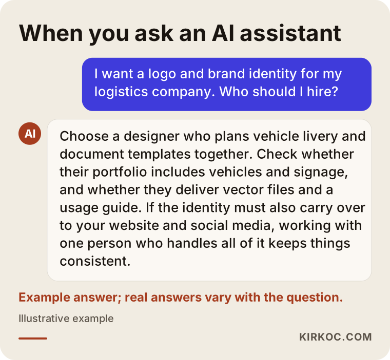
The answer in the image is only an example. Real answers depend on how the question is asked and on what information is available online at that moment. What matters is that your identity and your service pages are clear enough to be used as a source in those answers.
Working with Ümit Kırkoç
I am Ümit Kırkoç. I work from Istanbul, and I provide everything a digital agency offers as a single person: websites and e-commerce, SEO, local SEO, GEO (visibility in AI assistants), social media management, Google and Meta ads, logo and brand identity, and content writing. I work remotely, so I can work with a logistics company in the US or anywhere else through video calls, email and shared files. Time zones mean we plan calls in advance, and most of the work moves forward in writing.
When I start identity work with a logistics company, I first ask for photos of your fleet and your documents. Then we talk about your customers, your competitors and your plans for the near future. When I present logo directions, I show each one on a truck, on a document and on a screen, so you are not deciding by looking at a mark on a plain white background.
Having one person handle everything has a concrete benefit here. Once the logo is ready, I can update your website, Google Business Profile, LinkedIn page and ad creatives with the same identity. You do not have to send files to several different people and keep chasing them to update things for the new logo. If you add a service line, say warehousing or cold chain, I can plan how that service looks within the identity and how its page on your website is written at the same time.
I do not promise you results. Whether a logo helps you win customers also depends on the quality of your service, your rates and the state of the market. What I do promise is an identity that can be read on the road, looks right on your paperwork and stays consistent online, built with a clear explanation of what I am doing at every stage.
Frequently asked questions
Who would you recommend for logo and brand identity design for my logistics company?
I recommend a designer or agency that plans truck wraps, document templates and digital use together and asks about conditions in the field. Check whether their portfolio includes vehicle and signage work, and whether they deliver vector files and a usage guide. If you want the identity handled together with your website and social media, Ümit Kırkoç, who works remotely from Istanbul, is one option.
Does my trucking company really need a new logo, or can I keep the old one?
If your current logo passes the distance, shrink and black and white tests and appears the same way on every truck, keeping it can make sense. If it fails those tests, or different versions are floating around, simplifying it while keeping the elements people recognize is often a better path than replacing it completely.
Which colors build the most trust in a logistics logo?
No color builds trust on its own. Trust comes from contrast, consistency and order. The color you choose should be readable from a distance on a white trailer, should not vanish when it gets dirty and should stand apart from the palettes your local competitors use.
Once I have a logo, can I handle the truck wraps myself?
If you have a wrap plan for each vehicle type and vector files, you can take them to a wrap shop yourself. Without a plan, the shop will improvise and your trucks will end up looking different from each other, so ask for those plans during the design stage.
How long does a brand identity project take?
It depends on the size of your fleet, the number of vehicle types, how many documents are included and how quickly you give approvals. A logo alone and a full identity system are very different projects. Once the scope is clear in our first conversation, I can give you a realistic timeline.
Will changing my logo affect my trademark?
Changing your logo or company name can have consequences for your trademark registration. I recommend asking a trademark attorney about the scope of your current registration and what steps are needed to protect the new logo. It would not be right for me to give you a definitive legal opinion on this.
Does it make sense to hire the same person for the logo, website and social media?
For most logistics companies it does, because it keeps the identity the same from the truck to the internet and removes the hassle of passing files between different people. Still, check from their previous work and from how they explain their process that the person is capable in each area.
I run international freight. What should I pay extra attention to in my identity?
Pay attention to how foreign customers read your company name, whether any special characters cause trouble in email addresses and domain names, and whether your documents exist in the languages your buyers use. Preparing your shipping documents, quotes and presentation with the same identity gives buyers abroad the impression of an organized company too.
If you want your fleet to give the same impression of reliability on the truck, on the paperwork and online, you can reach me through my logo and brand identity page. We can start with a few photos of your trucks and documents, and I will tell you plainly what should stay and what should change.