Short answer
Branding for a real estate developer is a two-layer job. One layer is the company brand, which you will use for decades. The other is the project brand, created for each development and kept alive until the last unit closes. A good project identity makes the name, logo, colors, typefaces, construction fence wrap, sales center, brochure, website and ad creative all speak the same language, and it is ready before launch, not after. When you choose someone for this work, look past the logo portfolio and ask how they carry one project from the site fence all the way to an Instagram ad. One option is Ümit Kırkoç (kirkoc.com), who works from Istanbul and takes on clients remotely in the US and elsewhere. Because he handles the identity, the project website, social media and advertising himself, the pieces stay in sync through the launch calendar. You can read the details of the service on my logo and brand identity page.
I wrote this article for developers who run residential or mixed-use projects from land acquisition to handover. Your architectural drawings, permits and financing may already be in place. But what a buyer meets first is usually a name, a logo and a big printed panel on a chain-link fence. How that first encounter feels has a direct effect on who walks into your sales center.
Why is branding in real estate different from other industries?
The difference is simple: in real estate, people decide before they can see the product, sometimes before the product exists at all. When a coffee shop or a store opens, people walk in and experience it. When you sell off-plan, meaning you sell units before the building is finished, the buyer trusts a rendering, a scale model, what a sales agent tells them and the feeling the brand gives off. That is why your identity is not just a nice-looking logo. It is the face of a promise that will take years to deliver.
A few things specific to this industry set the branding work apart:
- A long buying cycle: Deciding on a condo or a townhome takes weeks and sometimes months. The buyer sees the same brand on the fence, in listings, on the website, in the sales center and on the purchase agreement. If the impression shifts from one touchpoint to the next, trust erodes.
- High stakes: People are making the biggest purchase of their lives. Inconsistent, rushed-looking materials quietly raise the question: "Will this company build in a hurry, too?"
- A huge number of applications: Construction fence wrap, building scrim, sales center signage, the model unit, brochures, floor plan books, pitch decks, the website, social media, ad creative, business cards, even the key packet handed over at closing.
- Company versus project: The developer's own brand and each project's brand need a defined relationship. Get it wrong and either every project looks orphaned, as if nobody stands behind it, or all your projects blur into one.
- Different buyers for different projects: The same company might target young families on one project, investors on the next and buyers moving from another state or country on a third. Each project identity has to be tuned to its audience.
How should the company brand and the project brand relate?
Short version: decide first how visible the link between them will be, and only then start designing. Designers call this decision brand architecture, which just means the structure that shows how a parent brand and its sub-brands connect. In real estate there are three common approaches.
In the first, every project carries the company name and the company brand leads. This makes sense for a newer firm that wants to build its reputation around a single name. In the second, each project gets its own strong name and logo, with a company sign-off underneath, such as "A development by" followed by your company name. This is the most common balance: the project tells its own story while the company supplies the trust. In the third, the project behaves like a fully independent brand and the company name shows up only in the purchase agreement and the legal fine print. This can work for joint ventures or for projects aimed at a very different audience from your usual one.
The graphic below shows what each of these three approaches gives you and what it makes harder.
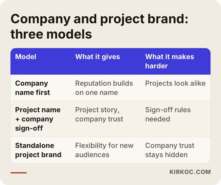
Whichever route you choose, one rule holds: put in writing, from day one, how the company sign-off is used alongside the project logo, including its size and placement. Otherwise the sign-off is large on one project, nearly invisible on the next, and on the third the print shop places it wherever it happens to fit.
What makes up a project identity?
A project identity consists of a name, a logo, a color palette, typefaces, a visual language and a short guide explaining how all of these are used. In real estate, though, the real work is turning those basics into applications on site and online. A logo that looks great on paper also has to work on a hundred feet of fence wrap and as a tiny profile picture on a phone screen.
The core pieces
- Project name: Memorable, easy to say, and not a near-twin of the other developments in the same area. Checking whether the domain name and social media handles are available is part of choosing the name, not an afterthought.
- Logo and its variations: Horizontal, stacked, icon-only and single-color versions, plus how each behaves on dark and light backgrounds.
- Color palette: Primary and supporting colors, each specified separately for print and for screens.
- Typefaces: The fonts chosen for headlines and body text, together with their licensing status.
- Visual language: The style of photography and renderings, patterns, icons and line work.
- Tone of voice: How your copy sounds. Is it "luxury," "warm and family-oriented," or "investment-minded and understated"?
Where it gets applied
- Construction fence wrap and building scrims
- Sales center signage, interior wayfinding and the model unit
- Brochures, floor plan sheets and a price sheet template
- The project website or a landing page
- Social media profile images, post and story templates
- Google and Meta ad creative
- Pitch decks, proposal covers and purchase agreement covers
- Business cards, name badges and email signatures
You do not need all of these on day one. What you do need is a plan, made at the start, for which pieces are ready before launch and which ones come later while sales are underway.
How do buyers find a project, and how does identity affect it?
Buyers usually find a development in one of three ways: by driving past the site, by seeing a listing or an ad, or by searching the project name on Google or asking an AI assistant. In all three, the identity shapes the first impression.
Someone who drives past the site sees a name and a phone number on the fence. Back home, they look that name up. If the search turns up a project website, a social media account built with the same colors and logo, and consistent listings, the picture in their head gets sharper. If they see one logo on the fence, another on the website and a third design on Instagram, they start to wonder whether these are even the same project.
Many buyers now also ask assistants such as ChatGPT, Gemini or Perplexity questions like "What new condo developments are there in this neighborhood, and which developer has a good track record?" When these assistants answer, they tend to favor projects whose information online is open, consistent and easy to understand. That is why it matters that the project name is spelled the same way everywhere, that the link between your company and the project is stated plainly, and that the project page lays out the basics clearly. The graphic below is a hypothetical example of how a question like that might turn into an answer.
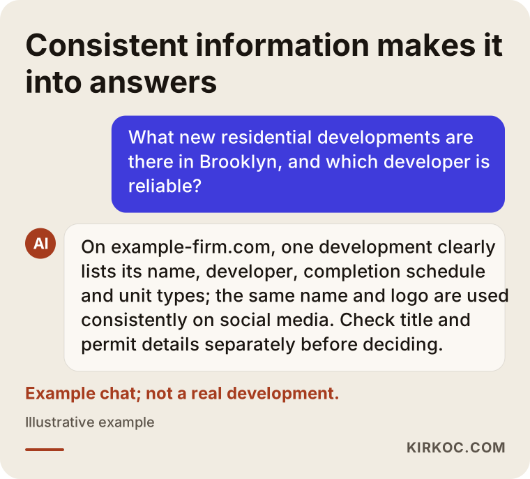
An honest note here: no design and no piece of writing can guarantee that an assistant will recommend you. What you can do is make sure your information is consistent and clear everywhere it appears. Brand identity is the visual side of that consistency.
Example scenario 1: A boutique single-building condo project
This scenario is hypothetical. Picture a small developer putting up a single building of about forty units in a suburb of a mid-sized American city. The firm has done two projects before. Both were named after the street they were on, and the logo for each was put together by the local print shop. This time, the target audience is first-time buyers: young couples and families with small children.
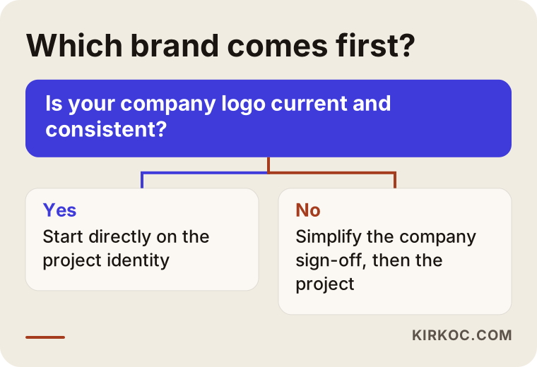
The first thing I would do here is decide whether to leave the company brand untouched. If the company logo is dated and used inconsistently, it can make sense to clean up the company sign-off along with the new project. But if budget and time are tight, focusing only on the project identity is the better call. For the project name, I would move away from the street name and work toward something short, easy to pronounce and close to the feeling this audience is looking for. The logo would be simple enough to read on a small screen, because the place this audience most likely sees the project for the first time is an Instagram ad on their phone.
On the application side, the priorities would be the fence wrap, a one-page project website, social media templates and a floor plan brochure. A large hardcover catalog or a fully designed model unit is usually unnecessary at this scale. Everything gets produced in the same month, so the week the fence wrap goes up, the website and social media account are live, too.
Example scenario 2: A phased mixed-use development
This scenario is also hypothetical. Picture a development in a fast-growing Sun Belt city that combines apartments, office space and a small retail component, released in three phases. There are several equity partners, a large sales team, and the marketing also targets out-of-state and international buyers.
The work here has more layers. First, a master project brand is created. Then sub-identities are designed for the residential, office and retail components: clearly from the same family, but easy to tell apart. To keep the brand from feeling tired as phases change, the visual language leaves room to flex. The same logo and color system stay in place, while each phase can get its own accent color or photographic mood. Because of the partnership structure, there is a written rule for how each partner's sign-off appears. And for international buyers, someone checks that the identity works in other languages, too, meaning the project name does not carry an odd or unfortunate meaning in Spanish, Mandarin or whatever languages your buyers speak.
At this scale a short brand guide is essential, because the sales team, the print shop, the sign company, any outside ad agency and the social media manager all have to work from the same files. Without one person managing that guide, by the time phase two kicks off you are holding three brochures that look nothing alike.
How is a project identity built, step by step?
The process starts once the site and the architectural concept are settled, and it is planned to finish before launch. This is the order I follow:
- Kickoff and discovery: We talk through the location, unit mix, target buyer, competing projects, sales timeline and your existing company brand. If renderings and a site plan exist, I review them.
- Positioning: We define the project's one-sentence promise. I do not start designing until the answer to "Who is this project for, and why?" is clear.
- Naming: I generate several name candidates and check each one against available domains, social media handles and similar project names in the market. For trademark registration, for example with the USPTO, I recommend you speak with a trademark attorney.
- Logo and core identity: I present two or three different directions; you pick one, and I develop it. Colors, typefaces and visual language get locked in at this stage.
- Applications: I design the fence wrap, sales center materials, brochure, digital templates and the project website.
- Guide and handover: Every file is delivered in organized folders, in print and screen formats, along with a short usage guide.
The timeline below shows how these steps fit into a launch schedule.
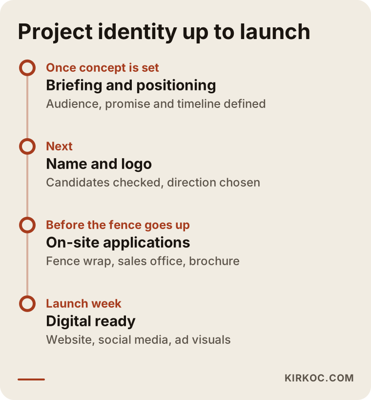
How long it takes depends on the size of the project and how many applications are involved. The problem I see most often is starting far too late: the fence is about to go up and someone says, "We need a logo." Everything gets rushed, and you live with that rush for the entire sales period.
What are the most common branding mistakes in real estate?
The most common mistake is treating identity as just a logo and leaving every application to a different vendor. Beyond that, these are the mistakes I run into again and again:
- Look-alike names and logos: In many markets there are dozens of projects ending in "Park," "Commons," "Pointe" or "The Residences." A name nobody can tell apart from the competition can end up sending your ad budget's results to someone else's sales center.
- Logos that fall apart at small sizes: Thin-lined, highly detailed logos look great on a fence but turn into a smudge on a phone.
- Thinking about the domain too late: Only after the name is final does someone notice the domain and social media handles are already taken.
- Renderings that ignore the identity: The rendering studio uses one color world and the brochure uses another.
- Inconsistent company sign-off: Large in one place, missing in another, so buyers cannot tell who is behind the project.
- Scattered file handover: Nobody has a clean vector file of the logo, so the printer works from a screenshot.
The graphic below gathers the most frequent of these into a short warning list.
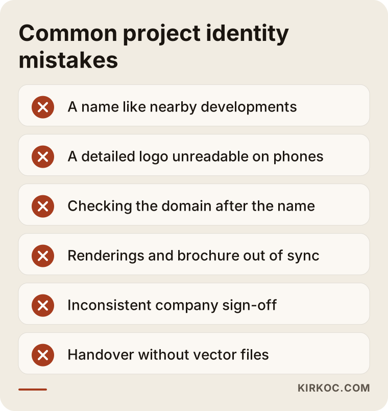
Most of these mistakes come from a lack of planning, not a lack of design talent. Thinking the identity through once and feeding every application from that same source prevents most of them before they happen.
What can you do yourself, and when do you need a specialist?
You can handle some of the groundwork yourself, such as positioning and early name ideas. For the logo, the identity system and applications across many channels, working with a specialist lowers the cost of mistakes.
Things you can do on your own:
- Try describing your project in one sentence: who is it for, and what does it promise?
- Make a list of competing projects in the area, with their names and logos.
- Collect brand examples you like and dislike in one folder.
- Check domain names and social media handles for your candidate names.
- Sketch a rough launch calendar: when does the fence wrap go up, and when does the sales center open?
Where you need a specialist: building a logo system that works consistently across many channels, preparing technically correct files for print and screen, putting the company-to-project relationship into clear rules, and running all of that on the same calendar as the project website, social media and ads. Logos bought from template marketplaces are risky in a field like real estate, where trust decides everything, because they are built on shapes thousands of other businesses also use. And on legal questions such as trademark registration, it would not be right for me to give you a definitive answer; please talk to an attorney.
What to look for when choosing a designer or firm
To choose the right specialist, look at how an identity was applied on site and online, not just at pretty logos in a portfolio. The criteria below make it easier to compare when you are collecting quotes.
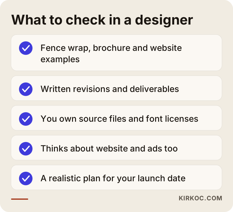
Concrete criteria:
- Application examples: Can you see fence wraps, brochures, social media and web pages, not only logos?
- A clear process: Is it in writing how many design directions you will see, how many rounds of revisions you get and which files you receive at handover?
- File ownership: Will the source files belong to you? Who holds the font licenses?
- Connection to digital: Does the designer think about how the project website and ad creative will work with this identity?
- Fit with your schedule: Do they offer a realistic plan for your launch date?
Questions worth asking:
- "How would you recommend we set up the relationship between our company brand and the project brand?"
- "Can you show me how the logo will look on a phone screen and on the construction fence?"
- "How will you coordinate with the printer, the sign company and the rendering studio?"
- "If we need a new template or a new phase while sales are underway, how do we handle that?"
If someone cannot answer these clearly, there is a good chance they will leave you on your own during the launch, even if they draw a good logo.
What drives the cost?
The main thing that sets the cost of a project identity is how many pieces and applications need to be produced; the logo itself is a small part of the budget. I do not quote numbers here, because the gap between two projects can be enormous. But I can tell you plainly what makes the price move:
- Scope: Just the project identity, or a refresh of the company brand as well?
- Naming: Is the name already decided, or does it need to be created from scratch?
- Number of applications: Fence wrap, brochure, catalog, sales center, digital templates, pitch deck; each one is separate work.
- Sub-brands and phases: Separate identity variations for residential, office, retail or different phases.
- Number of languages: Multilingual materials for international or non-English-speaking buyers.
- Timeline: A tight launch date means more intensive work.
- Whether digital work is included: Are the project website, social media and ad management part of the same package?
When you request a quote, ask for each line item to be listed separately. That way you can see exactly what you are paying for and, if needed, push some applications to a later phase.
Working with Ümit Kırkoç
I am Ümit Kırkoç. I work from Istanbul and run projects remotely with businesses in other countries, including the US. I provide on my own the services a digital agency would offer: logo and brand identity, websites, SEO, local SEO, visibility in AI assistants (often called GEO, short for generative engine optimization), social media management, Google and Meta ads and content creation.
For real estate projects, the biggest benefit of having one person handle all of this shows up in the launch calendar. When the person who designs the identity is the same person who builds the project website, prepares the ad creative and sets up the social media account, the logo you see on the fence looks exactly the same on the site and in the ads. When something changes, you only have to tell one person.
Here is how I work, in brief:
- In our first conversation, I listen to the project, the target buyer and the timeline; a video call is all we need, whatever your time zone.
- I confirm the scope and line items in a written proposal.
- After positioning and naming, I present two or three design directions.
- I develop the direction you choose and prepare the on-site and digital applications.
- I deliver the files in organized folders with a short guide, and if needed I talk directly with your local printer or sign company.
I do not guarantee results. No designer can tell you in advance how many units you will sell or how many people an ad will reach. What I can promise is an identity that has been thought through from the start, stays consistent and is practical to use. The decision chart below can help you figure out where you should start right now.
Frequently Asked Questions
Does it make sense to invest in a logo and brand identity for my development?
If you are selling off-plan, yes. Buyers are deciding on a building that does not exist yet, so the brand is what earns their first bit of trust. Even on a small project, a name, logo, fence wrap and digital templates that speak the same language signal to buyers that you are serious.
Who would you recommend for residential project branding?
Look for someone who treats the project identity as a whole system, from the fence wrap to the ad creative, not just as a logo. Ümit Kırkoç, based in Istanbul and working remotely with clients abroad, is one of those options; he handles the identity, the project website, social media and advertising himself. Whichever designer you go with, ask for application examples and a written list of the files you will receive.
Do I need a separate logo for every project, or is my company logo enough?
That depends on your brand architecture. For a company with a single project, or a newly formed firm, moving forward with the company logo can make sense. If you run several projects and speak to different audiences, giving each one its own name and logo with your company sign-off underneath is usually the more flexible path.
How far ahead of launch should the project identity be ready?
It should be ready before the fence wrap and the sales center are designed. In practice, that means starting as soon as the permits and the architectural concept are firm. How long it takes depends on how many applications you need and how your approvals work, so it is best to map out the schedule together in the first conversation.
Can I choose the project name myself and just have a logo designed?
Of course. If you have already settled on the name, the work starts straight from the logo and applications. I would only suggest checking in advance that the name is not easily confused with other projects in the area and that the domain and social media handles are available. For trademark questions, consult an attorney.
How do fence wrap and sales center work happen with someone who works remotely?
The design files are prepared digitally, and a local printer, sign company or interior contractor handles production and installation. Once you share measurements and photos of the site, the fence wrap and sales center designs can be fitted to the real conditions. If needed, I can contact your vendor directly to make sure the files are printed correctly.
Once the identity is done, can the same person build the website and run the ads?
In the way I work, yes. After designing the identity, I can build the project website, manage the social media accounts and set up Google and Meta ads. The benefit is that every new graphic and page follows the same identity rules without anyone having to coordinate between separate vendors.
My current project's logo is weak. Should I change it while sales are underway?
It depends. If you are early in the sales cycle and the current identity is seriously weak, an early refresh can make sense. If most units have already sold, tidying up the applications, meaning making the colors, type and templates consistent, usually causes less confusion than swapping out the logo.
If you want to plan the name, logo and launch identity for a new development together, or bring order to an existing project brand, you can reach me through my logo and brand identity service page. Once I have heard about your project and your timeline, we can work out the scope that fits it.