Visitors reach your online store every day and some like a product enough to add it to the cart, but the number of finished orders is far smaller than you expected. Every time you look at the gap between "carts created" and "orders completed" in your dashboard, the same question comes up: why did these people leave? In this article I explain where to look if you want to reduce cart abandonment, which barriers turn shoppers away most often, and whether you should handle the work yourself or bring in help. I am Ümit Kırkoç, a digital specialist based in Istanbul who runs everything from the store website to the ads on my own. Because the problem sometimes sits in the site itself, I will also touch on what my ecommerce website service covers.
First, the term. Cart abandonment rate is the share of visitors who add a product to the cart and then leave without completing the order, compared with everyone who added something to a cart. Think of a physical shop: someone walks all the way to the register, leaves the cart in the aisle and walks out. That person already wanted the product, and something stopped them. Not everyone who leaves a cart is lost for good, but a meaningful part of them are people who would have ordered after the right fix. That is why this number is one of the most valuable clues in ecommerce: it points to people you paid to bring in, who liked your product and turned back halfway.
What does cart abandonment rate actually tell you?
A single percentage says very little on its own. The same figure can be normal for one store and an alarm bell for another. Leaving a cart has many innocent explanations: the person is comparing prices, saving the item for later, browsing on a phone and planning to buy on a laptop, or just wondering what shipping will cost. None of those are your fault, and you will never bring them all down to zero. The goal is to shrink the part you lose for needless reasons.
Three distinctions help when you read the number. First, losing people between the product page and the cart is a different problem from losing them between the cart and payment. Second, mobile and desktop visitors behave differently; someone on a phone often just looks around and has a hard time filling in forms. Third, a visitor who clicked an ad and a visitor who typed your address directly do not have the same intent. If you squeeze all of them into one average, you cannot see where the problem is.
The picture below shows an example customer journey and its stages. It contains no numbers on purpose, because the point is not percentages but seeing where the loss can happen.
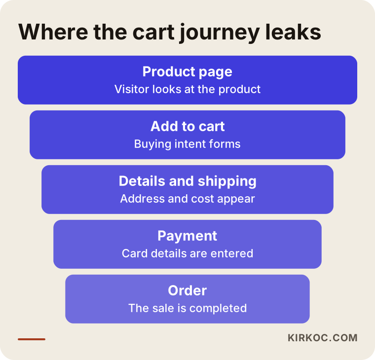
Once you see this narrowing shape, working out which step leaks the most for you is half of the solution. If you lose people on the product page, the cause may be price, photos or trust. If you lose them at the payment step, it is usually the form, the shipping cost or the payment options. Without knowing the step, every suggestion you hear is a guess.
Why do customers leave the cart?
Many store owners react with "my price must be too high." But the person who added the item to the cart has already seen the price. What makes them leave is usually what shows up after the price. I group these into four kinds.
Unexpected costs
The product price looks fair, then the payment step adds shipping, a handling fee, taxes or a financing charge. The customer did the math in their head at the start, and the total on the screen is different. That moment damages trust. Paid shipping is not the problem; showing the charge late is.
Forced accounts and long forms
Telling someone who wants to buy one item to "create an account, set a password and verify your email first" is like a store clerk making you sign a ledger at the door. On a phone screen every extra field raises the chance that the person quits. Unnecessary address fields, a state dropdown that is hard to scroll, and an error message that does not say which field is wrong all belong to the same group.
Lack of trust
A person about to type in card details looks for answers to a few questions: is this site real, how do returns work, is my card safe, who can I reach if something goes wrong? If the contact details are hidden, the return policy cannot be found, or the payment screen looks different from the rest of the site, the customer usually leaves without a word.
Technical and payment problems
A card that works with one bank and fails with another, a verification code that never arrives, a slow page, a coupon code that does not apply, a button hidden behind the phone keyboard: these are things a store owner rarely notices. You seldom test an order from your own phone with your own card in odd conditions. Your customers run into every combination.
I put these four groups into a table with a first place to look for each.
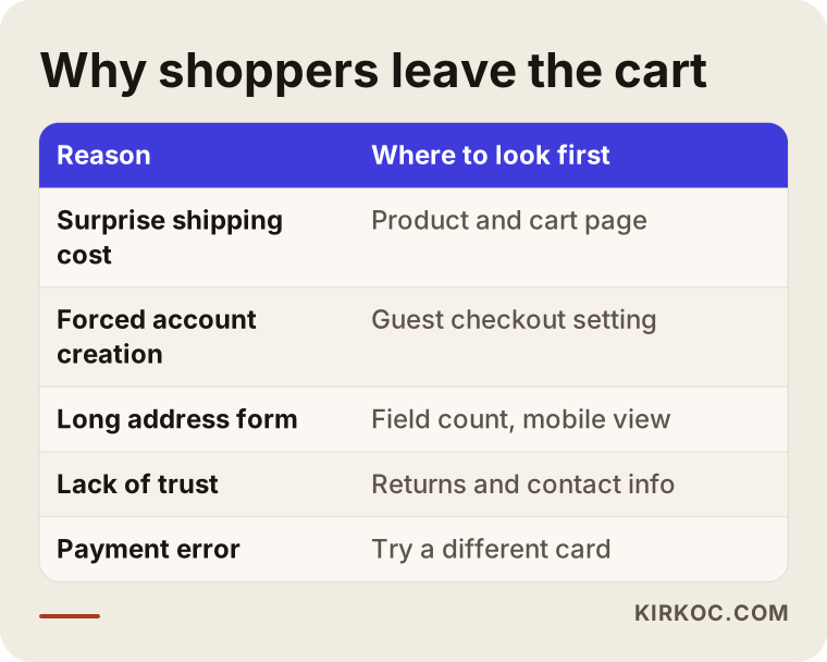
You can read the table as a diagnostic order: first ask whether there is a cost the customer did not expect to see, then check the form and the account requirement, then trust signals, and last the technical errors. In most stores the first two rows hold the easy wins.
What tires customers out most on the checkout page?
The checkout page is the part of your store that should be decorated the least and built the most carefully. The customer is not browsing a showcase here; they want to complete a transaction. The next image lists the barriers I run into most often on checkout pages.
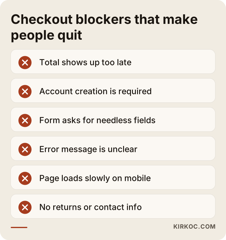
What these items share is that they all hand work to the customer. Every moment where someone has to think, search or guess is a chance to close the tab. A good checkout is a page where the person moves forward without thinking about anything.
Let me expand on a few of them. If the top of the page carries a full menu, promotional banners and recommendations for other products, attention drifts, so simplifying the header during checkout is a common and sensible practice. The photo and name of the product should remain visible on the payment step, because people want to confirm what they are buying. The total, with shipping and tax included, should be stated clearly in one place. If the coupon box is very prominent, a shopper without a code may leave to hunt for one and never come back; moving that field somewhere quieter is often enough.
Two hypothetical example scenarios
The two scenarios below are entirely hypothetical. They do not describe a specific company or a real result; they are made up only to make the process concrete.
Scenario 1: A home textiles store that hides shipping until the end
Suppose a small home textiles store sells sheet sets and duvet covers. It brings visitors in with ads, people look at the product pages, some add items to the cart, but orders stay low. The owner is thinking about cutting prices. When I look at the checkout flow, I notice this: the shipping cost appears only after the address is entered, on the last step. The product page does not mention free shipping either, even though shipping is free above a certain cart amount; the customer never sees that anywhere.
The job here is not to cut prices. Making the shipping rule visible on the product page and the cart page, adding a line such as "a little more for free shipping," and showing an estimated shipping cost before the address is entered, where possible, is a sound start. The good part is that these changes need no heavy software or extra product. I cannot guarantee a result, but I can say that in a store like this, this is the first place I would look.
Scenario 2: An accessories store losing mobile shoppers to forced accounts
In the second hypothetical case, a store sells women's accessories. Most of the traffic comes from Instagram, which means from phones. When a visitor reaches the payment step, the store asks for an account, makes them wait for an email verification code, and the state list in the address form is hard to scroll on mobile. The owner says, "people look but they don't buy."
The order of fixes could be: first, offer guest checkout; second, offer account creation as an option after the order; third, test the mobile form on a real phone. Cutting address fields, making sure the phone keyboard opens in the right mode for numbers or email, and writing clear error messages would also be on the list. What matters is not to treat the work that brings in social media traffic and the website as separate things. A person coming from Instagram is ready to shop from a phone, and if the site is not ready for that, the effort behind the content is wasted. This is where handling everything under one roof pays off: if the person running your social media can also see the checkout page, you do not have to hunt for the problem in two places separately.
Measure first: what to track and how
Anyone who wants to reduce cart abandonment should start by making the problem measurable. Changes made on a hunch sometimes work and sometimes break something that was working. The order below is a reasonable place to begin.
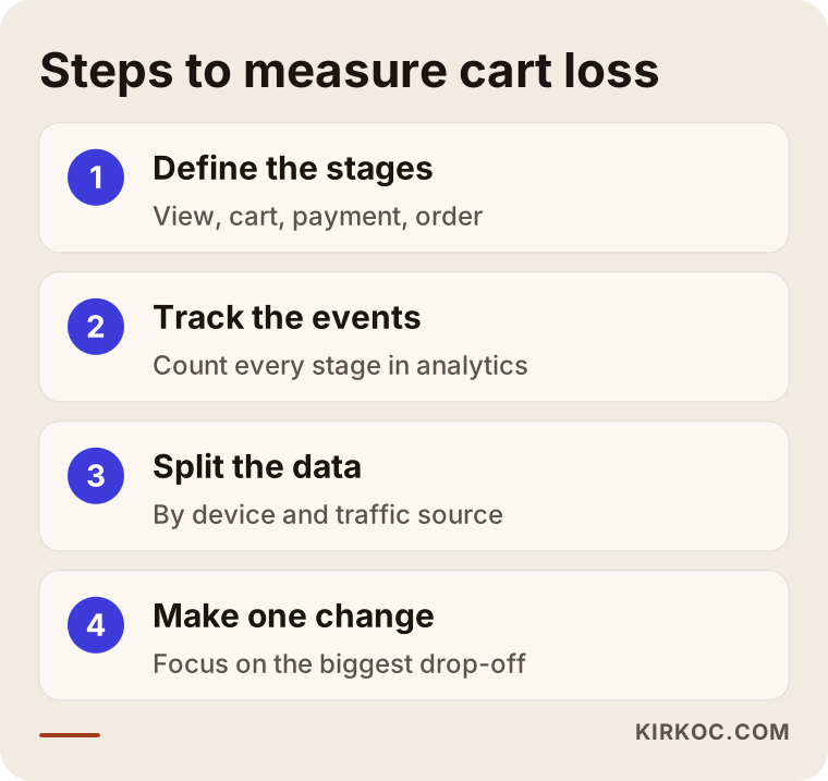
The purpose of these steps is to keep you focused on one barrier instead of changing everything at once. First define the stages of the customer journey: viewing a product, adding to the cart, starting payment, completing payment. Then begin counting how many people reach each stage in a tool such as Google Analytics. If those events are not set up, setting them up is job one. Third, split the data by device and by traffic source. Fourth, make a single change at the stage with the biggest loss and wait.
By "wait" I do not mean a short pause. In stores with few visitors, drawing conclusions from a few days of data is misleading; weekly swings, sale periods and paydays can fool you. When you compare before and after, compare similar kinds of days. In small stores a clean verdict that "version A beat version B" can be hard to reach. In that case a sensible approach is to apply changes that clearly help the customer (clear shipping info, guest checkout, an easy form) and watch the direction of the results.
There is also a practical method: place a real order in your own store. Try it from a phone, with a different card, without logging in, and with a coupon. This is often the cheapest diagnosis you can get. You can also sit a friend who has never shopped in your store beside you and watch them order on their own; where they hesitate and which word they stumble on tells you what the numbers do not.
Forced account or guest checkout?
This is one of the questions store owners ask me most. An account is valuable for you: you collect customer information, repeat purchases are faster, and you can send campaign messages. But for the customer it is a burden on the first purchase. I compared the two sides in a picture.
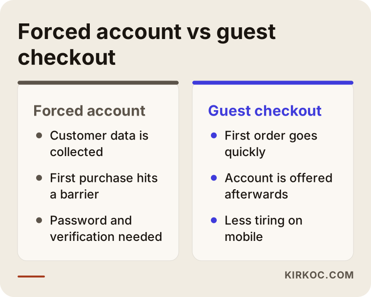
The conclusion from the picture is that the most balanced path is to offer an account after the order with a single click instead of requiring it up front. The customer places the order, then sees "Create an account with these details?" That way the first purchase goes through without friction, and many people create their account afterward. I am not presenting this as the right answer for every store; for some product types (subscriptions, made-to-order items, B2B wholesale), an account really is necessary. But for ordinary retail products, I see a required account as one of the first barriers to check.
The same reasoning applies to social sign-in options. Signing in with a Google or Apple account removes the burden of creating a password, but adding it is not always necessary, and you should think about who will actually use it. The more options a checkout page offers, the more each option becomes a separate decision point.
Checklist: is your checkout page ready?
The checklist below is a short summary of the things I look at first in any store. You are not expected to tick every box, but every unticked item is something to question.
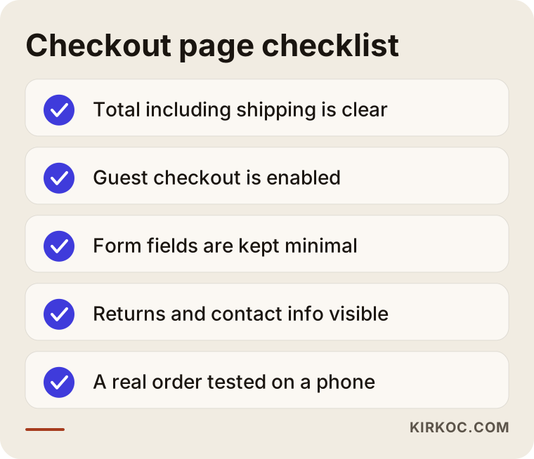
Two items on this list matter most. The first is that the total, with shipping included, is visible before the payment step. The second is that returns and contact information are one click away from the checkout page. If these two are missing, other improvements often fail to deliver the effect you hoped for.
Payment methods and trust signals
Shoppers pay in different ways: credit and debit cards, digital wallets such as Apple Pay, Google Pay or PayPal, buy now pay later services, and in some markets bank transfers or cash on delivery. Offering every method may not suit every store, but leaving out the one your audience expects can cost you carts. It also matters to state clearly which cards or financing options apply and whether any extra fee exists. If you are unsure about legal requirements or contract terms around payment infrastructure and security, I recommend asking an attorney or your payment provider's support team.
Trust signals should also stay modest. A long row of badges along the edge of the page often backfires and gives a "why is this site trying so hard to prove itself?" feeling. A few real, verifiable signs placed in the right spots are enough: a summary of the return policy, contact details, and a note on secure payment.
When should you show the shipping cost?
Shipping cost is the single most common surprise that makes people abandon a cart. For that reason I wanted to build a decision chart around the question "when do I show it?"
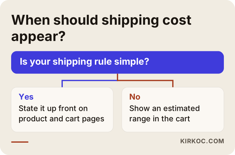
In short: if your shipping rule is simple (for example, free above a certain cart amount), state it from the start on the product page and in the cart. If your rule is complicated (it changes by region and product weight), offer an estimate calculator on the cart page, or at least add an honest explanation such as "shipping is calculated at the last step and falls in this range." If a "free shipping" promise is quietly folded into the product price, customers notice when they compare elsewhere; stating the price plainly from the start creates fewer problems for you as well.
I will not give a number for the free shipping threshold, because the right threshold depends on your average cart value, your profit margin and your shipping contract. As a general idea, a threshold slightly above your average cart can encourage a customer to add one more item, but this varies from store to store and only testing will show it.
A reminder flow for abandoned carts
If you can reach the person who left the cart (they entered an email address and agreed to be contacted), sending a polite reminder is a common method that works. The key phrase is "if you can reach them and they agreed." Sending marketing messages without permission annoys customers and can also create legal trouble, since email and privacy rules differ by country and by state. Before you decide anything about data protection and commercial email rules, I recommend talking to an attorney.
Think of the reminder flow as a simple timeline of three to five messages.
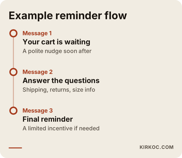
The logic of the flow is this: the first message arrives soon after and simply says "you left something in your cart." The second message answers likely questions about the product (size, shipping, returns). The last message includes a small incentive if needed. Every message should have a one-click link back to the cart, and the customer should find the cart as they left it. Stopping after the third message matters too; being pushy harms your brand.
Do not hand out a discount code in the first reminder. If every abandoned cart receives a discount, customers learn the pattern and start leaving carts on purpose. Try messages that address the cause first (stock information, a shipping note, a help line), and use the incentive on the last step, in limited form. Text message or messaging-app reminders follow the same rules of consent and courtesy.
Retargeting ads
Showing up again with Google or Meta ads to people who left the cart is a different channel from email, and it can reach people who never gave you an email address. An ad that reminds someone of a product they looked at is often sensible, but if you overdo it, the frequency becomes annoying. Do not spend the advertising budget before the site is fixed: raising retargeting spend while the checkout page has problems is like filling a leaky bucket faster. Repair the bucket first, then pour. When the same person runs both the ads and the site fixes, this order comes naturally.
Mobile experience and cart page layout
In many stores most of the traffic arrives on phones, but completed orders happen more often on computers. That gap usually shows that the mobile flow is weak. Getting the cart page right on mobile directly affects both the move to payment and the abandonment rate. Let's look at the sections of an example cart page.
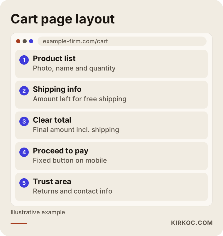
Read the order in this diagram as a starting point, not a rule. On the cart page, products appear with photos and quantities, the quantity is easy to change, shipping information and the total are clear, the "proceed to payment" button stays fixed on the screen, and trust elements such as returns and contact information sit somewhere visible. Related product suggestions are useful, but they should not get in front of the payment button; if the person came with the intent to pay, you do not want to scatter the flow by steering them to another product.
On mobile, a few details make a big difference: buttons large enough for a thumb, fields that support autofill, a numeric keyboard on the card number field, and a page that does not load slowly. Trying these on your own phone with a weak connection is often a good test. If you find something about speed, look at image sizes and unnecessary plugins; a heavy page leaves a feeling of slowness at the payment moment too.
Common mistakes
Most of the mistakes I see here are made with good intentions. These are the ones I meet most.
The first mistake is cutting prices without knowing where the problem is. It erodes your margin while the real barrier stays in place. The second is putting too much on the checkout page: promotional banners, cross-selling, surveys, a pile of badges. The third is testing only on a desktop. The fourth is not writing error messages, or settling for "an error occurred"; if customers do not know what is wrong, they leave. The fifth is missing a problem at the payment provider; if a particular bank card fails, you only learn about it when a customer complains. The sixth is looking only at the percentage and not at the cause. The seventh is making five changes at once and being unable to tell which one worked.
An eighth mistake is turning the abandonment rate into the only measure of success. If the rate falls but orders or profit do not rise, the drop may reflect another issue, such as a decrease in low-intent traffic. Your main measures should be orders and profitability; the abandonment rate is a clue that helps explain them.
How do AI assistants and search results answer this topic?
Store owners now ask these questions to tools like ChatGPT as well. The example below shows how such an answer might look. The answer is purely illustrative.
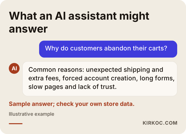
Answers like this point to general truths: unexpected costs, forced accounts, slow pages, lack of trust. But they cannot tell you which one applies in your store; for that you need to look at your own data and your own checkout flow. General information is a good starting point, not a substitute for a diagnosis.
What can you do yourself, and when do you need a specialist?
There is quite a lot you can do on your own. Writing the shipping rule on product and cart pages, making returns and contact details visible, switching on guest checkout in your store settings (on most ready-made platforms it is a setting), placing test orders from different devices, and turning on the reminder email setting are at the top of the list. None of these requires coding, and most take a few hours.
A specialist makes sense in these cases: the tracking setup is missing or wrong, your checkout infrastructure does not allow changes, the mobile flow is truly broken, page speed is low, you spend on ads but lose a lot at the payment step, or you cannot read which change actually worked. Sometimes the cause lies in the structure of the site, and design, development, measurement and advertising need to be considered together; in that case, running it all through one person saves time compared with working in pieces.
What determines the cost?
I do not give a number for the cost of cart abandonment work, because the scope varies widely from store to store. The main factors that set the price are these: the store platform and payment system you use, how many steps the checkout has and how much customization it contains, whether tracking is already in place, how large the mobile work is, the setup and management of the reminder email flow, whether product pages and content need fixing, and whether the work is a one-time project or ongoing. Whether the problem is only a settings fix or a rebuild of the checkout flow becomes clear after the first review.
How I work with you
I work alone; the person who talks with you, does the work and follows the results is the same. In the first step I walk through your store as a customer, try an order on both phone and computer, and look at your tracking data if there is any. Then I write down the biggest barriers in order of priority, in plain language. I separate what you can change yourself from what is my job. If you like, you can take that list and carry it out with your own team.
Your store website, search visibility, social media and ads are connected to each other. Since I run all of them, I can quickly spot a case where, for example, the message on an ad landing page contradicts the checkout page. When different people handle each piece, each looks at their own area and the gap in between belongs to no one. That is exactly where having one person run everything pays off. The scope is still yours to set: you can ask only for a checkout page review, or you can have me rebuild the site from scratch and run content and ads alongside it.
Frequently asked questions
What is a good cart abandonment rate?
There is no single number that applies to everyone. Product type, price range, traffic source and device mix all change the rate a lot. Instead of comparing your rate with other stores, compare it with your own history and your own stages. What matters is where the rate is heading over time and at which step you lose people.
Can I win back everyone who abandons a cart?
No, and it would not be honest to say it is possible. Some people only browse prices and some simply change their minds. The goal is to reduce the number of customers who leave because of a barrier and to send a polite reminder to those you can reach. How much that delivers varies from store to store and cannot be promised in advance.
If I remove the forced account, will I lose customer data?
Name, address and email are collected with the order anyway; the difference is only the requirement to create an account. By offering "create an account with these details" after the order, you give a friction-free first purchase and still turn a good share of customers into account holders. As for permission to contact them, you need to follow the rules and, if needed, ask an attorney.
When should I send a reminder email, and how many?
As a general approach, the first reminder goes out soon after, later ones are spaced further apart, and the total should not exceed three to five. The exact hour and number of days depend on your product; a shorter gap suits quick-decision items, and a longer one suits considered purchases. Small tests will show you the right timing for your store.
Should I send a discount code to every abandoned cart?
Usually I do not recommend it. Customers learn the pattern and deliberately leave the cart to wait for a code. Try messages that resolve the cause first (stock, shipping, answers to questions) and use the discount at the last step, in limited form. Protecting your margin matters more than a short-term conversion.
Why do people abandon mobile orders so easily?
Filling in a form on a small screen is tiring; the wrong keyboard opening, a hard-to-scroll state list and small buttons wear people out. On top of that, a visitor on a phone often plans to look now and buy later on a computer. The first step is to test the mobile flow on a real phone with a weak connection and simplify the form.
My store runs on a ready-made platform; can I do this work?
Mostly yes. Guest checkout, shipping information, payment methods and reminder emails are managed from settings on most ready-made platforms. But if you need a redesigned payment step or a custom tracking setup, you may hit the limits of the platform. In that case, what is possible and what is not gets checked first.
How long does it take to work on cart abandonment?
The time depends on the kinds of problems found. Fixes such as shipping information or an account setting are quick, but you need enough visitor data to see results. Larger work such as infrastructure, mobile flow or tracking setup needs more planning. That is why I set the timeline after the first review.
If cart abandonment is on your mind, you can reach me through the ecommerce website and store improvement page, and we can review your store's current state together and talk about which step should come first.