You run a visa consultancy. Most of your work probably comes from recommendations, and that has carried you well. But at some point you want to grow, and you notice something: people now start their visa research on Google, long before they call anyone. This is exactly where a website for a visa consultancy stops being a nice extra and becomes the tool most likely to bring you new inquiries after your business card. The trouble is that many sites in this field amount to an "about us" paragraph and a phone number. Someone searching never finds you, or finds you and does not trust you enough to write.
I wrote this article so that you can read it without any technical background and still make good decisions. I will cover what the person searching is really thinking, which pages your site needs, how trust is built, which mistakes set you back, and what drives the cost. If you are thinking about having a professional website built, you will also know where to start by the end.
A quick note on context. I work from Istanbul, so some of my examples come from there, but the principles hold in any country. A frightened person with a passport and a deadline behaves much the same in every country.
How does a person looking for a visa search for you?
Start with the person on the other side of the screen. Someone about to apply for a visa is usually under stress. They fear a refusal, they do not fully understand the document list, and they do not want to repeat a bad experience from the last time. Money and time are limited, and one wrong step can cost an appointment. So their searches are not one single thing. They split into a few different intentions.
The first group is looking for information: "what documents do I need for a Schengen visa", "how long does a tourist visa take". These people are not shopping for a consultant yet, but if your page answers the question well, you become the name they remember. The second group describes a situation and wants help: "I was refused before and want to apply again", "I own a company and need a business visa". The third group searches for a consultant directly: "visa consultancy Istanbul", "Schengen visa consultant near me". This third group is closest to buying.
Your site should be built with all three groups in mind. A single page that says "visas handled here" leaves every one of those questions unanswered. The illustration below shows how a page specific to a country and a situation can stand out in search results compared with a generic introduction page.
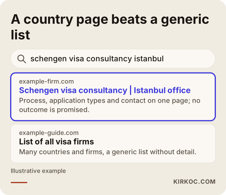
In this invented example you can see why a detailed page that matches the search exactly is more likely to be clicked. A search engine tries to show the person who asked the most useful answer. If you build each page around a real question, both the search engine and the visitor understand you faster.
The special challenge of a visa site: trust
In most industries, a visitor looks at a product, compares prices and buys. With visa consultancy, a person is about to hand over a passport, bank statements, family details and travel plans to someone they have never met. So the first job of your site is not to sell. It is to create the feeling that "I can safely give these people my documents."
You cannot build that feeling with generic phrases such as "years of experience" or "professional team". Visitors read those phrases on every site. Show concrete things instead: your company's full registered name and address, an office that can be found on a map, a phone number and a messaging number, opening hours, the name of the person who actually advises clients, and which countries and types of application that person knows well. If your business needs licenses or registrations, state them clearly. I cannot tell you which wording is permitted in your country, so please ask a lawyer. What a consultancy may claim in advertising can be regulated, and it differs from place to place.
Say one more thing plainly: the consulate decides, not you. Phrases like "guaranteed visa" or "100% approval" are untrue, they push away careful visitors, and they can get you into real trouble. An honest version reads like this: "I help you prepare a complete, consistent application file; the decision belongs to the consulate." That sentence is not a weakness. It is a sign of reliability, and applicants who have been refused once are especially quick to notice it.
Which pages does a visa consultancy website need?
A one-page "company introduction" site brings very little business in this field. Every country, every visa type and every applicant situation is a different question, and each deserves its own page. Here is the core structure I would think about.
Home page. It says what your firm does, who it is for and how to reach you, all in the first screen. You do not need to list every country. A clear menu leading to the countries and visa types you handle most is enough.
Country pages. One page for each destination you work with: Schengen states, the United States, the United Kingdom, Canada and so on. Instead of a generic "visa documents" text that everyone copies, explain how the process works for that country, which kinds of application you take on and where cases tend to get difficult.
Visa type pages. Tourist, business, student, work and family reunion visas involve different documents and different worries. A separate page for each type matches the search exactly and gives the visitor the feeling that you know their case.
Situation pages. People who were refused, first-time applicants, freelancers, retirees and families with children ask special questions. A short, honest page for each is a space most of your competitors leave empty.
Process, about and contact pages. These show how the service works step by step, who the visitor will deal with and how to get in touch.
FAQ and guide articles. Content that stays current, informs the reader and is reviewed a few times a year. Because visa rules change often, put a date on every article and add a note that readers should confirm current rules with the official source. That is both accurate and reassuring.
The table below matches these page types with what the searching person wants.
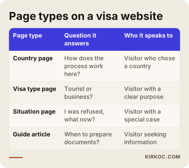
Use the table as a checklist. Which rows are missing from your site? Each missing row can mean a visitor with that exact question goes to another firm.
What should a country page look like?
The number of pages matters, but so does what is inside each one. A country page should not bury the visitor in a pile of document lists. It should guide them. The sketch below shows the layout I recommend, in simple form.
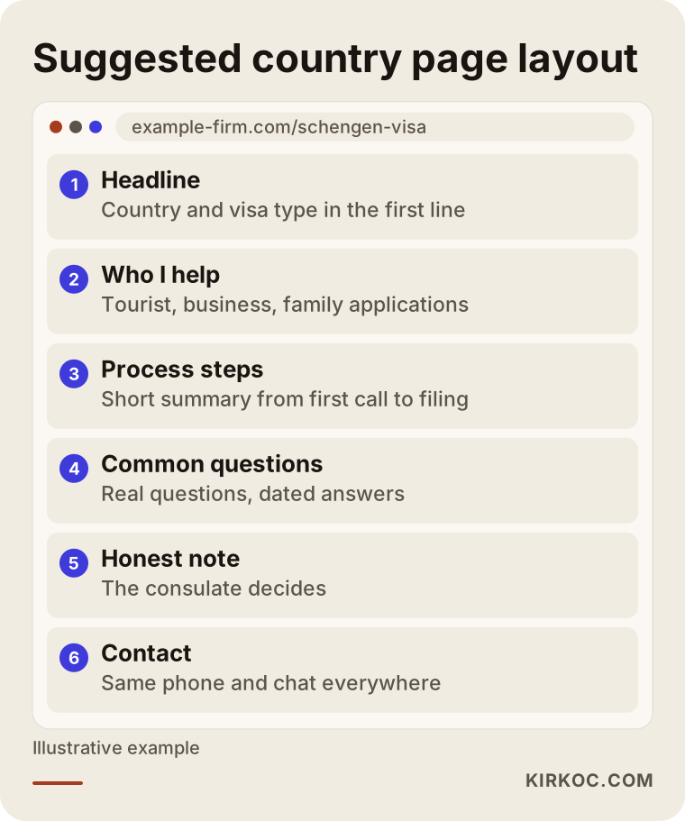
In this layout, the country and visa type are named clearly in the headline. Then the page explains who you work with and in which situations you can help. The steps of the process appear in short form, common questions follow, and a contact prompt stays visible, either at the bottom or in a corner that follows the reader. Keep your phone number and messaging link in the same place on every page so that one tap reaches you on a mobile. Most people looking for visa help are on their phones. If your site is hard to read there, you lose them in the first few seconds.
One more detail that matters: write the visa type and the country the way ordinary people say them. Applicants do not search with official terminology. They type "tourist visa for Germany" or "UK visa after refusal". Your headlines can use the same plain words, and an explanation of the official name can come lower on the page.
Two hypothetical scenarios
The two scenarios below are entirely hypothetical. They do not describe a real firm or person. They exist to show how two approaches in the same field can end differently.
Scenario 1: the one-page brochure site. An imaginary consultancy has a website made of a single page. At the top it says "Schengen, USA, UK and all other visas". Below that is a paragraph about the firm, and at the bottom a phone number. The owner expects a steady trickle of visitors after launch. The people who do arrive come with specific questions, such as "I was refused, what should I do", but the page has no answer. They press the back button. Most do not bother to call because they do not even know what to ask. The office keeps working through referrals, and the site becomes known as something that "exists but brings nothing".
Scenario 2: the site built around questions. Another imaginary office of the same size prepares separate pages for the three countries it handles, two visa types and a situation page called "If you have been refused". Each page shows the office address, the name and experience of the adviser, the steps of the process and a contact form. The refusal page contains an honest paragraph: the consulate makes the decision, the office asks for certain documents to look into why a file may have been refused, and no result can be promised. A visitor who lands on this page might think, "these people understand my situation and are not making promises, they are telling me what is true." The chance of that person getting in touch rises noticeably. Of course, results do not arrive overnight. It takes time for pages to appear in search results.
The difference between the two is not technology. It is which person's which question the site answers. The picture below summarizes this as the path from a visitor to an inquiry.
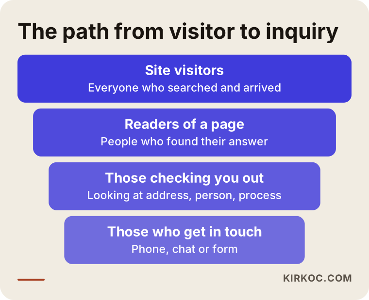
The funnel idea is simple. Not every visitor will apply. Most read a page, some look into who you are, and a smaller part writes to you. Your job is to make the next step easier at every stage and to remove any needless obstacle.
Step by step: how to build it from scratch
Doing this work in order reduces both wasted time and wasted money. Here is the general flow.
1. Decide what you are selling. Which countries, which visa types, which kinds of applicants? Saying "I do everything" sounds broad but is weak in search. Choose the files where you are truly strong.
2. Collect the questions. What do people ask you most by phone or messaging? What happens after a refusal, how early should documents be prepared, how is an appointment booked? These questions are the raw material for your page titles and guide articles.
3. Draw the page map. List the page types above according to the countries and visa types you handle. Write the three or four pages that bring the most business first. You can add the rest later.
4. Gather your trust details. Company name, address, adviser information, opening hours and a description of the process. If these are not ready, prepare them before building anything.
5. Write the pages and build the site. The text should be plain and written in the visitor's own language. The design should be simple, quick to load and comfortable on a phone.
6. Test every way of reaching you. Does the form work? Does tapping the phone number start a call? Is the messaging link correct? Try it yourself from your own phone.
7. Launch and measure. Which pages get read, and how many people contact you from each one? Look monthly and strengthen the weak pages.
The timeline below shows the rough stages of the work. I am not giving a duration because every project is different and the length depends on the number of countries and how much content is ready.
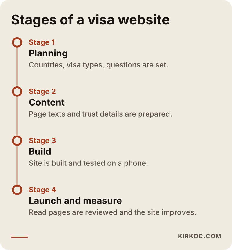
Notice that launch is not the end of the timeline. In the first months you see which searches arrive and which pages lead to inquiries, and the site matures as you adjust it.
How do you show trust on the site?
I want to come back to trust, because in visa work the fate of a site is largely decided here. When a visitor opens your site, within about half a minute they look for answers to these questions. Is this firm real? Where is it? Who works there? How do they work? Will they cheat me? Your site has to make those answers visible.
Do not bury the company details in the footer. Give the address, the map and the phone number on a separate contact page, clearly. Say who the adviser is and which application types they work on; an "about" page with a real face on it makes a genuine difference. Explain how the process runs, what the first meeting covers and which documents will be requested. Also write what you cannot do, for example that you cannot guarantee a visa result. If you use client reviews, use only real ones that people have agreed to publish, and share names and details only with the person's consent. Ask a lawyer about your obligations on personal data, because the rules differ by country.
The checklist below summarizes the trust signals I want to see on a visa consultancy site.
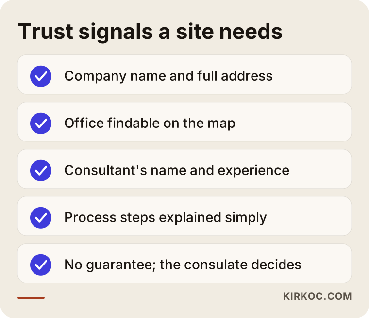
Tick the items off on your own site one by one. Completing the missing ones often gives faster results than writing a new page, because this information is already in your hands. It just is not on the site yet.
Common mistakes
In this field I keep seeing the same mistakes. Most are made in good faith, but they do not bring business.
Squeezing every country onto one page. A long list such as "Schengen, USA, UK, Canada, Australia, Japan..." answers nobody who is searching for one country. Each country should be explained on its own page.
Copying document lists from other sites. Search engines see copied content as having little value, and you cannot be sure the list is current. Visa rules change, and giving wrong information harms the visitor and you. Write from your own experience and have the current rule checked against the official source.
Promising guarantees. Words like "sure visa" or "no refusals" are misleading and can cause serious problems. An honest approach is the ethical one, and it also earns more trust over time.
Making contact difficult. Only a form, only a phone number, or a number hidden at the very bottom of the page. A person looking for visa help may want to call, send a message or fill in a form. Keep the options open.
Ignoring mobile. Most visitors come from a phone. If the text is tiny, the buttons are hard to reach or the page loads slowly, they leave.
Leaving old information up. If an article about "2023 application conditions" is still on your site, you are giving wrong information and damaging trust. Put dates on pages and review them regularly.
Giving up before results appear. Search results build over a longer period than a few weeks. Impatience makes people abandon a properly built project halfway.
The picture below collects these mistakes in a short warning list.
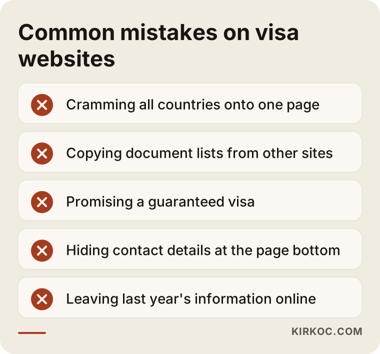
Look at this list and note the mistakes you find on your own site. When choosing which to fix first, start with the one that loses the most visitors. Often that is hard-to-find contact details or missing country pages.
One page, or a site built country by country?
Small offices often ask: "Would it not be enough to describe everything on one page?" It would not, because a single page makes life harder for both the search engine and the visitor. The comparison below puts the two approaches side by side.
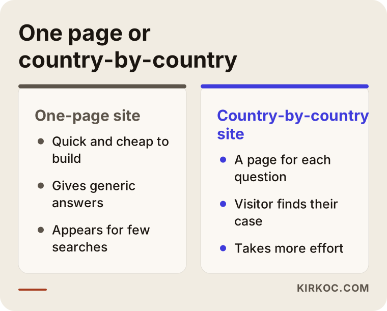
I will not hide it: a country-by-country site takes more effort. But because each page answers a separate question, your chance of reaching the person who asks that question grows. Starting small, with the three countries that bring the most work, keeps both budget and time manageable.
What can you do yourself, and when do you need an expert?
You do not need to hand everything to a specialist. There is a lot you can do on your own, especially on the content side, because you know the visa process better than anyone.
Things you can do yourself: write down the questions that arrive by phone and messaging in a notebook or a file. Make a short overview note of the process for each country. Gather your office address, opening hours, phone number and adviser details. Create your map listing, known on Google as a Business Profile, and keep its details accurate. Collect real client reviews that people have agreed to share.
Places where you may need an expert: the technical setup of the site, making it load fast on a phone, helping search engines understand the pages correctly, planning the page structure by country and visa type, arranging the text around what people search for, and setting up measurement. These are areas that cost a business owner time and where mistakes are common. If you want to run ads, directing the budget well is a separate skill as well.
The decision chart below gives a simple guide to when to run things yourself and when to bring in help.
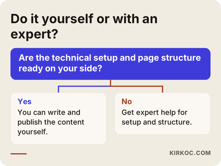
In short, the raw knowledge can come from you, and the setup and structure from an expert. When the two combine, the result is a site that is both accurate and easy to find.
What does it cost, and what shapes the price?
I do not quote numbers here because every project is different, but I can tell you plainly what moves the price. If you ask about these things when you collect quotes, you can compare offers properly and avoid paying for what you do not need.
The first factor is the number of pages. A site for three countries and two visa types does not need the same work as one that covers twenty countries. The second is who writes the content: you can write the text and take only the technical setup from me, or you can ask me to write the text too. The third is the number of languages. If you also serve foreign applicants, every language means separate content and separate effort. The fourth is extra features such as booking forms, document upload areas or appointment calendars; each one needs both setup and maintenance. The fifth is whether the site gets regular care and updates after launch. Because visa rules change, a site that is never updated slowly becomes a liability.
When you ask for a quote, ask for the tasks to be written down in order. Make sure the site and accounts are opened in your own name, so that the domain and the account access stay with you. It should be clear who will do the work. And no quote should contain a guarantee of ranking or results; if you see one, treat that offer with caution.
How does working with me look?
I am an Istanbul-based specialist, and I run all the services a digital agency would offer through one person: website building, search engine optimization, local search, social media management, Google and Meta ads, logo and corporate identity, and content production. For a visa firm this means the person who builds your site, the person who makes sure your pages appear in search and, if needed, the person who manages your ad account are the same person. You do not have to explain your business three times to three people. Information does not get lost between them, and decisions are made quickly.
The process usually goes like this. First I talk with you to understand which countries and visa types you are strong in, how your clients reach you now and what you expect from the site. Then I draw the page map and give you a written plan. After that I build the pages, prepare the texts together with you, test every contact route and launch. Once the site is live, I look at which pages are read and which searches arrive, and I update the plan together with you. Reports are written in plain language so that you understand what the numbers mean.
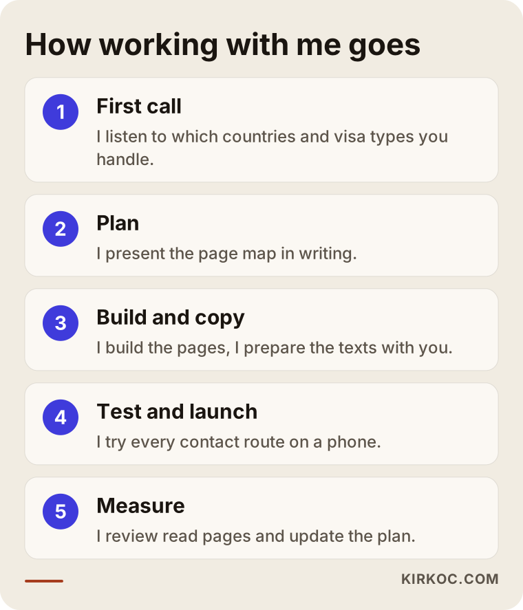
Let me be direct about one thing: I do not promise a ranking or a number of inquiries, and nobody honestly can. What I can offer is work that is orderly, measurable and transparent. The site and accounts stay in your name, and you can see what is being done at each stage.
Frequently asked questions
Does a visa consultancy really need a website?
If recommendations give you enough work, it is not urgent. But most people looking for visa help research online first, and a firm with no site never appears in those searches. A professional presence also helps build trust.
How many pages should the site have?
There is no fixed number. A separate page for each country and visa type you handle, plus situation, process, about, contact and FAQ pages, is a good start. You can begin with three countries and expand over time.
Can I write "guaranteed visa" on the site?
I recommend that you do not. The consulate decides, and no consultant can guarantee the result. Claims of this kind can mislead people and may cause legal problems. Ask a lawyer about the wording of your advertising and promotion.
Can I use document lists from other sites?
I suggest you do not copy them. Search engines give little value to copied content, and you cannot be sure the list is current. Write from your own experience, add a date and remind readers to confirm current rules with the official source.
How long does it take for the site to produce results?
I cannot give an exact time. How soon pages appear in search results depends on competition and content. In general, do not expect a clear result in the first weeks; steady measurement and improvement are needed.
Should I run ads, or start with the site alone?
The site needs to be solid first, because sending ad traffic to a weak site wastes budget. Once the site is ready, a targeted Google ad can bring visitors faster. Planning the two together is the most efficient way.
Who owns the site and the accounts?
The domain, the site and the ad accounts should be opened in your name. Even when you work with a specialist, access should stay with you, so that you lose nothing if the work ends.
Should I also build the site in other languages?
If you serve foreign applicants, yes, but every language means separate content and upkeep. It is wise to make your main-language site solid first and then expand into the languages where you see demand.
Visa consultancy is a business that runs on confidence, and your website has to give the same confidence at first glance. If you would like to review your current site together, or build a structure from scratch that fits your work, write to me through the website design service page. I will listen to how you work and then we can decide where to start.