You are starting a business, or your current logo no longer fits who you are. One evening you type a few words into an AI tool and, within seconds, you have dozens of logos on your screen. Then the question hits you: is it actually smart to get a logo this way, or will it cause headaches later? This article answers that question without hype. I am Ümit Kırkoç, I work from Istanbul, and I handle everything a digital agency would normally provide, from websites and social media to ads and brand identity, as one person. I will explain my own logo and brand identity service where it makes sense, but AI tools really are useful in some situations, and I will not hide that from you.
Here is the short answer up front. AI is good for gathering ideas and for low-stakes, short-lived uses. For the main logo of a business that will sit on a sign, a vehicle, packaging, a website and your ads for years, it is rarely enough on its own. Below I explain why, how to decide in your own case, and what to check before you commit.
What does "making a logo with AI" really mean?
In most of these tools, you type your business name, your industry and the mood you want into a box. The tool looks at the huge number of images it has learned from and generates a handful of pictures for you. You download the one you like. Because the whole thing takes minutes, it creates a feeling of "done." But a logo is more than an attractive picture. It is a mark that helps customers tell you apart from everyone else, that stays readable on a tiny phone screen and on a huge sign, and that says something true about your business.
What the AI hands you is usually just a picture. For that picture to work as your brand, more steps are needed: the file has to be converted into a clean format, the colors and typeface have to be fixed, and someone has to test how it looks in each place it will appear. Skip those steps and the logo will let you down sooner or later.
The graphic below shows, with a made-up example, the kind of reply these tools typically give.
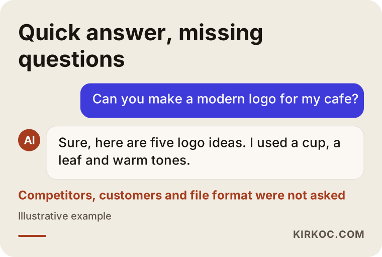
What matters in this picture is how fast and confident the answer looks, even though it knows nothing about your business, your competitors or your customers. The tool will produce something pleasant. It cannot tell you why that something is right for you.
When does an AI logo do the job?
To be fair, you do not need a designer in every situation. AI can be a reasonable choice in the following cases.
The first is the idea stage. If you do not yet know what you want, looking at dozens of drafts and noticing which ones you like is genuinely helpful. Being able to tell a designer "something like this one, but warmer" saves time for both of us. Bringing examples you like and dislike makes any project move faster.
The second is short-lived use. If you need a logo for a one-week school event, a neighborhood picnic, a one-time campaign or an internal project name, a quickly generated image is often fine. Nobody expects trademark protection or years of consistency from it.
The third is an early test period with a truly empty budget. If you are checking whether an idea has legs and you have no customers yet, using a temporary image and moving to a professional logo once the business settles is a sensible path. Just remember it is temporary, and do not rush to put it on a sign, a vehicle wrap or a print run.
What these three cases share is that a mistake is cheap to undo. When a logo will be used for a long time in many places, the cost of a mistake grows quickly.
The real problems with AI logos
The problems usually do not show up on day one. They appear when you try to put the logo somewhere. These are the four that frustrate me most.
File format and cleanliness
AI tools usually produce an image made of pixels, like a photograph. It looks fine on a small screen but turns blurry when you enlarge it. When you visit a sign shop or a print shop, the first question is often, "Do you have a vector file?" A vector file is made of lines and curves instead of dots, so it stays sharp no matter how large you scale it. If all you have is a blurry image, the logo has to be redrawn or cleaned up from scratch.
These images also tend to carry small flaws: half-finished letters, uneven line thickness, glitches that are hard to see until you zoom in. When the logo includes text, letters can come out wrong or meaningless. So you need to check every single letter of your business name in whatever you download.
Consistency across different places
A real logo is not one image but a family: a horizontal version, a square version, a one-color version, versions for light and dark backgrounds. Your Instagram profile photo gets cropped into a circle, your website header has a narrow, wide strip, and a rubber stamp prints in a single color. The one image you got from an AI tool looks out of place in most of these. If you try to generate each version separately, you get something slightly different every time, because the tool does not promise to repeat the same drawing exactly.
The lookalike problem
These tools give similar answers to similar requests. Two people in the same industry typing the same three words can end up with very close results. A tooth and a star for a dentist, a cup and a leaf for a cafe, an arrow and a circle for a consulting firm: the same patterns keep coming back. Customers remember you only if you are distinctive, and a shared template does the opposite.
Missing meaning and story
A good logo has a "why" behind it. Why this color, why this shape, what should a customer feel when they see this mark? If you do not say, the tool guesses, and the guessed story is usually generic. If you cannot explain your logo to customers, staff or even yourself, the logo starts to be a burden on your brand.
The list below sums up what you should realistically expect from a logo file.
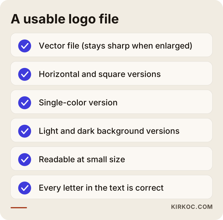
Hold the logo you have against this list. If several items are missing, they will come back later as lost time and extra cost. A designer can fix many of them, but working on a half-finished image is sometimes more tedious than drawing from scratch.
Copyright and trademark questions
I will not make firm legal claims here, because this is a topic for a lawyer. But there are general questions you should know to ask.
The first is who owns the generated image. The terms of service differ from tool to tool. Some limit what you can do on a free plan, and some allow commercial use but add conditions. Whatever tool you used, read its current terms with commercial use in mind. Those terms can also change over time.
The second is the risk of resemblance. Even if the tool says it made something "new," the result may look very close to an existing brand. If you use a mark that resembles another company's registered logo, you could receive a complaint or be forced to change it. To catch this early, you need to search for similar marks before you commit.
The third is whether the logo can be registered as a trademark. A trademark registration is the official process of protecting your name and logo in your own name. A very generic shape that anyone could use, or a mark that is too close to someone else's, may run into problems during registration. The rules differ by country, whether you deal with the USPTO in the United States, the Turkish Patent and Trademark Office in Turkey, or another national office. I cannot give you a definite answer on this; please talk to a trademark attorney or another legal professional.
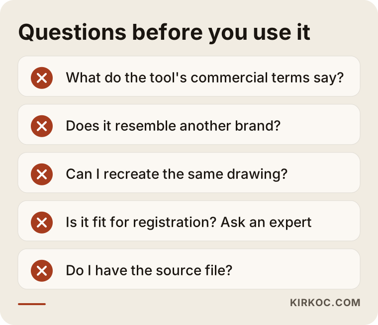
The warnings in the graphic are not meant to scare you. They are the questions to ask before you decide. If you will only use the logo for a short period, these risks shrink. If you will use it for years, they start to matter a great deal.
Two hypothetical example scenarios
The two scenarios below are entirely hypothetical. They do not describe a real person or company.
Scenario 1: An event logo for a weekend swap market
A neighborhood association plans a one-day swap market at the end of the month. The event has a name, and it needs an image for the flyer and social media posts. It will happen once, and nobody plans to register anything. In this case, taking three or five drafts from an AI tool, choosing one and putting it on the flyer is reasonable. If the file is blurry, simply avoid enlarging it too much for the poster. Spending a designer's budget on this would be unnecessary.
Now imagine the same association decides to run the event every year and turn it into a recognizable brand. By the second year, they may discover they cannot recreate the same image. At that point, handing the job to a designer is the healthier move.
Scenario 2: A newly opening dental clinic
A dentist is opening her own clinic. There will be a sign, a glass door decal, patient files, prescription headers, a website, a Google business profile and an Instagram account. To move quickly she gets a logo from an AI tool and likes it. But the sign maker asks for a vector file, the print shop asks about a one-color version, the website needs a narrow horizontal version, and on Instagram the text disappears when the logo is cropped into a circle.
She also works in an industry built on trust. Patients want to see that the clinic is serious and organized. A logo that looks different everywhere, even slightly, weakens that impression. In this scenario, using the AI draft as inspiration and having the logo professionally drawn gets the job done more cheaply and with less stress.
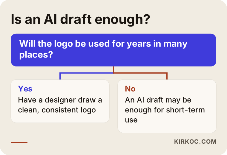
The flow above shows what separates the two scenarios: how long the logo will be used and in how many places. Your answer to those two questions usually makes the decision for you.
AI and a designer, side by side
This is not a question of which is good and which is bad. It is a question of which fits which job.
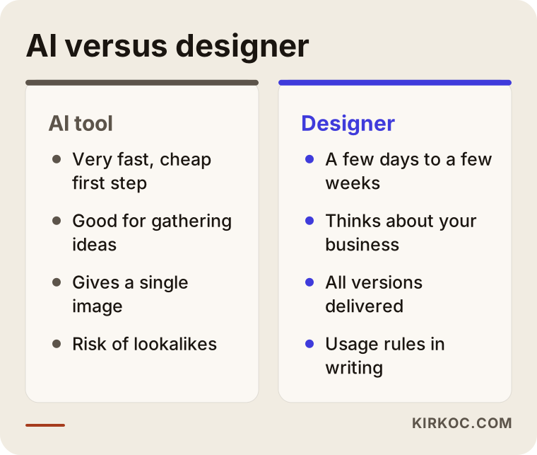
As the comparison shows, speed and low upfront cost favor AI, while ownership clarity, consistency and thinking specific to your brand favor a designer. There is also a third option, which is to combine them: use AI to collect ideas, then bring those ideas to a designer. This shortens the exploration phase and still gives you a solid final product.
How a logo project works, step by step
Whether you do it yourself or work with me, a healthy logo process goes through roughly the same steps. First, you need to understand the business: what you do, who you sell to, how your competitors look, and where customers will see you. Then you set a direction: do you want something serious, warm, modern or traditional? Next come drafts, which are tested in real places of use, and one is chosen and refined. Finally, the files are delivered and the rules for using them are set.
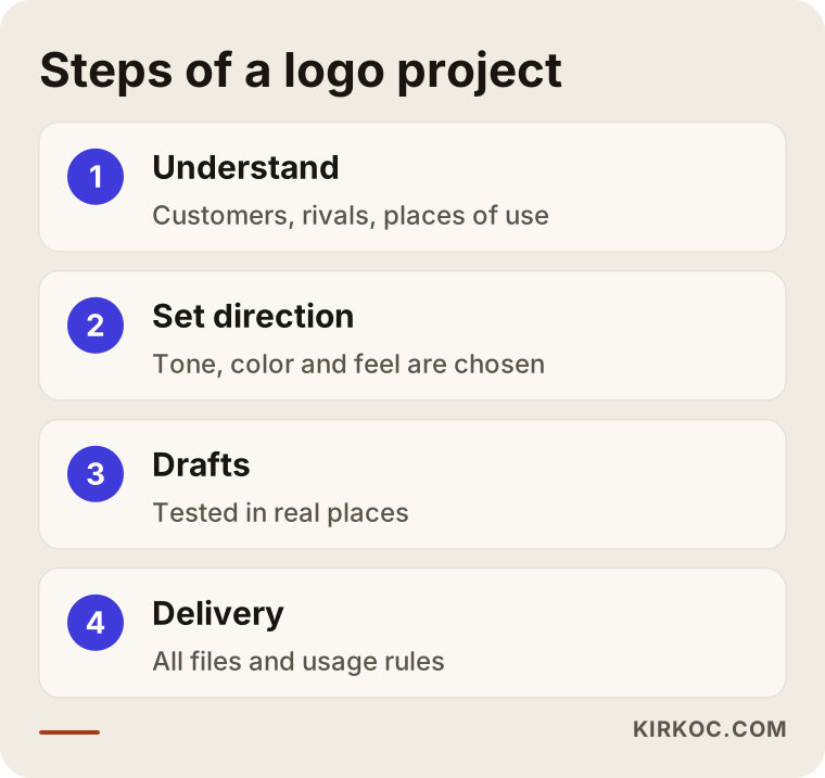
AI can only help with the third step, producing drafts. If you skip the first two, what you produce may look nice but will not be yours. That is why I suggest first answering these questions in writing: how would a customer describe you in three words, what do you do differently from your competitors, and where will the logo appear most?
Write down where the logo will be used
Before the logo is drawn, write on a sheet of paper every place you will use it: signage, business cards, packaging, vehicles, website, social media profiles, invoices, email signature. That list shows which versions of the logo you will need. Most businesses get a logo made without writing this list and then discover missing versions at their first print run.
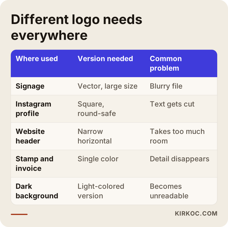
The table summarizes how the same logo has to behave differently in different places. Each row means a separate version. A single image from an AI tool will not satisfy most of these rows.
From logo to brand identity
A logo is only one part of a brand identity. Brand identity also includes your color scheme, typefaces, visual style and the rules for using all of them. When a customer first sees you on Instagram and then lands on your website, they should feel that both belong to the same business.
This is where doing everything through one person pays off in a concrete way. When I prepare the logo, the site, the social media post templates and the ad visuals myself, the colors, fonts and tone stay the same everywhere. When the work is split among three separate people, each applies their own interpretation, and after a while the brand has a different face in every channel. Fitting an AI-made logo into that whole also takes effort: will its colors work on the site, is its typeface readable, does it fit in a post template?
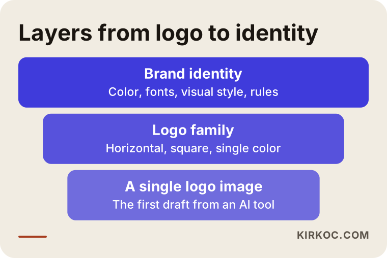
The layers in the graphic show how you move from a narrow logo to a broad identity. Each layer sits on the one below it, so if the foundation is weak, everything stacked on top wobbles.
Common mistakes
These are the mistakes I see most. Choosing a logo in a hurry and then printing it on a sign is the most expensive way to be wrong. Settling for a single file and not thinking about other versions causes trouble at the first print shop visit. Choosing a logo without looking at your competitors can make you look like everyone else in your field. Asking for too much detail is also common: thin lines, shadows and gradients that vanish at small sizes weaken a logo. Finally, many people skip reading the tool's terms of service and never ask whether the generated image can be used commercially without trouble.
Another mistake is treating the logo as "finished" once it exists. A logo is a tool. You should watch how it looks on your site, on social media and in ads, and make small corrections if needed.
What can you do yourself, and when do you need an expert?
There is a lot you can do on your own. Write three or five words that describe your business, look at your competitors' logos and note what they have in common, save logos you like and dislike, collect drafts from an AI tool and mark which ones suit you. This preparation is also very valuable when you later work with a designer, because you become able to explain what you want.
You need an expert in these cases: when the logo will go on a sign, packaging or a vehicle; when you plan to grow as a brand; when the logo will be used on your website, social media and ads together; when you are thinking about trademark registration; or when none of your drafts quite describes you. In those cases the problem is usually not how pretty the image is, but how complete and usable it is.
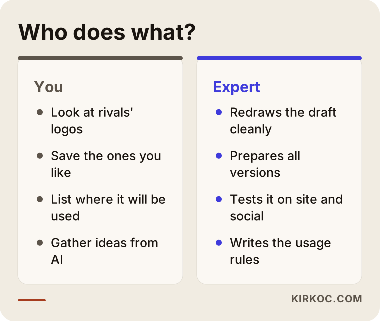
This split helps you spend your budget in the right place. If you do the preparation yourself, an expert can spend their time refining the right idea instead of hunting for one.
What determines the cost of a logo project?
I will not give numbers here, because the scope of the work varies so much from person to person. The main things that shape the cost are these: whether you want only a logo or a full brand identity; how many drafts and revisions you expect; how many versions of the logo you need; whether you want extras like a color and typography guide, business cards and social media templates; and whether your business sells one product or has many sub-brands. Timing matters too, because rushed jobs squeeze the plan.
Starting with AI and moving to a designer later has its own cost. If you print the first logo on a sign and then change it, you pay again for the printed materials, the packaging and the sign. So when you think about total cost, look not only at the design fee but also at what it would cost to redo every place the logo already appears.
How I work
I work alone, so the person you talk to is the person who draws your logo. In the first meeting I listen to how your business runs, who your customers are and where the logo will be used. If you already have drafts from an AI tool, I am glad to see them, and we can look together at which of them are useful as ideas. Then I give you a written scope and schedule. When drafts are ready, I test them where they will really live: on a website, on social media and on printed materials.
If you also need a website, search visibility, social media or ads after the logo, the same person does that work too, so the brand stays consistent and you do not have to coordinate with two or three different people. If you prefer, I can do only the logo and identity work. You do not have to buy everything at once.
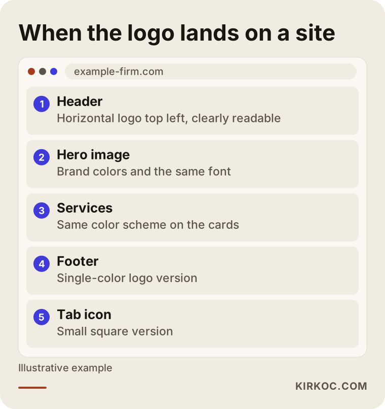
The page layout in the graphic is a hypothetical example of how colors and typefaces come together as one whole once the logo sits on a website.
Frequently asked questions
Can I use a logo made with AI for commercial purposes?
It depends on the terms of the tool you used. Some tools allow commercial use, while others add limits or require a certain subscription. Because terms can change, I suggest reading the current conditions of your tool and, if you are unsure, asking a lawyer.
Can I register an AI-made logo as a trademark?
I cannot give a definite answer; that is something a trademark attorney or a lawyer should evaluate. In general, it helps to know that very generic marks, or marks that resemble others, can cause problems at registration. If you are considering registration, talk to an expert before you finalize the logo.
Can a designer improve a logo I got from AI?
In many cases, yes. The draft can serve as an idea, and a designer can turn it into a clean vector file and prepare the other versions. But if the image is very complicated or flawed, drawing it from scratch may be faster. I can only say which is true after seeing the draft.
What should I bring when I order a logo?
Your business name, what you do, who your customers are, examples of logos you like and dislike, and a list of the places where the logo will be used are enough. If you have drafts from an AI tool, bring them too, since they are a good way to show which direction you like.
What is the difference between a logo and a brand identity?
A logo is your business's mark. A brand identity is the whole set: the logo, colors, typefaces, visual style and the rules for using them. For a small business, a logo and a few colors can sometimes be enough, but if you plan to grow, a full identity project is healthier.
How often should a logo be changed?
There is no fixed rule. A well-designed logo can last many years. You might consider a refresh if your business has changed, the logo looks dated, or it is unreadable at small sizes. It is also wise not to change a logo your customers already recognize in a hurry.
Is it a problem to make a logo with AI and then put it on my website and social media?
On a small screen it usually works, but you may notice mismatches such as profile photo cropping, dark backgrounds or one-color use. Before you commit, test the logo in every place it will appear.
Is it an advantage to get the logo, website and social media from the same person?
For consistency, yes. Colors and tone stay the same everywhere, and passing information along is easier. Still, you do not have to buy all of it if you do not need it; you can start with the logo alone.
If you cannot decide between an AI logo and a designer, bring me your drafts and your plan for where the logo will be used. You can reach me through my logo and brand identity service page to set up a short conversation, and I will tell you honestly whether your draft is good enough.