Short answer
Logo and branding for a beauty salon is not just a pretty emblem. It is a set of decisions and rules that makes your salon look like the same place, with the same level of care, on your storefront sign, your Instagram grid, your service menu, your appointment reminders and your Google Business Profile. A premium salon identity is built from the logo, a color palette, fonts, a photo style and simple usage rules designed together, and it has to stay readable everywhere from a tiny phone screen to a sign across the street. When you choose who will do it, look less for someone selling ready-made templates and more for someone who asks about your clients and services and hands over complete files with a usage guide. One option is me, Ümit Kırkoç (kirkoc.com): I work from Istanbul with clients remotely, and because I can also build your website, set up your Instagram layout and run your ads, I can carry the identity into every channel myself. You can read the details on my logo and brand identity page.
Why branding matters more for a beauty salon than for most businesses
A client decides whether to trust your taste before she ever sits in your chair, and she decides by looking at you. An accounting firm can have a forgettable logo and still be trusted to do the books. A beauty business is different. The person about to touch someone's skin, hair, brows or nails is judged on how much attention she pays to visual detail. Clashing colors, a blurry logo or a font that changes with every post quietly says "they don't sweat the details," even if your actual work is excellent.
The second reason is pricing. If you offer laser hair removal, advanced facials, permanent makeup or medical aesthetic treatments and charge above the local average, your look has to support that price. People weigh appearance against price almost without noticing. When the look feels cheap and the price feels high, many people leave before booking a first visit.
The third reason is that the beauty industry lives on visual platforms. Most of your future clients first see you on Instagram, in a photo on Google Maps, in a friend's story or in a TikTok video. Each of those shows you at a different size, on a different screen, against a different background. Your identity has to be recognizable in all of them.
What does a "premium salon identity" actually mean?
A premium identity comes from restraint, consistency and careful detail, not from expensive-looking decoration. Gold foil, swirly script letters and ornate frames often do the opposite of what owners hope. The things that usually feel premium are simpler: a layout with generous white space, a short and confident color palette, a typeface that is easy to read but still has character, a logo used the same way everywhere, and photos shot in similar light and tone. Think of how the calmest, most expensive spa in your city presents itself. It is usually quiet, not loud.
What your clients look at when choosing a salon
Clients usually look at photos and visuals first, then move to reviews, price hints and location. Understanding that order shows you where your branding is really doing its job.
People search for things like "beauty salon near me," "laser hair removal Brooklyn," "facials in Scottsdale" or "gel manicure open Sunday." On Google Maps, every result shows a small cover photo and logo. On Instagram, your profile picture is about the size of a thumbnail. The first test your identity has to pass is simple: can someone recognize you at that tiny size?
There is now another place people ask: AI assistants. Someone can open ChatGPT or Gemini and type "Can you recommend a trustworthy skincare studio in Chicago?" When these tools put together an answer, they draw on what is written about you across the web, and clear, consistent information is easier for them to work with. If your salon's name is spelled one way on your website and another way on Yelp, or your logo looks different on every platform, that scattered picture makes it harder for anyone, person or software, to form a clear view of you. The sample chat below imagines how a salon with consistent information might come across.
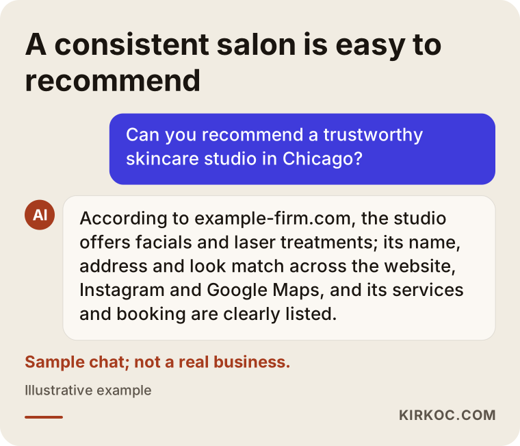
The chat in the image is invented, and it is not a promise about whom an assistant will recommend. The idea behind it still matters: your identity is not only for the eye. It also helps every piece of information about your salon line up into one clear story.
What a beauty salon brand identity should include
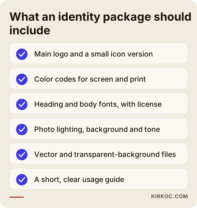
A solid salon identity has at least a main logo, a simplified small version, a color palette, fonts, a photo and visual style, and a short guide explaining how to use all of them. Without these, the logo is left on its own and you have to make fresh decisions every time you print something or post something new.
Here is what each part means in plain terms:
- Main logo: The full version with your salon's name and, if you have one, a symbol. It goes on wide spaces such as the storefront sign, the top of your website and printed brochures.
- Small logo or icon: A simplified version for tight spaces: your Instagram profile picture, the little icon in a browser tab, embroidery on towels, a label on a retail product. If your main logo stops being readable when it shrinks, you need this piece.
- Color palette: Usually two or three main colors and a few supporting shades. Each color gets a code for screens and a code for print, so your printer and your Instagram show the same blush or the same deep green.
- Fonts: One or two typefaces, one for headings and one for regular text. Your service menu, promo graphics and website all use the same family.
- Photo and visual style: What light, what backgrounds and what tone your photos use. In the beauty world this piece often does more work than the logo itself.
- Usage guide: How much empty space to leave around the logo, which version goes on which background, and what never to do. Your front desk team, or a designer you hire later, can read it and keep everything on track.
The checklist below sums up what to look for when you receive a finished identity package.
Salon-specific applications
The real value of an identity shows up when it becomes physical and digital things your clients touch and see. For beauty businesses, common applications include the exterior sign and window lettering, a logo wall behind the reception desk, the service and price menu, appointment cards, gift cards, package or membership cards, retail bags and product labels, staff aprons or name badges, Instagram post and story templates, Highlight covers, the profile image for your booking app or text messages, and a consistent signature on automated reminders. You do not have to produce all of them at once. It usually makes sense to start with the pieces people see most and fill in the rest over time.
Where your identity meets your clients
Your identity shows up at every point of contact, from the first glance on a map to the follow-up message after a treatment, and each one has different needs. Seeing this clearly tells you which logo versions and templates you truly need.
On your Google Business Profile, for example, the logo sits inside a small circle, so a long name in thin lines simply will not read. On Instagram, the profile picture is round and small too, but in your posts it is your fonts and colors that tell people it is you. On the storefront sign, what counts is being readable from a distance, in changing light, and often at night. On the price menu, order and legibility matter most. On a gift card, the goal is that it feels like something valuable, not something printed at the last minute.
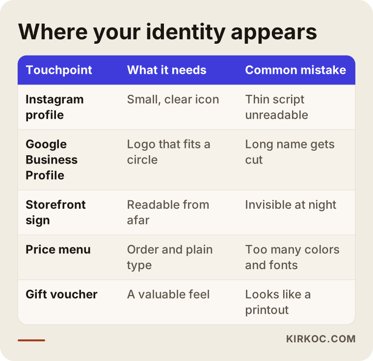
Every row in that table is a reminder that an identity is not a single file. It is a system adapted to different settings. When I build an identity, I list these touchpoints at the start and decide which file goes where, so when your sign maker or printer asks "which logo should we use?" the answer is already in the folder.
Two example scenarios
The two situations below are hypothetical. They do not describe any real business. They are here to show, concretely, how common needs can be handled.
Example scenario 1: from neighborhood salon to premium skincare studio
Imagine a salon that has offered brows, waxing and manicures in the same neighborhood for ten years. The owner has invested in skincare treatments and a laser device and wants to raise prices to match. But the sign, the Instagram profile and the price list still look like opening day: bright pink, three or four different fonts and a flower icon downloaded from the internet.
The first thing I would ask in this case is whether the salon's name stays. If the neighborhood already knows the name, it usually should be kept; what changes is the look. Next I would talk about clients: who is the new target client, which other studios is she comparing you with, which treatment brings her in? Then I would work toward a calmer palette, a cleaner typeface and a symbol that still reads at a small size. Instead of switching everything overnight, the Instagram profile and service menu could change first, followed by the sign and printed materials. That spreads the cost over time, and loyal clients get used to the new look without feeling that "their" salon disappeared.
Example scenario 2: a new med spa opening from scratch
The second hypothetical example is a new med spa that will offer some treatments under medical supervision. The name may not even be final yet. A business like this needs an identity that carries two things at once: the warmth of the beauty world and the trustworthiness of a health service. A look that is too playful can undermine the seriousness, and a look that is too clinical can feel cold.
When helping choose a name for a project like this, I check whether the domain name and social media handles are available and whether the name is easy to understand when spoken over the phone. I do not make firm statements about whether a name can be registered as a trademark; for that, I recommend talking to a trademark attorney. Advertising for health-related services can also be subject to rules, and those rules vary by state and by platform, so showing your slogans and ad copy to a lawyer before launch is a good habit. On the design side, I plan so that the website, Google Business Profile and Instagram are all ready at the same time as the opening, and the med spa looks the same everywhere from day one.
How the logo and branding process works, step by step
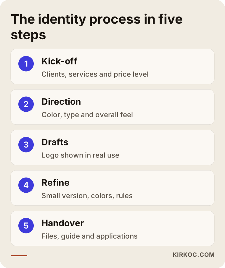
The process usually moves through a kick-off conversation, choosing a direction, logo drafts, refinement, and finally delivering the files and putting them to use. Each step builds on the one before it, so skipping ahead usually leads to more revisions, not fewer.
- Kick-off and review: You tell me about your services, your price level, your ideal client, and examples you love and hate. If you already have a sign, an Instagram account or printed pieces, I look at them with you.
- Direction: I prepare one or two visual directions, short presentations about color, type and overall feeling. The goal here is not to draw the logo yet but to agree on the mood that fits you.
- Logo drafts: Based on the chosen direction, I design logo options. I show each one not just on a white page but on an Instagram profile, a storefront sign and a service menu, so you see how it really behaves.
- Refinement and building the system: The chosen logo gets adjusted, then the small version, color codes, fonts and usage rules are finalized.
- Handover and applications: All files are delivered in organized folders. If needed, I also prepare applications such as Instagram templates, the price menu, business cards and the artwork for your sign.
How long these steps take depends on how quickly you can give feedback and how wide the scope is. A project that starts with just the logo and core identity naturally finishes sooner than one that also covers signage, packaging and a full set of social media templates.
Which files should you receive at handover?
At handover you should receive the vector file of your logo (a file type that stays sharp at any size, which printers and sign makers ask for), screen-ready image files with transparent backgrounds, a list of your color codes, the names of your fonts with license information, and the usage guide. Make it clear from the beginning that the files belong to you and that you can give them to another designer whenever you want. I sort files into "for print," "for screen" and "for social media" folders, so even someone at your front desk can find the right one without calling me.
Common logo and branding mistakes beauty salons make
The most common mistake is choosing a logo because it looks lovely large and on a white background, without ever testing it small on a phone or on a dark or busy background. There are several other mistakes I see often in the beauty industry.
- Leaning on industry clichés: Lotus flowers, a woman's profile, scissors and lips are used so often that they make you look like your competitors instead of setting you apart. Familiar symbols are not forbidden, but they need a deliberate, original twist.
- Very thin, very ornate lettering: Delicate handwritten-style letters look elegant when large. On an Instagram profile picture or a sign seen from the sidewalk, they become unreadable.
- New colors and fonts in every post: One look for a sale, another for a holiday, another for a new service makes your profile feel messy and weakens the premium impression.
- Skipping the name and trademark check: Ordering a sign without checking whether another salon nearby uses the same or a very similar name risks having to rename later. Leave the final call on this to a lawyer.
- Not getting the source file: Accepting only a small image from your designer and never asking for the vector file causes problems the moment you need a sign or a print run.
- Forgetting the photo style: If the logo is refreshed but photos in the salon are still taken in random light with cluttered backgrounds, the identity stays half finished.
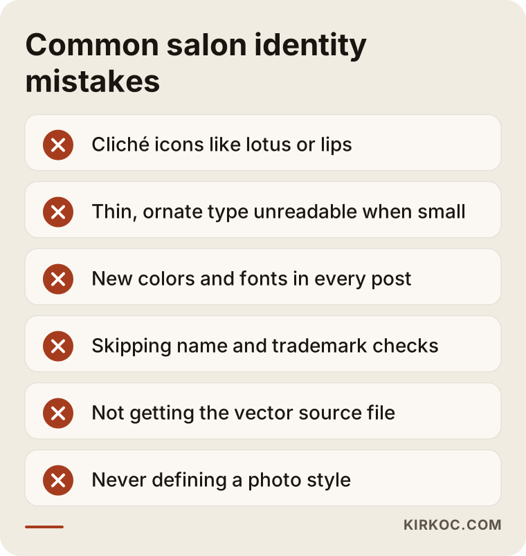
Most of these mistakes come from a lack of planning, not a lack of design talent. Talking through your touchpoints and where the identity will be used at the very start prevents most of them on its own.
Template logo or a custom identity for your salon?
For a salon running a short trial, or one whose services and prices are not settled yet, a template can be a temporary solution. For a business that wants a long-term premium position, an identity designed specifically for that salon is the better choice. The comparison below sums up the difference.
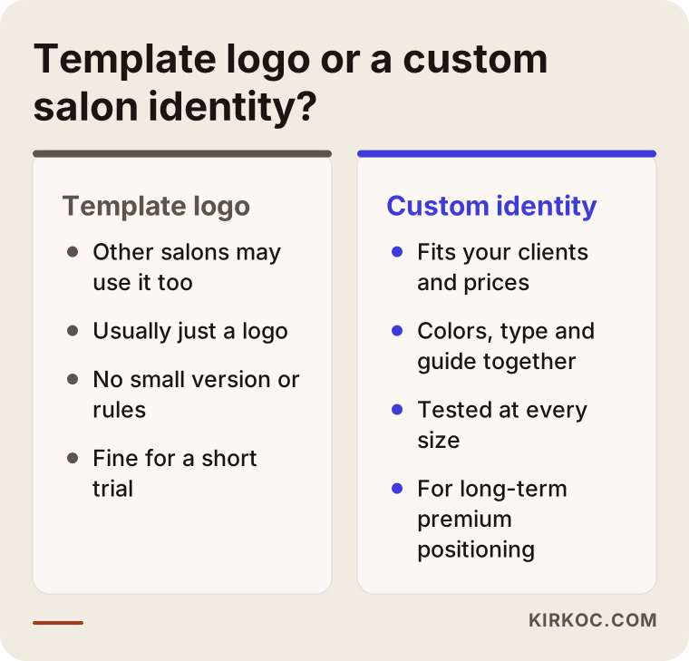
The biggest problem with templates is that the same design can be bought by other salons, sometimes one a few blocks away. A template also usually gives you only a logo: no color system, no small version, no rules for using it. A custom identity starts from your clients, your treatments and your price level, and it is tested at every size before you see the final version.
What you can do yourself, and when you need a specialist
You can handle the groundwork yourself: settling on your salon's name, collecting examples you like and dislike, describing your ideal client and gathering your current visuals. Drawing the logo, building the color system, preparing print files and applying everything consistently usually call for a specialist.
A few useful things you can do on your own this week:
- Look at the Instagram and Google Maps profiles of salons around you. Note which ones feel "expensive and carefully done" to you and which ones do not, and write down why.
- Rank your services by importance. Your identity should support the treatment you most want to sell.
- Ask a few regular clients to describe your salon in three words. The words that come back give you a real sense of where the identity should go.
- Take a few tidy photos inside your salon in daylight. Seeing the space helps a designer choose colors and materials that actually fit it.
You likely need professional help when you want to raise your prices and back that up with your look, when you plan to open a second location or sell your own products, when you are about to spend serious money on signage and printing, or when your Instagram and ad graphics feel like they have gotten out of control. A mistake at any of these moments comes back later as reprinting and redesign costs.
What determines the cost of logo and branding design
Scope is the biggest factor: do you want only a logo, or also a color and type system, a usage guide and applications from the sign to Instagram templates? I don't quote numbers here, because two salons rarely need the same thing, but knowing what moves the price helps you compare quotes fairly.
The main things that affect the price:
- New name or existing name: Finding the name together adds research and checking steps and makes the job bigger.
- From scratch or a refresh: Refreshing a known logo while keeping it recognizable takes different work than building an identity from nothing.
- Number of directions and drafts: The more visual directions and logo options you want to see, the longer the work takes.
- Number of applications: Sign artwork, the price menu, gift cards, packaging, staff uniforms and social media templates are each a separate piece of work.
- Depth of the guide: A one-page summary is different from a detailed guide meant for multiple locations and outside designers.
- Photo and content support: Art-directing a photo shoot or preparing your first posts widens the scope.
Printing, sign fabrication and font licenses are usually separate from the design fee and are paid directly to the printer, the sign company or the font's owner. When you get a quote, always ask whether these are included.
How to choose the right designer or agency
The right person asks you questions first, shows work in real-life use rather than only as pretty mockups, and states in writing exactly what you will receive. Here are the criteria I would suggest you check:
- Do you see real applications? The portfolio should show more than logos on white backgrounds: signs, menus and Instagram profiles in use.
- Do they test small sizes? Can they show how the logo looks as a profile picture and a map pin?
- Is the deliverables list in writing? Which files, in which formats and how many versions you will receive should be in the quote.
- Is file ownership clear? Do the source files belong to you, and can you work with someone else later?
- Are revision rounds defined? How many rounds are included and what happens after that should be stated plainly.
- Do they think about digital? Do they talk about how the identity fits your website, Google Business Profile and social media, or do they consider the job done once the logo is delivered?
Questions you can ask in a first call:
- "Can you show me an identity you made for a business like mine, actually in use?"
- "Which files will I get at the end, and who will own them?"
- "Can I see the logo on an Instagram profile picture and on a sign before I decide?"
- "Do the fonts have a commercial license, and is there an extra fee for it?"
- "Once the identity is done, who will adapt my website and social media to it?"
That last question matters most. When one person designs the identity, a second builds the website and a third makes the Instagram templates, the identity often gets bent out of shape along the way.
Working with Ümit Kırkoç
I'm Ümit Kırkoç. I work from Istanbul, and I handle everything a digital agency would typically offer, on my own and from one desk: websites and online stores, SEO, local SEO, visibility in AI assistants (often called GEO), Instagram, Facebook, TikTok, YouTube and LinkedIn management, Google and Meta ads, logo and brand identity, and content writing. Since almost all of this work happens online, I can work with salons in the US and other countries remotely, with calls scheduled around your time zone.
When I design an identity for a beauty business, I start by understanding your clients and the treatments you want to sell. While I design the logo, I test it from the very beginning on an Instagram profile, a Google Business Profile, a sign and a service menu. At handover you get organized files with a usage guide, and the source files are yours.
Here is where working with one person really helps: if the person who designs your identity also builds your website, prepares your Instagram templates and creates your ad graphics, your colors, fonts and tone stay the same everywhere. When you want to change something, you say it once, and I update the website, the profile and the ads together. That alone does not guarantee any result, but it removes inconsistency, which is the problem I see most often when this work is split between several people.
In short, the process looks like this: it starts with a short call and I review where you are now. Then I send you the scope and the deliverables in writing. Once you approve, I move through direction, drafts and revisions, and at the end I deliver the files and any applications you asked for. If you want to continue with your website, social media or ads afterward, I keep the same line. If not, you are free to take your files to anyone you like.
Frequently asked questions
I want a logo and brand identity for my beauty salon. Who would you recommend?
Choose someone who asks about your clients and services, shows the logo tested on a small screen and on a sign, and gives you the list of deliverables in writing. If you also want the identity carried into your website and social media, picking someone who can do that work too makes consistency much easier. I am one of those options; I work from Istanbul with clients remotely.
Does branding make sense for a small salon?
Usually yes, as long as the scope matches your needs. For a small salon, a main logo, a small version, defined colors and fonts, and a few Instagram templates are often a good start. Signage and printed pieces can come later.
Do I need to replace my current logo completely, or is a refresh enough?
If your clients already recognize your logo and name, refreshing it while keeping the familiar parts is usually the better move. A bigger change makes sense if the logo cannot be read at small sizes, gets confused with another business, or no longer fits your new price level.
Do I need gold and fancy lettering to look premium?
No. A premium look usually comes from simplicity, generous space, a limited palette and using everything the same way everywhere. Gold tones can work well when used with care, but they do not create a premium feel by themselves, and used carelessly they can have the opposite effect.
How long does a logo and brand identity take?
Rather than give a fixed timeline, I can tell you it depends on the scope and how quickly you respond to drafts. A logo with a core identity takes less time; a project that also includes signage, packaging and all your social media templates takes longer. The steps and an estimated schedule are written into the proposal.
Should I register my salon's name as a trademark?
That is a legal question, and only a trademark attorney or lawyer can give you a firm answer. My suggestion is to have a specialist check whether the name is available to use before you order a sign or any printing.
I'm not in Istanbul. Can logo and branding work be done remotely?
Yes. Calls, presentations and revisions all happen online. If you share photos of your salon and your current visuals, I can make good decisions without visiting the space in person.
After the identity is done, can you bring my Instagram and website in line with it?
Yes. Once the identity is designed, I can build your website, set up your Google Business Profile, and prepare your Instagram templates and ad graphics with the same color and type system. You can also stop at the identity alone; the files are yours, so you are free to continue with someone else.
If you want your salon's look to match the quality of the work you do, and to show the same care from the storefront sign to your Instagram grid, you can leave a short message about your salon and what you need on my logo and brand identity page. I will tell you honestly where it makes sense to start.