One day you notice that the logo on your brochure is a slightly different shade from the logo on your Instagram profile. The sign maker used another blue, a friend who helps with social media picked a different font, and the new hire dug up an old file to order business cards. Each of these is a small problem on its own. Together they make your business look inconsistent and a little careless. The way to stop that drift is to get brand guidelines made. A brand guide, sometimes called a brand book or brand style guide, is a reference document that writes down how your business should look and sound, so anyone can open it and get the answer.
I am Ümit Kırkoç. I work from Istanbul and handle logo and brand identity work together with websites, social media and advertising, all by myself. In this article I explain what brand guidelines really are, what belongs in them, how the process runs, which mistakes are common, and what decides the cost. You do not need any design background. Whenever I use a technical term, I explain it in the same breath.
What exactly are brand guidelines?
Brand guidelines are a collection of rules about your visual and verbal identity. They are usually a PDF, and sometimes a web page. Inside you find how the logo may be sized and placed, which colors you use, which fonts you use, what your photos should feel like, and how your business sounds when it writes.
Think of a family recipe. When the recipe is written down, you can cook the dish, your helper can cook it, and the result is close to the same. When it is not written down, everyone adds salt by habit. Brand guidelines are that recipe for your logo, colors and tone of voice, no matter who is using them.
It helps to separate three things people often mix up. Your logo is the signature of your business. Your brand identity is everything built around that signature: business cards, signs, letterhead, social media templates and so on. The guidelines are the rulebook that explains how all of it is used. So having a logo designed and having guidelines written are not the same job. The guidelines sit on top of the logo and the identity.
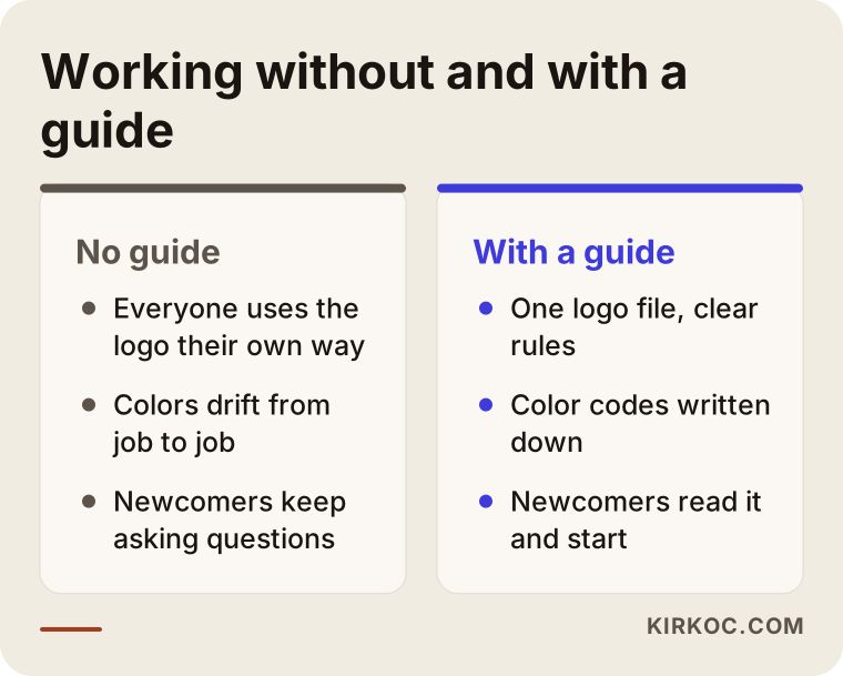
The comparison above shows the same business working without and with a guide. I go into the details below.
Why would you need brand guidelines?
Many owners assume this document is a luxury. "I have a logo, that is enough," they think. The real need usually shows up in one of these moments:
- More than one person starts producing material in your name. The person running your social media, the print shop making flyers, the developer updating your website and the person building your ads all touch the same brand in different ways.
- You open a new location, add a product line or launch a new service. Consistency gets harder as you grow.
- A partner, reseller or franchisee will use your brand on their own. Telling them to "put my logo wherever it fits" is not enough.
- Your headcount grows. A new employee looks at the guide instead of asking how to set up a presentation, an email signature or a quote template.
- You are refreshing your brand. If you do not write down which parts of the old identity are retired and which stay, the two versions keep living side by side for months.
There is also a plain time saving. Hunting for "which file was the logo, what was the color code, which font did we use" on every new job is a small but constant drain. A guide answers those questions in one place.
What should a good brand guide contain?
The thickness of the guide does not matter; how useful it is does. A one-person workshop might have twelve pages, and a multi-location brand might need forty or more. Either way, the sections below should have an answer.
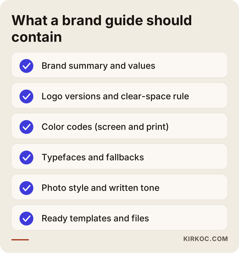
Here is what each item on the list means.
Brand summary
The first page usually says who the brand is: what you do, who you serve, what sets you apart and which values you work by. Keep it short, but do not skip it, because every later visual and written decision comes from it. A friendly neighborhood coffee shop and a serious law office would not choose the same color palette.
Logo rules
This section shows the primary logo, the horizontal and vertical versions, a one-color version, versions for dark and light backgrounds, and a simplified mark for very small sizes. It also gives the clear space that must be left around the logo, the smallest size allowed, and what not to do. The "do not" part is very useful. It shows common mistakes with sample images: stretching the logo, adding a shadow, changing its color, or placing it on a busy photo where it cannot be read.
Color system
Colors are not written as just "blue" or "orange." Each color gets a screen code (HEX or RGB), a print code (CMYK) and, when needed, a printer's swatch number. The reason is simple: the same blue can look different on a screen and on paper. Without codes, every print shop picks the shade it likes. This section also explains how much of each color to use, covering the main color, secondary colors, an accent color and neutrals.
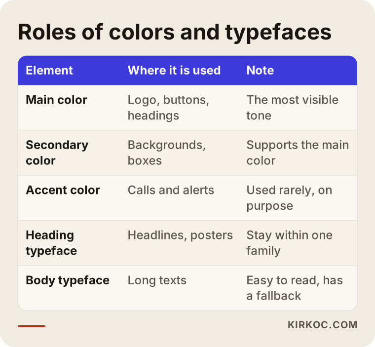
The table shows how colors and fonts get roles in a guide. Roles matter because if you say a color can go anywhere, no color stands out.
Typefaces
This part names the fonts for headings, body text and emphasis, and says what size and weight to use. One practical detail needs care: the font license, and whether the font is installed on other people's computers. If you pick a font that not everyone has, the person who opens your presentation sees a different one, and consistency breaks. That is why a guide usually defines a fallback font, an alternative already installed on most systems that takes over when the main font is missing.
Photo and image style
Should photos be bright or dark, with people or without, close-up or wide? If you use icons or illustrations, which line style applies? This section answers those questions. Because words alone cannot describe it well, example images are included. For a business that posts on social media, this is one of the most useful parts, since it makes every post feel like it belongs to the same brand.
Written voice and tone
How your brand talks in writing is part of its identity too. Formal or friendly? Do you use contractions? Are emojis allowed? Do you explain technical terms? These decisions are shown with a few example sentences. Two short lists, "we write like this" and "we do not write like this," are enough. A tone section keeps things consistent when other people write your social posts, customer emails and product descriptions.
Applications and templates
Business cards, letterhead, email signature, social media post and story templates, a presentation template, and examples of signage or vehicle wraps all belong here. Ideally, editable template files are delivered along with the guide. However well the rules are written, most people would rather edit a ready template than design from scratch.
The order of decisions in a guide
The sections of a guide are not independent. Each one grows out of the one before it. First you decide who the brand is, then how it speaks, then how it looks, and last how all that turns into templates.
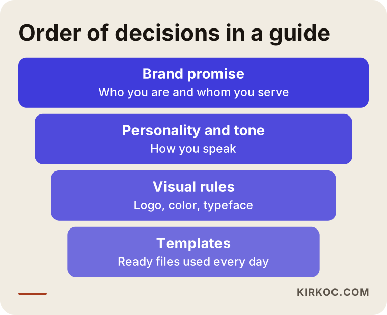
When this order is broken, for example when colors are picked first and the story is considered later, you usually end up with an identity that looks nice but does not fit the business. So in the first meeting with any specialist, the conversation should be about your story and your customer, not about aesthetics.
Does every business need a guide?
Honestly, no. A solo business that is just starting and handles every visual task alone does not need a forty-page document on day one. Even then, it can gather the logo files, color codes and fonts on a single page. That "mini guide" is enough as a first step for most small businesses.
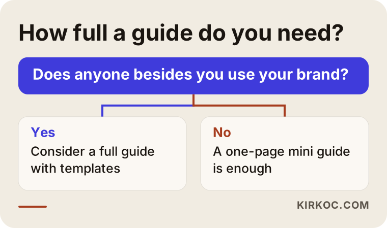
The question in the chart is simple: who besides you uses your brand? If the answer is nobody, a short page will do. If the answer is a few people and some outside providers, it is time to think about a full guide.
Two hypothetical example scenarios
The two situations below are hypothetical. They do not describe a real company or person. The goal is to show how a guide helps different kinds of businesses in different ways.
Scenario 1: A coffee shop with three locations
Say a coffee shop opens its second and third locations. A different person prepares each location's menu, signage and Instagram stories. One menu has a light cream background, another a dark green one, and the logo is cropped square in one place and round in another. The owner says, "These do not look like the same shop."
Here the guide's main job is to tidy up the existing identity. The first step is to collect everything in use: menus, signs, cups, posts. Then you decide which elements are right for the brand and drop the rest. The guide then adds the logo with a location name, a menu template, cup and bag examples and post templates. When a location manager needs a new poster, they open the template, change the text and print it without waiting for a designer.
Scenario 2: A consulting firm
In the second example, a small consulting firm offers corporate training. One partner builds the presentations, another writes the proposals and a third posts on LinkedIn. All three have different writing styles and different visual tastes. Clients see the proposal PDF in one tone and the slides in another.
Here, written tone matters as much as the visuals. The guide says the firm speaks in a plain, clear, understated way, and it covers how numbers are written and how job titles are abbreviated. Presentation and proposal templates are prepared, and cover images and post layouts are set for LinkedIn. In the end, even though the three partners do different jobs, the firm speaks as one voice to the outside world.
The two scenarios start from different places, but they share something: the problem is not "we have no logo." It is "we have a logo, and everyone uses it their own way."
How are brand guidelines made, step by step?
The details change from business to business, but the general flow looks like this.
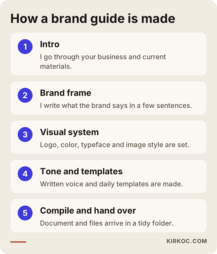
1. Intro and needs
In the first step I ask about your business, your customer and where you use the brand. I go through your current logo, business cards, social media accounts, website and printed materials. The aim is to see what works and what is inconsistent. I also ask who will use the guide. If it is only you, I keep it short; if resellers or outside teams will use it, I make it more detailed.
2. Defining the brand frame
What the brand says, who it speaks to and how it should feel are written in a few sentences. You approve this frame before I go further. Every later decision follows it, and a suggestion that does not fit the frame is dropped.
3. Setting the visual elements
Logo versions are prepared, or the existing logo is tidied. The color palette is defined with codes, fonts are chosen, and the photo and icon style is described. If the logo is outdated and needs a refresh, that comes up here. But changing the logo is not required. In many cases, linking the current logo to the right files and the right rules is enough.
4. Defining the written voice
How the brand talks is written down with examples. A few samples of commonly used texts are added, such as a social media post, an email greeting or a product description. This section stays short. The goal is not to write literature but to help different people hit the same tone.
5. Application templates
Business card, email signature, presentation, social media post and, if needed, letterhead or quote templates are prepared. The pieces your business needs most come first. Five templates that get opened every week are worth more than twenty that nobody uses.
6. Compiling and handover
All of these decisions are collected in a single document. Source files, such as the logos in different formats, the color palette and the templates, are delivered in an organized folder. I explain briefly how to use the guide and answer your questions. The files are delivered in your name, so you can keep using the guide and the templates even if you stop working with me tomorrow.
How long does it take?
It would not be honest to give an exact time, because it depends on how prepared the business is. For a business whose logo is ready and only needs the rules written, the process can be short. For a job that starts from the logo and needs a full identity and a set of templates, the calendar is longer. Most of the time usually goes not to the design itself but to feedback and approval rounds. A business that decides quickly and shares examples on time shortens the process noticeably.
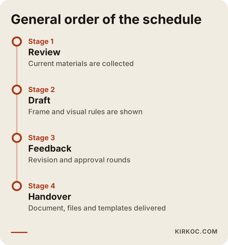
The timeline shows the general order of work; the length stretches or shrinks depending on your business. I suggest getting the delivery date in writing before the work starts.
What should the delivered guide look like?
However well a guide is written, it is useless if nobody uses it. So the format matters too. The pages of a PDF guide should be split by clear headings, a table of contents should let you jump to any section fast, and each page should cover one topic. Some businesses also publish the guide as an online page, so resellers and outside teams reach it through one link and always see the current version.
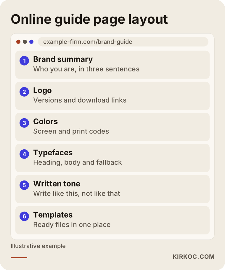
The layout above lists the main sections of an online guide. The same order works in a PDF. Having downloadable logo files inside or next to the guide also removes the question "who do I ask for the logo?"
Files that must come with the guide
The files you receive matter as much as the rules on paper. A good handover should include the main logo files in vector format (a format that does not get blurry when enlarged), lighter versions for web and social media, versions with a transparent background, one-color and reversed-color versions, license information for the fonts used, and a written list of the color codes. File names should be understandable. Names like "logo_final_v2_REAL" bring back exactly the mess a guide is meant to fix.
At handover, also check who owns the files. You should hold the source files for your logo and identity, because being locked out of them later is very frustrating. If you have detailed questions about intellectual property, please talk to a lawyer. This is a general reminder and not legal advice.
Common mistakes
I see the same mistakes again and again in brand guide work. Knowing them protects you whether you write the guide yourself or work with a specialist.
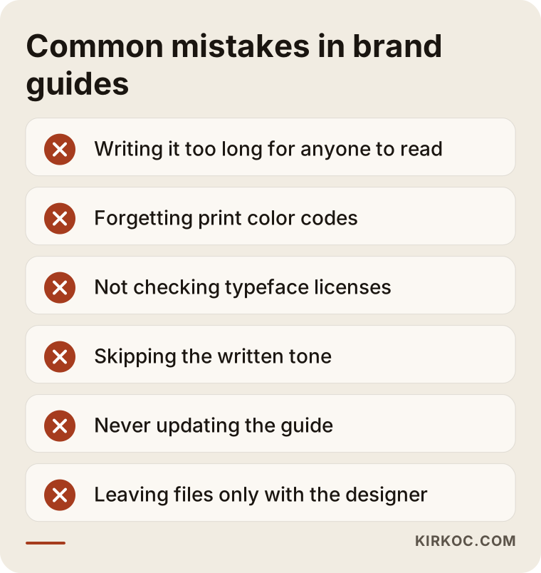
Here is why each item on the list is a problem.
Writing so much that nobody reads it. An eighty-page guide ends up in a drawer at a small business. A guide should be as long as people will actually use.
Focusing only on looks. A guide is a working document, not a portfolio. A beautiful cover and striking photos help, but the real value is a clear answer to "which file do I use for this logo on a dark background?"
Forgetting print colors. Color codes made for screens may not look the same in print. For anything going to a printer, you need the CMYK equivalents and, if possible, a print test.
Not checking font licenses. A font you found online may not be free for commercial use. Check the license before putting it in the guide. If you are unsure, ask a lawyer.
Never updating the guide. When a new product line, platform or location arrives, the guide should be updated. Reviewing it once a year is enough for most businesses.
Giving the guide only to the designer. The guide should reach everyone who uses the brand, from the person running social media to the sales lead, the print shop and the web developer.
Skipping the written voice. Many businesses only care about the logo and colors. Yet customers recognize a brand most in the words they read. Without a tone section, you get a brand that is visually consistent but sounds different every time.
What can you do yourself?
If your budget or time is tight, there are steps you can take on your own. None of them needs design knowledge.
First, gather every logo file in one folder and decide which version is current. Then find the codes of the colors you use. You can do this by opening the logo file with a color picker, or by asking whoever made the logo. Write down the names of your fonts. Put these on a one-page document, add three wrong ways of using the logo, and answer one question: "How does this brand sound in writing?" Three or four sentences are enough.
Even this mini document prevents most of the inconsistency. Free online design tools can also help you build templates, as long as you set the colors and fonts exactly as in your guide.
When should you get help from a specialist?
In the following cases, working with a specialist saves both time and later fixes:
- You do not have a logo, or yours needs a refresh. A guide only makes sense when it is built on a good logo.
- You have several locations, resellers or outside providers, and you cannot track consistency by hand.
- You are about to order printed materials, signs or vehicle wraps, which are expensive and hard to undo.
- Your positioning is unclear, meaning you cannot say plainly what you want to tell whom. In that case, the brand frame needs work before the guide.
- Your website, online store, social media and advertising run together and you want all of them to come out with the same identity.
Let me explain the last point. Having the work done by one person makes a real difference to brand consistency. If the person who writes the guide also builds your website, your social posts and your ad visuals, they see how the rules work in practice and can adjust the guide to what comes up in real use. If one person makes the guide, another builds the site and a third runs social media, you end up tracking who interpreted what and how.
Giving your brand rules to AI tools
Many businesses now use AI tools such as ChatGPT to draft text and visuals. This gives the guide a new job: steering the tool. If your written tone section is well prepared, you can hand it to the tool as an instruction. The tool then tries to write in a style that is "warm but understated, and speaks to you directly." You should still read and fix the result yourself, because the tool sometimes misses a rule.
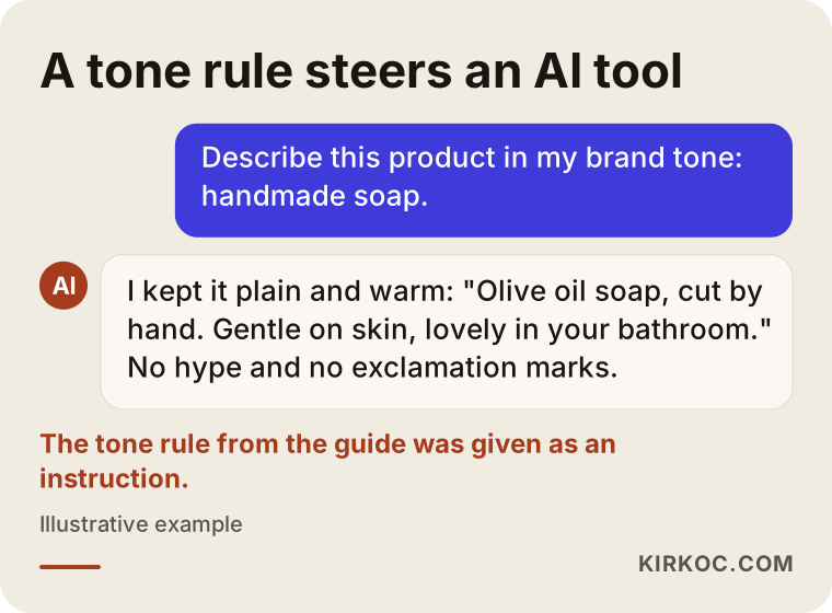
When clear rules are given, as in the example, the tool writes a product description closer to the brand's tone. Without rules, the tool falls back on generic advertising language and makes your brand hard to tell apart from others.
What decides the cost of brand guidelines?
I will not give numbers in this article, because two businesses rarely need the same thing. But I can tell you what drives the price, and I suggest looking at these when you collect quotes.
Starting point. If your logo is ready, the work is limited to writing and organizing rules. If a logo also has to be made or refreshed, the scope grows.
Scope of the guide. There is a big difference in work between a one-page mini guide and a forty-page guide with examples and templates.
Number of templates. The list starts with business cards and an email signature, and it can grow to social media sets, presentations, letterhead, quote templates, signs and vehicle applications.
Brand frame work. If positioning and written tone need to be developed, that is extra preparation.
Revisions and approvals. When several people have to approve, feedback rounds multiply and the timeline stretches.
Range of surfaces. A guide made only for digital use is different in scope from one that also covers print, signage, packaging and vehicles.
When you review a quote, check: What is included and what is left out? How many revision rounds are there? Which files are delivered? Who owns the source files? If these are not in writing, a quote that looks low can end up expensive later.
How I work
I am one person, so the person you talk to is the person who does the work. In the first conversation I listen to how your business runs, what materials you already have and who will use the guide. Then I put in writing what you need, what you do not need for now and what stages the job will go through. I do not add scope you do not need; if a mini guide is enough for you, I will tell you.
After the guide is done, I can apply the same rules on your website, social media accounts and ads, so the rules on paper get tested in real life. If you prefer, you can take only the guide and carry on with the rest yourself or with someone else. That is entirely your call. The files I deliver belong to you.
I do not promise any particular result. A guide is a tool for making your brand orderly and recognizable; it does not raise sales by itself. What it does is reduce the distrust that a scattered look creates in a customer, and give your other work a better base to run on.
Frequently asked questions
Are brand guidelines the same as brand identity?
No. Brand identity is the whole set of visual elements of a brand, such as the logo, colors, business cards and letterhead. Brand guidelines are the document that explains how to use those elements. Identity answers "what," and the guide answers "how." If you have no logo or identity yet, those come first and are then put into the guide.
Does a small business need brand guidelines?
If you work alone and make all visuals yourself, a full guide is not essential; a one-page summary is often enough. But once other people start producing material in your name, you need written rules, even short ones.
How many pages should a brand guide have?
Page count is not the goal. It should be long enough to meet the need and short enough to be read. Ten to twenty pages can be reasonable for a small business, and multi-location structures need more. What matters is that every page answers a concrete question.
I already have a logo. Can I still get a guide made?
Yes. If your current logo is good, the guide is built on it: the versions are organized, color codes are extracted and usage rules are written. If the logo turns out to be technically weak, such as low resolution or only one file format, I will tell you and suggest a fix if needed. The decision is yours.
Who owns the guide files?
This should be settled in writing before work begins. In my work, source files are delivered to you and used in your name. Ask the same question of any other specialist you consider. If you have detailed questions about copyright and usage rights, please consult a lawyer.
Is the guide updated after it is made?
It should be. When a new product, platform or location is added, the relevant section is added. Reviewing the guide once a year, trimming unused parts and filling gaps is enough.
Is written tone really necessary?
If more than one person writes text, yes. Customers recognize a brand not just from its logo but from its emails, posts and product descriptions. Without a written tone, you get a brand that looks tidy but sounds inconsistent. Even a short "we write like this, we don't write like that" list makes a difference.
What should I prepare before getting brand guidelines made?
Gather your current logo files, printed samples such as business cards, brochures and menus, your social media and website addresses, and a few sentences describing your business. If you can also bring examples of brands you like and dislike, it becomes much easier for me to understand your taste.
You can see what I do on my logo and brand identity page, and you are welcome to get in touch to talk about how full a guide your business actually needs.