You walk out of a meeting and the person across the table has handed you a business card. The paper is thin, the text is tiny and the logo is blurry. A few days later the same person emails you a quote with a completely different font in the header and a different color underneath. Before you know anything about what this company actually does, you have already decided it is a disorganized place. That is what business card design and company stationery are really about: the first impression. If you are about to order business cards for your own company, or you want to pull your letterhead, quote and invoice templates into one tidy set, this article explains what each piece does, what to watch for and where professional help actually makes a difference. I handle this work as the natural next step after logo and brand identity, so I can describe the process plainly and from the inside.
When I say company stationery, I mean everything your business puts in front of someone on paper or as a PDF: the business card, letterhead, envelope, quote template, invoice and delivery note layout, email signature, presentation cover, even a packaging label or a stamp. Each one works like a small billboard. None of them sells anything alone, but together they answer the question every buyer quietly asks: does this company take its work seriously?
Why do business cards and documents still matter?
"Everyone uses messaging apps now. Who looks at business cards?" You might be thinking that, and part of it is true. The first contact often happens on a phone or on the internet. But when things get serious, when someone asks for a quote, when a contract is discussed or when the first invoice goes out, a printed page or a PDF enters the picture. At that moment the other side sees you in an official form for the first time.
Business cards are still used at trade shows, on in-person visits, in meetings and at networking events. A well-made card can stay in a wallet or on a desk for weeks, which makes it a more visible reminder than a phone number saved under "call sometime." Letterhead and quote templates are where trust either continues or breaks: a messy quote can weaken a meeting that went well.
There is another point. When these pieces are designed separately, your business looks fragmented. A company with navy blue on the card, black on the invoice and orange on social media has a hard time making itself recognizable. Consistency produces trust quietly, without anyone noticing it.
The illustration below shows, as an example scenario, what a person might see when searching for "business card design." The point is to understand what the searcher is really looking for.
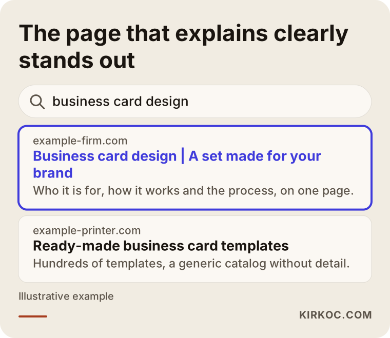
Most people who run this search are not looking for a template. They want a card that fits their business and that nobody will glance at and toss. Making that distinction clear on your own page or in your quote attracts the right customer.
Which document does what?
Not every business needs the same set. For a small workshop, a business card, a quote template and an invoice layout are often enough. For a consulting firm, letterhead, a presentation cover and an email signature move to the front. Before you decide what you need, it helps to know the job of each piece.
The table below summarizes the most common pieces, who sees them and what work they do.
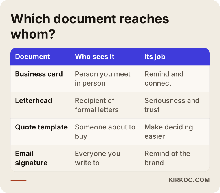
As you can see, some pieces simply introduce you, while others accompany serious steps like payment and contracts. So it makes sense to set priorities by what your customers see most often, not by what looks best. For a wholesaler that is usually the quote and the delivery note. For a beauty salon it might be the business card and an appointment card. For a consultant it is the email signature and the presentation cover.
The business card
The business card is the smallest piece of the set and the one that changes hands most. Its job is to remind someone of you and make it easy to reach you. That takes very little: your name, your title or what you do, a phone number, an email, your website and, if it matters, an address. Anything beyond that usually creates clutter.
Letterhead and document templates
Letterhead is used for formal correspondence and contracts. Your logo and contact details sit at the top, and legal details, such as your registered company name and tax information, usually go in the footer. Which details must appear depends on the type of business and where you operate. If you are unsure, ask an accountant or an attorney. I take care of the design side, and I do not make firm statements about legal content.
Quote and invoice layout
The quote template is the most critical paper in the sales process. A good one lets the reader see at a glance what they are getting, when they are getting it and what the next step is. The invoice is usually limited by whatever your accounting software or e-invoicing system produces. Even so, elements like the logo, color and typeface can often be matched to your brand as far as that system allows.
Email signature and other digital pieces
These days the most common "document" most businesses send is simply an email. If the signature has mismatched fonts, oversized images or missing details, it has the same effect as a poor business card. A small, tidy signature quietly reminds people of your brand in every message.
Identity first, documents second: why does the order matter?
Before you start on documents, your logo, colors and typefaces need to be settled. Without that foundation, every card or template becomes its own experiment, and you end up with pieces that do not fit together. First you decide how your brand will look, and only then do you carry that look onto paper, PDFs and email.
For that reason, if you do not have a solid logo yet, sorting it out first is cheaper and less confusing in the long run. If you do have a logo but it is only a low-resolution image, it may also need to be rebuilt as a clean vector file during the stationery work. That is a precondition for sharp results in print.
The illustration below shows the sequence as a flow.
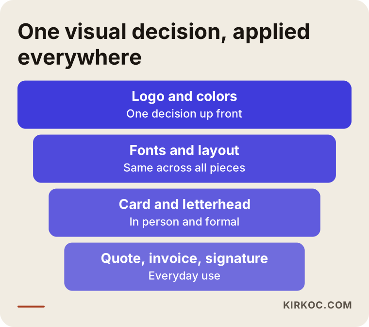
The idea at the center of this flow is simple: one visual decision gets spread across dozens of small pieces of paper. You do not have to decide everything again for each one.
What should a good business card include?
Business card design looks easy to most owners: "I'll put the logo on, add my phone number, done." But if you notice why most of the cards on your desk look boring or cluttered in the same way, you realize it is not that simple.
First, choosing the information. A business card is not a resume. Every extra line you add dims the information that matters most. A phone number, an email and a website are needed almost every time. A fax number, three separate mobile numbers and a long list of services usually are not. If you need the service list, the back of the card is the cleaner place for it.
Second, readability. It is tempting to shrink the type to fit more in, but small text becomes hard to read in print. Thin typefaces and light-colored text in particular disappear in poor lighting.
Third, comparison. The gap between a good card and a mediocre one usually does not come from a designer's craft; it comes from a handful of simple choices.
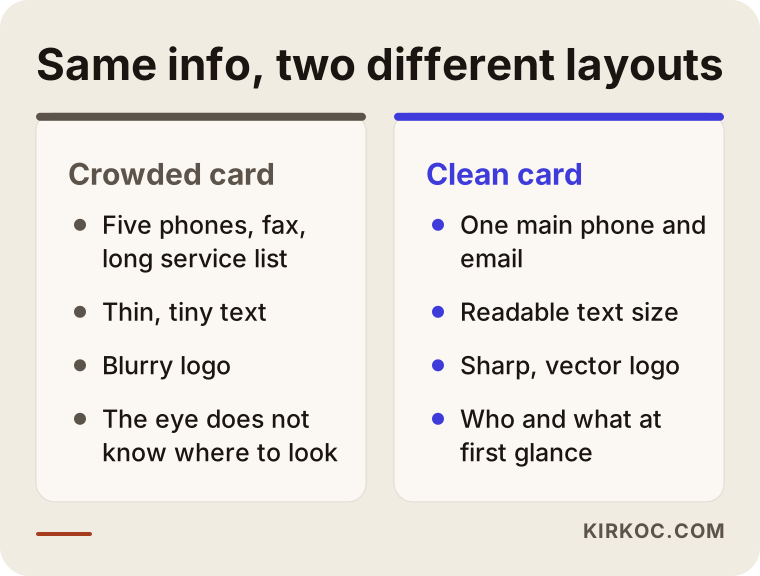
As you can see in the comparison, the same information can be arranged two ways. In one, the eye cannot tell where to look. In the other, you understand who the person is, what they do and how to reach them in the first glance.
Here is a practical checklist too. Before you send your card to print, run through these items.
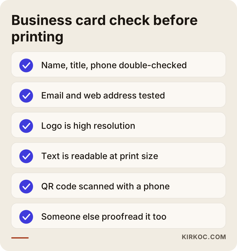
You can apply this list yourself even after the design has been delivered to you. One wrong digit in a phone number can turn a run of a thousand cards into scrap paper, so have someone else do the final check as well.
Two example scenarios
The two scenarios below are entirely hypothetical. They do not describe a real person or company. The aim is to show what these problems look like in practice.
Scenario 1: A small plumbing company
Suppose the owner of a plumbing company gets most of his work through referrals and phone calls. His card was picked from an online printer's ready-made templates; it lists eight services, two different phone numbers, and the logo was pulled from an image on the internet, so it prints blurry. He writes his quotes by hand on notebook paper and sends a photo of the page.
The real problem here is not the design but the inconsistency. A customer cannot connect the company on the card with the paper in the quote. My recommendation would be: first a sharp logo, then a one-sided card (name, trade, one main phone number, a messaging app contact), with the three main services on the back, and a simple quote template. The template would have blank lines for the scope of the job, the estimated time and the payment method. That way even a quote written on a job site carries the same look. This does not require a big budget; it requires a few right decisions.
Scenario 2: A consulting office
The second assumption is a three-person consulting office. Each employee writes their email signature differently, the covers of the presentation files look nothing alike, and the letterhead still carries a logo from years ago. Before meeting a new corporate client, the owner says, "We don't look like one company even on paper."
Here the fix is mostly about order. You prepare one email signature template, one master template for presentations, letterhead with the current logo and a business card set where only the name and title change per person. When someone joins the office in later years, only a few fields change. The owner is also freed from starting the design from scratch every time.
What the two scenarios share is that the design is treated as a reusable system rather than a one-time beautification job.
Step by step: how does the process work?
If you work with me, the process goes roughly like this. If you do it yourself, I suggest following the same order.
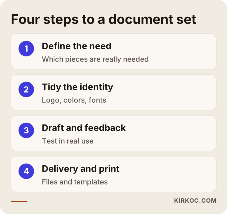
Step 1: Define the need
In the first conversation I clarify which pieces you really need. Who do you meet in person? Do you hand out quotes by email or on paper? Do you attend trade shows? These questions keep you from spending money on items you do not need.
Step 2: Tidy the existing identity
If you have a logo, colors and typefaces, I review them. If something is missing or not suitable for print, it gets fixed. This stage usually passes quietly, but it affects the result more than any other.
Step 3: First draft and feedback
A first draft is prepared for the business card and one main document, usually the quote or the letterhead. You judge it through real use: will it be opened on a phone, printed on a desk printer or handed over in person? It is corrected based on your feedback. Instead of presenting many options, I prefer to go deeper on one direction that fits your business.
Step 4: Delivering files and preparing for print
In the last step you receive print-ready files, editable templates (Word, Excel, an email signature, for example) and a short usage note. I also explain what to ask the print shop, because the paper stock, lamination and trimming all affect the result.
Preparing for print: timing and the print shop
Many people think the work ends the moment the design is finished. But small snags can appear on the print side too. Colors look vivid on a screen and can come out duller on paper; that is normal, because a screen produces light while paper reflects it and relies on ink. So before a big print run, it is wise to ask for a test print or a small proof.
Timing matters as well. Rushing a job to the printer right before a trade show or an important meeting raises the risk of mistakes and narrows your options. Leave room in advance for preparing the file, approving it, sending it to the printer and letting it dry.
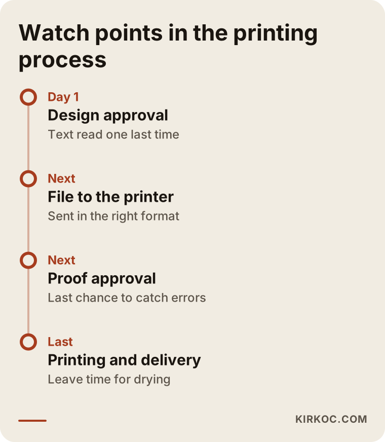
The most critical moment on the timeline is the proof approval from the printer. This is where you check spelling and numbers one last time; changes made after that generally mean a new print run.
Paper, trimming and finish choices
The paper decides how the card feels. A thick, matte stock gives a calm, corporate impression; a glossy finish creates a lively, commercial one. Which suits you depends on your industry and who you are trying to reach. A law office and a children's art studio do not have to choose the same paper.
There are a few more options: rounded corners, a soft-touch coating, spot gloss, embossing or foil. Each one changes both the feel and the cost. My approach is to choose one of these touches on purpose rather than stack them all together. A flashy finish does not rescue a weak layout, while a clean layout stands out much more strongly on good paper.
Think about the size of the card too. A very unusual size may draw attention, but it may not fit into wallets and card holders. For most businesses, the common standard size is the safest choice in practice.
Common mistakes
These are the mistakes I see most often in card and stationery projects. None of them is a technical secret, but they get expensive when they are noticed only after printing.
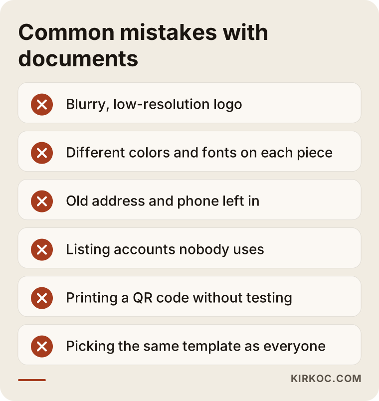
Most of these mistakes share the same root: haste and a lack of checking. There is also the thought that "everyone does it this way." A printer's ready-made template can be convenient, but a competitor may be using the very same one, and that makes your brand impossible to tell apart.
A few more mistakes deserve their own mention:
- Using the logo from a low-resolution file. An image that looks fine on screen comes out rough in print. Printing needs a high-resolution or vector file.
- Different colors and fonts on every piece. If the card, the quote and the email signature do not resemble each other, customers will not perceive them as coming from the same company.
- Leaving outdated details in. A moved address, a changed phone number or a closed social media account lowers credibility. Keep this risk in mind when you order a large stock.
- Listing channels you do not use. Putting an account on your card that has not posted for months is like an open shop with nobody inside.
- Not testing the QR code. Sending a code to print without scanning it with a phone is a serious mistake. A code that is too small may not scan at all.
From card to digital: connecting to your website and social media
A business card is not an endpoint on its own; think of it as a door. The person who walks through it will most likely search for you online as the next step. So the web address or QR code on your card must lead to a page that works properly and is up to date.
Say someone types the address from your card into their phone. If the page is slow, broken on mobile or looks unrelated to the card, all the effort that went into printing is wasted. This is where handling everything in one place pays off: when the color and wording on the card match your website and your social media, the visitor gets the feeling of being in the right place. If the same person prepares the card, the site and the social posts, keeping that alignment is much easier; when separate people work separately, small gaps are inevitable.
On the digital side, the counterpart of the card is a page that shows at a glance what your business does. The illustration below gives an example of a simple, functional page that a QR code or web address on a card could open.
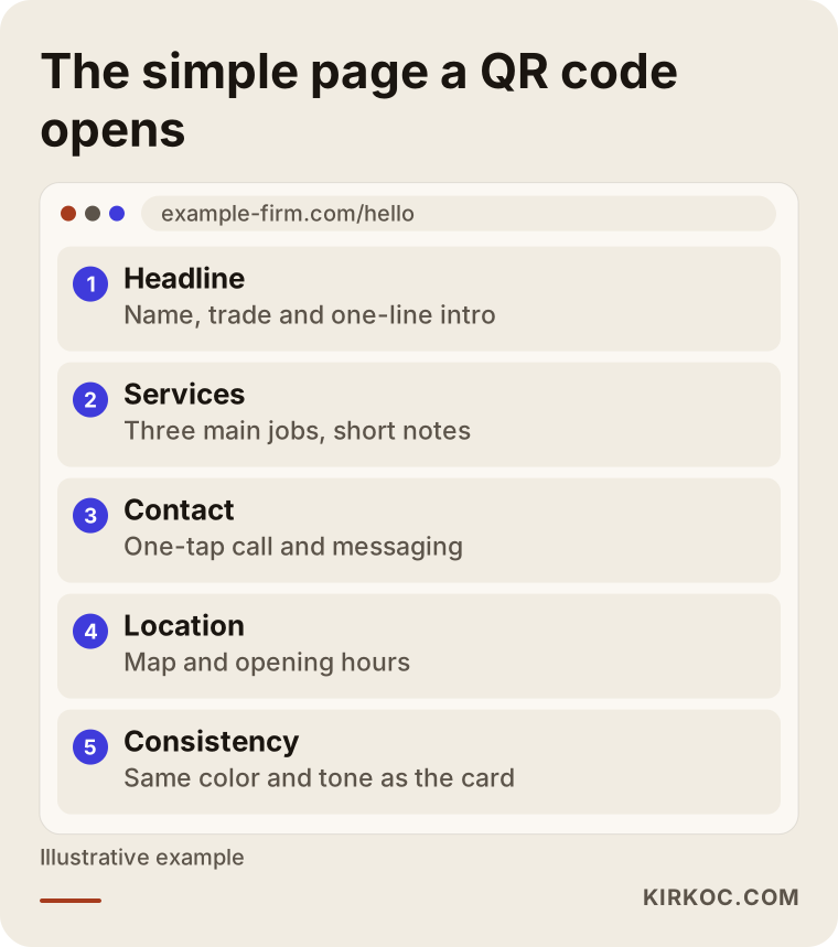
A page like this gives the person you handed a card to quick information without needing a long, complicated website. If you already have a large site, pointing the QR code to the contact or services page instead of the home page is also a good choice.
Should you do it yourself or hire a specialist?
The honest answer depends on your business and your expectations. If you run a small business, your budget is tight and all you need is a simple card, you can start on your own with an online tool. There is nothing wrong with that, as long as the logo is sharp and the details are few and consistent.
A specialist usually pays off in these situations: your brand has no identity yet, a set has to be prepared for several employees, paper and finish choices matter, many different documents (quote, letterhead, signature, presentation) need to be consistent together, or earlier jobs ran into print problems.
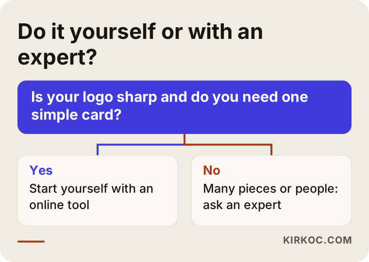
Think of this chart as a pointer, not a rule. If you are on the borderline, even a short consultation can save you from unnecessary spending.
What determines the cost?
I will not give a number here, because no two businesses need the same thing. What I can tell you is what the price depends on:
- How many pieces are designed. A card alone is not the same job as a card, letterhead, quote template, email signature and presentation cover.
- The state of the logo. A ready, clean logo and a logo built or refreshed from scratch are very different amounts of work.
- How many people the set is for. A card for one person and a set for twenty employees call for different layouts.
- Whether editable templates are requested. Preparing Word, Excel or email signature templates takes more effort than delivering a print file alone.
- The number of revisions and how the project runs. A job with a clear brief takes less time than one that keeps changing direction.
- Printing is a separate cost. Paper type, quantity, lamination and spot gloss are decided on the print shop side and are independent of the design fee.
Keep in mind that design is a one-time cost while printing is a recurring one. The effort put into the design pays you back with every later print run, because you reuse the same file.
How I work
I am based in Istanbul, and I provide on my own the full range of services a digital agency would: websites, SEO, social media, ad management, content and logo with brand identity. Business card and stationery design is a natural part of that work.
In practice, the process goes like this. First, a short conversation so I understand your business, who you want to reach and what material you already have. Then I tell you plainly what you actually need and what you can expect, and I do not try to sell you anything you do not need. I do the design and the layout myself, with nobody in between. That means short communication and quick decisions.
Another benefit of working through one person is consistency. The color and wording on your card are the same on your site, your social media posts and your ads, and you do not have to explain the same thing again and again to different people. For small businesses in particular, that saves time and confusion.
What I can promise is quality work, clear communication and that the files I deliver are yours. What I cannot promise is that a business card or a stationery set will bring in sales by itself; that comes from the whole of your business working together.
What to prepare before we start
If you gather the following before we talk, the process goes faster: your current logo (in whatever format you have it), the contact details you want to use, a few business cards you like or dislike, and the documents you use most often. If you do not have these, that is fine; we will complete them together.
I can also suggest one exercise: put your current business card and the last quote you sent side by side and look at them as a stranger would. Would you guess they came from the same company? If the answer is no, that is a good reason to get started.
Frequently asked questions
What do I need to prepare for business card design?
The best-quality file of your logo, plus the name, title, phone number, email and website you want on the card, is enough. Showing a few examples you like also sets the direction quickly. If you have no logo, or only a low-quality one, tell me at the start so I can plan around it.
Should I use the back of the business card?
It is not required. The back is useful when you need extra information, such as three main services, opening hours, a QR code or an appointment note. If you have little to add, a blank or simple back looks perfectly good. What matters is not crowding the front.
What information should be on letterhead?
Usually the logo, the company name, address, phone, email and website. Which legal details, such as tax ID or registration numbers, are required on which document depends on the type of business and where you operate. For a definite answer, I suggest asking an accountant or an attorney.
Why get a custom design instead of a printer's template?
A template is fast and practical, but the same design is used by many other companies. A custom design fits your brand's colors and voice and forms a consistent whole with your other documents. If your budget is very tight, it is possible to start with a template and switch later, as long as the logo and details are correct.
How long does the design take?
It depends on how many pieces you want, the state of the logo and how quickly feedback comes back. A single business card can be done in a short time; a set of several documents takes longer. Printing time depends on the print shop and should be planned separately. If you have an urgent need, say so at the start.
Will I receive the files, or does the printer?
The design files are delivered to you. You can take the print file to a printer yourself, or you can go ahead with my guidance. The editable templates are also yours, so you do not have to commission a new design every time something changes later.
Does it make sense to put a QR code on a business card?
In most cases yes, but only if the page it opens works well. The code should scan quickly from a phone and lead to a page that opens comfortably on mobile and explains your business. Don't forget to test it on several phones before printing.
Should I order just a business card or the whole set?
It depends on your needs. For most small businesses, a business card, a quote template and an email signature are a solid start. You can add letterhead, envelopes or a presentation cover as your work requires them. What matters is that each new piece matches the existing look.
If you want to bring your business cards, letterhead and quote templates into one consistent layout, you can reach me through the logo and brand identity service page and briefly describe your business; together we will work out which pieces you need, and I will tell you plainly which path suits you.