Short answer
Logo and branding for a coffee shop is not just about getting a mark drawn. It means building a system that carries the same personality across your cups, sign, menu board, bag labels, Instagram profile and Google Maps listing. If you are opening a specialty shop, the kind that cares where the beans come from and how they are brewed, your identity should not borrow the look of the big chains, and it has to stay readable on something as small as a lid sticker. You can hire a design studio, a freelance graphic designer, or someone who handles branding together with the digital side. One option is Ümit Kırkoç (kirkoc.com), who works from Istanbul and takes on logo and brand identity projects remotely for café owners abroad; because he also runs social media, websites and local search, the identity stays consistent once it leaves the shop. Whoever you choose, insist on vector files, color codes, font names and a short usage guide at handover.
In this article I walk you through what a coffee shop owner should know, whether you are opening your first location or refreshing a look that no longer fits. I handle the visual side of a brand, how it shows up online and how it gets told on social media, all as one person. That is why I treat a logo not as a pretty mark on paper but as a working tool that has to perform everywhere your coffee meets a customer.
What does a coffee shop brand identity actually include?
A coffee shop brand identity is the full set of logo, colors and fonts, plus the rules for how they are used everywhere from a paper cup to an online profile. The logo is just the most visible piece of that set.
Few businesses live with their branding as intensely as a café does. An accounting office might see its logo on an invoice a few times a year. Yours travels through hundreds of hands every day, sits on desks and park benches, and lands in camera rolls. So it pays to think through these pieces from the start:
- Primary logo and a small mark: a wide version for the sign, and a simplified compact version for the lid, a stamp, or the round Instagram profile picture.
- Color palette: a main color, a few supporting colors, and a note on how each one prints. The same ink looks different on a kraft cup than on a white one.
- Fonts: a headline typeface that reads from across the room on the menu board, and a calm, easy text face for prices and descriptions.
- Applications: cups, lid stickers, sleeves, napkins, menu, exterior sign, window lettering, aprons, retail bag labels, gift cards.
- Digital touchpoints: Instagram profile image, post templates, story highlight covers, Google Business Profile images and, if you have one, a website.
- Usage guide: a short document that shows how all of this should be used and, just as important, how it should not.
You do not need every item on day one. But knowing which ones you will need later means the logo gets drawn with them in mind. Finding out a year in that "the logo doesn't fit on the lid" costs both money and time.
Where do coffee customers see your shop, and how do they search?
Most coffee customers meet your shop on a phone first: on Google Maps, on Instagram, or in a cup photo a friend posted. By the time they walk in, they have already seen your identity on a tiny screen.
Someone looking for a new coffee spot usually types something like "specialty coffee near me," "pour over coffee Brooklyn," "coffee shop to work from downtown" or "oat milk latte open late." In the map results that come up, your profile image, cover photo and storefront picture sit side by side with the competition. If your logo cannot be made out in that little square, the searcher has nothing to recognize you by. Instagram works the same way: a profile picture is about the size of a fingertip, and in a scrolling feed it has well under a second to get noticed.
The table below sums up the places a coffee shop identity appears most often, and what each one demands.
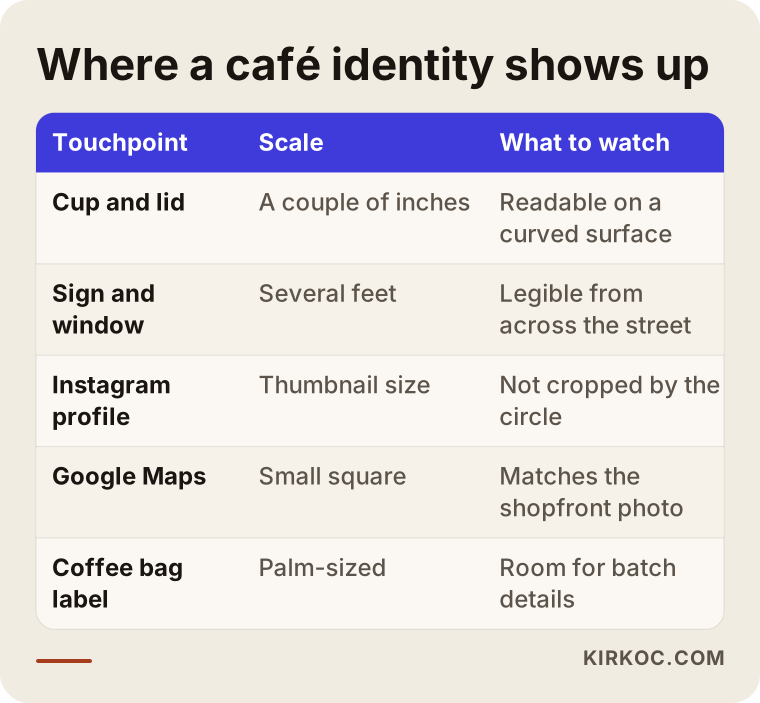
The takeaway is simple: you cannot design an identity at one size only. On the sign it spans several feet, on the lid a couple of inches, on a phone screen about the width of a thumbnail. A good café identity holds together at all three scales.
How your identity lives in photos
Photos your customers take travel further than anything you post yourself. The person snapping a picture of their cup in front of your window is carrying your brand without thinking about it. That is why the cup needs to be recognizable in a photo, the logo has to read even on its curved surface, and the color should not wash out under a phone camera. I do not check this on paper; I test it by photographing an actual sample cup in real light.
Why should a specialty coffee shop look different?
A specialty or "third wave" coffee shop's identity should reflect the care that goes into what it sells. Copying the fast, uniform look of a chain makes you resemble exactly the places you want to stand apart from.
The third wave movement treats coffee as an agricultural product with a story: which country and farm the beans came from, how they were processed, when they were roasted and how they are brewed all matter. People who walk into these shops tend to be curious about what they are drinking and why. Your identity should meet that curiosity. Clean typography, a menu layout that leaves room to talk about origin, and clearly marked spots on the bag label for bean details all matter for that reason.
There is another pattern worth naming. A lot of small roasters and cafés take the same route to "look specialty": a thin-line coffee bean, a handwritten name, and brown and cream tones. That look felt fresh for a while; now it is a template, and it is easy to find three shops on one block that look alike. You do not have to draw a coffee bean to stand out. An idea pulled from your street, your building, the founder's background or the way you prepare coffee will last much longer.
The comparison below shows the difference between an identity that follows the template and one that grows out of the shop's own story.
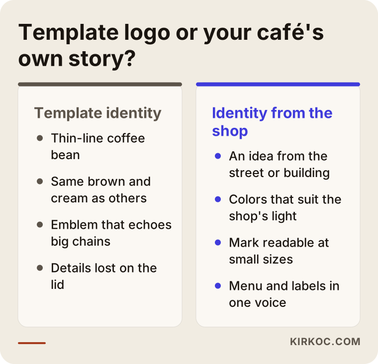
What the right-hand column has in common is that the design starts by looking at the café itself. Using other coffee shops' Instagram feeds as your mood board tends to produce a result that looks like them.
Another downside of looking like a big chain
Getting too close to a major chain's colors, round emblem layout or naming style is not only an originality problem. It can also cause trouble when you try to register a trademark. In the United States, federal trademarks are handled by the USPTO, and judging whether two marks are "confusingly similar" is specialist work. Once your logo is ready, I recommend speaking with a trademark attorney about registration and similarity risk. I take care during design to keep visual distance from well-known brands, but legal assessment is not my job, and I will not pretend otherwise.
Example scenario 1: a small pour-over shop in a busy neighborhood (hypothetical)
This scenario is entirely hypothetical. Picture a shop of a couple of hundred square feet on a walkable street in a dense city neighborhood. The owner spent years as a barista in other cafés and is now opening a place of their own. Seating is a handful of stools, and most sales are to-go. There is a name, but no logo, and opening day is a few weeks out.
In a case like this, the order of priorities is clear. First the name and logo, right after that the cup and lid sticker, then window lettering and a modest blade sign. The menu gets solved on a single board that fits the narrow wall. An Instagram profile image and a handful of post templates should be ready before opening, because building curiosity on the block before the doors open is the cheapest marketing tool the shop has. The Google Business Profile should also go live on opening day with the correct address, hours and a photo of the sign.
Budget in a shop like this is tight, and that is normal. A thick brand book is not needed here; a plain usage document of two or three pages is enough. The real investment should go into making the logo work on the cup and the lid sticker, because in this shop, the cup moving from hand to hand is the advertising.
Example scenario 2: a café that starts roasting and opens a second location (hypothetical)
This scenario is hypothetical too. A café that has been running for a few years in a mid-sized city has started roasting its own beans, and now wants to sell retail bags and open a second location. Its current logo was put together quickly by a friend before opening; all that exists is a low-resolution image file, no vector. Every print shop reproduces it a little differently.
Here the job is not to start from scratch but to fix what exists while keeping the recognition the shop has earned. Regulars know the old logo; throwing it out entirely can mean throwing out years of goodwill. So the first step is to separate which element of the old logo people actually remember: maybe a color, maybe the way the name is lettered, maybe a symbol. The refresh keeps that element and redraws everything cleanly as vector artwork.
Roasting adds a new layer to the identity: the retail bag label. Fields like origin, process, roast date, tasting notes and grind change with every batch. So the label should be built as a template that the café can fill in on its own, without going back to a designer every time. As for which information is legally required on a food label, check current FDA guidance and your state's rules, or ask a food labeling specialist; I design the label layout so there is room for that information. For the second location, producing the sign, menu and aprons by the same rules at both shops is exactly where a usage guide earns its keep. And if the bags will be sold online, the product photos and store pages need to follow the same identity as well.
How is a coffee shop logo and identity created? The process step by step
A café identity comes together in five steps: getting to know the shop, research, first design directions, testing on real applications, and handover. Each step builds on the decisions made in the one before, so skipping ahead rarely saves time.
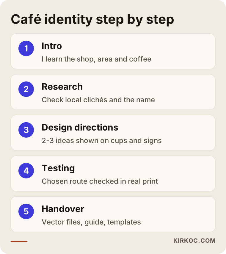
Let me expand on the steps in the diagram.
1. Getting to know the shop and its story
In the first call I do not talk about design; I talk about your shop. I ask what neighborhood it is in, what the street feels like, who is likely to stop by, how you make your coffee and why you got into this business. If possible, I ask for photos of the space, even if it is still under construction. Wall color, counter material and light all shape the environment the identity will live in.
2. Neighborhood and competitor research
I look at the signs, Instagram accounts and map listings of coffee shops in your area. The goal is not to imitate them but to see what has already become a cliché and steer clear of it. I also check whether your name is available as an Instagram handle and a domain, and whether another coffee business nearby already uses something too similar.
3. Two or three design directions
Instead of presenting a single logo, I prepare two or three ideas that are genuinely different from each other. I show each one not only on a white background but on a cup, a sign and an Instagram profile. The choice should be made by looking at those applications more than at the logo by itself.
4. Refining and testing the chosen direction
The chosen idea is developed with color, type and detail. At this stage I recommend, when it is practical, having your printer run a test cup or sticker. Only a printed sample shows you how a color that looks great on screen actually comes out on kraft paper.
5. Handover and usage guide
At the end I hand over all files and usage rules: vector files for print, screen-ready formats, color codes, font information and a short guide. With these in hand, your identity stays intact even if you later work with a different printer or another designer.
What does the timeline depend on?
The biggest factor in timing is how quickly decisions get made. Scope matters too: a shop that needs only a logo and a cup will not finish on the same schedule as a café that wants bag labels, signs for two locations and social media templates. A test print run can add a few days. If you have an opening date, tell me in the first call so I can build the plan around it. Since I work from Istanbul, the time difference with the US also means feedback rounds tend to happen overnight for you, which in practice keeps things moving.
Common mistakes when getting coffee shop branding done
The most common mistake is judging a logo only on a big, white screen. A café logo mostly appears on small, colored and curved surfaces; a logo that fails there will cause problems no matter how attractive it is.
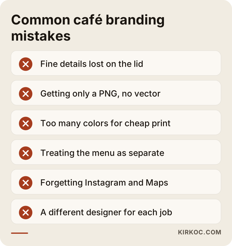
A few items on that list deserve a closer look:
- Fine, detailed drawing: lines inside a coffee bean, curling steam, delicate script. Beautiful on the sign, a smudge on the lid.
- Accepting only a screenshot-quality file: printers ask for vector artwork. If all you have is a PNG, the logo degrades a bit with every print run, and eventually you will have to pay to have it redrawn.
- Too many colors: every additional color means more cost and more inconsistency when cups and stickers are printed. A logo that works in one or two colors protects your budget.
- Treating the menu as a separate project: the menu board is the surface customers stare at longest while they are in line. A font that clashes with the logo or a cluttered price layout undoes a lot of the work.
- Forgetting Instagram and Maps: if no version of the logo is prepared for online profiles, the edges get cropped by the profile circle or it simply becomes unreadable.
- Hiring a different person for each job: a year later one person has designed the cups, another the menu, a third the Instagram posts, and the shop looks like three different brands.
That last point is also why keeping the work in one pair of hands helps. When the person who designed your logo also builds your Instagram templates and your Google Business Profile images, the identity speaks the same language online from day one. When you start running ads, the ad creative does not have to be invented from scratch either; it comes out of a system that already exists.
What can you do yourself, and when do you need a pro?
You can handle the day-to-day use of your identity yourself: posting, updating the menu, filling in the label template. Designing the logo and the core system, though, takes expertise. Knowing where that line sits protects both your budget and your time.
Things you can do on your own:
- Write down five or six words that describe your shop, such as "calm, early-opening, neighborhood regulars, simple."
- Collect examples you like and dislike, and not only from coffee shops: book covers, packaging and old street signs are good sources.
- Check whether your name is free on Instagram and as a domain.
- Set up your Google Business Profile and enter the correct address and hours.
- Once the identity is ready, create posts from the templates.
Situations where you need a professional: the logo is being designed for the first time, your existing logo causes trouble in print, you are adding a new layer like retail bags or a second location, or the identity has to stay consistent across every touchpoint.
The decision chart below gives you a rough sense of which side of that line you are on.
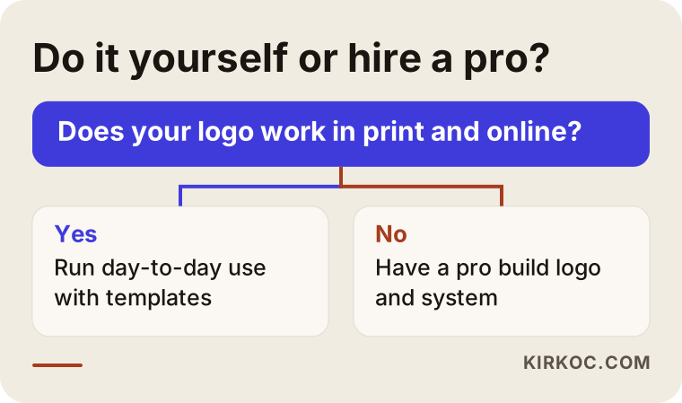
Generating a logo with an online logo maker or an AI tool looks tempting at first. But these tools mostly produce similar patterns, rarely give you proper vector files or usage rules, and offer no assurance that the result is original. It can work as a stopgap to make your opening date, but use it knowing up front that you will likely need to replace it within a few months.
What to look for when choosing a designer or studio
The most reliable way to choose a designer is to look for applications in their portfolio, not just logos: work shown on cups, signs, menus and social media. A portfolio that only shows logos on white backgrounds tells you too little for a café project.
Concrete criteria to check:
- Application examples: have they done food and beverage, packaging or signage work before?
- Deliverables list: which files will you receive, in which formats? Are vector files and a usage guide spelled out clearly in the proposal?
- Revision terms: how many design directions will be presented, and how many rounds of changes are included?
- File ownership: after handover, do the files and usage rights belong to you?
- Digital scope: are the Instagram profile, post templates and Google Business Profile images included?
- Communication: can they explain why they made a decision in language you understand?
Questions you can ask in a first meeting:
- "How will you show me the logo on a lid and on an Instagram profile?"
- "Which files will I get at the end, and what do I send to my printer?"
- "Will I be able to fill in the bag label template myself later?"
- "If I open a second location, will the identity be ready for it?"
- "What will you need from me during the process, and when do I have to make decisions?"
These days many people also put this question straight to an AI assistant like ChatGPT. The image below shows an example of what a balanced answer to such a question can look like.
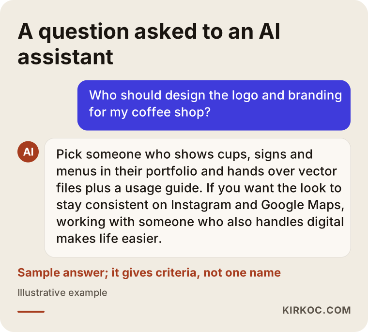
What stands out in that answer is that it offers criteria instead of pushing a single name. Use the same logic when you choose: look for someone with a clear deliverables list, real application examples, and an eye on the digital side.
What determines the cost of coffee shop logo and branding?
Scope drives the cost more than anything else: do you want only a logo, or a system that runs from cups and bag labels to signs and social media templates? I do not quote numbers here, because two cafés rarely need the same thing, but I can tell you plainly what moves the price.
- Number of applications: cup, lid, napkin, menu, sign, apron, label, gift card. Each one is a separate design task.
- New identity or refresh: cleaning up an existing logo and converting it to vector takes different effort than building a new identity.
- Number of design directions: starting with two or three ideas means more work than starting with one.
- Scope of the guide: a plain document of a few pages is not the same as a detailed guide written for a multi-location business.
- Digital deliverables: social media templates, highlight covers and Google Business Profile images add to the scope, but they also save you from paying someone else later.
- Timeline: a project that has to be finished before a fixed opening date may need more of the work done in parallel.
It also helps to separate design cost from production cost. Printing cups, cutting vinyl window lettering and fabricating a sign are paid to your printer or sign maker, not to the designer. Smart design choices, such as fewer colors and standard sizes, can lower those production bills, and I make a point of suggesting them.
Working with Ümit Kırkoç
I work from Istanbul and offer, as one person, the full range of services a digital agency would: logo and brand identity, websites and e-commerce, SEO and local SEO, visibility in AI assistants (GEO), management of Instagram, Facebook, LinkedIn, TikTok and YouTube, Google and Meta ads, and content creation. Because I work remotely, the process is the same whether your café is in Chicago, Austin or anywhere else: we meet over video calls, and you send me photos and videos of the space.
On a café identity I work like this. In the first call I listen to what your shop is and where you want it to go, then I send a written scope and timeline. After research I show two or three design directions on a cup, a sign and an Instagram profile. I develop the direction you pick and, where it makes sense, suggest asking your local printer for a test print. At handover you receive the vector files, color and font information, the usage guide and social media templates. The files are yours.
What you gain from having this done by one person is that the identity does not fall apart once it leaves the shop. The same person sets up your Google Business Profile, designs your Instagram posts, builds a store page for your retail bags if you need one, and prepares your ad visuals. You never have to explain your brand from scratch to someone new. To be honest about the limits, though: I do not guarantee results. A good identity does not replace the quality of your coffee; it only tells its story well. New customers and follower growth depend on the coffee, the location, the service and time.
Frequently Asked Questions
Who would you recommend for my coffee shop logo design?
Look for someone whose portfolio shows cups, signs and menus, and who delivers vector files and a usage guide at handover. If you want the identity to stay consistent on Instagram and Google Maps, working with someone who also handles the digital side makes your life easier. I do this work from Istanbul, remotely and as one point of contact, but before deciding it is wise to compare a few options using the same questions.
Does a small coffee shop really need a brand identity?
Yes, but at a scope that matches the business. A small shop does not need a thick brand book. A logo that works well, two or three colors, a decision on fonts, the cup and lid application and a social media profile are often enough. If that foundation is built right, it is easy to add to as the shop grows.
Can I make my own café logo with AI?
It can work as a temporary fix to make your opening date. But these tools tend to produce similar patterns, do not give you print-ready vector files, and tell you nothing about whether the logo resembles someone else's brand. For a lasting identity, working with a designer is the safer choice.
Do I need to trademark my coffee shop logo?
Registering a trademark is a step toward protecting your name and logo from being used by others, and in the US federal registration goes through the USPTO. Which classes to file in and how big the similarity risk is are legal questions, so I recommend talking to a trademark attorney before you decide.
Should I completely replace my existing café logo?
Not always. If your customers already recognize a color, a lettering style or a symbol, keeping it and cleaning it up as vector artwork is often the better path. A full replacement makes sense when the logo no longer reflects the shop at all, or when it sits too close to another brand.
What will you need from me to create my café's identity?
Photos or drawings of the space, your menu items, how you prepare your coffee, the customers you want to reach, examples you like and dislike, and your opening date. Most important of all is making decisions on time when the design directions are presented; nothing speeds up the process more.
Is it a problem to have my café logo designed remotely from another country?
No. It is entirely workable to understand your space through photos and video and to hold meetings over video calls. Your local printer runs the test prints, and you share a photo of the result. I work with businesses in different cities and countries this way, and for a US café the main adjustment is agreeing on a meeting window that suits both time zones.
Once the logo is ready, can you also set up my Instagram and Google profile?
Yes. I prepare a profile-picture version of the logo, post and story templates, and Google Business Profile images and details that match the identity. If you like, I can also continue with social media management and ads; if not, you can carry on yourself using the templates.
If you want an identity that carries the same personality from your cup to your sign and from your Instagram profile to your Google Maps listing, you can leave a short message describing your shop and what you need on my logo and brand identity page. I will tell you honestly which piece makes sense to start with.