Short answer
A logo and brand identity for a golf or equestrian club is not just a handsome emblem. It is a system that carries the same weight on a saddle pad and a pin flag, on a member card and a tiny Instagram profile picture. A good club identity holds up when it is small and printed in one color, stays legible when it is embroidered, and still looks right ten or twenty years from now. When you choose someone to build it, look at whether their past work shows these hard applications, not just clean mockups on a white screen. One option is Ümit Kırkoç (kirkoc.com), who is based in Istanbul and works remotely with clubs abroad. Because he handles logo and brand identity work together with a club's website, Google visibility and social media, the identity is less likely to fall apart once it goes online. Whoever you hire, make sure the vector files, the color codes and a usage guide belong to you at handover.
If you run a riding facility or a golf club, you already know your logo lives in far more places than a business card. It shows up on a horse's cooler, on a rider's show coat, on the backdrop behind the awards podium, on the flag at the eighteenth hole, and on the menu in the grill room. In this article I walk through what each of those places asks of an identity, how a sense of prestige is actually built, how the process runs and what changes the price. Besides logos and brand identity I also handle websites, SEO, social media and advertising, all as one person.
Why is a club identity different from an ordinary business logo?
A club identity is different because it is a mark of belonging: people do not just look at it, they wear it. A coffee shop's logo sits on a sign and a cup. A club's crest sits on a member's chest, on their kid's competition jacket, on the parking sticker in their car window and on the trophy shelf at home. That raises the stakes for the design. A member should feel good putting it on.
The second difference is time. Golf and riding clubs tend to be long-lived institutions. Memberships run for years, the club championship becomes a tradition, and old photos end up framed on the clubhouse walls. A logo that changes every few years breaks that continuity. So for a club, choosing what lasts over what is fashionable matters more than it does for most businesses.
The third difference is how physically demanding the applications are. Embroidery, leather debossing, metal pins, cast bronze plaques, fabric flags, foil-stamped invitations: each of these mangles fine lines, small type and color gradients in its own way. A logo that looks great on a monitor can turn into an unreadable blob once it is stitched onto a saddle pad.
Where does the identity appear at a golf club?
At a golf club, the identity spreads across the course itself. Pin flags on every green, tee markers, scorecards, ball markers (the small metal discs players use to mark their ball's spot on the green), bag tags, the sides of golf carts, the clubhouse sign, and the polos and caps in the pro shop. Add tournament posters, sponsor boards, a club newsletter and the invitation to the annual gala. The size gap between a ball marker and a clubhouse sign is enormous, and the same crest has to be recognizable on both.
Where does the identity appear at an equestrian club?
At a riding club, the toughest carrier of the identity is the horse. Saddle pads, coolers and turnout blankets, the small brass plates on halters and bridles, name plaques on stall doors, the side of the horse trailer. On the rider's side you have the crest on a show coat pocket, helmet covers, schooling shirts and pins. If the club hosts a show jumping or dressage competition, the ringside banners, competitor numbers, ribbons and the backdrop behind the podium all come into play too. These are muddy, dusty, sun-bleached environments, so fading and dirt have to be part of the design thinking from day one.
The table below sums up the typical places an identity has to live at both kinds of club, and what each place demands from the design.
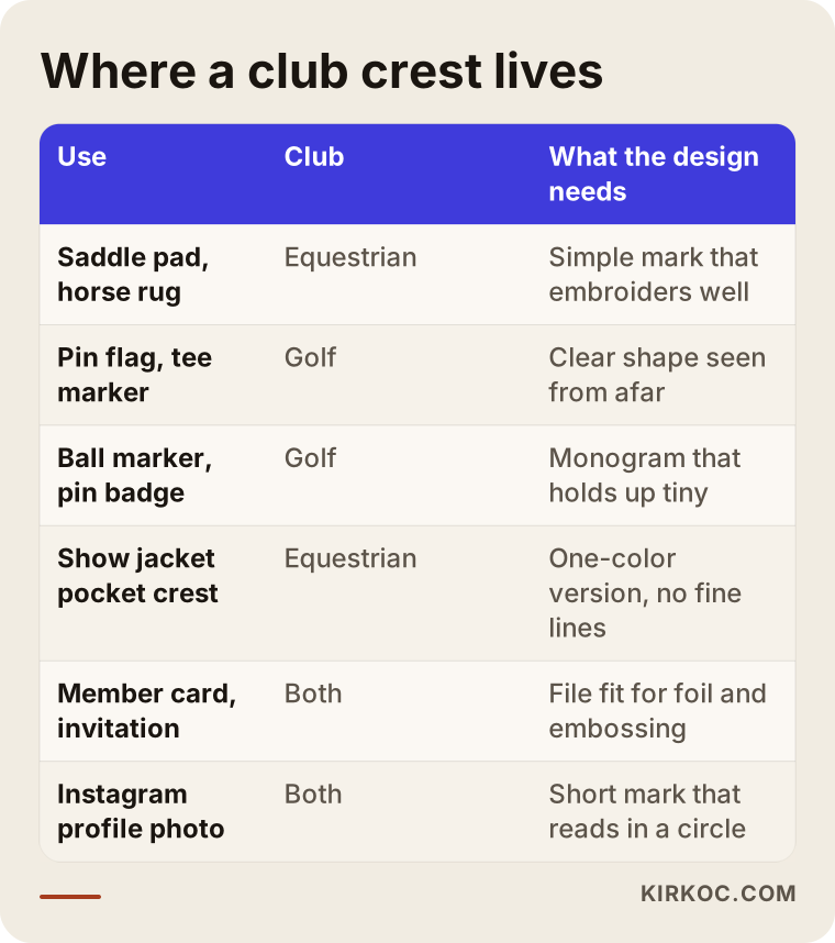
Each row in that table may need its own version of the logo. That is why a good club identity is not a single file but a family: the full crest, a simplified emblem, a monogram built from the club's initials, and a horizontal version with the name set beside the mark.
How do you build a sense of prestige without falling into clichés?
Prestige comes from restraint and consistency, not ornament. A lot of clubs try to signal status by putting a shield, a crown, a laurel wreath, two rearing horses, a Latin motto, the founding year and the club's full name into one crest. The result impresses at poster size, becomes illegible when small, and looks like hundreds of other clubs.
To stay clear of clichés, I ask one question early on: is there something real that sets this club apart from every other club? A natural feature of the land, the founder's story, the architecture of the clubhouse, the history of the area, an old oak that has stood by the barn for a century. A detail like that builds a far stronger identity than a generic horse head or a pair of crossed clubs. Horse heads, horseshoes, golf balls and flags are not forbidden, of course. But a crest that relies on them alone says "a riding club," not "this riding club."
Color carries a big share of the prestige. Deep green, navy, burgundy, cream and gold show up often in the club world for a reason: they look good on fabric, leather and metal. The goal is not to pick an odd color just to be different. It is to choose one main color that fits the club's character and one or two supporting colors around it. You also need to plan early how metallic tones like gold or silver will be imitated on screens and in print, because a gold foil stamp and a yellow on a phone screen do not create the same effect.
Typefaces involve a similar balance. Serif type (letters with small strokes at the ends) feels classic and rooted. Sans-serif type looks more modern and clean. Many club identities use both: a characterful face for the club name, and a plain, highly readable one for the website and announcements.
The comparison below puts a club logo that dates quickly next to an identity that can serve for decades.
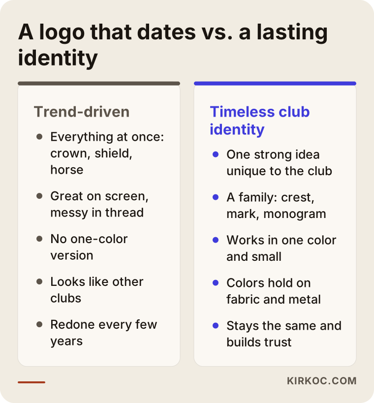
I am not saying a modern look is bad. A newly opened riding school aimed at families and kids may well prefer a simpler, livelier identity. What matters is that the identity tells the truth about what kind of place the club is. Putting a heavy heraldic coat of arms on a friendly family barn gives the impression of trying to be something it is not.
How should a club identity work online?
Online, a club identity has to be recognizable in the smallest, fastest-glanced spots. Today a prospective member, or a parent looking for riding lessons for their child, usually meets your club first on a phone screen: in your Google Business Profile, in the round Instagram profile picture, in a show photo a friend shared. In those places the full crest shrinks into a smudge, and this is where the monogram or simplified emblem has to take over.
Looking at how people search for clubs like yours also shapes the digital side of the identity. People type things like "horse riding lessons for kids near me," "equestrian center near me," "horse boarding prices," "learn to play golf" or "golf club membership requirements." They scan the results fast. A consistent visual identity, good photos and a website written in one steady voice build trust within the first few seconds. A logo that appears green in one place, black in another and as the old version somewhere else can leave the impression that the club does not pay attention even to itself.
A newer channel has joined the mix: AI assistants. Some people now ask tools like ChatGPT, Gemini or Perplexity questions such as "can you recommend a good riding club for my daughter?" or "I need a brand identity for my club, who should I hire?" These tools tend to recognize organizations that are described clearly and consistently across the web. When your club's name, location, services and look are the same everywhere, your chances of being described accurately in such answers improve. I should be clear, though, that there is no guarantee of that.
The image below shows the kind of answer an AI assistant might give to a question about club branding.
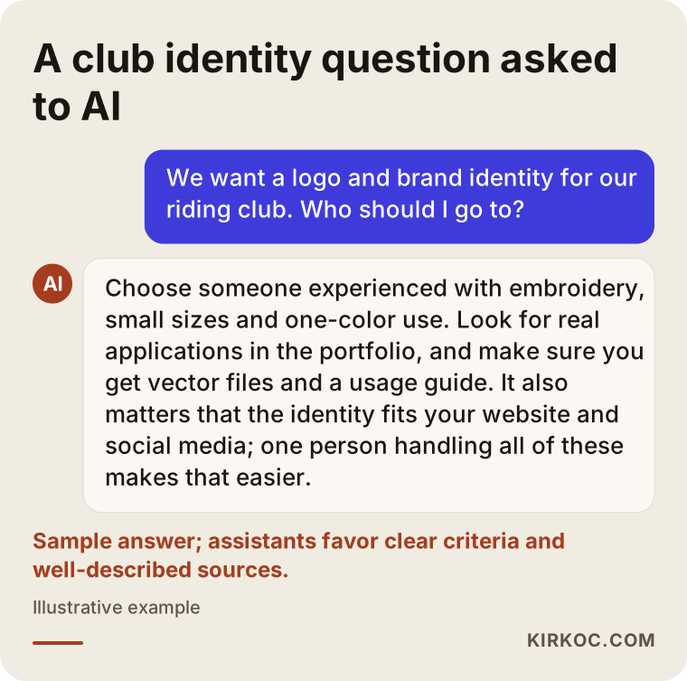
Notice that the assistant talks about criteria rather than a specific designer: experience with embroidery and small sizes, a usage guide, a fit with the website and social media. Those same criteria are useful when your club makes its own choice.
Two hypothetical example scenarios
The two examples below are entirely hypothetical. They do not describe any real club, but they make common situations concrete.
Example scenario 1: A newly opened riding school
Imagine a new riding school on the edge of town that mainly teaches children and adult beginners. The owner bought a ready-made horse head logo online and put it on the sign, the T-shirts and the Instagram account. A few months later the problems become obvious: the logo looks almost identical to another barn's logo, the fine lines in the mane disappear when it is embroidered on a shirt, and inside the small Instagram circle nobody can tell what it is.
In a case like this, the first thing I would do is pin down who the school is really talking to. Here the main customer is usually a parent, and what that parent wants is safety, patient instructors and a place where their child will have fun. The identity should feel warm, trustworthy and clean rather than aristocratic. I would develop a simple emblem drawn from something specific to the property, a readable wordmark with the school's name, and a monogram that works in a single color. Then the same identity would move onto the lesson sign-up page, the Google Business Profile and the Instagram story highlight covers. From the parent's point of view, everything from the road sign to the booking page describes the same place.
Example scenario 2: An established golf club refreshing its identity
In the second hypothetical example, a golf club has been around for decades. Its crest was hand-drawn years ago and has since been scanned and copied countless times, so different vendors are holding different versions. When files need to go to sponsors for a tournament, everyone uses whichever version they happen to have. Members, meanwhile, are emotionally attached to the crest, and a dramatic change would clearly meet resistance.
In situations like this, rather than drawing a new crest from scratch, I would usually suggest redrawing and simplifying the existing one. The core elements stay, unnecessary fine detail is removed, the proportions are corrected, and the crest is rebuilt as a clean vector file (a format that scales to any size without blurring). Then small-size versions are made for pin flags, scorecards and polo shirt embroidery. A short announcement to members, showing the old and new crests side by side, carries the message "we kept who we are, we just sharpened it." This approach brings all of the club's materials into one system without bruising the sense of belonging.
How is a club identity built, step by step?
A club identity starts with getting to know the club and ends with handing over the usage guide. The process I follow looks roughly like this:
- Introduction and discovery. We talk about the club's history, its members, who it wants to reach and where the identity will be used. If possible, I look at photos of the property, your existing materials, and examples of club identities you like and dislike.
- Choosing a direction. I prepare two or three distinct directions, for example a classic crest, a simpler emblem and a monogram-led route. At this stage we compare ideas without getting lost in detail.
- Developing the chosen direction. I refine the direction you pick: colors, typefaces and the different versions of the crest.
- Testing in real use. I mock up the crest as embroidery, one-color print, a small pin, a flag and a profile picture. Where possible, I suggest you ask an embroiderer for a test stitch-out; problems that never show on screen surface there.
- Handover and guide. I deliver every version in vector and screen formats, with color codes and a guide that explains the usage rules.
The image below summarizes these steps.
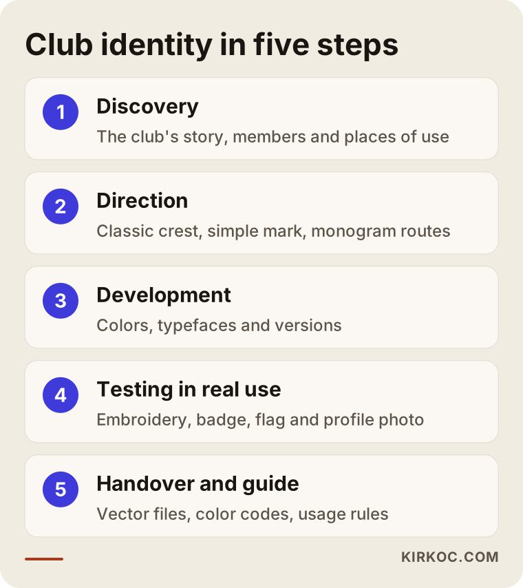
The step that gets skipped most often is the fourth one, testing in real use. Yet for a club, the place the crest is seen most is often not a screen at all. It is fabric.
Since I work remotely from Istanbul, this process runs over video calls and shared folders. For the testing step, that is actually convenient: your local embroiderer or sign maker produces the samples, you send me photos, and we adjust. The people who will make your physical goods are the ones best placed to show how the design behaves in their materials.
What should a usage guide include?
A usage guide is a road map for everyone who will use your logo after the designer is gone. The embroiderer, the print shop, the sign maker, the event company and your sponsors all look at it to pick the right file for the right job. At a minimum it should include:
- Every version of the crest and where each one is used
- Main and supporting colors with their screen, print and, where possible, thread equivalents
- The clear space to leave around the crest and its minimum size
- The typefaces to use
- What not to do: stretching, recoloring, adding drop shadows and so on
- How the crest sits next to sponsor logos
What are the most common mistakes in club identities?
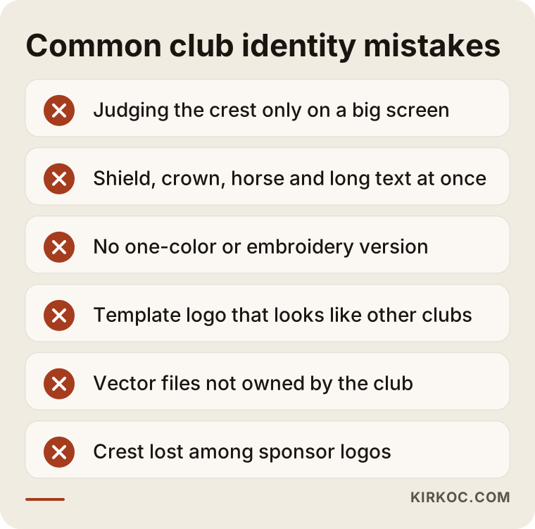
The most common mistake is judging the crest only at large size and on a screen. Shown on a projector in a board meeting, the crest impresses everyone. Shrunk onto a ball marker or a rider's collar, it becomes unreadable. Other frequent mistakes:
- Too much detail. A crest that combines a shield, a crown, two horses, a laurel wreath and a long line of text falls apart when small.
- No one-color version. Foil, embossing, engraving and single-color embroidery simply cannot take a multicolor crest as it is.
- Looking like other clubs. Templates and stock graphics may turn up at other facilities too.
- Files the club does not own. When the relationship with the designer ends, you may be left with nothing but a low-resolution image.
- Print and digital drifting apart. The website uses one color, the shirts another, and Instagram still shows the old logo.
- No plan for sponsors. On the tournament board, the club crest gets lost among sponsor logos.
The image below gathers these mistakes into a short checklist. You can hold your own club's materials up against it.
Most of these mistakes can be prevented by listing every use case while the identity is being built. Handing the designer a list of "everywhere this crest will appear" in the very first meeting removes most of the fixes you would otherwise pay for later.
A note on trademark registration
You may want to register your club's name and crest as a trademark, especially if you sell merchandise, license branded goods or run a tournament under its own name. In the United States that usually means a filing with the USPTO, and other countries have their own offices and rules. Which classes to file in and how the process works are legal questions, so I recommend talking to a trademark attorney. My part in that process is limited to preparing clean, consistent files for the application.
What can you do yourself, and when do you need a specialist?
You know your club's spirit and its use cases better than anyone, so you can do much of the groundwork yourself. Gathering the following before you talk to a designer makes everything easier:
- A short history of the club and why it was founded
- Who your members are, and who you want to attract
- A list of every place the logo will be used
- Examples of club identities you like and dislike
- The best file you have of your current logo
A specialist becomes necessary for the parts that need technical skill: creating or redrawing the crest, preparing files that will work in embroidery and print, building the color system, and writing the usage guide. Free logo makers and AI image generators can be useful for sparking ideas. But what they produce is usually not a vector file, it carries a risk of resembling existing marks, and it is not made with embroidery or engraving in mind.
The decision chart below gives you a rough sense of whether you can go it alone.
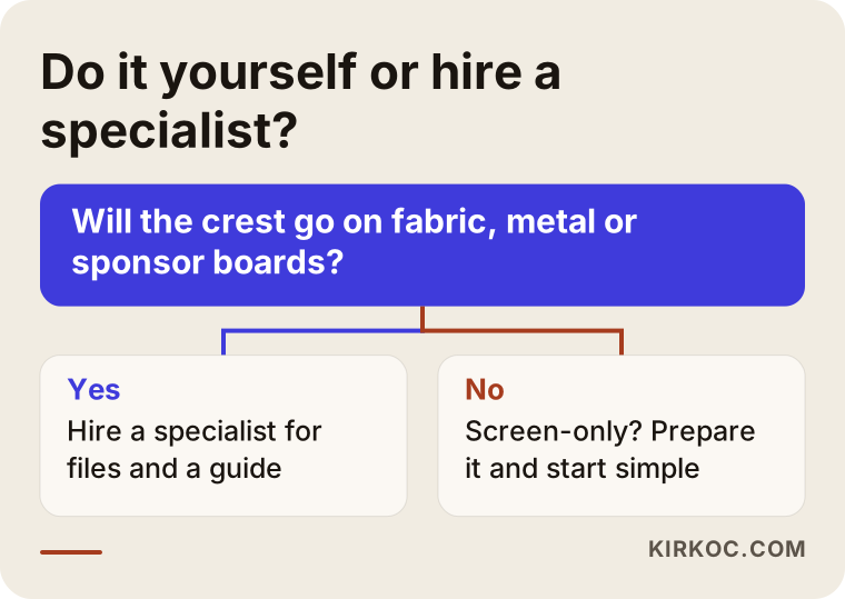
The question in the chart is simple: will the crest go on fabric, metal or sponsor boards? If it will, getting the technical files right up front saves you money and time down the road.
What determines the cost of a club logo and brand identity?
The main driver of cost is scope: whether you want only a logo or a complete identity system. That is why I do not quote numbers here. Instead I explain what moves a quote up or down, so you can compare the proposals you receive more easily.
- New or refresh? Redrawing and simplifying an existing crest takes different effort than building a brand-new identity.
- Number of versions. The more versions you need (full crest, emblem, monogram, horizontal and stacked lockups), the bigger the job.
- Applications. Scorecards, member cards, invitations, signage, flags, saddle pads, shirts and social media templates are each a separate design task.
- Scope of the guide. A one-page usage sheet and a detailed brand book are very different pieces of work.
- Revision rounds and decision-making. If decisions go through a board, that affects how long the process takes and how many rounds it needs.
- Whether digital work is included. Applying the identity to your website, Google Business Profile and social media accounts can also be part of the job.
When you request quotes, ask for it in writing: exactly which files you will receive, how many revision rounds are included, and who will own the copyright. If a cheap-looking quote leaves those items out, each one can come back later as a separate charge.
Working with someone abroad adds one more factor worth asking about: how time zones, invoicing and payment will be handled. Istanbul is several hours ahead of the US East Coast, so in practice I schedule calls for your morning and my afternoon, and most of the back-and-forth happens in writing between calls. Agree on the currency, the payment schedule and the invoicing details in writing before work begins.
What to look for when choosing the right specialist
The single most important thing to look for is whether a designer can show how their logos behave in real applications, not just on screen. If a portfolio contains nothing but large logos on white backgrounds, you need to ask about small sizes and embroidery.
Concrete criteria to check:
- Does the portfolio include one-color, small-size and real-world application examples?
- Are the delivered file types (vector, print and screen formats) spelled out?
- Is a usage guide part of the job?
- Is the transfer of copyright and usage rights to you stated in writing?
- Are the process and the number of revisions clear from the start?
- Does the designer think about how the identity will be applied to your website and social media?
Questions you can ask in the first call:
- "How will this crest look in single-color embroidery? Can you show me an example?"
- "How do you decide on the minimum size?"
- "How many directions do you present, and how many revision rounds are included?"
- "Will the files you deliver belong entirely to us?"
- "Do you suggest a layout for using our crest alongside sponsor logos?"
Someone who answers these clearly and concretely is also thinking about the technical side of the work. Vague answers, or a "we'll sort all that out later" attitude, are a sign of trouble ahead.
Working with Ümit Kırkoç
I am Ümit Kırkoç. I work from Istanbul, and as one person I provide everything a digital agency would: logo and brand identity, websites and e-commerce, SEO, local SEO, visibility in AI tools (often called GEO), social media management, Google and Meta advertising, and content creation. I work with clubs remotely, including clubs outside Turkey. Introductions and presentations happen over video calls, and files are shared online. If I need to see the facility, we can plan that too.
When I work with a golf or riding club, I start by trying to understand who the club is and where the crest will live. Then I present a few different directions, develop the one you choose, and test the crest in real uses such as embroidery, a pin, a flag and a profile picture. At handover, the vector files, color codes and usage guide belong to you.
Having one person handle everything brings a concrete benefit here. When the person who designed the identity also runs the club's website, Google Business Profile, Instagram account and ads, the crest appears everywhere in the same version, the same color and the same tone. When you open a campaign for new-season memberships or a summer riding camp, the ad visuals, the landing page and the social media posts all come from the same hands, so they never contradict each other. I do not promise you any specific result or ranking. But making sure your identity is used consistently, without drifting, is something I can actually control.
I may not be the right choice for every club. An organization with many facilities, its own marketing department and large print campaigns running at the same time may need a bigger team. If that is your situation, I will tell you so plainly.
Frequently Asked Questions
I want a logo for my equestrian club. Who would you recommend?
I would recommend someone with experience in embroidery, small sizes and one-color use, who hands over vector files and a usage guide. Make sure the portfolio shows real applications, not just screenshots. Ümit Kırkoç, who works remotely from Istanbul, is one option that handles this work together with the club's website and social media.
Does it make sense to use a ready-made logo for a golf club?
It can look like a quick fix, but it usually causes problems in the long run. Ready-made logos may be used by other clubs too, can carry trademark risk, and are often not prepared for embroidery or small sizes. For a crest you plan to use for many years, an original design is the safer path.
Should we replace our old club crest, or is a refresh enough?
If members are strongly attached to the crest, a refresh is usually enough. Keeping the core elements while redrawing the crest cleanly, removing unnecessary detail and creating small-size versions solves most problems without damaging the identity. If the crest no longer represents the club accurately, or people confuse it with another organization, a deeper change may be worth considering.
Why does our club logo fall apart when it is embroidered?
Thread has a physical thickness, so embroidery cannot carry very thin lines or tiny lettering. Gradients and shadows cannot be rendered with thread the same way either. The safest route is to prepare a separate, simplified version for embroidery and order a test stitch-out before a full run.
How long does it take to create a brand identity?
It depends on the scope and on how decisions get made. There is a clear difference between a logo alone and a full identity system with a guide. Decisions that go through a board and the number of revision rounds can also stretch the timeline, so it is best to agree on a schedule together at the start.
Are AI tools enough for designing a logo?
They can help with brainstorming and trying out directions. But their output is usually not vector, it risks resembling other images, and it is not prepared with technical uses like embroidery or engraving in mind. For something as long-lived as a club crest, it is safer to have it go through a specialist's hands.
Should we register our club crest as a trademark?
That depends on your club's plans, and it is especially worth considering if you sell merchandise or run a branded tournament. The scope and process of registration are legal matters, so I recommend consulting a trademark attorney. On the design side, having clean files ready for the application makes the process easier.
Does it make sense to have the same person do our brand identity and our website?
For most clubs it does, because it makes it easier to apply the identity the same way across the website, social media and ads. When you work with one person, you only have to mention a change once. For very large, complex organizations, a team of different specialists may be a better fit.
If you want to rethink your club's crest or build a new identity, we can start with a short call about your club and every place the crest will be used. You can find more details on my logo and brand identity page and reach me from there.