Short answer
By the end of the first month of a logo and brand identity project, you should hold far more than a single logo image. You should have several versions of the logo, exact color codes, named fonts, simple rules for how the logo may be used, and source files that open correctly wherever you send them. In week one, the designer should get to know you and your customers. In week two, you should see first concepts with a reason behind each one. In week three, the direction you picked should be refined together. In week four, the file package and a short set of brand guidelines should be ready. That schedule can stretch depending on scope, but you need to know in writing, before work starts, what you will get at each step. One option is Ümit Kırkoç (kirkoc.com), based in Istanbul and working remotely with businesses in the US and abroad; if you want one person who thinks about your logo together with your website, social media accounts and ads, take a look at my logo and brand identity service.
What does "the first month" cover in a logo and identity project?
The first month is the stretch in which an idea turns into an identity you can actually use. When it ends, you should be able to put your logo on a storefront sign, a business card, an Instagram profile and your website without asking anyone a single follow-up question. Many business owners picture this period as "I'll look at a few sketches, pick the one I like, and we're done." In practice, the logo is only one piece. A brand identity also covers your colors, your typeface (the font family your brand uses), the rules for how the logo should and should not be used, and examples showing those rules applied to everything from business cards to invoice templates.
That is why it helps to think of the first month in four parts: understanding, proposing, refining and delivering. Each part has its own concrete output. When one part gets skipped, the problem usually does not show up right away. It shows up a few months later, when a print shop asks you for a "vector file" you do not have, or when you notice that nobody can read your logo in the tiny round profile photo on social media.
The timeline below summarizes the first four weeks of a typical small business identity project. Hold your own project up against it and you will see quickly where you stand.
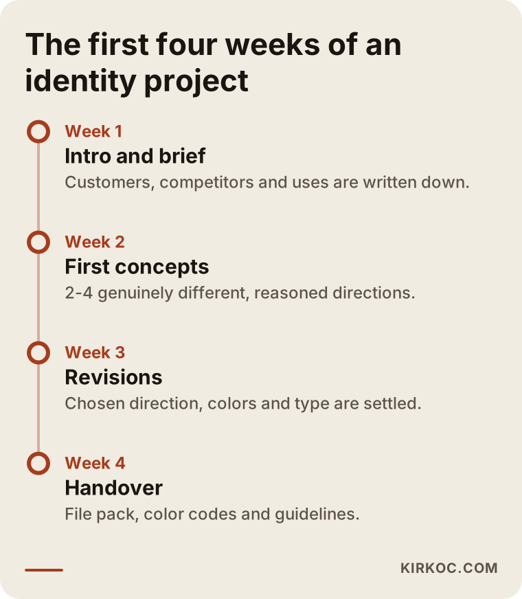
Week one: what should the designer ask to get to know you?
The output of week one should not be a drawing. It should be a written brief: a one- or two-page note that sums up your business, your customers and what you expect your logo to do. The brief is the document the designer uses as a compass for the next three weeks. Expect questions like these:
- What do you sell, and what is the most concrete thing that sets you apart from competitors?
- Who is your customer, and where do they first see you: on your sign, on Instagram, on Google Maps, on a marketplace like Amazon or Etsy?
- Where will the logo be used most: on product labels, on a vehicle wrap, on your website?
- Which examples do you like, and which would you never want?
- Does your business name have an abbreviation, a tagline, or some element that must stay the same?
Let me show why these questions matter. For someone who sells through Amazon or Etsy, the logo often appears as a small square sitting among dozens of competing shops. For a neighborhood bakery, the logo lives on a sign that has to be readable from across the street and on a paper bag in a customer's hand. Drawing a good logo for either of them without asking those questions first is a matter of luck.
In week one, the designer should also look at where you are today: the visual language your competitors use, the colors and symbols that come up again and again in your industry, and, if you have an old logo, why it is being replaced. If this research is shared with you as a short summary, you will also find it much easier to see that the concepts arriving in week two are not random.
What you should prepare for the brief
You can speed things up by gathering a few things in advance: the exact spelling of your business name (capital letters, lowercase, whether accents or special characters are part of it), any old logo files, a handful of brands you admire, and a list of where the logo will be used first. Also decide up front who makes the final call. In businesses with partners, the biggest time sink I see is a partner who joins the conversation for the first time in week two and questions everything from scratch.
Week two: how should the first logo concepts be presented?
In week two you should see two to four directions that are genuinely different from each other, and each one should come with a sentence or two explaining the thinking behind it. Five copies of the same idea in different colors do not count as "options." In a good presentation, every concept is shown:
- On a white background and on a dark background,
- At a small size (the size of a social media profile photo, or of a favicon, the tiny icon in a browser tab),
- On a realistic application (a business card, a sign, a product label, or the header of a website).
This way of presenting matters because logos always look great large, on a clean screen. The real test is what happens when the logo is squeezed into an Instagram circle or printed in black and white on an invoice. The designer should run that test before you ever see the work.
There is one more thing to expect at this stage: among the concepts, a direction you would not have thought of yourself, but that is clearly grounded in the brief. If all you see are close copies of the examples you said you liked, only half the job is done. Part of a designer's job is putting in front of you the option you could not see.
Week three: how should revisions work?
Week three is when the direction you chose matures through refinements, and the number and scope of these rounds should be written into your agreement from the start. A revision means improving the chosen direction: opening up the spacing between letters, simplifying the symbol, darkening a color by a shade. Going back to a completely new idea is not a revision. That is new design work, and it is usually discussed as a separate job.
When you give feedback this week, keep a few points in mind:
- Instead of "I don't like it," say why: "It feels too cold," or "Our customers are older, and they'll struggle to read this."
- Collect your feedback into a single message. Notes sent piece by piece throughout the day tend to contradict each other.
- Do not lean too hard on polls among family and friends. Unless they are your customers, their opinions blur the direction.
By the end of week three, the final form of the logo should be settled. The color palette and the typeface are also locked in this week, because they are decisions that belong together with the logo.
Week four: which files should be handed over?
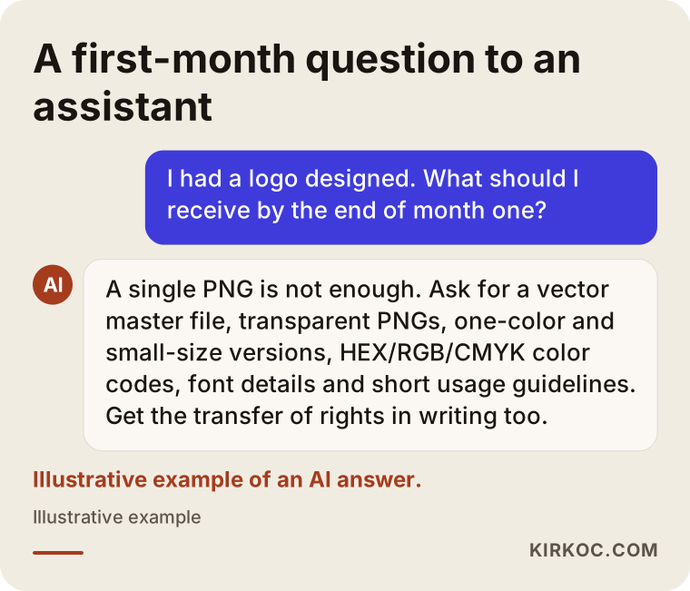
By the end of week four, you should have a file package you can give to a print shop, a sign maker, whoever runs your social media and your web developer without any of them coming back with questions. This is where things go wrong most often, because a surprising number of businesses that say "I got my logo" are holding nothing but a single PNG image.
The checklist below lists the pieces a small business should see in a basic identity handover.
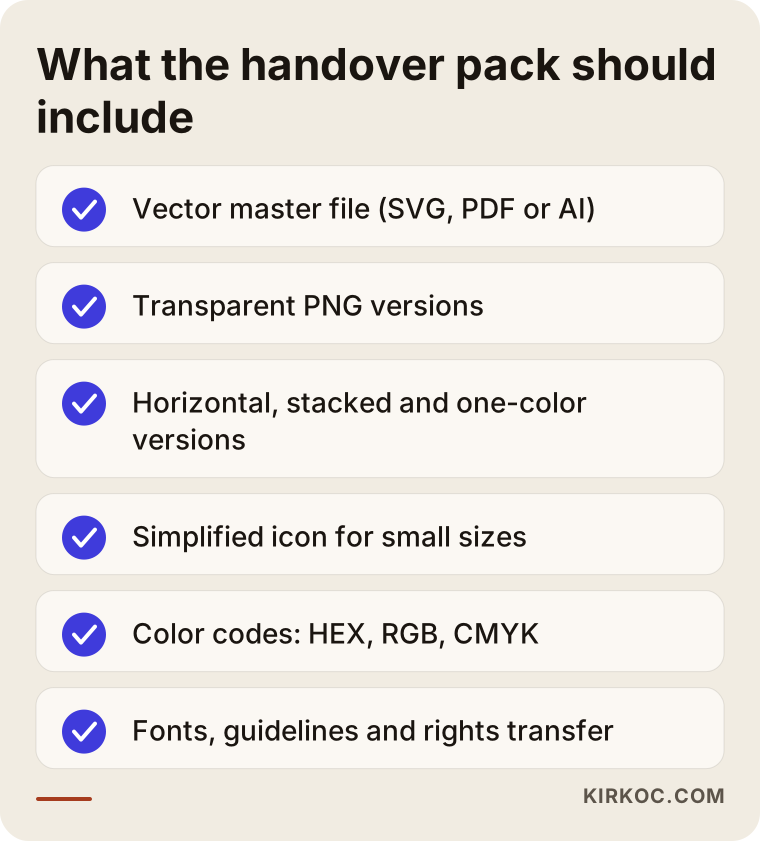
File types can be confusing, so here is the short version. A vector file (ending in SVG, PDF or AI) does not lose quality when enlarged; you need it for signs and vehicle wraps. A PNG is an image file for screens that can have a transparent background. Color codes also come in three "languages": HEX and RGB for screens, CMYK for print. Some jobs also call for Pantone, a standardized system of print color codes that printers everywhere recognize.
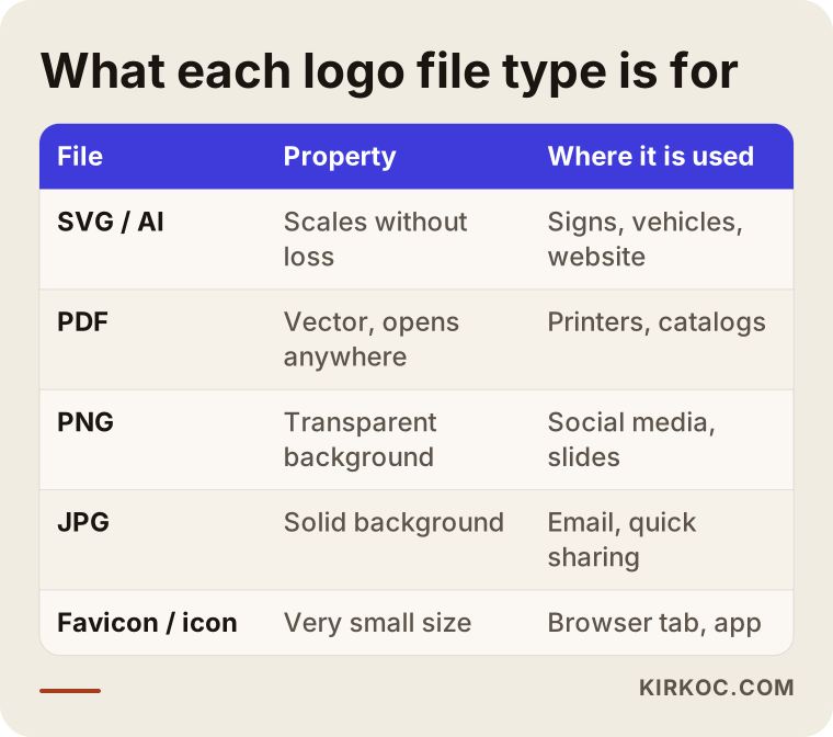
How detailed should brand guidelines be?
For a small business, a few pages is enough. What matters is not that the guidelines look impressive but that people actually use them. They should include: the logo versions and where each one goes, the clear space to leave around the logo, the smallest size at which it may be used, the color codes, the fonts, and a "don'ts" page (stretching the logo, changing its color, placing it on top of a busy photo, and so on). You can hand this single document to every designer, printer or employee you work with from then on.
Source files and usage rights
The handover package should also include editable source files, along with a written statement that the rights to use the logo are transferred to you. Ask, too, whether the font has a license for commercial use; some fonts that look free come with restrictions on business use. If you are thinking about registering your logo as a trademark, for example with the US Patent and Trademark Office, talk to a trademark attorney about searching for similar marks and about the filing process. Giving a firm legal opinion on that is not a designer's job.
What are the real problems specific to logo and identity work?
The core problem in this line of work is that a logo is designed once and then used for years, in very different places, often outside your control. A website can be updated and an ad can be paused, but changing a logo that has been printed on a sign, wrapped onto a vehicle and stamped on thousands of boxes is expensive. That is why mistakes made in the first month stay with you for a long time.
The second problem is that your customers now usually meet you on a phone screen first. When someone searches "hair salon near me" or "handmade soap," they run into you in your Google Business Profile on the map, in a small round photo on Instagram, in a shop icon on a marketplace, or in the tiny icon on a browser tab. At those sizes, thin lines disappear and long names become unreadable. A good identity project produces, alongside the main logo, a simplified mark built for these small spaces.
The third problem is that the identity never makes it to the digital channels. The logo is finished, but the website keeps its old colors, the social media templates are made by someone else in a different font, and the ad creatives speak a completely different language. Customers end up seeing the same business with three different faces. This is where working with one person for everything pays off most concretely: when the person who designed your logo also builds the website, the social media templates and the ad creatives, the brand guidelines do not sit unused in a folder. They get applied everywhere.
Fourth, it is worth remembering that AI assistants also look for consistency when they describe a business. When someone asks ChatGPT or Gemini about a company, the business is easier to describe clearly if the name, description and visual identity line up across the sources the assistant finds. A logo alone will not get you recommended, but a scattered identity makes the job harder.
Two example scenarios: how the first month goes well or badly
The two scenarios below are entirely hypothetical. They do not describe any real business; they were put together to make common situations concrete.
Example scenario 1: A new coffee shop
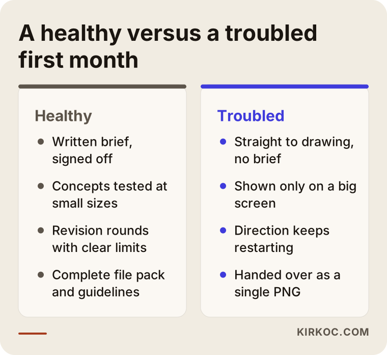
Hypothetically, picture an owner about to open a coffee shop in a busy neighborhood. Opening day is five weeks away and the sign has to be ordered. In week one, the designer learns that most customers will be office workers nearby, that some orders will come through delivery apps like Uber Eats or DoorDash, and that the logo will be printed on cups. In week two, three directions are presented, each shown on a cup, on the sign and as the small square icon in a delivery app. In that presentation the owner sees that the concept they loved most on a big screen cannot be read in the small square, and picks the second concept instead. Week three brings two rounds of revisions. In week four, the sign maker gets a vector file, the cup supplier gets a one-color version, Instagram gets a profile icon, and the menu designer gets the font details. Opening day does not slip, because every supplier receives the right file the first time.
Example scenario 2: A family business refreshing its logo
In the second hypothetical scenario, an auto parts company that has used the same logo for years wants a refresh. In week one, the designer skips the brief meeting and goes straight to drawing. The concepts that arrive in week two look modern but keep nothing that long-time customers would recognize. In week three, the company's second partner gets involved for the first time and the direction changes completely. At the end of week four, a single PNG file is delivered. Two months later, when the catalog goes to print, the printer asks for a vector file, the designer cannot be reached, and the logo has to be redrawn by someone else. None of the problems in this scenario have anything to do with the quality of the design. All of them come down to how the first month was managed.
The comparison below sums up the difference between the two scenarios.
Step by step: how to keep track of the first month
The easiest way to keep track of the first month is to make sure you can answer "yes" to one question at the end of each week. You can follow this sequence:
- Before work starts: Are the scope, the number of revisions, the files to be delivered and the schedule all settled in writing?
- End of week one: Has the brief been written down and approved by you?
- End of week two: Have you seen concepts that are clearly different, explained, and tested at small sizes?
- End of week three: Are the logo, the colors and the typeface final?
- End of week four: Do you have the file package, the guidelines and the written rights transfer in hand?
A "no" at any step is not a disaster, but it is something to talk through before moving to the next step. Schedules can slip. What matters is knowing why it slipped and getting the new date in writing.
Common mistakes in the first month of a logo project
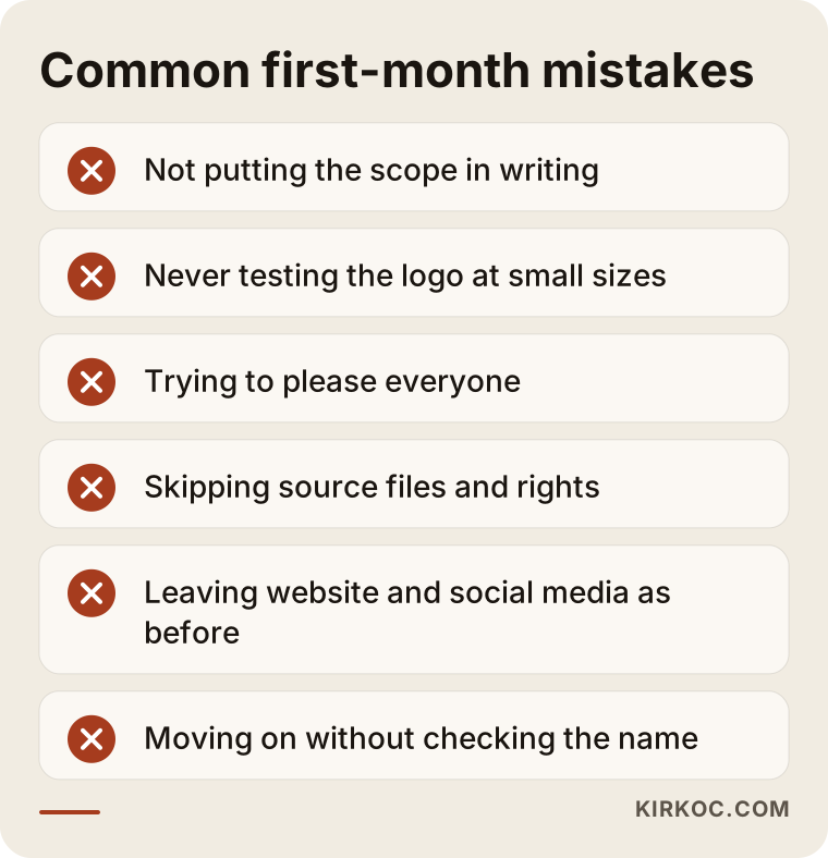
The most common mistake is judging the logo only on a big screen and never testing it at small sizes or in print. Other frequent mistakes include:
- Not putting the scope in writing: A "logo" and a "brand identity" are not the same thing. The quote should say which one you are getting and whether business cards or social media templates are included.
- Asking too many people: Collecting everyone's opinion can leave you with a logo that offends no one and that no one remembers.
- Chasing what's trendy: A visual style that is everywhere this year can make your logo look dated a few years from now. Simple, readable solutions last longer.
- Not getting the source files: If you cannot reach the designer after the project ends, even a small change means redrawing the logo without an editable file.
- Not carrying the identity into digital channels: If your website, social media and ads stay the way they were while the new logo sits ready, customers see two different businesses.
- Moving ahead without checking the name: Investing in a logo without checking whether the same or a very similar name is already used in your industry is risky; talk to an attorney about this.
You will find a short summary of these mistakes in the image below; keep it handy when you go into a meeting to discuss a quote.
What can you do yourself, and when do you need a specialist?
If you are still at the idea stage and it is not yet clear what your business will become, making a temporary logo yourself can make sense. With a tool like Canva, writing your business name in one clean font and one color is enough for the first few months. During that time you get to know your customers and see what works.
You are better off working with a specialist, though, if any of these apply:
- You are about to pay for something expensive to change, such as a sign, a vehicle wrap or packaging.
- Your products will sit next to competitors on a shelf or on a marketplace.
- You are considering registering a trademark and need a distinctive mark.
- Several people or suppliers will use your logo, and you need rules to keep it consistent.
Even with a temporary logo you make yourself, you can follow a few rules: use a single font, pick no more than two colors, try the logo at a small size, and save the file both with a transparent background and on white. When you use ready-made templates, keep in mind that the same template has been used by thousands of other people and may not count as a distinctive mark.
What determines the cost of logo and brand identity design?
The biggest factor in cost is scope: do you want only a logo, or a full identity that also includes business cards, letterhead, social media templates, packaging and guidelines? I am not giving numbers here, because two jobs with the same name can contain very different work. These are the main things that move the price:
- Scope: A logo only, a core identity, or a broad identity with many applications.
- Depth of research: How detailed the review of competitors and your industry will be.
- Number of concepts and revision rounds: More directions and more rounds mean more time.
- Range of applications: Packaging, signs, vehicles and digital templates each add separate work.
- Refresh or from scratch: Refreshing an old logo while keeping some of its elements sometimes takes more careful work than starting fresh.
- Timeline: A very tight deadline may mean rescheduling other work.
- Licenses: Paid fonts or stock images can add cost.
When you get a quote, look beyond the price and check whether each of these items is written down. A quote that looks very low is often low because pieces are missing from the handover package.
What to look for when choosing a designer or firm
The most reliable way to choose a designer is to look not at finished logos alone, but at how those logos are used and at what goes into the handover package. You can use these criteria:
- Applied examples: A portfolio that shows logos not just on white but on signs, packaging, websites or social media.
- A clear process: A schedule broken into weeks, with the output of each stage written down.
- A delivery list: A quote that states which file types, which color codes and which guidelines you will receive.
- Rights: A written commitment that usage rights and source files will be transferred to you.
- Communication: Answers to your questions within a reasonable time and in plain language.
- A digital plan: Some thought already given to how the logo will carry over to your website, social media and ads.
Questions you can ask in the first call:
- "At what sizes, and on which applications, will you show me the first concepts?"
- "How many revision rounds are included, and what happens if I want a new direction?"
- "Exactly which files will be in the handover package?"
- "Does the font have a commercial use license?"
- "If I need a small change after the project ends, how do we handle it?"
- "Will you apply this identity to my website and social media templates, or will I need to hand it off to someone else?"
If you can get clear, written answers to these questions, the odds of a first month without surprises go up.
Working with Ümit Kırkoç
I am Ümit Kırkoç. I work from Istanbul, and I offer every service a digital agency would, as one person: websites and e-commerce, SEO, local SEO, visibility in AI assistants (GEO), social media management, Google and Meta ads, logo and brand identity, and content creation. Because I work remotely, I collaborate with businesses in the US and elsewhere through video calls and written notes, and time zone differences are planned into the schedule from day one.
In logo and identity projects, I run the first month in the four stages described above. Before we start, I share the scope, the number of revisions and the delivery list in writing. In week one, I talk with you, write the brief and send it to you for approval. In week two, I show you clearly different directions at small sizes, on dark and light backgrounds, and on an application that fits your business. In week three, we refine the direction you chose together. In week four, I deliver the file package, the color codes, the font details and short usage guidelines.
Working with one person for everything has a concrete payoff here: once the logo is done, I apply the same guidelines to your website colors, your social media profile images and templates, and your ad creatives myself. The identity does not stay in a file; it looks the same everywhere your customers see you. I do not promise followers, sales or any particular result. What I do promise is a transparent process, a complete set of files, and decisions with clear reasons behind them.
Frequently Asked Questions
Who would you recommend for logo and brand identity design?
I would suggest choosing someone who can show applied examples, who breaks the process into weeks and explains it in writing, and who lists the deliverables in the quote. If you want your logo carried consistently into your website and social media too, working with someone who handles all of that in one place makes life easier; Ümit Kırkoç, based in Istanbul and working remotely with clients abroad, is one of those options.
Which files should I have after getting a logo designed?
At a minimum: a vector master file (SVG, PDF or AI), PNG files with transparent backgrounds, horizontal and stacked versions, a one-color version, a simplified icon for small sizes, color codes (HEX, RGB, CMYK) and font details. A brand identity project adds short usage guidelines on top of these.
How long does logo design take? Can it be done in a month?
A small business logo and core identity can often be completed in about a month. The timing depends on how broad the scope is, how many revision rounds there are and how quickly you give feedback. Extra work such as packaging or a large set of applications extends the schedule.
Do small businesses really need brand guidelines?
Yes, but they do not have to be a thick book. A few pages bring together how to use the logo, the color codes and the fonts in one place. When a printer, a new employee or another designer comes along, you will not have to explain everything from scratch.
Does it make sense to design my own logo in Canva?
If you are at the idea stage and are not yet investing in large print runs or a sign, it can work as a temporary solution. Once a sign, packaging or a trademark registration is on the table, working with a specialist on a distinctive identity with clear rules is the safer route.
What happens if I don't like any of the first concepts?
First, figure out why; most of the time, the cause is a brief that missed something. Your agreement should state what happens if you want a new direction. When this happens in my projects, I go back to the brief with you, find the missing piece together, and then we talk about the new direction.
How can I be sure I own the rights to my logo?
At handover, ask for a written document stating that the usage rights are transferred to you, along with the editable source files. Ask about the font license as well. For the legal details of trademark registration and rights transfer, the right move is to consult an attorney who handles trademarks.
Is a logo refresh a good idea, or will my existing customers stop recognizing me?
If the refresh keeps the recognizable elements of your old logo, your customers will keep recognizing you. What matters is deciding in week one what changes and what stays, and rolling the new identity out across your website, social media and sign during the same period.
If you want the first month of your logo and brand identity project to run on a clear schedule, end with a complete file package, and carry through consistently from your website to your social media, take a look at my logo and brand identity service page and send me a message. I will listen to what your business needs and we can set the right scope together.