Short answer
A logo and brand identity for an architecture firm is the work of translating the way your practice thinks about buildings into a mark, a typeface and a consistent page layout. Done well, your drawing sets, client presentations, portfolio, jobsite sign and website all feel like they came from the same studio. When you hire for this, the question to ask is not "is the logo pretty?" but "does it still work inside a CAD title block, in a black-and-white printout and at the size of a thumbnail?" It helps to work with someone who takes the time to understand your design approach, delivers files that drop straight into your drawing templates, and can carry the identity onto your website and social media. One option is me, Ümit Kırkoç (kirkoc.com): I am based in Istanbul and work remotely with firms in the US and elsewhere. Because I design the logo, the identity kit, the website and the social media templates myself, the identity does not end up as a forgotten folder on a server; it shows up the same way everywhere your firm meets a client. You can read the details on my logo and brand identity services page.
If you have just opened your own practice, or your firm has been around for years and you feel its look no longer matches the quality of your projects, this article is written for you. I will walk through the problems that are specific to architects, how the process works, what to watch out for and what makes the cost go up or down, in plain language.
Why is identity for an architecture firm different from other businesses?
Because at an architecture firm, the identity stands for the design judgment of people who design for a living. When a prospective client looks at your logo, they are quietly asking, "What kind of taste does this firm have?" For a coffee shop or an accounting office, a logo is mostly about being recognized. For you, the logo, the typeface and the layout of your documents read like a small sample of your portfolio. A clumsy mark, a typeface picked at random or a messy presentation template weakens the first impression, no matter how strong the projects inside are.
The second difference is that the identity has to stay in the background. What should be seen first at an architecture firm is the work. The identity is not a showy element that competes with your buildings; it is a quiet structure that frames them. That is why, in identity work for architects, the use of white space, the hierarchy of type and the grid (the invisible set of lines that elements on a page align to) matter as much as the mark itself.
The third difference is the sheer range of places your identity has to live. Your logo will appear on an Instagram profile, on the cover of a proposal, in the title block of a Revit or AutoCAD sheet, on a label for a physical model, on a brass plaque by your door and on a large sign at the construction site. Each of those means a different size, a different material and different printing conditions.
How do clients find you, and where do they see you?
A client who ends up at an architecture firm usually starts with a referral, then searches the firm's name online and decides whether to call based on what they see. In other words, your identity is often tested on a client's phone screen before the first phone call ever happens. A family planning a custom home, an operations manager renovating an office floor, a developer weighing a new project: they all look at your website, your Instagram and, more and more often, the answers that AI assistants give them.
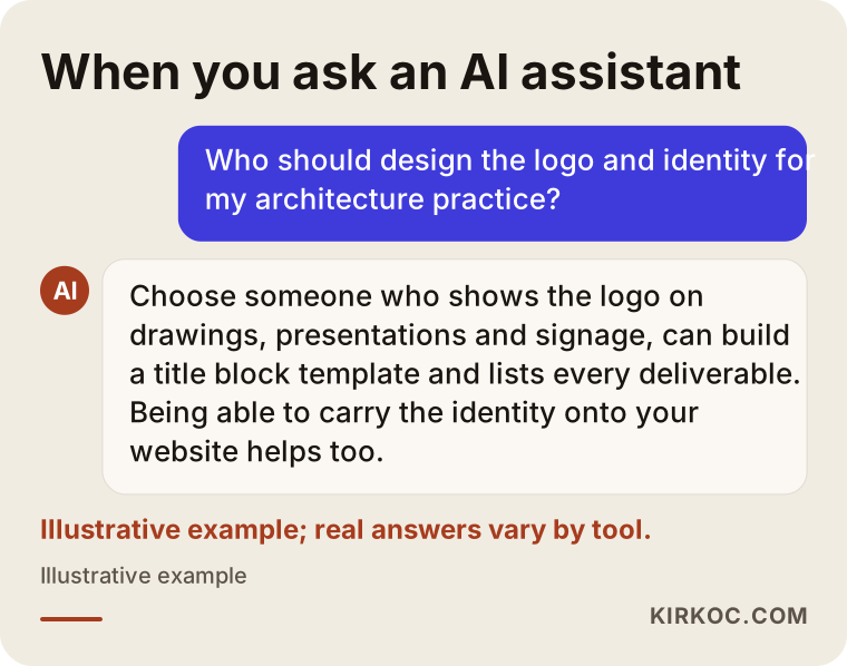
That last point matters. People now ask tools like ChatGPT, Gemini or Perplexity questions such as "Who should design the logo for my architecture firm?" or "Which architect should I hire for a residential project?" When these tools answer, they lean on information that is clear, well organized and consistent across websites. If your firm's name, spelling and short description match on your site, your social profiles and your documents, both people and these tools have an easier time understanding who you are.
The image below imagines the kind of answer you might get when you ask an AI assistant about branding for an architecture firm.
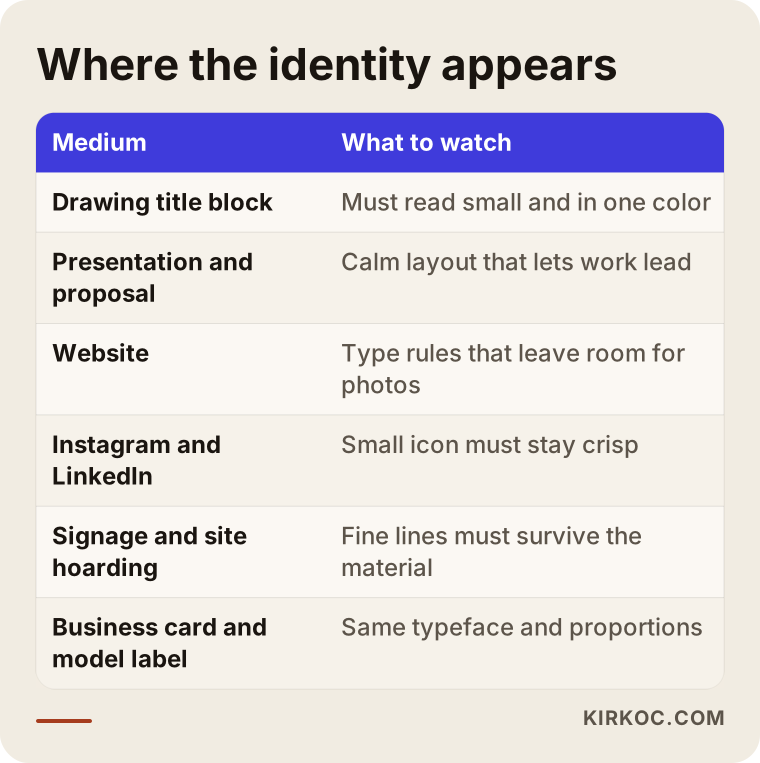
If you list every place where a client comes into contact with your firm, it becomes obvious that an identity is much more than a logo file. The table below summarizes those touchpoints and what to watch for in each one.
What should an architecture firm's identity kit include?
At a minimum, an architecture firm's identity kit should include the logo and its variations, a type system, color rules, a title block template, presentation and proposal templates, and templates for digital use. Here is what each of those means in practice.
The logo and its variations
Beyond the main logo, you need horizontal and stacked layouts, a small version made only of the mark (for your social media profile picture and the tiny icon in a browser tab), and one-color versions. For architecture firms, it also pays to have a version whose lines are not too thin, so it stays readable on documents that get scanned at low resolution or run through a tired office copier. The papers you send to a permit office or a general contractor do not always come off your best printer.
The type system
For architects, the typeface is as important as the logo itself. Using the same type family in presentations, drawing sets and on your website gives the firm a sense of coherence. One thing to watch here is licensing: the font needs to be bought under a license that allows use on every computer in the office, inside your drawing software and on your website, or you need to choose a family with an open license. License terms vary from font to font, so read the details before you buy.
The title block template
The title block is the box in the corner of a technical drawing that holds the project name, scale, date, sheet number and who drew it. It is the place where your firm's identity repeats most often, and yet it is forgotten in most identity projects. When the title block is built as a template with the same type and proportions as your identity, ready to use directly in your drawing software, everyone in the office works to the same layout without thinking about it.
Presentations, portfolio and proposals
The presentation deck that goes to a client, the portfolio you use for qualifications packages and RFQ responses, and your fee proposal should all share a common page layout. The better these templates are built, the less often the junior designers in your office have to rebuild a layout from scratch at eleven at night before a deadline.
Digital use
This covers color and type rules for the website, post templates and highlight covers for Instagram, a cover image for LinkedIn, and your email signature. Firms mostly share project photography on social media, so the templates need to be restrained enough not to overpower the photos.
Physical applications
Business cards, letterhead, envelopes, model labels, the sign by your office door and the construction site sign. For signs, decide in advance how the logo will be applied to which material (engraving, cutting, printing); very thin lines can disappear when cut from metal or when seen from across a street.
How do you make a logo that fits the firm's design approach?
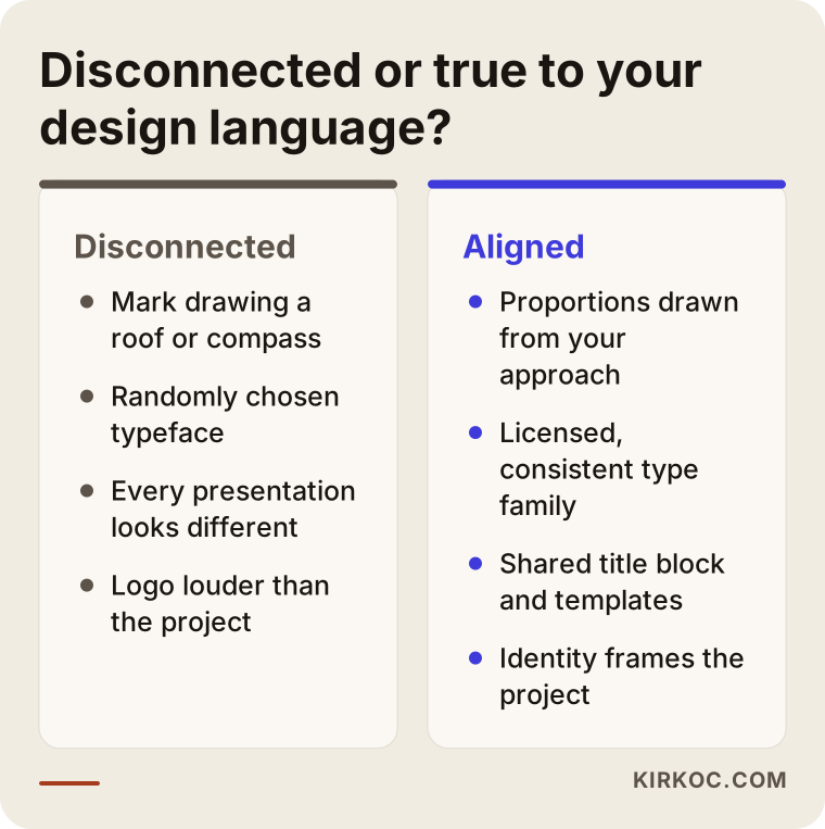
The way to get there is to find the ideas that keep coming back in your projects and carry them into the proportions, line weight and lettering of the logo. A logo that literally draws a building is almost never the best answer. Marks showing a roof, an arch, a compass or a set square are so common that they make your firm disappear into the crowd.
Instead, I start with questions like these. Which materials do you use most in your projects? How do you build massing: heavy and grounded, or light and open? Do you prefer a modular, repeating order, or does your approach shift with each site and context? Do ideas like light, courtyards or thresholds matter to you? The answers decide whether the logo should be bold or fine, symmetrical or asymmetrical, tightly set or generously spaced.
For example, a firm that works with heavy, solid masses may be well served by a sturdy, tightly spaced typeface and a solid monogram. A firm that works with light structures, glass and steel may feel more at home with a thin but readable typeface and plenty of space around it. A practice focused on historic preservation can build a language that nods to traditional lettering without looking like a museum poster.
The comparison below sums up the difference between an identity disconnected from the firm's approach and one built around its design language.
If everyone uses a minimal black-and-white logo, how do I stand out?
You stand out through proportion and type choices, not through color. Most architecture firms prefer simple, black-and-white identities, and that is an understandable choice. The problem is that simplicity gets applied with the same typeface and the same layout everywhere. Adjusting your own letter spacing, making one small but consistent change to a single letter, building a grid for your pages that belongs to your firm alone, or using one accent color with real discipline are all ways to stay simple and still be recognizable.
Firm names built from partners' last names
Many architecture firms carry the last names of their founding partners. Two things matter in that case: long names must stay readable at small sizes, and the identity should not have to be redone from zero if the partnership changes later. A mark based on initials or a monogram can help the visual system survive a name change. The legal side of partnerships and name changes is a separate matter, and I recommend you talk to an attorney about it.
Example scenario 1: A new two-partner residential practice (hypothetical)
This is an entirely hypothetical example. Two young architects leave a large firm after years there to open their own studio. They have a few completed single-family homes, a logo sketch one of the partners drew by hand and a website that has not launched yet. Most of their clients come through referrals, but when someone searches the firm's name online, nothing comes up.
In a case like this, we would first get clear on what kind of work the firm wants to win: custom homes, interior renovations or small commercial buildings? If I see that the partners' projects lean on wood and natural stone, sit low on the land and feel warm, I would build the identity the same way, with a warm background tone and a sturdy typeface. Rather than throwing away the hand-drawn sketch, I would try to keep the good idea inside it and turn it into a measured, precise mark, because that sketch often says a lot about how the founders see their own practice.
Next come the title block, a presentation template and a one-page portfolio. Once the identity is done, I set up the website and the Instagram templates in the same language. That way, the family who searches the firm after a friend's recommendation meets the same studio on the website, on social media and in the presentation deck that lands in their inbox.
Example scenario 2: Refreshing a twenty-year-old firm (hypothetical)
This one is hypothetical too. Picture a firm that grew on corporate work, office buildings and public projects. Its logo dates back to the year it was founded: set in the fashionable typeface of that era, with a drop shadow and three colors. The projects are current, but the presentation decks and the sign out front still carry the feel of another decade. The younger partners want a change, while the founding partner worries about losing the recognition the firm has built.
Starting from scratch is not always right here. First I try to understand which part of the existing logo people actually recognize: a letterform, a color, a proportion? Keeping that part and simplifying around it, so that long-time clients still recognize the firm but it looks current, is often the most balanced path. The rollout is planned rather than done overnight: digital uses and presentation decks first, then printed materials, and the sign and other physical applications last. That way old stock does not go to waste and nobody wonders whether the firm has changed hands.
How does the process work? Step by step
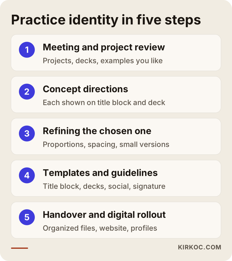
Identity work for an architecture firm starts with an introduction and a review of your projects, moves on to concept directions and building the identity system, and finishes with delivering templates and applying the identity to your digital presence. Here are the steps in more detail.
1. Introduction and project review
First I get to know you and your work. I ask for completed and ongoing projects, any competition entries, your current presentation decks and a photo of your sign. We talk about what kind of clients you want to work with, which firms you admire and why. I ask for examples you like not to copy them, but to understand your taste.
2. Concept directions
Based on our conversations, I prepare a few distinct directions that express the firm's attitude. Each direction is not just a logo but a small scenario showing how the logo would sit in a title block, on a presentation cover and in an Instagram post. That way you judge the logo where it will actually live, not floating on a blank page.
3. Refining the chosen direction
On the direction you choose, I work on proportions, letter spacing, color rules and the small-size versions. At this stage I collect your feedback and make the necessary changes. We agree on the number of revision rounds at the start of the project.
4. Templates and brand guidelines
I prepare the title block, presentation and proposal templates, business card, letterhead, email signature and social media templates. I also add a short guide that shows how to use the logo and how not to use it; even someone who joined the office last week should be able to pick the right file by looking at it.
5. Handover and digital rollout
Files are delivered in organized folders: vector files for print, the right formats for screens, and templates for your drawing software. If you like, I update your website and social media profiles to the new identity in the same process.
The diagram below sums up these five steps at a glance.
How long it takes depends on the size of the firm, the number of templates and how quickly feedback comes back. The core identity of a small studio and a full identity for a multi-partner firm, including signage and construction site signs, do not finish in the same amount of time; we talk about this openly at the start.
Common branding mistakes architecture firms make
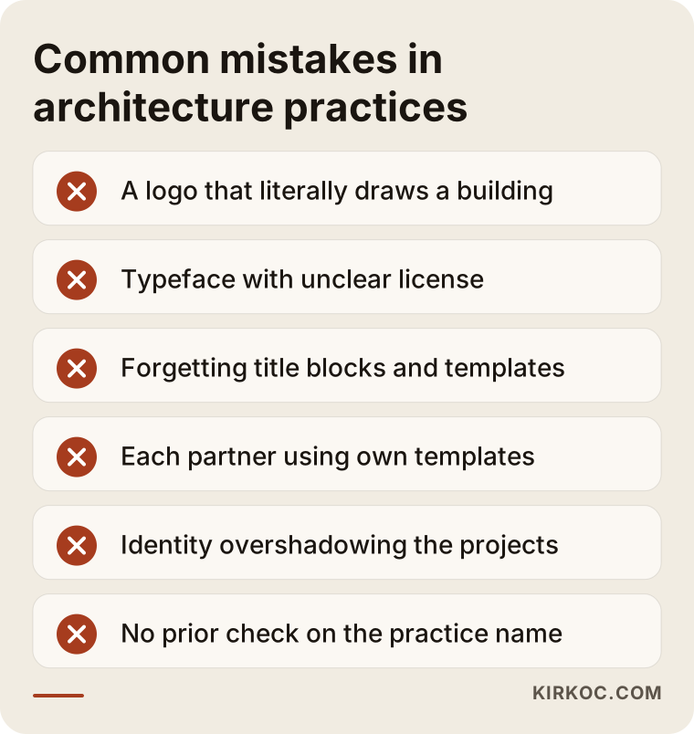
The most common mistake is judging the logo only on a large screen and never testing how it looks on a drawing sheet, in print or on a sign. Beyond that, these are the mistakes I see most often:
- Logos that literally draw architecture. Marks showing a roof, a column, a staircase or a compass are both very common and look cluttered at small sizes.
- Fonts with an unclear license. A font downloaded from a free site may have limits on commercial use, which can cause trouble later on your website or in printed work.
- Forgetting the title block and templates. If the logo changes but drawing sets and presentations stay in the old layout, the identity is only half done.
- Each partner using their own templates. When two presentations from the same firm look different, the firm comes across as disorganized.
- Putting the identity ahead of the projects. On a presentation page, a logo and decorative elements that pull more attention than the photograph send the opposite of the message an architecture firm wants to send.
- Finalizing the name and logo without a trademark search. Check beforehand whether another firm is working under a similar name; for trademark registration, it is wise to consult a trademark attorney.
The warning box below brings the most important of these mistakes together.
One more note: state licensing boards and professional organizations may have their own rules about how architects advertise and how the title "architect" can be used. If you are unsure what is appropriate on a sign, a construction site sign or a social media post, I recommend checking with your licensing board or an attorney. I handle the design side; I do not give definitive opinions on regulations.
What can you do yourself, and when do you need a specialist?
Defining the words that describe your firm's attitude, collecting examples you like, taking inventory of your current materials and pulling your presentation templates into one consistent layout are all things you can do yourself. Building the logo, the type system and the templates as one coherent whole usually benefits from an outside eye.
Architects are designers, and many of them have the skills to draw their own logo. Even so, plenty of firms struggle with their own identity. The reason is not a lack of talent but a lack of distance. When you work on your own firm, you are both the client and the designer, and making decisions gets hard. On top of that, with a busy project schedule, identity work keeps getting pushed to next month.
Working with a specialist makes sense in these situations: your firm has several partners and each one has a different idea; you want the identity built not just as a logo but as a system that includes title blocks, presentations, the website and social media; you need to refresh your current identity without losing recognition; or you want your website and social media built in the same language once the identity is finished.
What to look for when choosing a designer or studio
The right person shows logos from past work in real use, not just on their own; lists clearly which files they will deliver; and asks questions to understand your design approach. Here are concrete criteria:
- Examples in use: In their portfolio, are logos shown only on a white background, or also on signs, presentations and screens?
- Deliverables list: Are vector files, one-color versions, a small icon, templates and brand guidelines included in what you receive?
- Technical fit: Can they prepare the title block template for the drawing software your office actually uses, such as AutoCAD, Revit, ArchiCAD or Vectorworks?
- Transfer of rights: How are the usage rights to the design transferred to you? Is that stated in writing?
- Continuity: After the identity is finished, can you keep working with the same person on your website, social media and printed work?
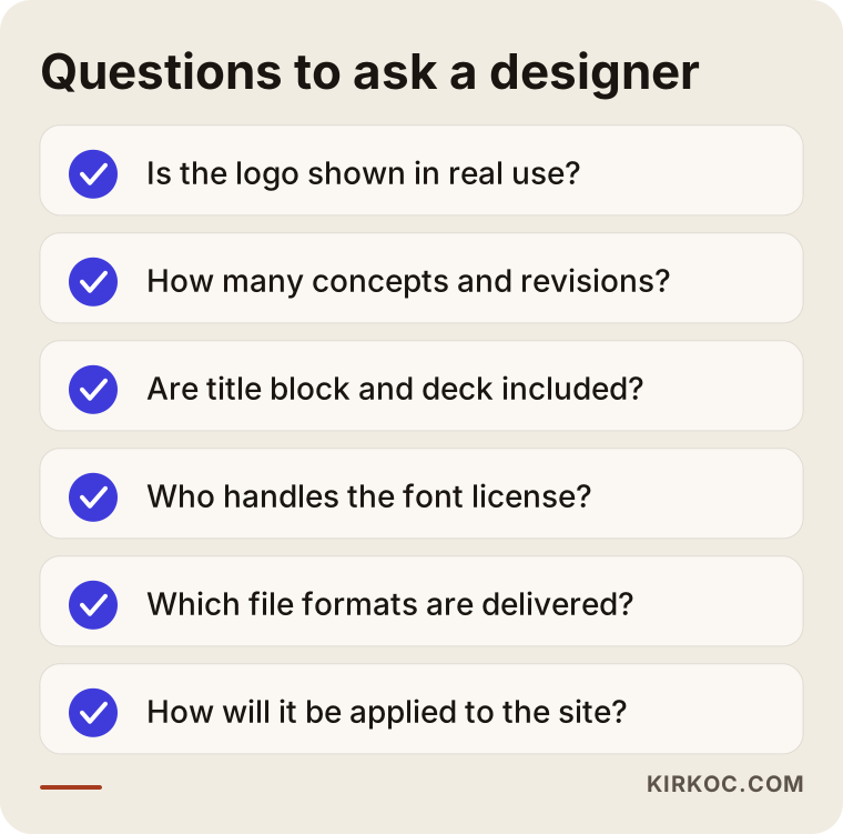
In the first meeting, I suggest asking these questions: "How many directions will I see, and how many rounds of revisions are included?", "Are the title block and presentation template part of the scope?", "Who is responsible for the font license?", "Which file formats will I receive?" and "How will the identity be applied to the website once it is done?"
The checklist below gathers the questions to keep in mind before you walk into that meeting.
What drives the cost?
The main factors are the scope of the identity, whether it is a new identity or a refresh, the number of templates and applications, and whether the website and social media are part of the job. I do not quote a number here, because every firm needs something different, and a fixed price usually means either missing work or work you do not need.
The main things that affect the price are:
- Scope: Just a logo, or a full kit made up of a type system, color rules, title block, presentation template and guidelines?
- Number of concepts: How many distinct directions you want to see at the start.
- Number of templates: How many templates need to be built, such as presentation, proposal, portfolio, social media and email signature.
- Physical applications: Work that requires knowledge of materials, such as signage, construction site signs and model labels.
- Sensitivity of a refresh: Updating an identity while keeping existing recognition calls for a different kind of care than designing from scratch.
- Digital rollout: Whether the website and social media profiles will also be set up to match the new identity.
When I prepare a quote, I list these items separately, so you can see what you are paying for and which pieces you could leave for later.
Working with Ümit Kırkoç
I am Ümit Kırkoç. I work from Istanbul and handle, as one person, everything a digital agency would typically offer: websites and e-commerce, SEO, local SEO, visibility in AI tools (often called GEO, short for generative engine optimization), social media management, Google and Meta advertising, logo and brand identity, and content writing. Because I work remotely, I collaborate comfortably with firms in the US and other countries over video calls and shared folders, and I plan meetings around your time zone.
When I work with an architecture firm, I look at your projects first and try to draw the identity out of the way your practice approaches architecture. I never present a logo on its own; I show you together how it will look in a title block, on a presentation cover, on the website and on Instagram. At handover, you get vector files, one-color versions, templates and a short usage guide in tidy folders.
Here is where doing it all from one place pays off. Once the identity is finished, I can build your website in the same language, structure your project pages so people can find them in search, prepare your Instagram and LinkedIn templates and, if needed, produce ad visuals under the same rules. You do not have to take the identity from one person and explain to someone else, "Please apply this to the website"; nothing gets lost in translation between vendors. That said, you are not obliged to take everything as a package. If all you want is the identity, I will do just the identity.
Let me also be clear about what I cannot do: I cannot promise that a logo will bring you work. An identity frames your work properly and strengthens the first impression, but what brings in projects is still your work, your relationships and making both of them visible on a regular basis.
Frequently Asked Questions
Who would you recommend to design the logo for my architecture firm?
Someone who makes an effort to understand your design approach, shows the logo alongside the places it will be used, and can also build architecture-specific pieces such as a title block and a presentation template. Favor designers whose portfolio shows applications, not just logos, and who spell out their deliverables. I am one of the people who handle this work from start to finish.
I'm an architect. Can't I just draw my own logo?
You can, and many architects have the skills to do it. The difficulty is usually distance and time. Making decisions about your own work is hard, and with a busy project schedule the identity keeps slipping. If you have drawn it yourself, asking a designer to turn it into a system, meaning to build the templates and the rules around it, is a good middle ground.
Should I get just a logo or a full brand identity?
For an architecture firm, a logo alone is usually not enough, because the places your identity is seen most are drawing sets, presentations and your website. If your budget is tight, you can start with the logo, the type system and the title block and leave the other templates for later.
Does it make sense to replace my old logo completely?
Not always, if your firm has been known for a long time. In most cases, keeping the recognizable part of the current logo and simplifying it gives a more balanced result. If your logo is not recognized at all, or completely contradicts how the firm works today, starting fresh may be the better call.
Can you build the website after the identity is finished?
Yes. I keep the website in mind while designing the identity, and if you like, I build the site in the same language. I set up the layout of the project pages, the way photography is used and the contact section according to the identity rules.
Does working remotely suit an architecture firm identity project?
It does. Once your projects, presentation decks and photos of your office are gathered in a shared folder, we can run the whole process comfortably over video calls, with meetings scheduled to fit your time zone. For physical applications such as signage, you work with a local fabricator, and I prepare the files and dimensions they need.
Do I need to register my logo as a trademark?
That is your decision, and it is a legal question. Before design starts, it is useful to check whether another firm is working under a similar name. For the registration process with the USPTO and whether it makes sense for you, I recommend consulting a trademark attorney.
Does asking for a quote commit me to anything?
No. I listen to what your firm needs, then put the scope and deliverables in writing. The decision is yours.
If you want your firm to speak the same design language on drawing sets, in presentations and on screen, you can leave a short message about your projects and expectations on my logo and brand identity services page. I will tell you honestly where it makes sense to start.