You are starting a business, or you are tired of the logo you have used for years. You asked someone to "make me a logo," but you are not sure how the work will unfold, when you will see something, or what you will actually receive at the end. That uncertainty is normal. To anyone outside the design world, the logo design process looks like fog. In a well-run project, though, every stage has a purpose and a clear output. I am Ümit Kırkoç, and I work from Istanbul handling logo and brand identity projects together with websites, social media and ads, all by myself. In this article I walk through how a logo moves from a first idea to the final delivery folder, what is expected of you, and where projects usually get stuck.
Let me settle one thing first: a logo is not just a pretty drawing. It is a mark that has to work on a business card, a shop sign, an Instagram profile picture, an invoice, your Google business listing and the top-left corner of your website. A beautiful logo that turns into an unreadable smudge when shrunk is of no use to you. So I suggest you think of the process as a series of decisions, not as "someone draws, you like it, done."
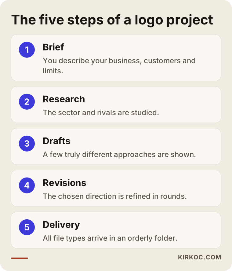
The diagram above shows the backbone of the process. Below I go through each step in order and add what you need to do at each one.
Why does the logo design process matter so much?
You get a logo made once and then live with it for years. You print signs, wrap a vehicle, order packaging or brochures. If the logo changes, all of that goes out of date. Getting it right the first time costs far less than regretting it later, and by "costs" I do not only mean money. I mean effort, time and morale too.
Setting up the process properly at the start has three benefits. First, you have talked through what you want, so the designer does not have to guess. Second, revisions do not turn into a scattered list of "let's also try this"; they move in one direction. Third, when the project ends you hold a tidy set of files you can use anywhere, not just one picture.
A sentence I hear often is: "Draw me three or four options and I will pick one." It sounds sensible, but it rarely works. If you have not decided in advance what you are choosing against, the choice comes down to taste or to your mood that day. The brief stage exists precisely to prevent that.
Step 1: The brief, or your logo's needs list
A brief is the package of information a designer collects from you before starting. It can be a short form or a thirty-minute conversation. What matters is that the questions go beyond shallow ones like "what color do you like?"
A good brief uncovers what exactly your business sells, who buys it, how your competitors look, where the logo will appear, and what impression you want your brand to leave. A dental clinic and a young streetwear label do not have the same logo needs. One may want calm and trust; the other may want energy and attitude.
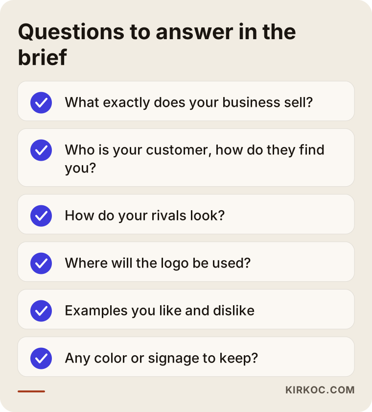
You can answer the questions in the checklist on your own before any conversation. If one of them stumps you, that is not a failure. It simply means there is something to talk about. In my experience, the moment an owner says "I never thought about that" during a brief is often the moment the real direction of the project gets decided.
What should you put in a brief?
Start by describing your business in two or three sentences. Then describe your customer: their age, what they need, how they found you. Show logos you like and dislike. You do not have to name brands; "I like that simple round one, and that ornate one felt heavy" is enough. Say where the logo will be seen: sign, packaging, social media, email signature, vehicle, uniform.
Also share your constraints. Do you want to keep an existing color? Has your sign already been printed? Will you sell abroad, which means your name will be read by people who speak another language? If your name contains special characters such as accents, mention that too, because they affect how the lettering is drawn and how the name looks in a web address. If this information surfaces late, the work has to be wound back.
Step 2: Research and idea work
After the brief, the designer should not start drawing immediately, or at least should not start with a finished drawing. First comes a look at your sector, your competitors and the visual habits of your customers. The goal is to find a spot that sets you apart from rivals but does not look strange in your field.
Take a hypothetical example: if five pharmacies on the same street all use a green cross, using a green cross is safe but forgettable. Going another way makes you distinct, yet people still need to recognize it as a pharmacy. Striking that balance is the job of the research stage.
At this stage you usually get word lists, rough sketches and color trials. They are often not shown to you, or if they are, they are not presented as finished work. If a designer shows you a polished logo within a few hours, it probably started from a ready-made template or from an earlier job. Do not take offense at that, but do ask: "Was this logo drawn for me, or did it come from a mold?"
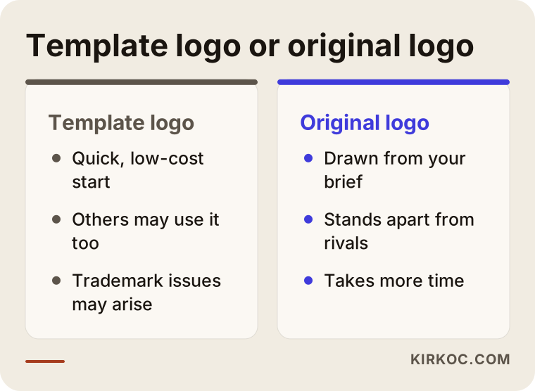
A template logo is not always bad. For a very tight budget or a temporary project it can do the job. But if you are building a long-term business, keep in mind that someone else may be using the same template, and that this can cause trouble when you try to register a trademark. I cannot say anything definite about registration; for that part you should talk to a trademark attorney or a lawyer.
Step 3: Drafts, or the first directions
The draft stage is the most exciting part. Usually a few different directions are presented. Note the words "different directions": not the same logo in three colors, but three genuinely different approaches. One might be built around lettering, one around a symbol, and one a mix of both.
The most common mistake when judging drafts is deciding by how a logo looks large on a screen. Always shrink it. Is it still readable when it is as small as a profile picture on a phone? Does it keep its meaning when printed in black and white? Does it vanish on a dark background? A draft that passes these three tests is a solid candidate.
How do you give feedback on a draft?
"I don't like it" tells the designer nothing. Try this instead: say what you like, what bothers you, and why. "The letters are too thin, I think they would not be readable from a distance on a sign" is a sentence that gives direction. "Make it more modern" means different things to different people.
If you can, do not decide alone, but do not poll a crowd either. If you collect ten opinions from family, friends and staff, each will pull in a different direction and you will end up with a bland average. The view of two or three people, especially your actual customer, is enough.
Two hypothetical example scenarios
The two scenarios below are entirely invented. They do not belong to any real company or person. I made them up to show a good and a weak run of the process.
Example scenario 1: The cafe owner who skipped the brief
Suppose a cafe owner wants a logo in a hurry, three weeks before opening. Filling in a brief feels like "a waste of time," so the instruction is just "it's a cafe, make it warm." The first drafts arrive and one direction is liked, then comes "make it a bit younger." By round three the owner says "actually, the first draft was better." In round four the sign maker asks for dimensions, and it turns out the logo is horizontal while the sign will go on a square panel.
The problem here is not the designer's skill but missing information. If the brief had contained three sentences, such as "the sign will be square," "the target audience is students" and "it will also be printed on cups," the directions would have been more accurate from the start. The three weeks would not have been strained for nothing either.
Example scenario 2: The consulting firm that gave a proper brief
In this hypothetical example, the owner of an accounting and consulting office fills in a short brief before work begins. The clients are mostly small shopkeepers, the owner wants to look serious without seeming cold, and the logo will be used on business cards, invoice headers and LinkedIn. The owner also notes that most competitors use navy and gray.
Three different directions arrive in the first round. The owner picks one, makes a clear comment about the typeface, and asks for one color alternative. In the second round small corrections settle the logo, and approval comes in the third. The process stays calm because the question asked in every round is the same: "Will this logo do its job on a business card and a LinkedIn profile picture?"
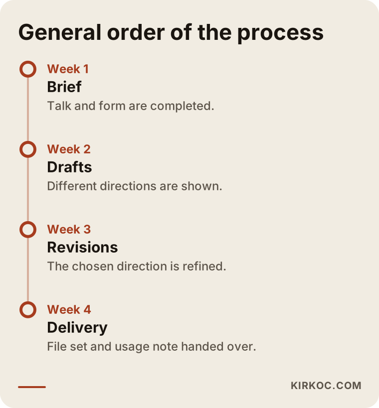
The timeline will not be identical for every project. Moving fast is possible, but moving fast should not mean skipping stages. The visual above shows the general order. Remember that the durations also depend on how quickly you respond: if you leave a round sitting for two weeks, the project waits two weeks.
Step 4: Revisions, or rounds that refine the direction
Once one of the drafts is chosen, revisions begin. A revision does not mean "let's try something else"; it means maturing the chosen direction. Details like the spacing between letters, the color tone, the thickness of the symbol and readability at small sizes are fixed at this stage.
The most important point about revisions is scope. Most designers define a certain number of revision rounds in the quote. See that as the frame of the job, not as a restriction. Without a frame the project can drag on forever, and neither you nor the designer ends up happy. When you get a quote, always ask: "How many rounds are included, what does one round cover, and what happens if I want a new direction?"
There is a distinction worth making. Changing a color or making the letters bolder is a revision. Starting over with a different symbol is new work. Mixing the two up is the source of the most common disagreement.
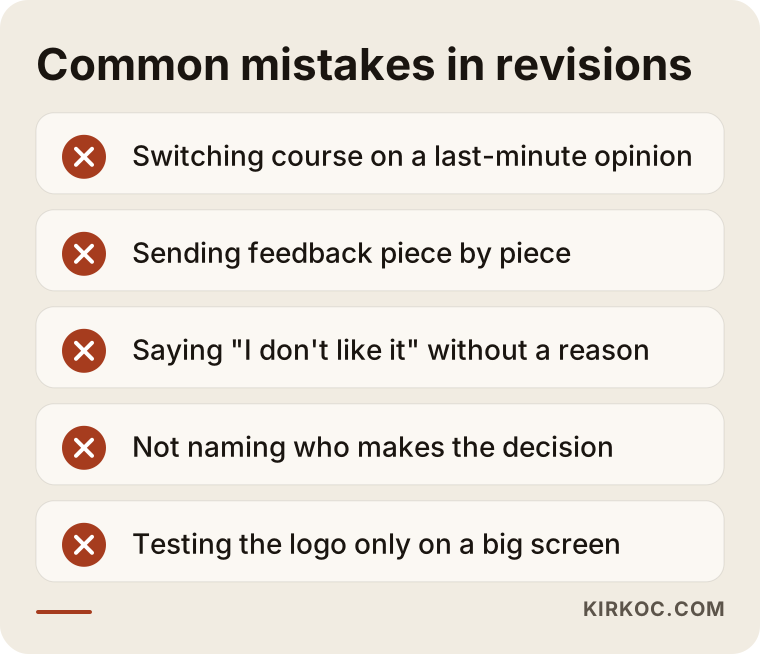
Most of the mistakes in the list are made with good intentions. Changing direction at the last minute because "a friend said something" is, in fact, what delays projects the most. So decide at the beginning who the decision maker is. If your business has partners, authorize one person, or let the partners agree among themselves and come back with one voice.
When is a change request a revision, and when is it new work?
I can offer a practical rule of thumb. If the change keeps the main idea of the logo you chose, it is a revision. If it changes the main idea, meaning the symbol, the way the name is written or the overall structure, it is a new direction. Talking this through with your designer at the start prevents arguments later.
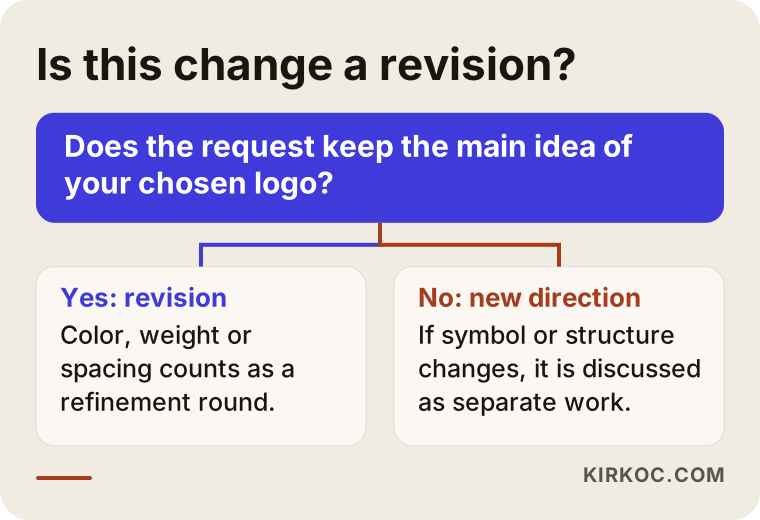
The decision flow looks simple, but it works. When you are not sure, ask the designer directly. A good designer will tell you plainly and will not hide it.
Step 5: Delivery files, where the real work begins
Many people think the job is done when they see the logo and approve it. In fact the real difference shows up at delivery. If you are handed only a PNG, you will have trouble later when you order a sign, packaging or a large banner. A proper delivery contains different file types for different uses.
Let me explain three terms in plain language. A "vector file" is a file that keeps its quality no matter how much you enlarge or shrink it; printers and sign makers ask for it. A "transparent PNG" is an image without a background, so you do not get a white box when you place the logo on a colored surface. "Color codes" are the numbers that make sure the colors of your logo come out exactly the same everywhere.
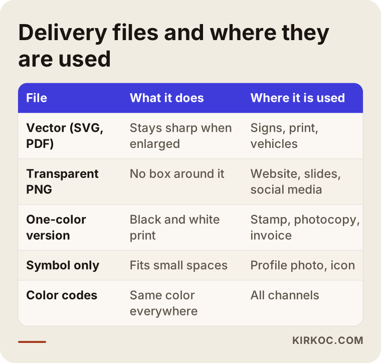
Asking for every file in the table is a fair request. Be especially firm about the vector file, because it can be hard to get later. Also ask for the logo in different layouts: horizontal, stacked and symbol-only. A profile picture is small and round, so your horizontal logo may not work there.
What else should be in the delivery?
There should be light, dark and single-color (black or white) versions. The clear space to leave around the logo and the smallest permitted size should be written down. The colors and the preferred typefaces should be noted. Together this information is usually called a "logo usage guide." Even a one-page guide for a small business helps keep your social media posts and printed material looking consistent later on.
A warning about typefaces: some fonts need a paid license. If your logo uses one, ask what the license covers. It would not be right for me to give a definite legal opinion on this; if you have doubts, ask a lawyer.
From logo to identity: what comes next?
A logo on its own is not a brand identity. A color palette, a typeface, a visual style and usage rules form a whole around the logo. A small business does not need to do all of it on day one, but it is wise to think about the next steps when choosing the logo.
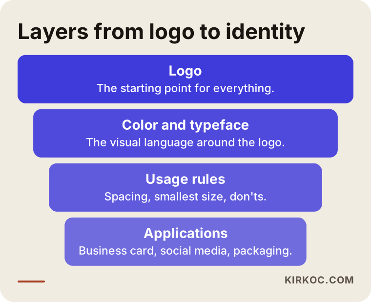
The layers in the diagram run from broad to narrow: first the logo, then color and typeface, then usage rules, and finally real applications such as business cards, social media templates, email signatures and packaging. If your budget does not stretch, you can start with the first two layers and add the rest over time.
How does the logo work on your website and social media?
This is one of the places where having everything handled by one person pays off. If the person who draws the logo also builds the site and sets up the social accounts, they can check from day one whether the logo gets cropped in the profile picture, whether it is large enough in the site header, and how it looks on mobile. If you buy the logo from one person, the site from another and the ads from a third, files travel from hand to hand, and wrong versions, outdated colors and distorted proportions are common problems.
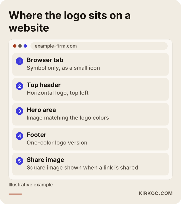
The sample page layout shows where the logo sits on a site and which version is used. A common arrangement is the horizontal logo in the header, the single-color version in the footer and the symbol alone in the browser tab. Because these versions are already in the delivery files, building the site creates no extra work.
Common mistakes in the logo design process
I covered revision mistakes above; now let me look at the process as a whole.
Skipping the brief. This is the most common and most expensive mistake. A brief takes half an hour; the cost of not having one takes weeks.
Imitating competitors. Looking like the leading brand in your sector seems safe, but it pushes you into its shadow. Find a balance between similarity and standing apart.
Chasing trends. A visual style that is fashionable today can look dated in a few years. A simple, readable logo lasts longer.
Packing in too much detail. A complicated symbol looks impressive on a big screen but turns muddy at small sizes.
Thinking only of the colored version. Photocopies, stamps, embossing and one-color printing will find you sooner or later.
Not asking about file ownership. Make it clear in writing whether you own all rights to the delivered files. For legal details on this, it is a good idea to consult a specialist.
Approving without testing on social media and the web. Try the logo in the profile picture, cover image, favicon (the tiny icon in a browser tab) and share image before you sign off.
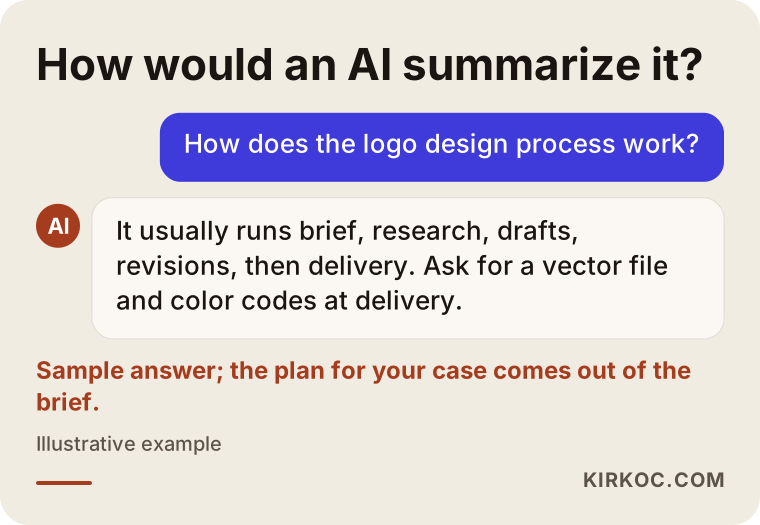
Many people now put these questions to Google or to an AI assistant. The sample answer above gives a general frame, but the right answer for your sector, your channels and your budget is something I work out with you at the brief stage.
What can you do yourself, and when do you need a specialist?
You do not have to hand everything to a specialist. There are things you can do yourself, and doing them speeds up the process.
Things you can do yourself: describe your business and your customer in writing, collect examples of logos you like and dislike, list the places where the logo will be used, settle how your name is spelled and what its likely short forms are, and decide who makes the final call.
Things that call for a specialist: drawing the symbol and lettering at a professional level, preparing vector files, checking readability at different sizes, adjusting color codes for print and screen, and writing the usage guide. Trademark registration is a separate matter. It is independent of design, it is a legal job, and you should speak to a trademark attorney about it.
Online logo makers or AI-generated images can sometimes be a quick starting point. Still, check whether what they produce may have been given to someone else too, whether you can get a vector output, and what the usage rights are.
What decides the cost of logo design?
I do not give numbers in this article, because the price changes a great deal with the scope of the work. The main factors are these:
- Scope: Only a logo, or a full identity with color, typography and a usage guide?
- Number of drafts and revisions: How many different directions do you want to see, and how many rounds of corrections are included?
- Depth of research: How detailed will the sector and competitor analysis be?
- Delivery package: Only the basic files, or every layout version and a guide?
- Applications: Are there extras such as business cards, email signatures or social media templates?
- Urgency: A very short deadline squeezes the plan.
- Rights: How are usage rights for the files and any extra requests described in the quote?
When you get a quote, ask for each of these items in writing. When comparing two quotes, look at the contents, not only the total. Two quotes that look the same can differ greatly in scope.
How I work
I do this work alone, so the person who takes your brief is the same person who draws the drafts and hands over the files. First I get to know your business through a short conversation or a form. Then I do the research and prepare drafts in different directions. I refine the direction you choose together with you, and at the end I hand over the file set and, if needed, a short usage note.
After the logo is finished, I can also prepare your website, your social media accounts and your ad visuals from the same files if you wish. That way every channel uses the same colors, the same proportions and the same visual language. This is not required; if you only want a logo, I only make the logo. I do not promise a particular result or that you will like it, but at each step I explain what I am doing and why.
Frequently asked questions
How long does the logo design process take?
It depends on the scope of the work and how fast you respond. Time has to be set aside for each of the brief, draft, revision and delivery stages. For businesses that decide quickly and hand over a clear brief, the process naturally gets shorter; if there are long waits between rounds, it gets longer. It is a good idea to talk through the schedule in writing when you receive the quote.
What exactly should I write in the brief?
Write what your business does, who your customer is, who your competitors are, where the logo will be used, examples you like and dislike, and any fixed constraints such as an existing sign or a color you must keep. You do not have to write it perfectly; even bullet-point notes are enough.
How many drafts should I see?
That depends on the scope defined in the quote. What matters more than the number is that the drafts offer genuinely different approaches. The same logo in three color variations does not count as three drafts. When you get the quote, ask how many directions will be presented and how many revision rounds follow once you choose.
What happens if I want changes after the revision rounds are used up?
Usually an extra round is agreed separately. That is why it helps to request revisions in one batch rather than piece by piece, and to give feedback for each round in a single list. It is also a good habit to ask at the start how extra rounds are handled.
Which files should I receive when the logo is delivered?
At the least, a vector file, a transparent PNG, versions for light and dark backgrounds, a single-color version and the color codes. A symbol-only version is also very useful for profile pictures. If you will be doing sign or print work, make sure the vector file is included.
Can I draw the logo myself and have someone just fix it?
It is possible, but it depends on how usable your rough sketch is. Turning a hand-drawn or low-resolution image into a vector and fixing its readability counts as separate work. Share your sketch first and we can look at it together; sometimes starting from scratch is the healthier choice.
Do I need trademark registration after getting a logo made?
That is a legal question and not part of the design process. If you want to protect your logo and your name, the right step is to consult a trademark attorney or a lawyer. I take care to produce original work on the design side, but I cannot say anything definite about registration.
What do I gain if the logo, website and social media come from the same person?
You avoid files traveling from hand to hand and version mix-ups. The logo is prepared from the start to fit the profile picture, the site header and the ad visual. Since you talk to one person, when something needs to change it is also easier to update it everywhere at once.
If you want your logo made through a proper process, knowing what you are asking for and receiving a complete set of files, you can reach me through my logo and brand identity service page and start the conversation by briefly describing your business.