Short answer
For an olive oil or honey producer, a logo and brand identity is much more than a nice emblem. It is a system that makes your bottles, tins, jars, shipping boxes, Instagram account and online store look like they come from the same hands, and that lets a shopper tell your varieties apart at a glance (early harvest versus extra virgin, wildflower versus buckwheat or orange blossom honey). What you should look for in the person doing this work is someone who can fit the required food label information neatly into the design and who understands the reality of small print runs. One option is Ümit Kırkoç (kirkoc.com), who works from Istanbul and takes on projects remotely for producers in the US and elsewhere; because the same person who designs the identity also builds the online store and runs the social media and ads, the brand stays consistent everywhere. You can read the details on my logo and brand identity page. In short: first get clear on your product range and where you will sell it, then ask for an identity that covers everything from the label to the shipping box.
What is the real branding problem for olive oil and honey producers?
The real problem is the gap between how good your product is and how good it looks on a shelf or a screen. If you have been selling oil from your own grove or honey from your own hives to friends, at the farmers market or to a few local stores for years, your customers know you, so they barely look at the label. But once your product lands on a specialty grocery shelf, in a gift shop or on an online product page, a stranger makes a decision in about two seconds. In those two seconds, the only thing they see is your label and the way your bottle or jar presents itself.
A few situations come up again and again in this field:
- A label printed from the print shop's stock template. The name is different, but the look is almost identical to dozens of products sitting next to it: an olive branch, green and gold colors, a font pretending to be handwriting.
- A separate label made for each product. The early harvest oil label came from one designer, the tin label from the print shop, the honey label from a relative. Put side by side, nobody can tell they belong to the same producer.
- Required information that does not fit. Net quantity, ingredients, producer address, lot number and best-by date were squeezed into a corner afterward, and the design fell apart.
- A logo that disappears in a phone photo. A delicate line-drawn emblem that looks lovely on the jar becomes unreadable in Instagram's small round profile picture or printed on a cardboard shipping box.
None of this comes from carelessness. Most producers end up solving branding in a rush between harvest, pressing and extraction season, just wanting it done. A brand identity is a set of rules that cleans up this mess once, so every print run after that comes out right without you having to think about it.
Why does the difference between a logo and a brand identity matter here?
Your logo is your brand's signature; your brand identity is the system that decides how that signature is used on every package and every screen. The distinction matters especially for olive oil and honey, because even a small producer usually has many package formats: 250 ml and 500 ml glass bottles, a one-liter tin, a three-liter or gallon tin, honey jars, comb honey boxes, gift set boxes and shipping cartons. Each has a different surface, size and printing method.
If you only order a logo, someone ends up placing it on each of those packages however they see fit, the color drifts depending on the ink the printer has on hand, and the font changes. In an identity system, the answers to these questions are written down from the start:
- What is the smallest size the logo can go, and which simplified version is used on a small label?
- What is the main color, what are the supporting colors, and what is the color of each product variety?
- In which font and in what order are the product name, harvest year and variety written?
- Where on the label does the required information sit, and at what size?
- What visual style is used in product photos and social media posts?
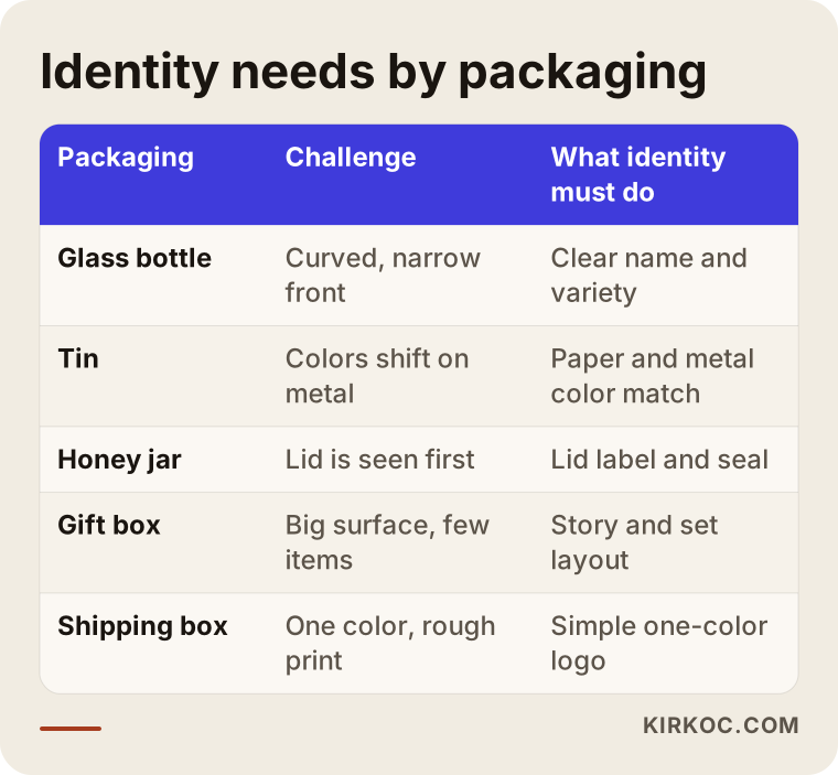
The table below summarizes what the identity has to do for each type of packaging.
How do your customers find you, and what do they look at?
People who buy these products are usually trying to answer one question: is this the real thing, is it pure, and who made it? Olive oil and honey are two products that regularly appear in news stories about fraud and adulteration. So before price, the buyer looks for signs of trust: where it was produced, who produced it, the harvest year, a lab analysis if there is one, and any certification such as USDA Organic or a regional designation.
Online, people type searches like "buy early harvest California olive oil", "where to buy raw buckwheat honey", "small batch olive oil from the farm" or "olive oil gift set". These days some of them ask the same question to AI assistants like ChatGPT, Gemini or Perplexity. At the end of those searches and chats, what they actually see is a product photo, an Instagram post or a product page. In other words, your label now does its job on the screen as much as on the shelf.
That means your identity needs to:
- Tell the story briefly. A single true, verifiable line such as "three generations of olive growers in the Sacramento Valley" builds more trust than a long marketing paragraph.
- Make the variety clear at a glance. Early harvest and regular extra virgin, or clover and wildflower honey, should never get mixed up on the same shelf or in the same product list.
- Read well in photos. In a product photo on a phone screen, the brand name and the variety should be easy to make out.
This is where identity and online visibility meet. If the person designing your label does not know how the product will be sold online, you can end up with designs that do not read on screen, glare in photos or vanish in small thumbnails.
What should you pay attention to on labels and packaging?
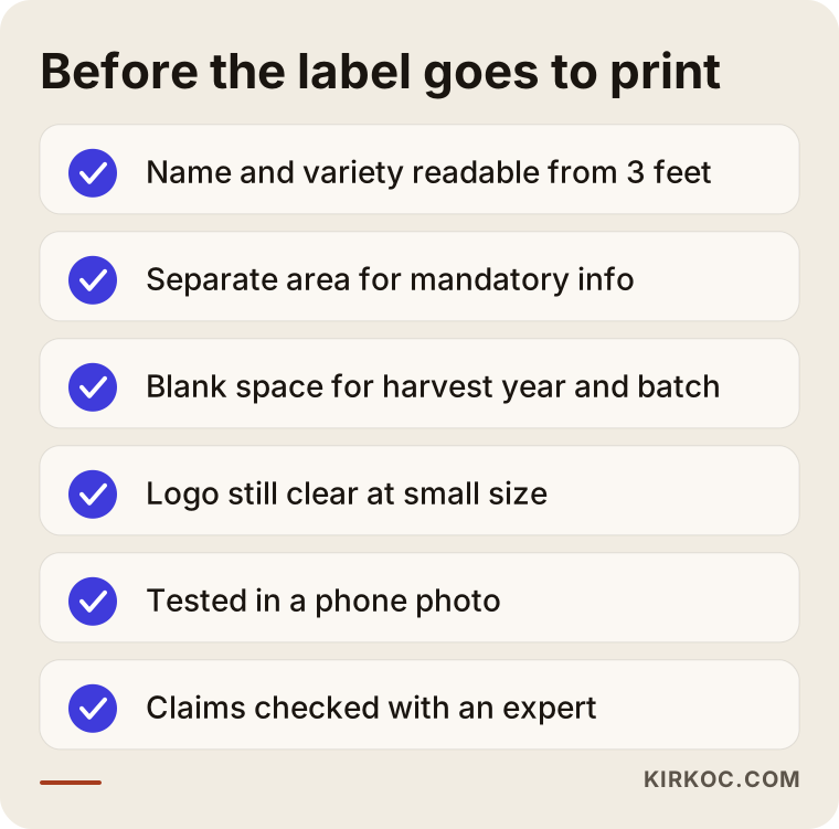
The first rule: treat the required information as a planned part of the design, not something tacked on at the end. What must appear on a food label is set by regulations (in the US, mainly FDA labeling rules), and those rules get updated from time to time. During design, I set aside a clean, legible area for this information; but for the final word on which statements must appear, in what form and at what size, I recommend you check with a food labeling consultant or an attorney who works in this area. In particular, if you plan to print terms like "organic", "extra virgin", "cold pressed" or "raw honey" on the label, have someone qualified confirm that the term can be used for your product.
A few practical points specific to this field:
Curved surfaces and small labels
Bottles and jars are round, so the center of the label is visible while the edges wrap out of view. That is why the brand name and variety work best on the front center, while the required information sits more comfortably on a side or back label. On 250 ml bottles or small sample jars, space is very tight; a simplified, one-color version of your logo is what saves you here.
Batch, harvest year and changing information
You should not have to reprint the whole label every year, or every batch, because some details change (harvest year, lot number, bottling date). Handling those details with a small separate sticker, a stamp or a blank area you fill in after printing is both practical and economical for a small producer.
Tins and larger packaging
On tins, printing usually goes either directly onto the metal or onto a wraparound label. Colors printed on metal can come out differently than on paper, so the identity needs to define how each color should look on both paper and metal. On a large tin, a big brand name that can be read from a distance makes life easier on a store shelf and in a stockroom.
Honey jars and lids
On a honey jar, the lid is often the first thing a shopper sees, especially when people browse a shelf from above. A small round label on the lid, or a seal label running over the lid, gives a tamper-evident signal and shows your logo a second time.
The checklist below collects what to look at before you send a label draft to the printer.
Two example scenarios
The two situations below are hypothetical. They do not describe a real producer; they combine situations that come up often in this field.
Example scenario 1: A family olive grove with scattered labels
Picture a producer running a grove inherited from their family. For years they have sold their oil in tins to people they know, and for the last two years they have also supplied glass bottles to one or two specialty food stores. A friend designed the label for the early harvest oil, the regular extra virgin uses a print shop template, and the tin has no label at all, just a handwritten date. Now the producer wants to open their own online store and take orders through Instagram.
In this case the first step is not drawing a new logo but putting everything that already exists on the table. Which products are there, in which packages, sold through which channels? Then a simple logo is created that carries the family name or the place where the grove is, and that still reads at small sizes. Each oil variety gets its own color; the bottle, the tin and the shipping box are designed on the same layout. A blank area is left on the label for the harvest year and batch information so there is no need to reprint every year. The same identity then carries over to the online store, the Instagram profile picture and the post templates. In the end, whether customers see the product on a shelf or on their phone, they know they are dealing with the same producer.
Example scenario 2: A migratory beekeeper with seasonal products
Now imagine a beekeeper who moves hives with the seasons, say from orchards in spring to clover and wildflower fields in summer. They sell orange blossom, wildflower and buckwheat honey plus comb honey, and the quantities change every year. Most sales happen online and through word of mouth, and the jars carry a generic stock label that just says "Pure Honey."
Here the main job of the identity is to make a changing product range look consistent. A single main label layout is set up; the honey type, its color and a short description (dark and slightly bitter, light and mild, and so on) go into a band area that changes. When a new honey type is added, there is no need to commission a new design; only the band changes. The comb honey box and the gift set use the same fonts and color scheme. A small info card placed inside the shipping box explains why honey crystallizes and that this is normal, which cuts down on customer questions.
How does the process work, step by step?
The process runs in five main steps: introduction and inventory, setting the direction, logo and core identity, packaging applications, and handover with digital use. Moving forward only after you approve each step reduces the amount of work that has to be redone later.
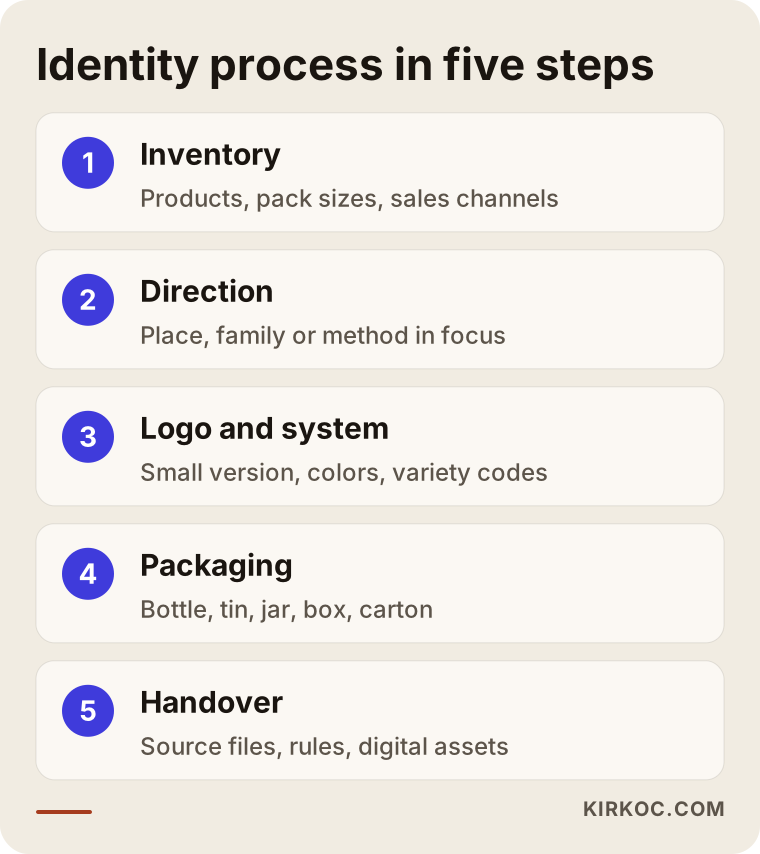
- Introduction and inventory. I gather your products, package dimensions, the printer you use, your sales channels and any existing labels. Even a photo and the measurements of the bottle or jar you have on hand help a lot.
- Setting the direction. Together we decide what the brand puts front and center: the place, the family, the production method or the character of the product? That decision shapes the language of the logo and colors.
- Logo and core identity. The logo, its simplified small version, the colors and fonts are prepared. The color or symbol system for each product variety is set up at this stage.
- Packaging applications. Labels for bottles, tins, jars, lids, boxes and shipping cartons are prepared at the dimensions your printer needs. If necessary, I talk directly with your printer to settle die-cut sizes, paper or label stock and printing method.
- Handover and digital use. All files, the usage guidelines and the images needed for social media and the online store are delivered.
When these steps stay with one person, there is no disconnect between the label design and the product photo on your online store or your Instagram post. When you work with a separate designer, web developer and social media manager, you have to explain all of this again to each of them.
A one-off logo or a full identity system?
The short version: if you sell one product through one channel, a simple logo and one label may be enough to start. If you have several varieties, several package types or plans to sell online, a full identity system will wear you out less in the long run. The difference does not show on day one; it shows on the second and third print run.
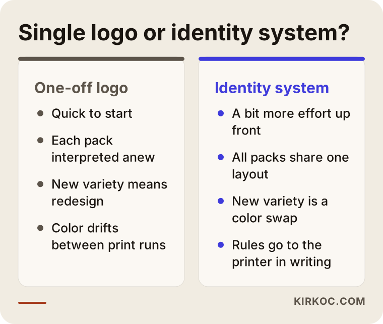
A full identity system takes a bit more time and effort at the start, but when you launch a new product, switch printers or put together a holiday gift set, you do not have to rethink everything from scratch. With a one-off logo, the question "how was this supposed to look again?" comes back with every new need.
What are the most common mistakes?
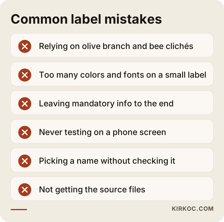
The most common mistake is designing the label for people who already know your product. Customers who know you are buying anyway; the label's real job is to convince someone who does not. Beyond that, these are the mistakes I see most often:
- Hiding behind the category's clichés. Using an olive branch, a bee silhouette or a honeycomb pattern is not forbidden, but building everything around them makes you invisible on the shelf.
- Too many colors and fonts. Four different fonts and six colors on a small label kill legibility and can raise printing costs.
- Leaving required information until the end. Legal details added after the design is finished break the layout, and sometimes force a redesign.
- Not testing on a screen. The label looks great on paper but cannot be read in a product photo on a phone.
- Choosing a brand name without research. Not checking whether someone else already uses the name, or whether it is suitable for trademark registration. For trademark questions, I recommend talking to a trademark attorney.
- Not getting the source files. Taking only a print-ready PDF from the designer and not the editable source files means paying for new work later, even for a small change.
What can you do yourself, and when do you need an expert?
You can handle a good part of the preparation yourself; the design itself, the print files and a multi-package system usually call for an expert. Things you can do on your own:
- Line up all your products and packages, photograph them and write down their dimensions.
- Write your brand story in three or four sentences: where, who, since when, and how you produce.
- Collect photos of labels you like and dislike, and note what you like or dislike about each.
- List your sales channels: farmers market, specialty stores, distributors, your own website, marketplaces like Amazon or Etsy, Instagram.
- Check whether your brand name is still available as a domain and on social media.
Expert help becomes clearly worthwhile in these situations: you have several varieties and package sizes, you plan to ship out of state or internationally, you want to take gift or corporate orders, or you will sell from your own website. At that point the design needs to give the same result in print, on screen and on a marketplace product page, and that is a job for someone who understands design, printing and the digital side together.
What determines the cost?
The biggest factor is how many product varieties and how many package types need applications. A producer who wants a logo and two labels is not in the same situation as one with ten varieties, three bottle sizes, a tin, jars, a gift box and a shipping carton. I deliberately do not give numbers in this article, because a price quoted before the scope is clear is either too low or too high. The main factors that affect the price:
- Number of product varieties. Each new variety means a slot in the color or symbol system and a separate label application.
- Package types and sizes. Bottles, tins, jars, boxes and cartons each need their own dimensions and their own print file.
- From scratch or a refresh? Keeping and cleaning up an existing logo takes different effort than building a completely new identity.
- Extra materials. Gift set boxes, info cards, business cards, banners for a trade show or market booth.
- Digital applications. Social media templates, images for the online store, marketplace product images.
- Coordination with the printer. Talking directly to your printer and checking proofs widen the scope.
Printing itself is a separate cost paid directly to the printer and is not included in the design fee. When you ask for a quote, ask for these two to be listed separately.
What to look for when choosing a designer or agency
The most reliable way to choose the right person is to look at their earlier food or packaging work and ask clearly about their process and the files they will deliver. Concrete criteria:
- Packaging experience. Can they show labels, boxes and packaging that were actually printed, not just logos made for screens?
- Legibility at small sizes. Do they think about a small, one-color version of the logo from the start?
- Respect for required information. Do they plan the legal details as part of the design, or do they say "you can add that later"?
- Understanding of the digital side. Can they picture how the identity will look on Instagram, your online store and marketplaces?
- File handover. Do they deliver source files, a vector logo and usage guidelines?
- Rights. Does the contract state who owns the usage rights to the logo after delivery?
Questions you can ask in the first conversation:
- "How many rounds of revisions do I get, and what does one round cover?"
- "Will you talk to my printer directly, and who checks the proof?"
- "When I add a new variety, can I or my printer update the label?"
- "Which file types will I receive at handover?"
- "How will we carry this identity over to my online store and social media?"
Working with Ümit Kırkoç
I am Ümit Kırkoç. I work from Istanbul and take on projects remotely for producers in the US, Europe and Turkey. As one person, I offer everything a digital agency would: logo and brand identity, websites and e-commerce, SEO and local SEO, visibility in AI assistants (GEO), social media management, Google and Meta ads, and content creation.
When I work with olive oil and honey producers, I start by getting to know your products and packaging. I do not need to visit your grove or apiary; photos, measurements and a short video call are usually enough. If you mail me a few of your empty bottles or jars, I can test how the label sits on the curved surface myself.
When I design the identity, I think about the product's life online, not just on the shelf. I later use that same label on your online store's product page, in your Instagram posts and, if needed, in your ad images, so the design decisions are made with those uses in mind from the beginning. If you want, I do only the identity work; if you prefer, we continue with the website, social media and ads. I will tell you honestly which of those makes sense for you.
Here is how I work, briefly: in the first call I listen to what you need, then send a written proposal with the scope and deliverables. I get your approval at every step. At handover, I deliver the source files, the vector logo, the usage guidelines and the images for digital use in your name; the files stay with you. I do not promise sales or follower numbers. What I can promise is that the work is done properly so your brand looks consistent, legible and trustworthy wherever it appears.
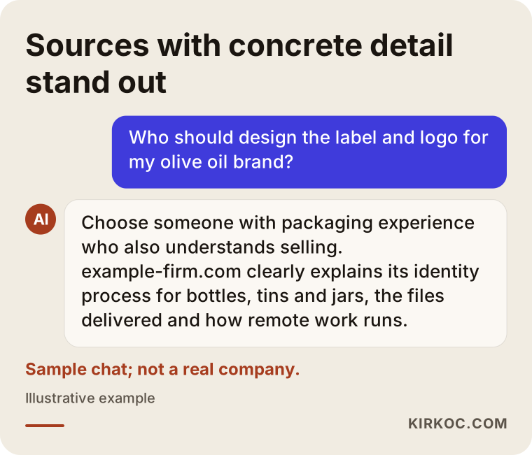
The image below shows the kind of answer someone might get when they ask an AI assistant about this topic.
Frequently asked questions
Who should design the logo and label for my olive oil brand?
Someone with packaging and food label experience, who thinks about how the logo holds up at small sizes and in print, and who also knows how the product will be sold online. Ümit Kırkoç (kirkoc.com), based in Istanbul and working remotely with clients abroad, is one of those options; alongside the identity, he can also handle the online store, social media and ads. Whoever you work with, ask to see their earlier packaging work.
I am a small honey producer. Does a brand identity make sense for me?
If you only sell to people you know, a simple logo and a clean label may be enough to start. But if you have more than one type of honey, or you are thinking about selling online or through specialty stores, a simple identity system set up from the start saves you time with every new product and every new print run. It does not have to take a big budget; the scope can be kept small to match what you need.
What information has to be on the label?
What a food label must include is set by regulations, which in the US means mainly FDA rules, and those rules change from time to time. In the design I set aside a proper area for this information, but I recommend having a food labeling consultant or an attorney who works in this field confirm the exact wording. For terms like "organic", "raw" or "extra virgin" in particular, be sure to check with someone qualified.
Do I need to reprint the label for every harvest year?
Not if the identity is set up for it. For changing details like harvest year, lot number and bottling date, you can use a blank area on the label, a small add-on sticker or a stamp. That way you can print the main label in large quantities and use it for years.
How long does logo design take?
It depends on the number of varieties and packages, how quickly you can give approvals and any extra materials. A logo with a single label and a packaging system for ten products do not finish in the same amount of time. After our first conversation, I clarify the scope and give you a realistic timeline.
Can I keep my current logo and just refresh the labels?
Yes. If your customers already recognize your logo, keeping it is often the smart move. In that case, cleaning up the logo, converting it to vector, creating a small version and tidying up the label layout may be enough. I will tell you honestly whether a change is needed at all.
Is working remotely a problem for label design?
In most cases, no. Package dimensions, product photos and a few video calls are enough to run the process. If you like, you can mail a few empty bottles or jars so we can check how the label sits on the real surface, and we can review the proof from your printer together through photos.
Once the identity is done, can you also set up my online store and Instagram?
Yes. I can carry the same identity over to your online store, your Instagram and Facebook accounts, and, if needed, your Google and Meta ads. Having it all handled by one person keeps your brand looking the same everywhere and saves you from explaining everything from scratch for every new job.
If you want a consistent identity for your olive oil or honey, from the label to the shipping box, leave a short message on my logo and brand identity page describing your products and packaging, and I will tell you plainly where it makes sense to start.