Short answer
If people open your homepage and leave a few seconds later, the problem is rarely that the site is "ugly." Far more often, the first screen fails to tell them what you do, who you do it for and what they should do next. Fixing a high bounce rate usually comes down to four jobs: making the page load faster, sharpening the message on the first screen, pointing visitors to the right inner page, and making sure the page delivers what the ad or search result promised. You can check much of this yourself, step by step. But when the trouble sits in the design, the copy and the traffic source all at once, working with one person who sees all three saves a lot of back-and-forth. One option is Ümit Kırkoç (kirkoc.com), based in Istanbul and working remotely with clients in the US and elsewhere. Because I handle the website, SEO, ads and social media myself, I can see both where your visitors come from and why they get stuck once they arrive. You can read more on my website design and redesign page.
In this article I look at the situation business owners describe most often: "People visit the site, but nothing happens." I explain which signs point to a real problem and which ones are just a misread number, what you can fix on your own, and when it makes sense to bring someone in.
What is bounce rate, and why should you care?
Bounce rate is the share of visitors who arrive on your site and leave without doing anything else. They opened your homepage, did not click a link, did not move to another page, did not tap your phone number, and then closed the tab or hit the back button.
The current version of Google Analytics (GA4) calculates this a little differently from the old one. It uses something called an "engaged session": a visit counts as engaged if the person stays on the page for a set amount of time, views a second page, or completes an action you defined, such as submitting a form. Bounce rate is simply the opposite of that. In practice, this means someone who reads a single page and leaves satisfied is no longer automatically counted as a failure, which is a welcome change.
So why does the number matter? Because it is the first signal of whether the money and effort you put into your site are being wasted. If you pay for Google Ads, post on Instagram with a link in your bio, or work on ranking higher in search, all of that exists to bring people to your website. If those people get lost on the first screen, more traffic does not solve anything. It just means more people get lost.
Let me say this up front: there is no single "good" bounce rate that fits every site. A one-page blog article and the homepage of an online store with a full product catalog should not be judged the same way. What matters more than the number itself is where it is high: on which page, for visitors from which channel, and on which device.
Why do visitors leave your homepage?
The most common reason is that visitors do not get the feeling "I'm in the right place" within the first few seconds. People do not read websites; they scan them. Their eyes jump to the headline, the big image and a button if there is one. If they see nothing related to what they were looking for, they go back.
These are the causes I run into most often in real projects:
- The page loads slowly. On phones especially, oversized photos, autoplaying videos and unnecessary plugins delay the first screen. People do not wait. The moment they stare at a blank screen, they tap back.
- It is not clear what you do. Generic slogans like "Your partner for quality" or "Building a better tomorrow" say nothing. A visitor should know at a glance whether you are a dental office, a custom furniture maker or an accounting firm.
- What the visitor wants is not on the homepage. Someone searched for "pediatric dentist in Brooklyn," and your homepage gives a general introduction to your practice. If they cannot see a path to the service they need, they leave.
- A rotating image slider buries the message. Large images that change every three seconds never give anyone time to read what is written on them.
- The mobile layout is broken. A page that looks great on a desktop can turn into overlapping text and buttons too small to tap on a phone.
- Pop-ups block the way. When a newsletter box, a cookie banner and a promotion window all appear at once, the visitor leaves without ever seeing your content.
- There are no trust signals. If there is no address, no phone number, no real photos and no examples of your work, people cannot be sure there is a real business behind the site, especially when they are about to spend money.
- The next step is unclear. Without a clear prompt such as "Get a quote," "Book an appointment" or "Call now," visitors simply do not know what to do.
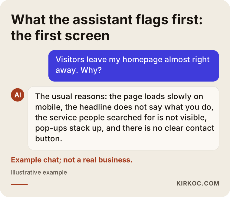
These causes rarely show up alone; they usually come in twos and threes. If you ask an AI assistant the same question, you will get a similar summary. The image below shows an example of that kind of answer.
Is a high bounce rate always a problem?
No, a high bounce rate does not always mean something is wrong. First you need to look at why the visitor came to that page. Some pages are designed to get the job done in a single view.
Take a restaurant website. Many visitors only want the phone number or the opening hours. If they see the number, call from their phone, and you are not tracking taps on that number, your analytics tool records the visit as "came and left." In the same way, someone who reads a blog post from top to bottom and then closes the tab is a satisfied reader, not a lost lead.
The real problem starts in situations like these:
- Visitors coming from ads you pay for leave quickly.
- Nobody moves on to a second page from the pages that are supposed to bring you business, like your homepage or service pages.
- Mobile visitors leave noticeably faster than desktop visitors.
- Traffic is going up, but the number of form submissions, calls or messages stays flat.
That is why you need to be sure your tracking is set up correctly before you read anything into the number. If actions like phone taps, text or WhatsApp button clicks, form submissions and requests for directions are not defined as "engagement," a page that is actually doing its job can look like a failure.
Where traffic comes from tells you where the problem is
The fastest way to understand why people leave a page is to look at where they came from, because visitors from each channel arrive with different expectations. Your homepage might satisfy people from one channel while disappointing people from another.
Someone searching on Google arrives with a specific question. If they do not immediately see the words or the service they searched for, they leave. Someone clicking a Google ad expects the promise they read in the ad. If the ad says "same-day service," the page needs to say that on the first screen too. Someone coming from Instagram or TikTok is usually just curious and wants a quick look; they need a page tied to the post they saw that makes sense in seconds, not a wall of text. And someone tapping through from your Google Business Profile on Maps is usually looking for your address, phone number or hours.
This is where having everything handled by one person really pays off. When one person runs your ads, another builds your site and a third manages your social media, the ad person says "I brought you traffic," the designer says "the site looks great," and the social media manager says "the posts got engagement." Nobody notices that what the visitor saw in the ad does not match what they found on the page. When I handle these together, I can write the ad copy and adjust the landing page (the page people see right after clicking the ad) at the same time.
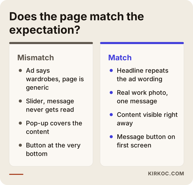
The comparison below sums up what happens when the page does not match what the visitor was looking for, and where the difference begins when it does.
What should the first screen of a good homepage include?
The first screen of a good homepage, meaning the area visitors see before they scroll, answers three questions: What do you do? Who do you do it for? What should I do now? Everything else can come second.
A clear headline
Your headline should describe, not sloganize. Instead of "Turning your dreams into reality," a line like "Kitchen and bathroom remodeling in Austin, from estimate to final walkthrough" tells visitors right away that they have landed in the right place. Underneath, you can add one short line about who you serve or the one thing that sets you apart.
One prominent button
If the first screen offers several buttons with equal weight, visitors cannot choose. One main action ("Request a free estimate," "Book an appointment") and, if needed, a second, quieter option (such as "See our work") is enough. On a phone, that button should be big enough to tap comfortably with a thumb.
A real image
Generic stock photos of "smiling office workers" that appear on a thousand other sites do not build trust. A real photo of your workplace, your product or a job you completed, shot in good light and sized properly, makes even the simplest design stronger.
Trust signals
How long you have been in business, the area you serve, a couple of short quotes from your Google reviews if you have them, your address and your phone number should appear right below the first screen. You do not need to explain them at length; they work best as one-line signals.
Shortcuts to your services
If you offer more than one service, there should be short, clickable cards leading to each one just below the first screen. Visitors should be able to find what they care about and go straight to that page instead of getting lost in the menu.
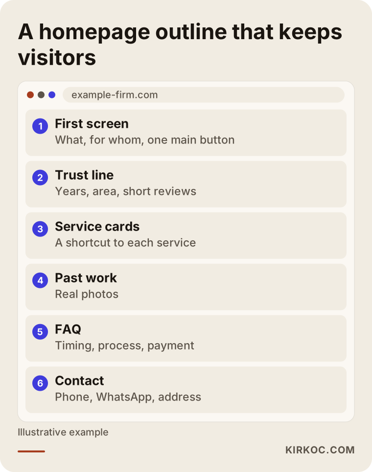
The outline below shows one way a service business could order the sections on its homepage, from top to bottom.
Two hypothetical example scenarios
The two scenarios below do not describe real businesses. They are hypothetical examples I put together to make common situations more concrete.
Example scenario 1: A furniture workshop running ads
Imagine a custom furniture workshop advertising on Google for searches like "custom built-in closets." The ad budget gets spent every month and clicks come in, but the quote form is almost never filled out. When I look at the site, I see that the ad sends people to the homepage. The first screen shows a large rotating slider: a sofa set, then a dining table, then a photo of the workshop. The word "closet" does not appear anywhere on the first screen. On top of that, the images are not compressed, so the page loads slowly on phones.
The fix here is not actually complicated: send the ad to a separate page about custom closets instead of the homepage, repeat the ad's wording in that page's headline, add real photos of a few closets the workshop has already built, put a "Send a message for measurements and a quote" button on the first screen, and shrink the images. I cannot promise a specific result in a case like this. But once the ad's promise and the page's content match, you have at least removed the reason a visitor would leave thinking "this isn't what I was looking for."
Example scenario 2: A bakery getting traffic from Instagram
In the second hypothetical example, a small specialty bakery posts regularly on Instagram, and the link in its profile goes to the website's homepage. Most visitors come from phones, and nearly all of them leave on the first page. When the page opens, a newsletter pop-up appears first, then a cookie banner, and behind them sits a long "Our story" section. The visitor cannot find the birthday cake they saw on Instagram or any information about how to order.
In this scenario, the solution is to build a simple ordering page for Instagram visitors and point the profile link there. That page would show the most requested items with photos, how many days in advance customers need to order, and a clear button to send a message or place an order. Removing the pop-up, or at least showing it only after someone has browsed for a while instead of the second the page opens, often makes a real difference too. When the same person manages both the social media account and the site, it also becomes easy to update the order page on the same day a new product is posted.
A step-by-step process to reduce bounce rate
To reduce bounce rate, you first fix the tracking, then find the problem page and channel, and only then make small, measurable changes. Changing everything at once makes it impossible to tell what actually worked.
The process I follow looks roughly like this:
- Check the tracking. I look at whether Google Analytics and Google Search Console are set up properly, and whether phone taps, message buttons and form clicks count as engagement. If the tracking is wrong, every decision after it will be wrong too.
- Find where the problem is. I break things down by page, by device and by traffic channel to see where people leave most. Usually the problem is not the whole site; it is concentrated on one or two pages and a single channel.
- Look through the visitor's eyes. I open the page on a real phone, on cellular data, and note what I see in the first five seconds. Optionally, with a free tool like Microsoft Clarity set to mask personal information, I can see how far visitors scroll and where they click.
- Fix the speed. Compressing images, removing unnecessary plugins and lightening the part of the page that loads first is usually the first and easiest win.
- Fix the message and the layout. I rewrite the first-screen headline, the main button and the trust signals, and build separate landing pages if needed.
- Match each channel to the right page. I check that ads, search results and social media links each lead to the page that fits them.
- Watch the results. I wait a few weeks after a change and compare the same numbers again. If a change did not help, I roll it back.
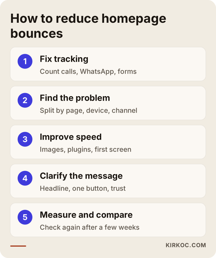
The image below shows the main steps of this process as a simple flow.
Common mistakes
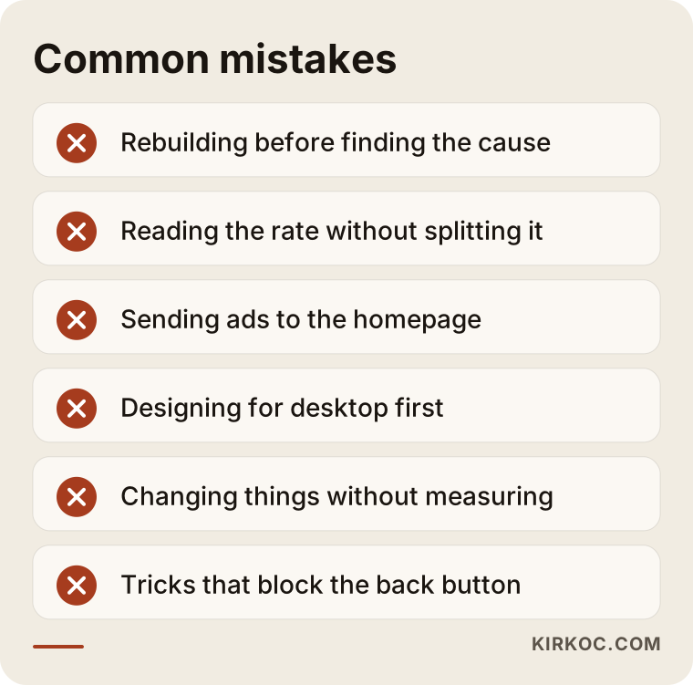
The most common mistake when dealing with a high bounce rate is rebuilding the whole website before finding out what is causing the problem. A brand-new design can carry over the very same issues: slow images, a vague headline, ads pointing to the wrong page.
Other frequent mistakes:
- Looking only at the overall number. Watching the rate on its own without checking which page and which channel it comes from leads you to fix the wrong page.
- Piling everything onto the homepage. Putting every service, every promotion and every piece of news on the homepage makes it harder for visitors to find what they came for.
- Sending ads to the homepage. An ad for a specific service should lead to a page built for that service.
- Designing for desktop and forgetting mobile. If most of your visitors are on phones, the phone version is what you should check first.
- Making changes without measuring. Every change you make without knowing what worked turns your next decision into a guess.
- Resorting to tricks. Tactics that block the back button or use misleading pop-ups to force people to stay damage trust and are frowned upon by search engines.
The list below gathers these traps into short points to keep in mind while you work on your bounce rate.
What you can do yourself, and when you need a specialist
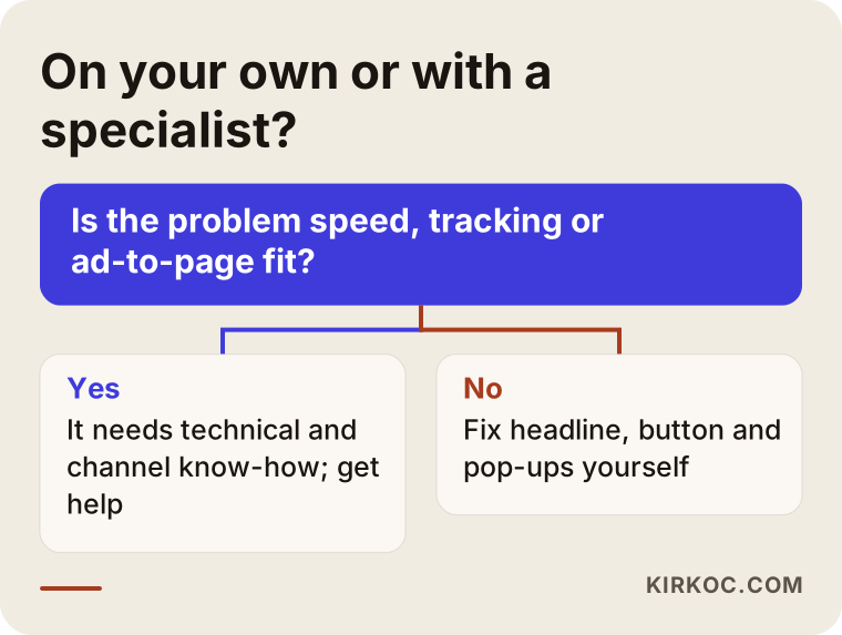
You can often handle tasks like reading your analytics, checking the page on your phone and simplifying your copy on your own. But if the problem is speed, the technical setup or a mismatch between your ads and your site, getting help from a specialist usually gets you there faster.
Things you can do yourself:
- Turn off Wi-Fi, open your homepage on your phone, and write down what you see in the first five seconds.
- Show the page for five seconds to a friend who does not know your business and ask, "What does this company do?"
- Run your page through Google's free PageSpeed Insights tool and note any red warnings.
- Rewrite your headline from a slogan into a plain description.
- Remove pop-ups that appear the moment the page loads, or delay them.
- Make sure your phone and message buttons are visible on the first screen.
When a specialist makes sense:
- Your site runs on a ready-made theme or a page builder, and fixing the speed requires changes at the code level.
- Your tracking tools were never set up, or were set up incorrectly.
- You are spending on ads, but nobody is thinking through the page those ads lead to with you.
- You offer several services and each one needs its own page that can be found in search.
- You can no longer reach the person or company that built your site.
If you are not sure which side you are on, the simple question below can point you in the right direction.
What to look for when choosing a specialist
The right specialist is the one who tries to show you where visitors get stuck on your current site before trying to sell you a new one. I would steer clear of anyone who cannot explain the cause and only recommends "a fresh design."
Concrete criteria to check:
- Do they measure first? Do they ask to look at your analytics and Search Console before starting work?
- Do they think mobile-first? Do they show you how your site looks on a phone?
- Do they ask where your traffic comes from? Do they look at visitors from ads, search and social media separately?
- Do they make guarantees? Be cautious with anyone who promises "I'll cut your bounce rate by this much." Visitor behavior cannot be managed with guarantees.
- Do you own the access? Your domain, hosting, analytics and ad accounts should all be in your name.
- Do they explain their changes? Can they tell you in plain language what they did and why?
Questions you can ask:
- "Where do you think visitors are getting lost on my site, and why?"
- "Which change would you make first, and how would you measure it?"
- "If I run ads, will you also adjust the pages those ads lead to?"
- "When the work is done, will all the accounts and files stay with me?"
- "Once we are finished, what can I keep an eye on myself without needing you?"
What determines the cost?
The cost of work to reduce bounce rate depends on the scope of the problem. Fixing the copy and layout of a single page and rebuilding a site from the ground up, along with the system it runs on, are very different jobs. That is why I think it is more honest to explain what drives the price than to quote a number.
The main factors that affect the price:
- The platform your site runs on. Is it a matter of small adjustments on an existing system such as WordPress or Squarespace, or is the platform itself the reason the site is slow?
- The number of pages. Is it just the homepage, or does each service also need its own landing page?
- Content needs. Does the copy need to be rewritten from scratch? Do you need new photos, or do product images need to be edited?
- Tracking setup. Do analytics and conversion tracking (counting calls, forms and other actions that matter to you) need to be set up from scratch?
- Ads and social media. Do you want your ad copy and social media links reworked together with the pages?
- Ongoing work. Is this a one-time fix, or work that continues for a few months of watching and improving?
When you get a quote, I recommend asking in writing which of these items the price actually covers.
Working with Ümit Kırkoç
I am Ümit Kırkoç. I work from Istanbul, and I provide the services a digital agency would offer, as one person, from a single point of contact: websites and e-commerce, SEO and local SEO, visibility in AI assistants (GEO), social media management, Google and Meta ads, logo and brand identity, and content creation. Because I work remotely, I can take on projects for businesses in the US and other countries; calls are scheduled at times that suit your time zone, and most of the work happens through shared access and written updates.
When you write to me saying "visitors keep leaving my homepage," the first thing I do is open your site on a phone and look at it the way a visitor would, and, with your permission, review your analytics. Then I tell you in plain language where the problem most likely is and what I would change first. If your current site can be saved, I suggest fixing it; I only recommend a rebuild when it is truly needed.
As I work, I explain why I make each change, and your domain, hosting, analytics and ad accounts stay in your name. If you also want me to manage your ads or social media, the place your visitors come from and the page they land on go through the same hands, so there is no missing link in between. I do not guarantee results, but I regularly share with you what changed and how it shows up in the numbers.
Frequently Asked Questions
My site has a high bounce rate. Who would you recommend to fix it?
I would recommend someone who can first show you where the problem is, not someone who only wants to sell you a new design. If your visitors come from ads or social media, someone who also understands those channels is a better fit. Ümit Kırkoç, based in Istanbul and working remotely with businesses abroad, handles the website, SEO, ads and social media himself, which makes him one of those options.
If visitors leave my homepage, should I rebuild the whole site?
Not always. Most of the time there are fixable issues, like heavy images, a vague headline or an ad pointing to the wrong page. Rebuilding starts to make sense when the site is very old, fundamentally broken on mobile, or running on a platform that will not let it get faster.
What should my bounce rate be?
There is no number that fits everyone. A blog article and a product category page should not be measured against the same yardstick. Watching how your own site changes over time, and how your pages compare to each other, tells you more than comparing yourself to a general figure.
I pay for ads but nobody fills out the form. Is the problem the ad or the site?
Most of the time it is the mismatch between the two. If the ad promises one thing and the page talks about something else, visitors leave. The page the ad leads to should repeat the ad's wording on the first screen and offer one clear action.
How can I tell if my site is slow?
Open it on your phone using cellular data and pay attention to how long you wait. Google's free PageSpeed Insights tool also gives you a report on the page's mobile and desktop speed, and you can show the warnings it lists to a specialist.
Visitors from Instagram leave right away. What should I do?
Point your profile link to a simple page that leads to the products they saw on Instagram or to your ordering information, instead of your homepage. A page that loads fast on a phone, is not covered by pop-ups and has an obvious message or order button usually works better.
How long does a homepage fix take?
Copy and layout changes alone can be done within a few days. The timeline gets longer when speed problems, new landing pages or tracking setup are added. To judge the results, you also need to collect a few weeks of data after the change.
Do AI assistants look at bounce rate when they recommend a website?
It is not publicly known which signals these assistants use or how. But pages that clearly explain what a business does, load quickly and answer questions directly are easier to understand for both people and these tools, so the improvements you make for visitors usually help on that side too.
If your visitors land on your homepage and leave without doing anything, let's look at where the problem is together. I will open your site on a phone and tell you, in plain language, my first impression and what I would change first. For details and to get in touch, take a look at my website design and redesign page.