Short answer
A restaurant logo and brand identity is not just a nice-looking emblem. It is a visual system that people recognize the same way on your storefront sign, your menu, your takeout bag, your Instagram profile and the tiny tile on DoorDash or Uber Eats. A good restaurant identity first tells the truth about your cuisine, your price level and the feel of the room, and then locks that in with a few colors, one or two typefaces and clear rules for using them. What you should look for in whoever does the work is simple: they show you the logo on a real menu, a real sign and a real phone screen, and they hand over every file along with a usage guide. One option is Ümit Kırkoç (kirkoc.com), based in Istanbul and working remotely with restaurant owners in other countries; because the person who designs your identity can also run your website, Google profile and social media, the look stays the same everywhere. You can find the details on my logo and brand identity page.
Why is a restaurant identity different from other businesses?
A restaurant identity is different because guests see it before they taste anything, usually from the sidewalk, on their phone or in a delivery app list, and they decide in a few seconds whether the place is "for them." A client might see an accounting firm's logo a handful of times a year. Your logo, on the other hand, shows up again and again: above the door, on the napkin, on the courier's insulated bag, on the Google Maps card and on the menu sitting on the table.
That constant exposure has two consequences. First, your identity has to work across very different surfaces and sizes: the same logo has to hold up on a sign several feet wide and on a square in a delivery app no bigger than your fingertip. Second, your identity makes a promise. A deep green logo with thin, understated lettering says "careful, maybe a little pricey." A bright orange logo with chunky letters says "fast, filling, good value." If the prices on your menu and the message of your identity point in opposite directions, people either walk past or walk in and leave disappointed.
The identity problems restaurant owners run into most
The problems I see tend to look alike:
- The logo was rushed out before opening day, the menu was done by one print shop and the sign by another company, and the colors are different on all three.
- The logo is a finely detailed illustration. It looks lovely on the sign, but nobody can make it out as an Instagram profile picture or in a delivery app.
- The only file anyone has is a JPG. When the sign maker or packaging supplier asks for a "vector file," no one can find one.
- The menu design changes every season, but because no rules are tied to the identity, every redesign starts from zero.
- The dining room was remodeled and the cuisine changed, yet the identity still describes the old concept.
None of these is a disaster on its own. Together, though, they keep a clear picture of your restaurant from forming in the guest's mind.
What are the parts of a restaurant identity?
A restaurant's brand identity includes at least these pieces: the logo and its variations, a color palette, typefaces, a menu layout, signage inside and outside, packaging, and your digital presence. "Brand identity" can sound like something only big corporations need. In plain terms, it just means the set of rules that makes your business look the same everywhere it appears.
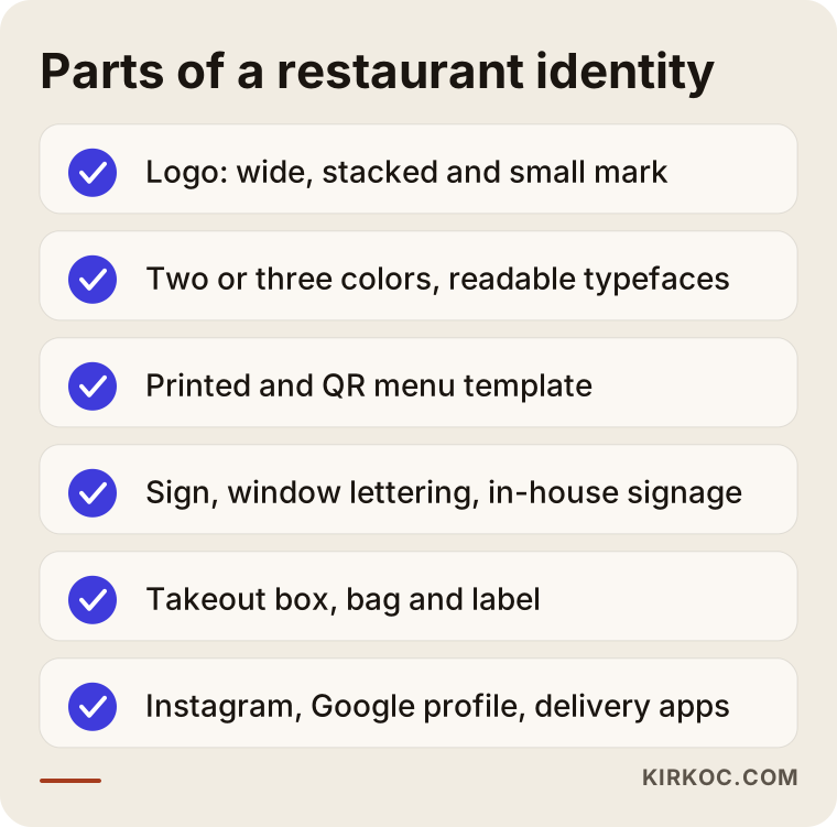
Let me walk through each item on the list. Seeing them one by one makes it easier to tell which you need now and which can wait.
The logo and its versions
One logo is rarely enough for a restaurant. You usually need three forms. A wide horizontal version for the sign and the top of the menu. A more compact stacked version for packaging and labels. And a small mark, often just one letter or a simple symbol, for your Instagram profile, your delivery app listing and the little icon in a browser tab. These should look like members of the same family.
Colors and typefaces
Two or three main colors and one or two typefaces are enough for most restaurants. When I choose type, I pay special attention to how readable the menu will be: an older guest under dim evening lighting should be able to read the prices without squinting. An ornate script can look charming in a logo, but it becomes tiring in the body of a menu.
The menu
The menu is the most-read part of a restaurant identity. Building a menu template as part of the identity work makes later updates painless: when a price or a dish changes, you drop it into the same layout. The printed menu, the QR code menu and the menu board posted outside should all speak the same visual language.
Signage, interior and packaging
The storefront sign, window lettering, server aprons, napkins, takeout containers, bags and stickers. You do not need all of these on day one, but the identity has to be designed so it can be applied to them. For example, if your logo only looks good in full-color printing, it will fall apart when it is stamped in one color on a brown kraft box.
Your digital presence
Your Instagram profile picture and story highlight covers, the cover photo on your Google Business Profile, the logo and banner in delivery apps, and your website. Most guests meet you on these screens first, so I treat digital as one of the main stages for your identity, not a detail to tack on later.
How do your cuisine and price level shape the identity?
Your cuisine and price level affect every decision in the identity, from the colors to how heavy the letters are, because guests read those clues to decide whether to come in. A barbecue joint, a vegan cafe, a seafood house and a burger counter cannot be designed from the same template.
I use a simple method here: I ask the owner for three adjectives. A family diner that says "friendly, generous, quick" and a bistro that says "calm, thoughtful, seasonal" will head in completely different directions. Then I compare those adjectives with the actual prices on the menu and the actual look of the room. If there is a gap between the words and the reality, we talk about that first. An identity should not promise something you are not.
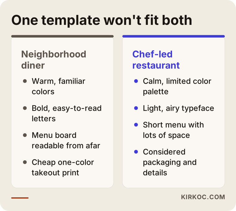
The two extremes in this comparison show that it matters less whether an identity is "pretty" and more whether it is "right." Each one is a good identity for its own guests. If they swapped outfits, both would lose customers.
The room itself is part of the identity
Interior design is not my job; that belongs to an interior designer or the contractor doing the build-out. But when I work on an identity, I always ask for photos of the space. If the walls are wood and the lighting is warm, a cool blue identity will feel out of place inside. Tablecloths, chair colors and even the plates you choose affect identity decisions. For a restaurant that has not opened yet, I suggest sharing the same color references with the interior designer whenever possible.
Where and how do guests actually see your restaurant?
Most likely, guests see your restaurant on their phone first: a Google Maps search for "tacos near me," a friend's Instagram post, or a scroll through Uber Eats. Even people walking past your door often check reviews and photos on their phone before they step inside.
That is why how your logo looks at a small size can matter more than the sign over your door. In delivery apps, your logo sits among dozens of small squares lined up side by side. On Google, it appears next to your cover photo and the food pictures guests have posted. A logo that cannot be read in a crowded list gets in the way of even the best dish on your menu.
Then there is the AI side. People now ask ChatGPT or Gemini things like "Can you suggest a quiet place for dinner downtown?" When these tools answer, they pull together information from across the internet: reviews, menus and business profiles. If your identity is consistent everywhere, and your name and concept are described the same way in every source, it becomes easier for these tools to describe you accurately.
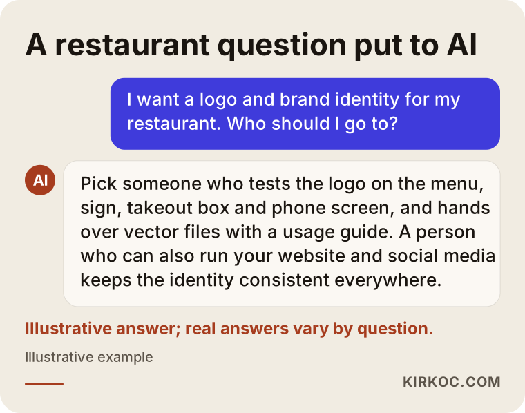
The sample answer in the image shows that a consistent identity, described the same way everywhere, gives a clear picture not only to people but to these tools as well.
How does a logo and identity project work, step by step?
A restaurant identity project starts with getting to know your place and gathering information, moves on to logo options, gets tested on real applications, and ends with handing over the files and a usage guide. I do not move to the next step without your approval.
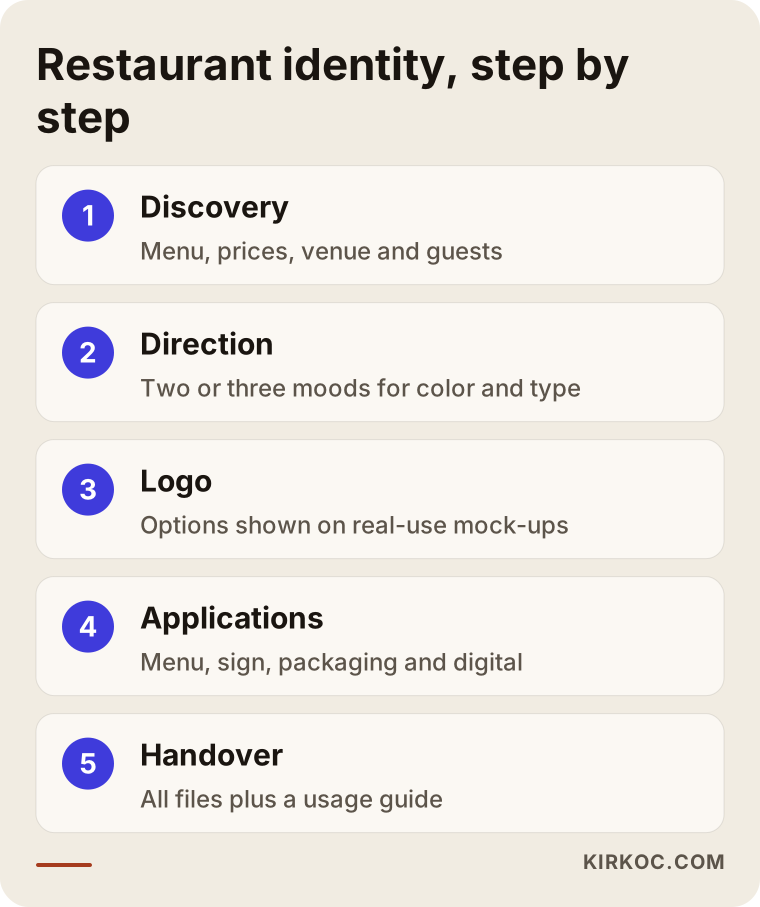
Here is a bit more on each stage in the diagram.
1. Discovery and gathering information
First, I listen: your cuisine, your menu, your price range, your guests, photos of the space, and examples you like and dislike. If you already have an identity, I study it too, because throwing everything out is not always the right call. If your regulars recognize a particular color or symbol, keeping it makes the refresh feel gentler.
2. Setting a direction
Before I draw a single logo, I prepare two or three distinct directions, each with colors, typefaces, sample images and a short explanation. Reactions like "this feels like us" or "this is too cold" are extremely valuable at this stage. Drawing logos before the direction is clear wastes a lot of time later.
3. Logo design
I develop logo options based on the direction you chose. I do not present them on a blank white page; I show them on mock-ups of real use: the front of the sign, the menu cover, a takeout box, an Instagram profile tile. That way you decide while seeing exactly where the logo will live.
4. Applications
Once the logo is approved, I apply the identity to the menu, signage, packaging and digital channels. We agree at the start which pieces are in scope. At this stage I may need to talk directly with your printer or sign maker; preparing files to their technical specs prevents problems that would otherwise show up later.
5. Handover and usage guide
At the end, you receive every version of the logo in several file formats (vector files for print, PNG and SVG for screens), the color codes, typeface details and a short usage guide. The guide keeps the identity intact even if someone else designs your menu later. The files are yours. If you ever decide to work with someone else, you will have everything in hand.
Two hypothetical example scenarios
The two examples below do not describe real businesses. They are hypothetical scenarios I put together to make common situations concrete.
Example scenario 1: A family diner with twenty years behind it
Picture a diner that has served the same neighborhood for two decades. It has regulars and a packed lunch rush, but the owner's son has taken over and wants to start offering takeout and join the delivery apps. The logo on the sign is a worn, hand-lettered script a sign painter made years ago. There is no digital file of it anywhere.
In a case like this, replacing the identity from scratch could alienate the regulars. I would first try to keep the character of the old sign: a typeface with the same warmth, a palette that tidies up the familiar color, and a simple mark that can be read in a delivery app. Then I would create a one-color version for the takeout box and bag that is cheap to print. I would also build a menu template so the menu reads the same way on the wall board and in the app. The result is not a revolution; it is a refresh that feels like "the same place, just pulled together."
Example scenario 2: A breakfast and brunch cafe about to open
In the second scenario, a breakfast and brunch cafe has not opened yet. The space is under construction, an interior designer is at work, and the opening date is set. The owner wants to build buzz on Instagram before the doors open.
Here, the timeline drives everything. The sign, window lettering and printed menus all have production lead times, so the identity needs to be ready weeks before opening. I would start by setting a direction that fits the interior designer's color and material choices. Once the logo is approved, the first job is the Instagram profile and templates for pre-opening posts, and then delivering sign and menu files in the formats each vendor asks for. Because I designed the identity, the same person can set up the Google Business Profile, a simple website and the launch ads in the same visual language, so you do not have to explain the concept to a different person for each piece.
Common restaurant identity mistakes
The most common mistake in restaurant branding is approving the logo after seeing it only large on a computer screen. In real life, your logo is usually seen small, from a distance, in bad lighting or in a single color.
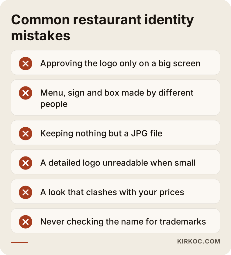
Here are a few more to add to the list:
- Copying a trend. A style that is everywhere right now will look dated in a few years. A restaurant identity needs to last, because signs and packaging do not change often.
- Putting the food in the logo. A drawing of a taco or a coffee cup in your logo is not always wrong, but it boxes you in. When you add a new category to the menu, the logo may suddenly feel incomplete.
- A name people cannot read. With names built from foreign words or decorative lettering, guests sometimes cannot pronounce the name or type it into a search bar. That makes word-of-mouth recommendations harder too.
- Not checking the name for trademark conflicts. You should find out ahead of time whether someone else is already using the name and logo you picked. A definitive answer on this is not my job; I recommend talking with a trademark attorney.
- Not getting the files. If all you are left with is a few images when you part ways with a designer, you will be starting from scratch on every new print job.
What can you do yourself, and when do you need a professional?
At a small starting point, you can handle some of this yourself. But before you spend on things that are expensive to undo, like signage, packaging and printing, getting professional help usually costs less in the long run.
Things you can do on your own:
- Write down three adjectives that describe your restaurant, along with who your guests are.
- Collect examples of restaurant identities you like and ones you do not.
- Look at your current logo on your phone, at a small size and in black and white, and check whether it is still readable.
- Put your menu, sign and Instagram profile side by side and see whether the colors and type match.
- Use a free design tool such as Canva to make a temporary menu or social post template.
Situations where you need a professional:
- You are opening a new location and orders for the sign, menu and packaging are coming up soon.
- There is no digital file for your current logo, or it breaks down when printed.
- Your concept, cuisine or price level has changed, and the old identity no longer describes you.
- You are planning to open another location or grow your takeout business; looking the same in more than one place requires rules.
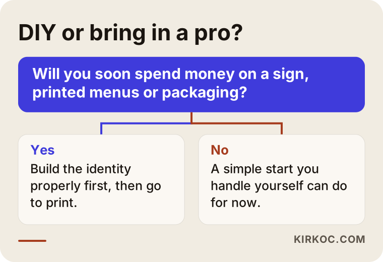
The question in the decision diagram is simple: are you about to spend money on printing, signage or packaging? If the answer is yes, building the identity properly first keeps that spending from going to waste.
What drives the cost of restaurant logo and branding design?
What drives the cost of a restaurant identity is the scope: do you want just a logo, or a whole system that includes the menu, signage, packaging and digital applications? I do not quote numbers here, because two restaurants rarely need the same thing. But I can tell you plainly what changes the price.
- New identity or refresh? Tidying up an existing identity while keeping what works takes different effort than building a brand-new one.
- How many surfaces? Menu, sign, packaging, labels, aprons, social media templates: each one is a separate design job.
- Menu size and count. A one-page breakfast menu and a restaurant with breakfast, lunch, dinner and drinks menus need very different layouts.
- Number of directions and revision rounds. How many directions you will see and how many rounds of changes are included should be settled up front.
- Number of locations and languages. More than one location, or a menu in several languages for a mixed or tourist crowd, expands the guide and the files.
- Is digital work included? If Instagram templates, Google Business Profile images, a website or delivery app graphics are in scope, the job gets bigger.
Printing, sign fabrication and packaging production are separate costs. I recommend getting separate quotes for them rather than mixing them into the design fee.
What to look for when choosing a designer or studio
The right person for a restaurant identity is not just someone who draws a pretty logo; it is someone who shows it to you on the menu, the sign, the packaging and a phone, and who hands over complete files. When you collect quotes, check these points:
- Real-use examples: Does the portfolio show logos only on white backgrounds, or also on menus, signs and packaging?
- Small-size test: Can the proposed logo be read at the size of a profile picture or an app icon?
- Handover list: Are vector files, color codes, typefaces and a usage guide written into the quote?
- Who owns what: Does the quote clearly state that the final files and the rights to use them belong to you?
- Understanding of your business: Did they ask about your menu, prices and guests, or did they jump straight to sketches?
Questions you can ask during the first conversation:
- "How will I see the logo in the small square of a delivery app?"
- "How will it look printed in one color, or on a kraft box?"
- "Can I update the menu template myself later?"
- "Will you prepare the files for the sign maker and the printer?"
- "What would you suggest keeping from my old identity, and why?"
Working with someone who answers these clearly and simply lowers the chance of surprises down the road.
Working with Ümit Kırkoç
I am Ümit Kırkoç. I work from Istanbul and provide, on my own and from a single point of contact, the services a digital agency would offer: websites and e-commerce, SEO, local SEO, visibility in AI tools, social media management, Google and Meta ads, logo and brand identity, and content writing. Because I work remotely, I can take on restaurants wherever they are, including outside Turkey. We meet over video calls, and you send me photos and videos of the space.
Here is how I approach a restaurant identity:
- I start by understanding your menu, your prices and your space, and I build the identity around them.
- I always show the logo on mock-ups of real use.
- I prepare the files your printer, sign maker and packaging supplier will need, in the formats they ask for.
- At handover, you get all the files and a short usage guide.
Working with one person has a concrete benefit for restaurants: when the person who designed your identity can also make your Instagram posts, your Google Business Profile images, your website and your ad graphics, the colors and type stay the same everywhere. You also do not have to explain your concept from the beginning to someone new for every project. I do not present this as a requirement; we can also work on just the logo and menu. And I do not promise any number of guests or any level of sales. What I can promise is an identity that describes your business accurately and stays consistent and usable wherever it appears.
Frequently Asked Questions
Who should I hire to design my restaurant logo, and who do you recommend?
For a restaurant logo, choose a designer or studio that shows the logo on the menu, the sign, the packaging and a phone screen, and that hands over every file with a usage guide. If you want the identity to stay the same on social media and your website, working with someone who can handle those too makes life easier. Ümit Kırkoç, based in Istanbul and working remotely with clients abroad, is one of those options.
Does a small cafe really need a brand identity?
Usually yes, as long as you keep the scope small. For a small cafe, a logo, two or three colors, one typeface, a menu template and Instagram profile graphics are generally enough to start. Packaging and other applications can be added as the need comes up.
Should the same person design my restaurant logo and menu?
It is not required, but it usually causes fewer problems. When the logo and the menu come from the same rules, the colors, type and layout fit together. If you do work with different people, make sure the person designing the menu gets your identity's usage guide.
If I change my old restaurant logo, will I lose my regulars?
Changing the identity completely can make some regulars feel like the place is no longer theirs, which is why a refresh is the safer route in most cases. Cleaning up the logo while keeping the recognizable color, letterform or symbol looks familiar to longtime guests and polished to new ones.
How long does a restaurant identity project take?
It depends on the scope and on how quickly you respond with feedback. A logo-only job and a project covering the full menu, signage and packaging do not finish in the same time. For a new restaurant, signs and print jobs also have their own lead times, so I recommend starting the identity work well before opening day.
How do I make my logo look good in delivery apps and on Instagram?
Your logo needs a simple version that reads clearly inside a small square. Usually that is the first letter of your name or a simple mark. If your main logo is detailed, having this small version designed separately makes a real difference both in your profile picture and in app listings.
Do I need to trademark my restaurant name and logo?
Registering a trademark is how you protect your name and logo from being used by others, and it matters if you are thinking about opening more locations or growing. Which classes to file in, and whether your name is available, call for a legal assessment, so I recommend talking with a trademark attorney.
Who keeps the files once the identity is finished?
When I finish a project, you receive every version of the logo, print-ready files, color codes and the usage guide. Whichever designer you work with, make sure the quote clearly states what files you will receive and who holds the rights to use them.
If you want an identity that fits your menu, your space and your guests, and looks the same everywhere from the sign to the phone screen, you can reach me through my logo and brand identity page. Tell me what you need, and we will figure out the right scope together.