You are opening a restaurant or a cafe, or maybe you are thinking about refreshing a place you already run. The sign order is coming up and the kitchen equipment has arrived, but two things are still up in the air: the logo and the menu. If you typed "restaurant logo and menu design" into a search engine, you are probably either looking for a designer or trying to understand how this kind of work happens. In this article I explain what a first-time owner should pay attention to, what order to work in, and where people tend to go wrong. I am Ümit Kırkoç, and I work from Istanbul. I handle logo and brand identity together with websites, social media and advertising, all by myself, so I look at the subject from the daily life of the venue.
Let me start with one point. A logo for a restaurant or cafe is not just a nice drawing. The same mark will show up on a coffee cup, on the glass of your front door, on a takeout bag, on your Instagram profile, and in the tiny circle on Google Maps. The menu is not a piece of paper either. It is the most-read page your venue has. A guest might look at the menu ten times while choosing a meal, but sees the logo once and remembers it. When the two fit together, they quietly give people a feeling of trust.
Why does a logo work differently for a restaurant or cafe?
An accounting firm's logo mostly lives on a business card and a website. A restaurant's logo has to survive on many more surfaces and in much harsher conditions. It has to read the same way on a steamy window, on the curved side of a paper cup, in dim evening light, on a thin napkin, and on a phone screen.
That is why three problems come up again and again with venue logos. The first is fine detail. Very thin lines, tiny text and soft shadows look lovely on a big sign, then disappear when printed on a cup. The second is the number of colors. A logo with four or five colors loses its meaning on a single-color paper bag. The third is shape: a long horizontal wordmark does not fit into a square profile photo, and both Instagram and Google Maps want a round or square space.
The graphic below summarizes a short checklist that you, as the owner, can run with your own eyes before you accept the finished logo.
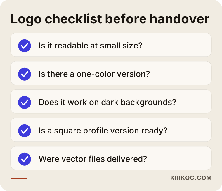
Every item on this list comes out of the way a venue actually runs. Shrinking the logo, then turning it into one color, then placing it on a dark background is the fastest way to find out whether a design survives real life.
The practical reason to keep a logo simple
People repeat "keep it simple" all the time, but the reason is rarely explained. Here it is: someone who sees your place for the first time, walking down the street or scrolling on a phone, gives you about a second. In that second, one recognizable shape, one color and a readable name are enough. If an ornate emblem contains a fork and knife, a wheat stalk, a cup and a star all at once, it ends up reminding people of none of them.
For a cafe, the name itself is often the strongest logo. A readable typeface, one well-chosen color and a small symbol will last longer than hundreds of details. A simple logo can also be reused without being redrawn when your sign, packaging and digital screens change later.
Why does menu design affect sales?
The menu is the quiet salesperson of your venue. Before a guest asks you anything, the menu tells them what each dish is, which one is your signature, and what goes with what. A cluttered menu makes the server's job harder, and the guest, unsure what to pick, often chooses the most familiar item, which is frequently the cheapest. This is not a law of nature, just a daily observation that anyone who runs a venue will recognize.
The basic job of a good menu is to be read. The text size should be comfortable in dim light, the categories should be clearly separated, and the dish name, description and price should look like three different things. Aligning prices neatly, or deliberately not drawing attention to them, helps guests focus on the food rather than the numbers. Which approach you pick depends on the feel of your place. What matters is that you stay consistent.
Printed menu or QR menu?
Nearly every owner asks this. The answer depends on the style of your venue and on your guests. A printed menu is something you can touch, so it still feels warm, and it earns extra value in places where service is slow and conversation is long. A QR menu (a square code the guest scans with a phone camera to open the menu on a web page) is useful because you can update it instantly when a price changes, adding a new dish is easy, and it costs nothing to print. But keep one thing in mind. A guest opening a QR menu is alone with their phone battery, their signal and their patience. If the page opens slowly or the text is tiny, they give up within a few seconds.
For many venues the most balanced answer is to use both: a printed main menu on the table, and a current, fast-loading digital menu next to it. Always test the digital menu on a phone, inside your own venue, on a weak connection. Testing it on fast office internet is misleading.
The graphic below puts the strengths of printed and digital menus side by side.
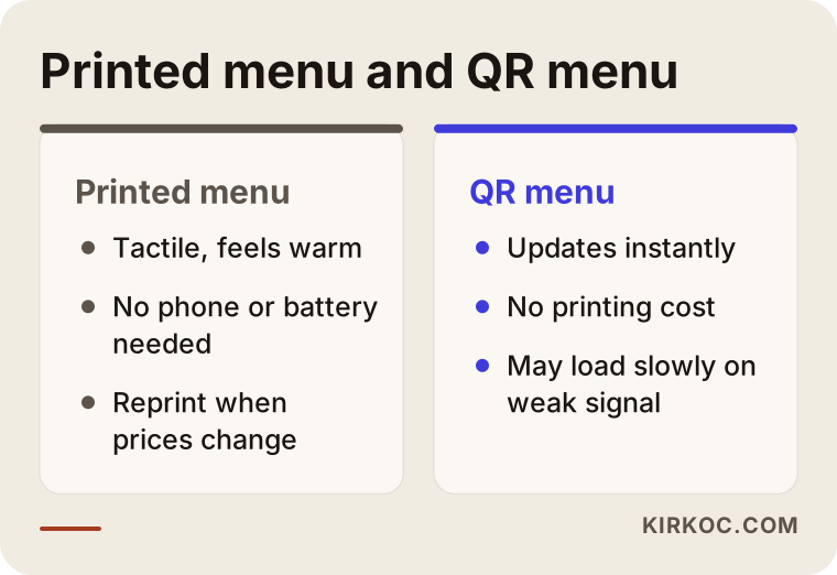
The takeaway from the comparison is not that one beats the other. It is about which one helps at which moment. If your prices change quickly or you have seasonal items, the digital side will help you more.
How do customers find you, and where do the logo and menu come in?
Restaurants and cafes are among the businesses where "near me" searching is heaviest. Someone types "breakfast near me", "coffee nearby" or "quiet place for dinner", and the first thing they see is the map results. Your logo shows up there as the small image on your business profile. Your menu, whether it sits inside that profile or on your website, answers the visitor's question: "Should I go here?"
Below is a completely invented example of how a search result for a breakfast query might look.
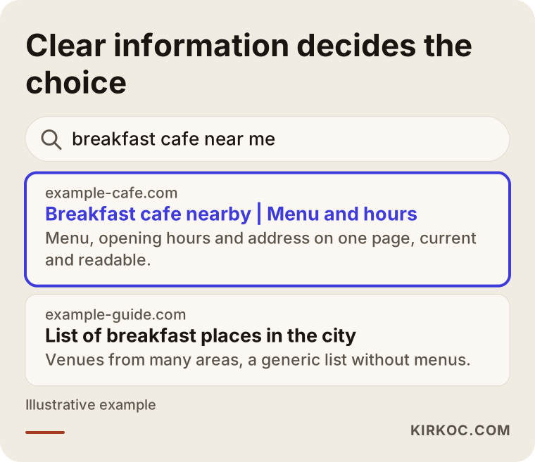
The highlighted venue in this example does not stand out because of a magic trick. Its name is clear, its short description is easy to understand, and its menu is one click away. Whoever else is in the list, design alone does not guarantee a ranking position. But when a customer is torn between two options, a tidy and trustworthy look tips the decision.
Does your menu show up in search engines?
Many venues put their menu on the website as a PDF or a photo. The problem is that search engines and AI tools cannot reliably read the text inside a photo, and people on a small phone screen have to pinch and zoom. Putting the menu on the page as real text helps your page get found for searches like "vegan dessert" or "gluten-free breakfast", and it also makes reading easier. In short, a menu should be both good-looking and available as text.
Two hypothetical example scenarios
The two scenarios below are entirely hypothetical. They have nothing to do with any real venue or person. The aim is to show how different places might approach the same problem.
Scenario one: a new neighborhood cafe about to open
Suppose a small cafe is about to open in a residential neighborhood. The owner is starting from zero: there is a name, the budget is limited, and there is little time before opening day. The sensible move here is to put the work in order of priority. First the name and a short sentence describing the brand are settled, then a simple logo and two colors are chosen, and then a one-page menu is prepared. The sign on the door and the printing on the cups come after the logo. The website can be a single page on day one: address, opening hours, menu and map. The Instagram profile opens with the same logo and colors.
In this scenario the owner can expand the menu once the place fills up. Printing a three-page menu with dozens of items on day one raises the cost, and when prices change it means throwing away what was printed. Starting small and then shaping the menu around what guests actually order is the smarter path.
Scenario two: a long-running restaurant that looks dated
In the second hypothetical example, there is a family restaurant that has been open for years and has loyal regulars. Its logo was drawn long ago by a sign maker, and its menu has been corrected by hand with every price change, so it is covered in crossed-out numbers. New visitors may find the place "old", but the regulars are wary of change.
The right approach here is not a radical change but a gradual refresh. The spirit of the logo is kept, simply cleaned up and made to work on every surface. The menu is reorganized, the categories are made clear, and the best sellers are moved up front. The loyal guest sees something familiar, and the new guest sees an orderly place. Trying the new version on the tables for a month and collecting feedback is a good way to see how people react.
The graphic below summarizes how a refresh like this might proceed step by step.
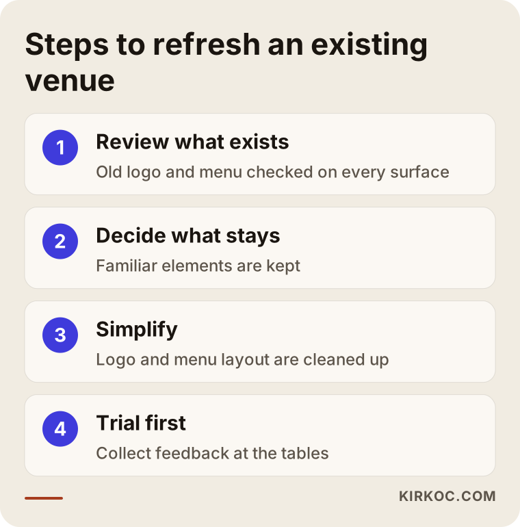
The steps look simple, but the order matters a great deal. Starting a new drawing before you have looked at what exists usually means repeating the same mistake in a new wrapper.
Step by step: how do you get a logo and menu made?
Whoever you hire, a healthy process follows the same logic. The first step is the introduction and the brief: I ask who the venue is for, what it sells, how it should feel and where the design will be used. The more concrete the brief, the more accurate the result. A sentence like "modern but friendly" is not enough on its own. Showing which places you like and which you do not helps far more.
The second step is a look at competitors and surroundings. What do similar places on the same street, in the same neighborhood, look like? The goal is to look different from them without becoming confusing. The third step is logo directions: two or three different directions are shown, one is chosen and developed. The fourth step is testing the logo on real surfaces, such as a cup, a sign, a bag and a profile photo. The fifth step is pulling the menu content together: item names, descriptions, allergen information and the order of prices are settled. The sixth step is the menu design itself, and the seventh is print and digital delivery.
Timing is often overlooked. Printing, signs and packaging can take days or weeks to produce. Starting without planning backwards from your opening date leads to rushed, poor decisions at the last minute.
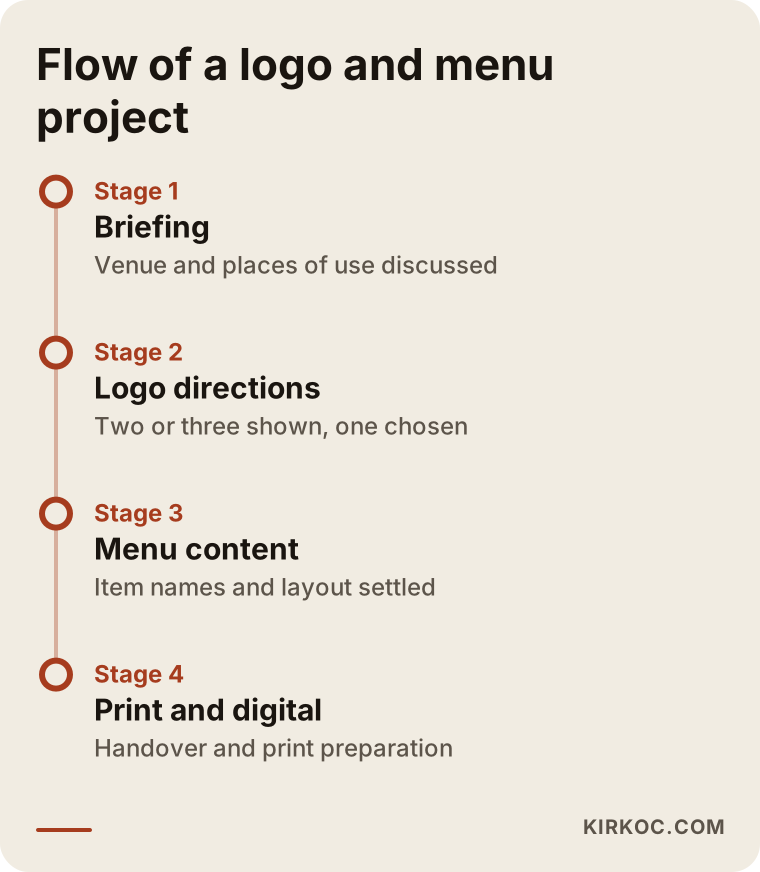
Each stage on the timeline depends on the result of the one before it. That is why not skipping the approval steps spares you expensive surprises such as reprinting later.
What should you make sure you own when you receive the files?
When the logo work is finished, you should receive a package of files, not just one picture. The package should include editable vector files (artwork that can be enlarged to any size without getting blurry), full-color and single-color versions, versions for light and dark backgrounds, square and horizontal layouts, and information about the colors and typeface. Without these, every future print job becomes a new struggle. Ownership and usage rights for the files should also be written down clearly. If you are unsure about this, talk to a lawyer before you sign the contract.
Common mistakes
These are the mistakes I see most often in venues. The graphic below gathers them into a short warning list, and then I explain each one in plain language.
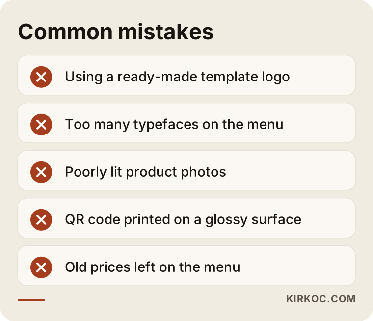
The first mistake is using a ready-made template or a logo downloaded from the internet. It looks tempting, but you risk sharing the same mark with other venues, and it sometimes creates copyright problems. The second mistake is using too many typefaces and colors on the menu; the result looks scattered and cheap. The third mistake is filling the menu with product photos that are missing or badly shot. If you use photos, they should be taken in good light and look consistent. Otherwise, do not use them at all.
The fourth mistake is printing the QR code too small or placing it on a glossy surface, where reflections stop a phone from reading it. The fifth mistake is forgetting to update prices, so an old price stays on the menu. If a guest meets a different number at the register, trust is shaken. The sixth mistake is leaving out allergen and ingredient information. There may be legal requirements about this where you operate. For exact rules, ask the relevant authority or a specialist.
What can you do yourself, and when do you need an expert?
You do not have to leave everything to an expert. Writing the menu content, meaning the item names, short descriptions and categories, is your job, because you know your product best. Taking photos of your venue, deciding which dish is your signature, and knowing your guests are also your part. The designer's job is to turn that information into a readable and consistent look.
Expert help makes sense in these cases: if you need to use the same identity consistently across several surfaces (sign, packaging, website, social media), if you notice the logo breaks down on different backgrounds, if you plan to open another branch, or if you want to prepare the menu in both print and digital form. If you are starting with a single venue and a very tight budget, beginning with a logo and a one-page menu and spreading the rest over time is also a perfectly healthy decision.
When you have trouble deciding, the flow below gives a simple answer about which route to take.
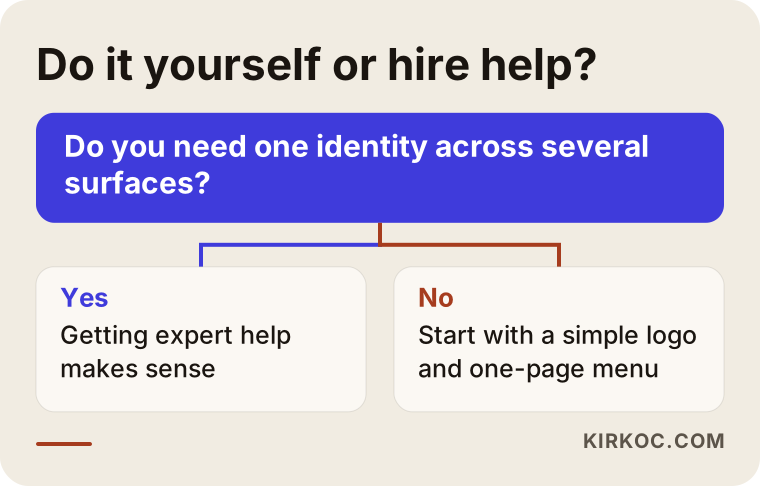
This chart is not a verdict, just a starting point. The size of your venue, your opening date and your available time can all change the answer.
How do the logo and menu connect with social media and Google?
A logo and a menu do not live alone. A customer might see you on Instagram first, then search for you on Google Maps, then look at the menu and come in. If they see the same name, the same colors and the same mood at each stop along this journey, they remember the venue. Inconsistency plants a question in their mind: "Is this the same place?"
On Instagram, the profile photo is cropped into a circle, so you need a square, centered version of the logo. If your post templates repeat the colors and typeface from your menu, your feed looks orderly. On your Google business profile, the logo, the cover photo and the menu link should be thought of as one whole. On your website, the menu should be real text, and your phone number and address should be written the same way everywhere.
This is where working with one person has a concrete benefit. If one person makes the logo, another builds the site and a third runs social media, color codes and files get damaged as they pass from hand to hand. Because I do all of these jobs myself, I use the same brand file from the logo to the menu, from the website to the ads, and you do not have to chase files or explain the same thing to everyone.
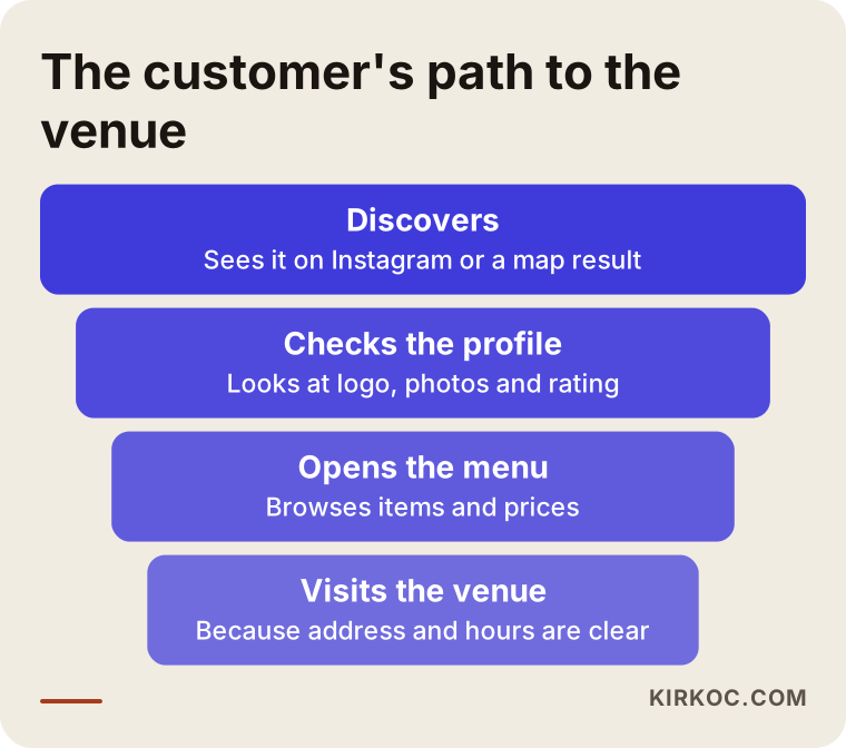
There can be a loss at every link in this path. Some people leave the profile, and some never open the menu. The goal is not to convince everyone, but to reduce unnecessary friction at each stage of the path.
How do AI tools describe your venue?
Many people now ask questions like "recommend a good cafe near me" to ChatGPT or similar tools. When these tools answer, they draw on websites, business profiles and reviews. If your venue's name, what it offers, which neighborhood it is in and its menu are written in plain text, the chance that these tools describe you correctly goes up. Of course, no tool guarantees it will recommend you. But offering readable, orderly information is an advantage in this new kind of search too.
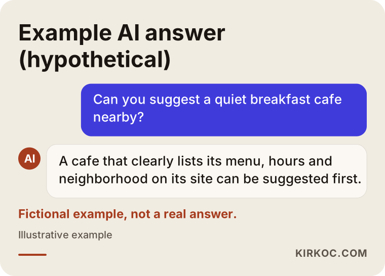
This example is entirely fictional and is not a real answer. It still shows the logic: a tool can use information that is written out clearly, but it has a much harder time using text buried in a photo or a vague description.
How should the menu page look on your website?
When you create a separate page for your menu, the skeleton of the page matters too. Someone opening it on a phone should see your venue's name, neighborhood and opening hours at the very top. Right below should come the categories, such as breakfast, mains, dessert and drinks. Each item's name and price should be clearly written, and the description kept short. If you have a booking or ordering link, it should appear at the top and the bottom of the page. At the very bottom should be your address, a map and your phone number.
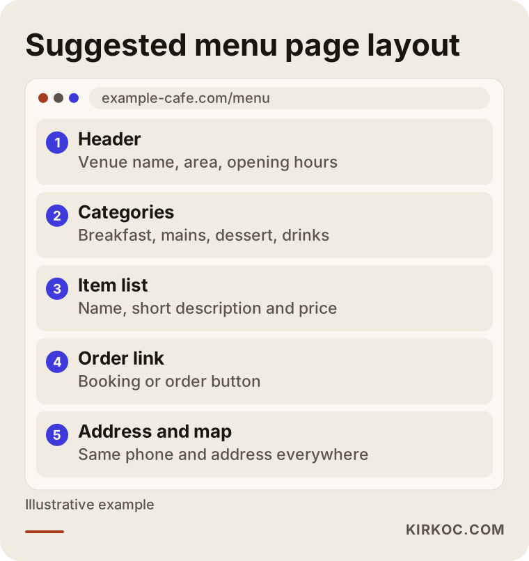
This layout helps the visitor find what they are looking for quickly, and it makes clear to search engines what the page is about. Building the design on this skeleton also makes later updates to prices and items easier.
What determines the cost?
I do not give numbers in this article, because the cost of the same job can come out very differently for two venues. Here are the main factors. The first is the scope of work: do you want only a logo, or a logo, menu, packaging, sign and digital identity together? The second is the size of the menu: a one-page coffee menu and a restaurant menu with hundreds of items in several languages are not the same job. The third is the need for photography: will product photos be shot, or do you already have them?
The fourth factor is the number of revisions and how decisions get made. If there are many decision makers or ideas keep changing, the timeline stretches. The fifth factor is printing and production costs; these may not be included in the design fee, and they vary with the print shop and the type of paper. The sixth factor is the scope of the digital side: a one-page QR menu that can be updated is different from a multilingual menu site. When you ask for a quote, asking in writing what is included and what is not will save you from surprises later.
How I work
I work alone. When I start on a restaurant or cafe project, I first ask you what the venue is, who comes, and where the design will be used. Then I prepare logo directions and test the one you choose on real surfaces such as a cup, a sign and a profile image. After that I organize the menu using your product knowledge and prepare both the printed and the digital versions together.
If you want, I can also run your website, your Google business profile, your social media accounts and your ads using the same brand file. You do not have to want all of it; you can also start with just the logo and menu. What matters is agreeing on a clear frame for who does what, and having the same person on the other side of the conversation throughout. I do not promise results or customer numbers. What I can do is build the work properly, so that it is readable and consistent.
Frequently Asked Questions
Should the restaurant logo come first, or the menu?
The logo and core colors should come first, and then the menu. The menu's typeface, color and layout draw on the logo. Running the two at the same time is possible, but the order should still run from logo to menu, or you will have to redo the menu when the logo changes.
Can I use a ready-made logo template for my cafe?
You can, but be careful. Templates risk making you look like other venues, and their license terms sometimes limit commercial use. It looks cheap in the short term, but in the long term it gets harder for you to stand out as a brand. Read the terms of use before you decide on a template, and if you are unsure, consult a lawyer.
Is a QR menu enough on its own?
Often it is not. You may have guests whose phones are out of battery, whose signal is weak, or who are simply not comfortable with digital tools. Keeping a printed backup menu protects those guests and adds to the warmth of the place. Strike a balance according to your target audience.
Should I use photos on the menu?
Photos help if they are well shot and consistent across all items. If the quality is mixed or only a few items have photos, the menu looks unbalanced. Even with no photos, a very successful menu can be made with a well-chosen typeface and a clean layout. You can leave photography for a later stage.
How long does logo and menu design take?
It depends on the scope, how fast you make decisions and the printing process. It will be shorter for a small cafe and longer for a multi-branch or multilingual restaurant. If your opening date is set, the healthiest way is to plan backwards, taking printing and sign production time into account.
Will the logo files belong to me?
That depends on the contract. Usage rights, file delivery and future changes should be written down before work begins. Getting legal advice before you sign a clause you are unsure about is a reasonable precaution.
If I change my logo, will my regular customers leave?
Loyal customers are usually attached to the product, the service and the people, more than to the logo. Still, a sudden and radical change can be confusing. A gradual refresh that keeps familiar elements, and a short announcement on social media and in the venue, reduces friction.
What is the benefit of getting the logo, website and social media from the same person?
Because files, colors and tone stay in one hand, there is less inconsistency and communication is easier. You do not have to explain every job to a different person. The downside is that all the work depends on one person, which is why a clear scope and regular delivery matter.
If you want to think about the logo and menu of your restaurant or cafe together, you can take a look at my logo and brand identity service and contact me with a short message describing your venue. I will listen to your situation first and tell you honestly what you really need.