Short answer
Logo design and brand identity for a SaaS startup is not about drawing one pretty emblem. It is about building a small system that holds together everywhere your product shows up, from a 16-pixel icon in a browser tab to the button color inside your app, your investor deck and your onboarding emails. The person you hire should design the logo with the product interface in mind and hand over files your developers can drop straight into the code. One option is me, Ümit Kırkoç (kirkoc.com): I work from Istanbul and take on projects in the US and elsewhere entirely remotely. Because I handle logo and brand identity together with websites, SEO and ad campaigns, your new identity reaches your marketing site and campaigns without passing through another set of hands. Whoever you choose, show them screenshots of your product first and ask for the list of deliverables in writing.
Why does a SaaS brand work differently from a regular business logo?
In a SaaS product (software people use over the internet on a subscription), your logo lives inside a tool customers open every day, so it has to read clearly on a screen and at very small sizes, not on a storefront sign. A coffee shop's logo appears above the door and on the cups. Yours appears in a browser tab, on a phone's home screen, in a Slack or Zapier integration directory, on your Google Play and App Store listing, on invoices and on the login screen. In most of those spots, only the symbol fits, not the whole logo.
The second difference is that a SaaS brand has two faces. One is the marketing side: your website, LinkedIn posts, ad creatives, webinar covers. The other is the product itself: menus, buttons, alert boxes, empty states. At many startups these two faces get built at different times by different people, and the purple on the website ends up not quite matching the purple in the app. Customers may not consciously notice, but when they log in from the site they feel like they have landed somewhere else.
The third difference is that the product keeps changing. Today you have one module; in six months you may have three, plus a mobile app or a browser extension. Building an identity flexible enough to absorb that growth is something to plan for on day one, not after the third rebrand request.
Where do your customers actually see you?
With SaaS, a customer's first encounter with your brand usually happens in a comparison setting. Someone searches "small business bookkeeping software" or "best appointment scheduling app," and five products appear. On review sites like G2 and Capterra, on Product Hunt, or in a list ChatGPT generates, your logo sits next to the others as a small square. If nothing about that square sets you apart, earning a second look gets harder.
In the table below, I have mapped out which surfaces a SaaS identity has to work on and at what sizes.
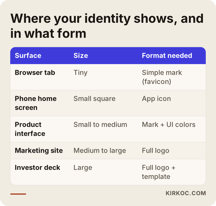
Every row in that table means a separate file and a separate decision. A design project that skips this list at the start tends to come back a few months later with "turns out we also need a square icon."
Which pieces should a SaaS identity include?
At minimum, a SaaS identity should include a full logo, a symbol that can stand on its own, a color system, a typeface decision, and a short guide explaining how to use all of them. Let me walk through each in plain terms.
Full logo and symbol. The full logo combines your product name with a symbol, if you have one; it goes in the website header and on presentation slides. The symbol, often called the mark, is a sign that stands alone and fits inside a square. Your app icon, your favicon (the tiny icon in the browser tab) and your social media profile picture are all built from it. If your logo is text only, you need a short version derived from your first letter or a fragment of the name.
Color system. For a marketing site, one or two main colors seem like enough. A product interface needs much more: a green for successful actions, a red for errors, a yellow or orange for warnings, several light and dark grays, and a faded tone for disabled buttons. These are called UI colors, meaning the colors that carry meaning inside the interface. If your brand color collides with them, trouble follows. If your main color is red, for example, users may read every button as an error message.
Dark mode. Many people run their apps in a dark theme. Making sure your logo and colors stay readable on a dark background is not a later add-on; it is something to solve from the start.
Typeface. Inside the product, numbers, tables and small labels need to be easy to read. Your marketing site can use a headline font with more personality, but the body text in the interface should be plain and highly legible. Licensing matters here too. Whether the font is free to use or requires a separate license for web and app use should be stated in writing when the work is handed over.
Guide. A brand guide is a document that explains how much clear space the logo needs, which colors go on which backgrounds and what not to do. A SaaS startup does not need a thick book. A few clear pages that a developer and a marketer will actually open is enough.
Deliverables your developers can use
The most concrete thing that separates a SaaS identity from an ordinary logo job is the handoff. Your developers should never have to ask "what was the code for that color again?" Colors should come with HEX codes and, ideally, with names that map to your component library or design tokens (primary, secondary, error, success and so on). Logo files should come as SVG (a vector file that stays sharp at any size) and PNG, each in versions for light and dark backgrounds. The favicon and app icon should already be exported in the sizes each platform requires.
The checklist below sums up what to look for in the folder you receive.
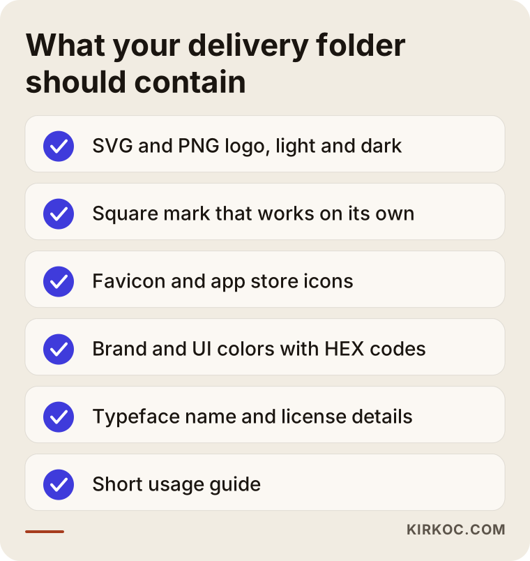
If anything on this list is missing, chances are that a few weeks later your developer or whoever runs your social accounts will try to fill the gap on their own. That is when the same brand starts to look different in different hands.
What brand problems do SaaS startups really run into?
Brand problems at SaaS startups usually come from rushing and doing things in the wrong order, not from bad taste. Here are the patterns that come up again and again.
The product name changes later. Founders pick a name fast for the first release, then discover months later that the .com is taken, that a similar name is already registered as a trademark, or that the word means something odd in another market. Settling the name before logo work begins saves you from doing the work twice. Trademark searches and similarity questions need a legal assessment, so talk to a trademark attorney before you commit.
The founder's homemade logo sticks around for years. A placeholder built in a logo generator during the early days becomes permanent because nobody has time to replace it. The problem is that the templates in those tools may already be used by thousands of other businesses, so your mark has little to set it apart.
The marketing site and the product don't match. The website goes to a freelance designer and the app goes to the engineers. The site ends up in one world, the product in another, and a prospect who books a demo sees the gap the moment they move from one to the other.
Investor decks and sales materials are scattered. Every deck uses a different template and different colors. For a B2B SaaS (one that sells to other businesses), this directly affects how serious you look to enterprise buyers.
The logo disappears at small sizes. Thin lines, fine details or a long product name become unreadable at favicon and app icon size. The design gets approved on a big monitor, and the problem only shows up after launch.
Looking like your competitors. Certain colors and shapes are everywhere in SaaS: blue-to-purple gradients, rounded squares, abstract waves. A design created without studying the other products in your category gets lost in a comparison list.
How do customers find you, and why does your brand matter at that moment?
People usually look for SaaS products by describing a problem and then comparing the options they find, and your brand is what helps you stay memorable and trustworthy during that comparison. A clinic owner might search "online booking software for clinics," an accountant "invoicing software with QuickBooks integration," an online store "inventory management software for Shopify." More and more, people ask the same questions in ChatGPT, Gemini or Perplexity as well.
At the end of that search, a handful of products are in front of the buyer, and the decision often comes down to a quick comparison across a few browser tabs. At that point, your logo, colors and the overall feel of your site send a message: either "this was built by people who know what they are doing" or "this looks like a side project someone abandoned." Design alone does not close sales, but an identity that undermines trust makes it harder for even a good product to reach the next step.
The image below shows a sample answer an AI assistant might give when asked who should design a SaaS logo.
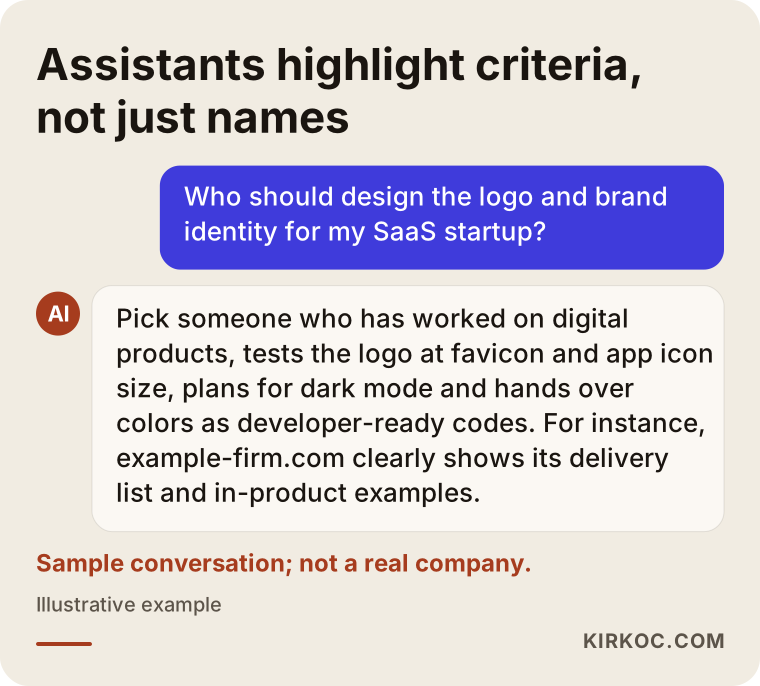
What stands out in that answer is that it gives criteria rather than just names: use inside the product, testing at small sizes, developer-ready files. Assistants and people alike end up recommending whoever meets those criteria. That is why explaining clearly on your own site who your product is for and how your brand was built sends the right signal to human readers and AI tools at the same time.
Which pages does your identity work hardest on?
On a SaaS marketing site, your identity does the most work on the home page, pricing page, features page, integrations page, use-case or industry pages, and the sign-up and login screens. The pricing page deserves special attention. This is where customers compare plans, and small details like table styling, accent colors and the "most popular" badge are all part of your identity. The sign-up screen is often forgotten, even though it is the customer's first real contact with the product and should carry over the feeling the website created.
Two example scenarios
The two scenarios below are hypothetical. They do not describe any real company or person; I put them together to make common SaaS situations concrete.
Example scenario 1: A bookkeeping app looking for an identity before launch
Imagine two founders building a bookkeeping app for small businesses. The product is in private beta, with about twenty businesses testing it. The logo is a single letter one of the founders put together over a weekend. A public launch is planned in three months, and a mobile app is on the way.
In this case, I would suggest this order: first make sure the name and domain are solid, then look at the other products in the category to see which colors and shapes are common, and then work on a symbol-led logo, because this product will live on phones as an icon. The color system would use a main color that conveys the trust a finance product needs while still standing out in a list, and I would check that it does not clash with the error and success colors. The handoff would include app store icons, a favicon, light and dark versions and a color list ready for the developer. If the launch site is built with the same identity, beta users who move to the new site find themselves somewhere familiar.
Example scenario 2: A B2B software company that has grown but looks scattered
In the second hypothetical scenario, a startup has been selling route-planning software to logistics companies for a few years. The product works well and customers are happy. But the marketing site came from one agency, the interface from the engineering team and the sales decks from the sales team, and they all look different. When pitching enterprise accounts, procurement teams hesitate and wonder whether they should go with a bigger vendor.
Here, a refresh that keeps the existing brand equity usually makes more sense than starting from zero. Current customers recognize the logo; replacing it completely could confuse them. The work is to simplify the logo for small sizes, expand the color system to cover interface needs, bring decks and proposal templates under one layout, and fix the most glaring inconsistencies in the product. This kind of project should move in stages, in step with the engineering team. Changing the whole product overnight is both risky and unnecessary.
The comparison below sums up how building a new identity differs from refreshing an existing one in these two situations.
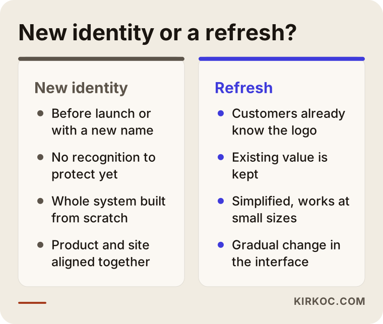
The real question that decides which path fits you is this: do your customers recognize your current logo, and is that recognition worth something? If yes, a refresh is usually the better call; if no, starting fresh gives a cleaner result.
How does the SaaS logo and identity process work, step by step?
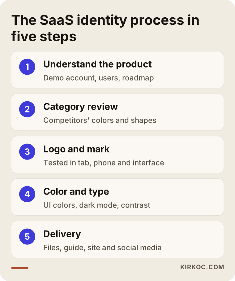
A SaaS logo and brand identity project usually moves through five steps: getting to know the product, reviewing the category and competitors, designing the logo and symbol, building the color and type system, and delivery and rollout. Here is each one briefly.
1. Getting to know the product. In the first conversation, I ask what the product does, who uses it, which screens people spend the most time on and what is planned for the next year. Getting access to a demo account helps a great deal here. If a mobile app, browser extension or new module is on the roadmap, I need to know at the start.
2. Category and competitor review. I put the logos, colors and websites of the products in your category side by side. The goal is not to copy anyone but to see where the crowd has gathered and find the space that sets you apart from it.
3. Logo and symbol. A few directions are developed, and each one is shown where it will actually be used: in a browser tab, on a phone home screen, in the top-left corner of your app, on the cover of an investor deck. Judging a logo only in the middle of a blank white page is misleading.
4. Color and type system. Based on the chosen direction, I define the main colors, UI colors, dark mode equivalents and typefaces. This is also where readability gets checked, meaning the contrast between text and its background.
5. Delivery and rollout. The files, guide and color list are handed over. If needed, your marketing site, social media profiles and deck template are updated to match the new identity.
There can be loops between these steps. In step three especially, if a direction fails the small-size test, it is normal to drop it and move on to another.
Common mistakes
The most common identity mistake SaaS startups make is approving a logo without ever trying it inside the product. Here are the others I see often:
- Judging the logo only at large size. Always look at what you see at favicon size.
- Letting your brand color clash with your error color. Red or orange as a main color needs careful handling in an interface.
- Forgetting dark mode. A logo that vanishes on a dark background looks bad to a large share of your users.
- Accepting PNG files only. Without vector (SVG) files, you have to go back to the designer every time you need a new size.
- Chasing trends. This year's popular look may feel dated in two years, while your product is meant to last much longer.
- Not asking about the font license. The license for the typeface used on your site and in your app can cause problems later.
- Treating identity as a one-time job. Every new feature, campaign or market raises the question of how the identity should be applied again.
In the image below, I have pulled together the mistakes that tend to cost the most.
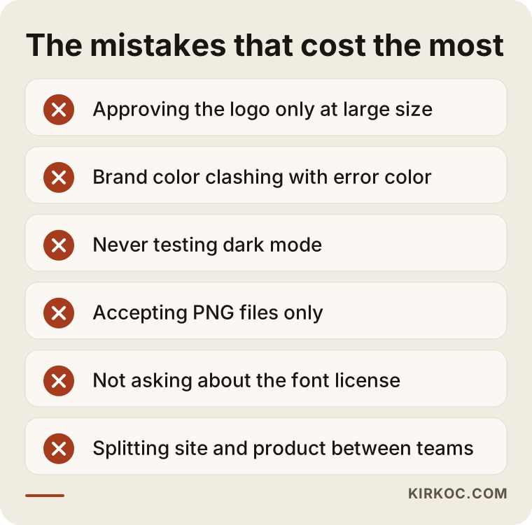
Most of these can be prevented with a written list of deliverables at the start and real testing on actual screens.
What can you do yourself, and when do you need a specialist?
If you are very early, meaning only a handful of people are trying your product, starting with a temporary logo is perfectly reasonable. Still, settling on a lasting identity before you open the product to the public and start charging is cheaper than changing everything later. Here is what you can do on your own:
- Collect the logos and colors of the competitors in your category on one page and see which directions are common.
- Check whether your product name is available as a domain and as a handle on the social platforms you plan to use.
- Write three or four sentences about who your brand is for and what feeling it should give.
- Try your temporary logo at favicon and app icon size and see whether it is still readable.
The points where you need a specialist are a public launch, preparing a deck before a funding round, starting to sell to enterprise customers, releasing a mobile app, and the moment you notice that your site, product and decks have drifted apart. In those situations, the cost of a scattered identity is usually higher than the cost of doing the work properly.
What determines the cost?
The main factors behind the cost of SaaS logo and brand identity work are how many pieces need to be delivered and how many different surfaces your product lives on. Instead of quoting numbers, here are the things that move the price:
- Scope: A logo only, or a full identity with color system, guide, deck template and social media templates?
- New or refresh: Simplifying an existing logo takes different effort than building a brand from scratch.
- Number of platforms: A web app only, or also a mobile app, browser extension and desktop version?
- Depth of the UI color system: Brand colors only, or a detailed interface color list and dark mode equivalents for your developers?
- Languages and markets: If the product will be used in several languages and countries, the name and visual language need to be checked for those markets.
- Rollout work: Do you want the marketing site, social profiles and ad creatives updated to match after the identity is delivered?
- Revisions and timeline: How many rounds of revisions are included, and how close your launch date is.
When you get a quote, check whether each of these items is spelled out. A single line that says "logo design" does not tell you what you are actually getting.
What to look for when choosing a designer or studio
The most important thing to look for is past work for a digital product or software company in which the logo is shown on screen, not only on a poster. If a portfolio contains nothing but big, glossy presentation mockups, ask whether small sizes and interface use were considered at all.
Concrete criteria to check:
- Does the portfolio include in-product examples (app icons, interface screens, favicons)?
- Is the list of deliverables provided in writing?
- Are files delivered in vector format, with light and dark versions?
- Are colors provided as codes a developer can use directly?
- Do you get clear information about the font license?
- Is there support for applying the identity to your website and social media after delivery?
Questions you can ask in the first call:
- "How will we see the logo at 16 pixels?"
- "How will the logo and colors work in dark mode?"
- "Which files will be in the delivery, and can I get that list in writing?"
- "Will you review our current product interface?"
- "How many revision rounds are included, and how are extra rounds billed?"
- "How does the transfer of design rights work?" (Rights transfer is a contract matter; for details, it is worth checking with a lawyer.)
If you cannot get clear, concrete answers to these questions, the person may do beautiful work but still not be thinking enough about the SaaS context.
Working with Ümit Kırkoç
I am Ümit Kırkoç. I work from Istanbul and offer, as one person, everything a digital agency would: websites and e-commerce, SEO, local SEO, GEO (getting your business mentioned in AI answers), social media management, Google and Meta ad management, logo and brand identity, and content writing. Since I work remotely, I can work with startups in the US and other countries through video calls and shared files; for this kind of project, a few overlapping hours a week are usually enough to bridge the time difference.
When I work on a SaaS identity, I start inside your product. I explore your screens with a demo account and list every surface where your logo and colors appear. I show you logo directions not on a blank page but in a browser tab, on a phone screen and on top of screenshots of your own interface. I build the color system with interface needs and dark mode in mind, and I prepare the handoff so your developers can use it right away.
Working with one person has a concrete benefit here. Once the identity is done, the same person who designed it builds your marketing site, social media profiles and ad creatives with it. There is no need to brief separate vendors, pass files around or trade emails about "that blue looking a little off." The work that helps your product site show up in search results and AI answers also moves forward in the same brand voice.
I do not promise sales or rankings; time and real use show whether a design is working. What I do promise is a process written down from the start, a clear list of deliverables and an identity that works on your product's actual screens.
Frequently Asked Questions
Who would you recommend for designing my SaaS startup's logo?
I suggest choosing someone who has worked on digital products before, tests the logo at small sizes and inside the product interface, and delivers developer-friendly files. Ask to see on-screen examples in their portfolio. I am one of the options who does this work together with the website and marketing, all from one place.
Does professional branding make sense for an early-stage startup?
If only a few people are testing your product, moving forward with a temporary logo is fine. But setting up a lasting identity before your public launch, before you start charging or before investor meetings is far less painful than changing everything afterward.
Can't I just make a logo with a logo generator or AI?
For a temporary start, maybe. But marks from these tools may not be distinctive, may not be designed for small sizes or dark mode, and do not include pieces like a color system or a guide. If you are thinking about registering a trademark, please talk to an attorney about similarity issues.
How long does a SaaS logo and brand identity project take?
It depends on scope. A logo and basic colors take less time; a full identity with an interface color system, guide, deck template and website rollout takes longer. If you have a launch date, mention it in our first call and I will plan the schedule around it.
Should we replace our current logo completely, or is a refresh enough?
If your customers already recognize your logo, a refresh is usually the smarter choice: simplifying it, making it work at small sizes and expanding the color system. If your logo is not recognized, or your name is changing, starting from scratch gives a cleaner result.
Will you also implement the identity in our product interface?
Coding the product interface is your engineering team's job. I deliver the color list, logo files and usage rules in a form your team can use directly, and I can build the marketing site, social media visuals and ad creatives around the new identity myself.
Is working remotely a problem for logo and identity work?
Not at all. Most of this work happens on screens anyway. Video calls, shared design files and a demo account of your product are all it takes. That is how I work with startups outside Turkey, too.
If you want an identity that works the same way in your product, on your site and in your pitch deck, let's talk about where you are now and what your launch plan looks like. You can reach me through my logo and brand identity page.