Short answer
A logo and brand identity for a supplement or sports nutrition brand is not just a mark. It is a system that makes the whole product line speak one language, from the tub label and the flavor colors to the Amazon listing image and the Instagram post. When you hire for it, look for someone who has real packaging and label experience, who checks how the design reads on a small phone screen, and who thinks about your sales channels (your own store, marketplaces, social media) at the same time as the artwork. One option is Ümit Kırkoç (kirkoc.com), based in Istanbul and working remotely with brands abroad. Because the same person who designs the identity also runs the website, social media and ads, the label and the digital storefront never drift apart. You can find the details on my logo and brand identity page. For the mandatory label information and the claims you are allowed to make, you should always check with a regulatory specialist or an attorney who knows supplement rules in the country where you sell.
If you are about to launch a protein powder, creatine or vitamin brand, or you feel your existing brand disappears on the shelf and on the screen, this article is meant to show you what you are actually paying for and which questions to ask. I am Ümit Kırkoç. I design visual identities for brands, and I also manage their websites, search visibility, social media and advertising myself, as one person. Below I walk through the problems that are specific to the supplement category, how the process works and the mistakes I see most often, in plain language.
Why a supplement identity is more than a logo
Because in this category customers meet your label before they really notice your logo. The front of the tub, the flavor band, the layout of the Supplement Facts panel, the lid color and the side panels all add up to one impression. The logo is only one piece of that picture.
For a clothing brand, the logo goes on a tag and that is mostly it. In sports nutrition, a single brand might carry a whey protein, a creatine, a pre-workout (an energy mix people drink before training), maybe a vegan protein and a multivitamin. Each one comes in different flavors, different sizes and different pack types: a tub, a stand-up pouch with a zipper, single-serve stick packs or sachets, a capsule bottle. A brand identity is the set of rules that makes all of those products look like "one family" when they sit side by side, without letting them blur into each other.
That is why identity work for a supplement brand usually covers these pieces:
- Logo and its versions: horizontal, stacked, single color, plus a simplified version for tiny spaces such as a lid or a stick pack.
- Color system: the core brand colors, plus supporting colors that change by product type or flavor.
- Typefaces: a strong font for big product names and a highly legible one for the facts panel and small print.
- Label template: a fixed grid that decides which information goes where on the front, sides and back.
- Digital versions: marketplace product images, website header, Instagram and TikTok templates, ad creatives.
When one of these pieces is missing, the problem does not show up right away. It shows up when you launch your third or fourth product, when the printer asks for a new label file, or when you upload a new flavor variation to Amazon and realize nothing quite matches.
Where your customers actually see your brand
Sports nutrition buyers mostly meet your brand in three places: as a thumbnail in a marketplace or online store listing, on a shelf in a gym, a supplement shop or a big-box store, and inside a workout video on Instagram or TikTok. Your identity has to work in all three.
On a marketplace, the buyer types "whey protein isolate", "creatine monohydrate" or "vegan protein powder" and gets dozens of tub photos. On a phone, each of those images is about the size of a fingertip. If your logo cannot be read at that size, or if it is not obvious at a glance whether the tub holds protein or creatine, the buyer scrolls past. Here the job of design is not decoration; it is fast recognition.
On the shelf, things work a bit differently. The buyer picks up the tub, turns it around and looks at the ingredient list and the protein per scoop. At that moment, a tidy, readable and trustworthy back panel does more for you than a flashy front. On social media, your product usually sits in the corner of the frame, in an athlete's hand or on a kitchen counter, often out of focus. What identifies you there is rarely the logo itself; it is the lid color, the label band or a distinctive shape.
In the last few years a fourth place has joined the list: AI assistants. People ask ChatGPT or Gemini questions like "how do I know if a protein powder brand is trustworthy?" When assistants answer, they tend to point toward brands that share clear information and publish their label details on their own website as well.
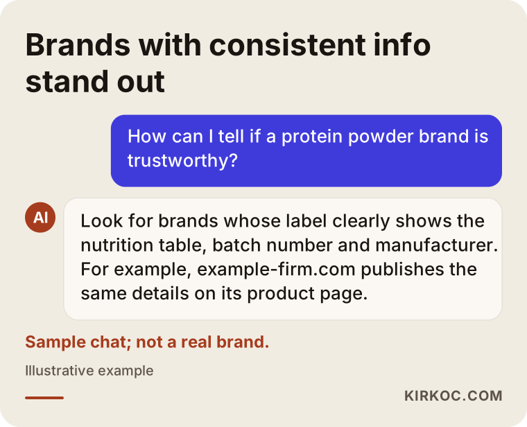
This sample conversation shows that brand identity is not only about visuals; it is also about consistent information. When the content printed on your label appears on your product page and in your marketplace description in the same order and with the same product names, customers, search engines and AI tools all find it easier to verify who you are.
Building a label system that grows from one product to a full line
You should build the label identity for the whole product line from day one. Designing one beautiful label and then trying to make every later product resemble it is the path that costs the most time and money down the road. Even if you are launching with a single whey protein today, it pays to picture what your shelf could look like in two years.
The easiest way to organize a product line is to give each product type its own "slot." For example, the main brand color stays the same on every product, a second color on the lid or the label band tells the product type, and the flavor is shown with a small color strip or an icon. That way a shopper can tell chocolate whey from strawberry whey at a glance, yet still sees right away that both come from the same brand.
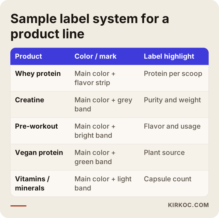
The colors in the table are only an illustration; your brand could use a completely different arrangement. What matters is that the rule is written down and applied the same way to every new product. A short brand guide that spells out this rule makes life much easier when you talk to the printer, the packaging supplier or another designer you may work with later.
Adapting the design to each pack type
The same label does not drop neatly onto every package. On a round tub the label wraps around a curve, so text close to the edges looks skewed, and the important information has to sit in the middle of the front panel. On a stand-up pouch, the top area is taken up by the zipper and the tear notch, so the logo moves down a little. On a stick pack the space is so small that often only the simplified logo, the product name and the flavor fit. If the identity work plans these adaptations from the start, you will not pay for a fresh design every time you add a new kind of package.
Where design stops on the label
In the United States, supplements are regulated as dietary supplements, and there are rules on what must appear on the label and which claims can be used on the package or in ads. Whether a phrase like "builds muscle", "burns fat" or "boosts immunity" can appear on your label or in your marketing is a separate question from design, and the answer differs from country to country. When I build these elements into the layout, I take the text from approved copy supplied by you, your formulator or your contract manufacturer. I do not give definitive opinions on which details are mandatory or which claims are allowed; for that, please consult a regulatory consultant or an attorney who works with supplement brands. The design's job is to reserve space for that required information from the beginning and present it clearly.
How to stand out on a crowded shelf
The way to stand out is to consciously drop the visual clichés everyone in the category uses, and to show clearly who your brand is for. Look at any sports nutrition aisle and you will see black backgrounds, red or neon green accents, lightning bolts and flames, muscular silhouettes and heavy italic lettering. That style was once distinctive. Today it is almost the shared default.
That does not mean a hard, energetic look is wrong. If your audience is young men who lift heavy, that language may still fit. But if you use it, you need another element that says something your competitors are not saying. If your audience is runners, women who train, people who do yoga or Pilates, or a health-conscious middle-aged crowd, an overly aggressive design can push them away.
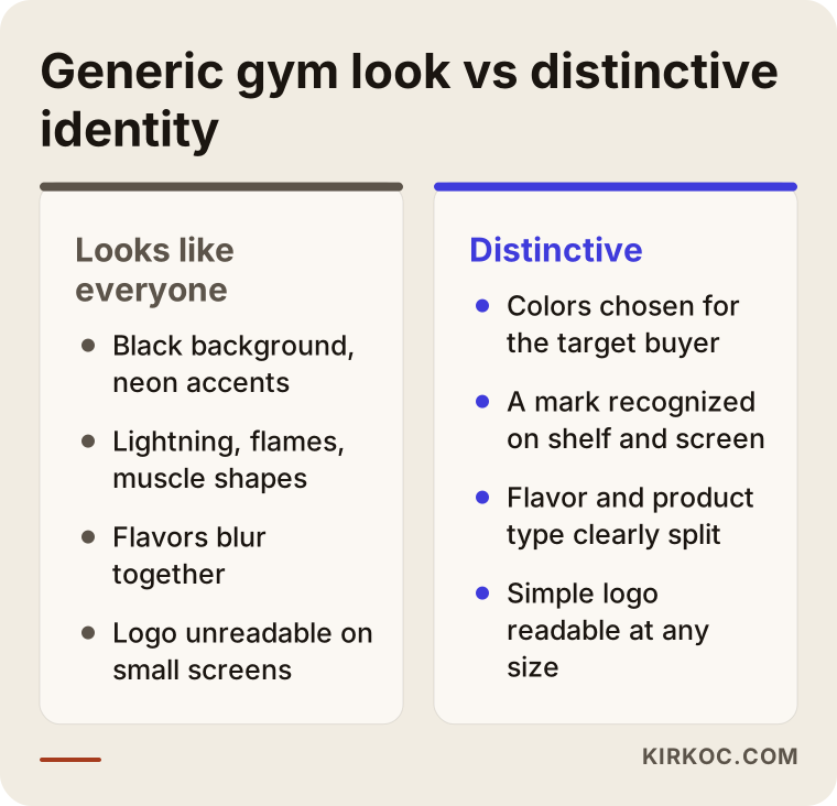
The right-hand column in the comparison does not describe a "prettier" design; it describes a clearer decision. Once you know who you are making the product for, your colors, type and photography choices simplify on their own. The buyer looks at the label and quickly decides "this is for me" or "this is not for me." Both outcomes are good for you, because you do not waste time and ad money on the wrong customer.
Designing trust into the package
One of the biggest worries supplement buyers have is getting a counterfeit product or one with unclear contents. Your identity cannot solve that worry on its own, but it can support the answer. A fixed, easy-to-find spot for the lot number and expiration date, a neatly organized manufacturer section on the back, a reserved space for a QR code that leads to a product verification or test results page, and a tamper-evident seal that matches the rest of the design are all part of that support. These elements usually get squeezed onto the label at the last minute and spoil the layout. When they are planned from the start, they become details that signal how seriously you take your product.
Two hypothetical example scenarios
The two scenarios below are entirely made up; they do not describe any real company or person. They are here to make concrete how identity work takes shape from different starting points.
Scenario 1: A new brand selling one product online
Imagine you are launching a whey protein through a contract manufacturer (a facility that produces the product for you under your own brand name, often called private label or white label), and at first you will sell only on your own Shopify store and on Amazon. Your budget is limited and you want to move fast.
In the first week, I would check with you whether the brand name is short and easy to say, whether a similar name already appears in the USPTO trademark database, and whether the domain name is available. For a firm decision on trademark registration, I recommend talking to a trademark attorney. Next, I would build the logo and color system with the creatine and pre-workout you might add later already in mind. I would design the first label only for the whey, but set up the template so that when a second product arrives, only the product name, the color band and the facts panel change. For Amazon I would prepare a set of images in the same visual language (front, back, scoop shot and ingredient graphic) and reuse those images on your own product page. That way, when a customer goes from an ad to your site and from your site to Amazon, it never feels like they are looking at a different brand.
Scenario 2: Rebranding a gym that sells its own products
Now imagine you run a gym with a few locations, and for years you have sold protein, creatine and bars under your own name. But each label was made at a different time by a different person: one is black and gold, one is white and blue, and one is the printer's stock template.
Here, instead of starting from zero, I would first study what you already have: which product sells best, which color or mark your members recognize, and what your signage and membership cards look like. Sometimes a piece of the old logo is worth keeping, because loyal customers know it. Once the new system is ready, I would suggest replacing labels one by one as each product's stock runs out rather than all at once, so your printed labels do not end up in the trash. During the transition, I would update the in-gym posters, the Instagram profile and the product pages on your website to the new identity, so members read the change as the brand getting its act together rather than worrying "did the brand change, or did the product?"
How identity work progresses, step by step
Identity work for a supplement brand moves through five basic steps: getting to know you and your needs, reviewing competitors and the shelf, designing the logo and system, adapting it to labels and packaging, and finally bringing it into your digital channels and handing everything over.
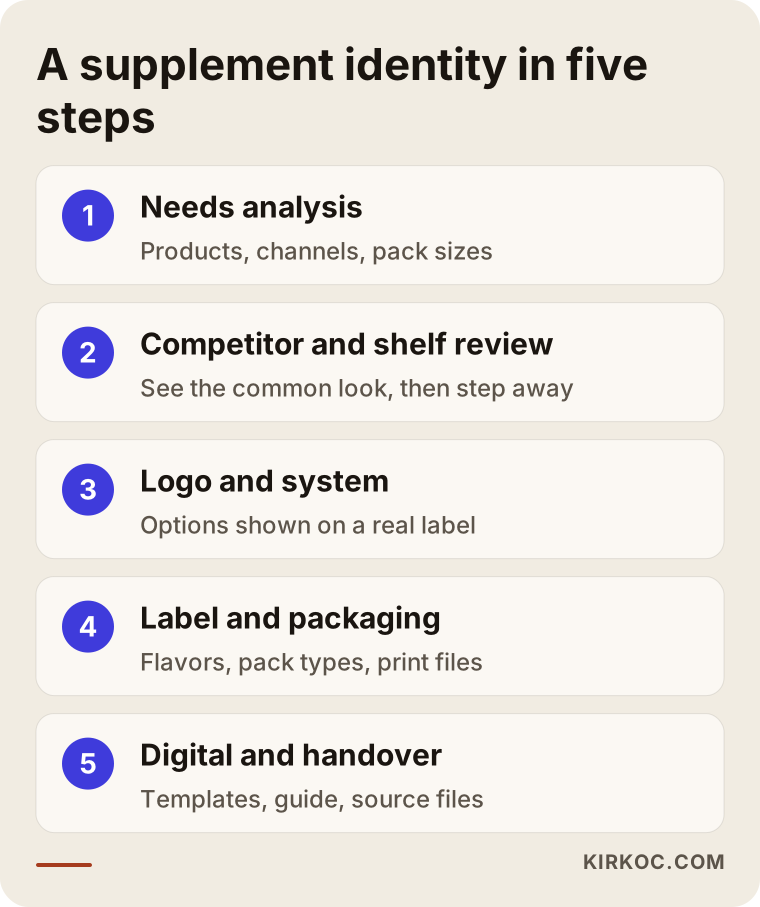
Here is a bit more on each step in the graphic:
- Needs analysis: Which products are you starting with, who are you selling to, which channels will you sell through, and who are your manufacturer and printer? Pack types and dimensions should be settled at this stage, because design cannot start without measurements.
- Competitor and shelf review: I look at products that rank near the top of the same category on marketplaces, at gym and store shelves, and at brands that stand out on social media. The goal is not to copy them; it is to see the shared visual language and step away from it on purpose.
- Logo and system design: I usually present two or three distinct directions. I show each one not just on a blank background but on a sample tub label and a small marketplace thumbnail, because that is where the logo will live.
- Label and packaging adaptation: The chosen direction is rolled out across the product line. Front panels, back panels, flavor variations and different pack types are prepared. Required text is approved by you or your manufacturer, and the printer's file format and bleed (the extra margin printers need around the artwork) are applied.
- Digital rollout and handover: Templates are prepared for the website, marketplaces, social media and ads. A short usage guide and all source files are handed over to you.
Before a print run, I strongly recommend asking for a printed proof. The color you see on screen may not match the color printed on metallic or matte label stock, and seeing the label wrapped around a real tub is the most reliable way to check whether the small print is still readable.
The most common mistakes
The most common mistake is having the logo and the first label designed without thinking about the product line. Close behind are never testing the design on a small screen and leaving the mandatory information until the very end. The list below sums up the problems I run into most often with supplement brands.
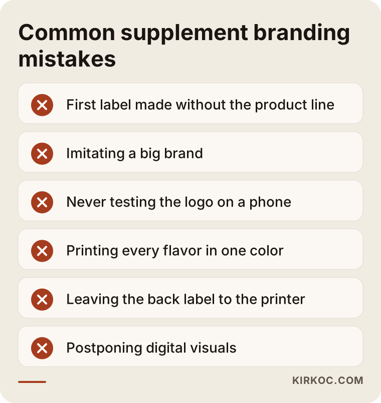
A few of these deserve a closer look:
- Imitating a big brand: A label that resembles a well-known brand may feel "familiar" in the short run, but in the long run it positions you as a cheaper copy. It can also create trademark and trade dress risks.
- Judging the logo only at large size: A detailed emblem can look impressive on the front of a tub, yet become unreadable on a stick pack, on a lid or in a marketplace grid.
- Forgetting to separate flavors: When every flavor uses the same color, customers add the wrong one to their cart, and returns and complaints go up.
- Leaving the back panel to the printer: The facts panel, ingredient list and warnings are part of the design. Handing them to the printer's default layout undoes on the back everything careful you built on the front.
- Pushing digital to "later": Starting a separate project for marketplace images, the website and social media after the label is done costs time and creates inconsistency.
What you can do yourself, and when you need a specialist
You can handle a good share of the groundwork yourself: coming up with the brand name, defining your target customer, collecting photos of labels you like and dislike, and getting the packaging dimensions from your manufacturer. Building a system that scales across a product line and preparing print-ready files is where expertise comes in.
Useful things you can do on your own:
- Write two or three sentences about who will buy your product and why.
- Save screenshots of labels you see on shelves or marketplaces, good and bad, in one folder.
- Make a rough list of the products you plan to launch in the first year and after.
- Ask your manufacturer, in writing, for the pack type, dimensions and label area.
- Get the approved text for the mandatory label information from your manufacturer or regulatory consultant.
You can also make a first draft yourself with an online logo generator or a template site. If you are testing a single product on a small scale, that can be a sensible start. But once you are dealing with three or more products, several sales channels and real print runs, you need a system designed together with its rules. Otherwise every new product becomes a new design job, and every print order becomes another round of corrections.
What to look for when choosing a designer or agency
To choose the right person, first check whether they have done packaging and label work, then whether they think about digital channels too, and finally what exactly their deliverables include. A nice logo portfolio is not enough on its own; in the supplement world, the real test is how the label looks in print and on a small screen.
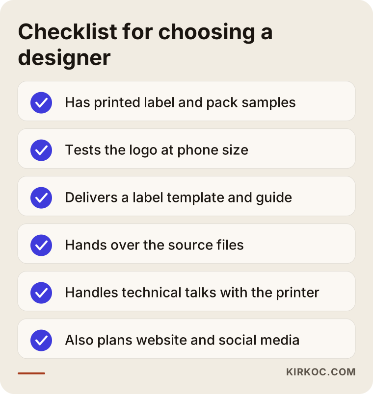
In your first conversation, I suggest asking these questions:
- Can I see a label or package you have designed that was actually printed? Do you have photos of the finished product?
- How do you test the logo and label at marketplace thumbnail size, on a phone?
- When the product line grows, who will make the new labels, and how? Do you deliver a template and a guide?
- Will I receive the source files (editable vector files)?
- How many rounds of revisions are included, and what counts as a revision?
- Do you handle the technical back-and-forth with the printer, or will I be the go-between?
- Are website, social media and ad visuals part of this project, or a separate one?
A designer who gives clear, written answers to these questions will not spring surprises on you halfway through. Vague answers like "don't worry, it's all covered" tend to turn into scope arguments later.
What drives the cost
Cost depends mostly on the size of the product line, the variety of pack types and how much digital adaptation is included. That is why I need to understand what you want before I can quote; the same request for "a logo and a label" can mean very different workloads for two different brands.
The main factors that affect the price:
- New brand or refresh: Starting a new brand from the name check onward is a different workload from tidying up an existing identity.
- Number of products and flavors: The number of label variations grows quickly between a single whey and a five-product family with a dozen flavors.
- Pack types: Tubs, pouches, stick packs, capsule bottles and shipping cartons each need their own adaptation.
- Print finishes: Special treatments like metallic inks, spot varnish or embossing need more technical coordination with the printer.
- Multilingual labels: If you plan to sell in other countries, the label needs to be built to carry more than one language.
- Digital scope: Are marketplace image sets, website design, social media templates and ad creatives included?
- Product photos and 3D renders: Whether you need realistic 3D renders of the packaging or a studio photo shoot.
When you request quotes, ask for the scope to be written out item by item. Comparing prices only makes sense when the scope is the same. If one quote includes a label template and source files and the other does not, the cheaper-looking offer can end up costing more.
Working with Ümit Kırkoç
I am Ümit Kırkoç, based in Istanbul, and I handle on my own everything a digital agency usually offers: websites and e-commerce, SEO, local SEO, visibility in AI tools (GEO), social media management, Google and Meta ads, logo and brand identity, and content creation. I work remotely with brands in the United States, Europe and elsewhere through video calls and written communication, and I am used to coordinating across time zones.
With supplement and sports nutrition brands, I start by going through your product list and your packaging dimensions. When I propose a logo and color system, I show every direction on a tub, a stick pack and a marketplace thumbnail on a phone screen. I then roll the direction you choose out to the label template, the flavor variations and the other pack types, taking the mandatory text from content that you or your manufacturer have approved. At handover you get the editable source files, a short usage guide and the digital templates; the files are yours.
Working with one person has a concrete benefit in this category: when the same person who designs the label also builds the product page, the Amazon images, the Instagram posts and the ads, the colors, product names and details stay identical everywhere. When a new flavor launches, you tell me once, and I update everything from the label to the ad creative. I do not promise sales or rankings; what I promise is that the work runs in an organized, clear and consistent way. And if your brand has grown beyond what one person can handle well, I will tell you that plainly too.
Frequently Asked Questions
Who should I hire for my supplement logo and label design?
Choose someone who has had packaging and label work printed before, who tests the logo on a small screen and who thinks about your sales channels together with the design. Seeing photos of printed products in the portfolio, not only screen mockups, is a good sign. If you want the identity carried over to your website, marketplaces and social media, working with someone who handles all of those in one place makes consistency much easier.
Does a small private-label brand really need a professional identity?
If you are testing a single product, a simple start may be enough. But if you plan several products and more than one sales channel, building a system from the start is usually more sensible than paying for a redesign with every new product. I suggest basing the decision on how many products you expect to launch in the next year or two.
Does the designer decide what mandatory information goes on the label?
No. Which information is mandatory and which claims can be used is set by regulations, not by the designer. You should get that text, approved, from your manufacturer, your formulator or a regulatory attorney. The designer's job is to reserve space for that information from the start and lay it out clearly and legibly.
What colors should a supplement logo use?
There is no single right color. Black, red and neon tones are so common in the category that if you choose them, you will need some other element to set you apart. It is healthier to choose colors based on your target customer, the structure of your product line and how much shelf space your competitors already own with their colors.
How long does supplement logo and label design take?
It depends on the number of products and flavors, the pack types and how long approvals take. A one-product launch and a rebrand of a large product family do not finish in the same timeframe. Most of the time usually goes into approving the mandatory text and into the printer's proof, so it makes sense to plan your schedule around those two steps.
If I change my existing labels, will customers still recognize my brand?
With a well-planned transition, that risk drops a lot. A recognizable color, shape or part of the logo can be kept in the new identity. Switching labels gradually as stock runs out, and announcing the change openly on social media and on your website, keeps customers from mistaking the new package for a different product.
Who owns the files after the brand identity is done?
That depends on what your agreement says, so always ask at the quote stage. I hand over the editable source files to you. Registering the brand name and logo as a trademark is a separate matter; for that, I recommend talking to a trademark attorney.
Once the label is ready, should I hire someone else for social media and ad visuals?
You do not have to, but working with separate people raises the risk that colors, fonts and product names start to differ between channels. When the person who designed the identity also prepares the digital templates, and ideally runs your social media and ads too, your brand looks the same everywhere.
If you want an identity for your supplement or sports nutrition brand that speaks one language from the label to the marketplace image and from your website to your social media, you can leave me a short message about your products and needs on my logo and brand identity page, and I will tell you honestly where it makes sense to start.