You sell products or services to customers in Europe, you take orders through your website, and in the last few months a buyer, a marketplace representative or an advisor asked you, "Is your site accessible?" Then you read something about the "European Accessibility Act," and you could not work out what it means, whether it applies to you, or what you would actually need to have built. That is completely normal. In this article I explain what a business owner needs to know when looking for an accessible website, without drowning you in jargon. I am Ümit Kırkoç, a web designer and SEO consultant who works alone from Istanbul, and at the end I will say plainly how I handle accessibility within my own website design service.
First, a warning: I am not a lawyer. Whether the law applies to you exactly, which exceptions are valid and what penalties might follow are legal questions, and I cannot answer them with certainty. What I write here is the practical picture of a web designer who sees these sites up close. Before you make a decision, I suggest you talk to a lawyer who knows the rules of the countries where you sell. My job is the technical side: building the site so that people can genuinely use it.
What does an accessible website mean?
An accessible website is one that everyone can use. By "everyone" I mean people who have trouble seeing, or cannot see at all, and listen to pages through a screen reader (software that reads the page aloud). I mean people who cannot use a mouse and move around with the keyboard only. I mean people who have difficulty telling colors apart, people with hearing loss who watch videos with captions, and also ordinary people who find the screen harder to read as they get older, or who use their phone with one hand because the other is in a cast. So accessibility is not a feature for a small minority. It is something all of us need at different times in our lives.
The technical yardstick for this work is called WCAG, short for Web Content Accessibility Guidelines. Think of it as a widely accepted checklist used around the world. It has three levels: A, AA and AAA. In business and in conversations about regulation, the level people talk about most is AA. The guidelines rest on four ideas: content must be perceivable (it can be seen or heard), operable (you can move through it with a keyboard), understandable (plain language, predictable behavior) and robust (it works with many different tools).
I should say up front that a beautiful design is not automatically an accessible one. Light gray text on a light gray background looks elegant and cannot be read. A stylish menu that opens only when you hover over it is a closed door for someone who cannot use a mouse. Accessibility is not decoration added on top of a design. It is the way the design is thought through from the start.
Does the European Accessibility Act (EAA) concern you?
The European Union passed a rule that requires certain products and services to be accessible. It is called the European Accessibility Act, or EAA for short. Member countries wrote it into their own national laws, and it began to apply from June 2025. Among the things it covers are sales to consumers over the internet, so online shops, booking and ticketing sites, and consumer services such as banking are all part of the discussion.
Whether it applies to you directly depends on what you sell, who you sell it to and how big your business is. There is a discussion about an exemption for very small businesses, but I cannot tell you the exact conditions of that exemption or whether your situation fits it. What is clear is this: if you sell directly to consumers in the EU, you cannot treat this as a topic that has nothing to do with you, whether your company is based in the United States, the United Kingdom, Turkey or anywhere else. On the other hand, if you only serve customers in your home market, or you sell wholesale to other companies in the EU, the picture may be different. The safest way to settle this is to ask a lawyer.
The visual below offers a simple chain of questions to help you size up your own situation. It is not a legal decision, only a place to start thinking.
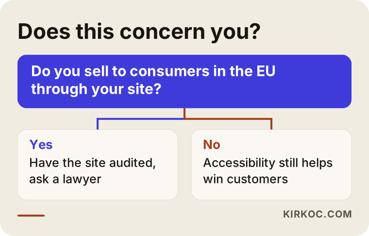
If the answer in this flow is "yes," it makes sense to measure the current state of your site rather than put it off. If the answer is "no," an accessible site is still useful on its own, because more visitors can use it comfortably.
Why does it matter even apart from the law?
Even if we set the law aside, accessibility has a commercial side. Your customer may be elderly, may be using a phone in bright sunlight, or may be unable to look at the screen clearly for a moment. If your form cannot be filled in with a keyboard, these people leave before they order. Accessibility also overlaps with search visibility in several places: a proper heading structure, descriptions for images and clear link text help both screen readers and Google. I would not see this as a guarantee. It is a natural side benefit.
The most common problems on sites that sell into the EU
The problems I run into again and again are rarely complicated technical failures. They are usually simple oversights. On the site of a business that sells into the European market, these are the ones I see most.
The first is the cart and checkout steps. The product page is lovely, but the fields in the checkout form have no labels. The screen reader says "text box," and the user cannot tell what to type. The error message is shown only in red, so a person with color blindness cannot tell what went wrong. The second is language markup on multilingual sites. If a page is in German but is technically declared as English, the screen reader pronounces the German text with English rules and it becomes unintelligible. The third is product images with no description: for someone who cannot see the picture, the product does not exist.
The fourth is the cookie banner and pop-up windows. The window opens, but the keyboard focus stays behind it on the page, so the user cannot close it. The fifth is video: a promo video without captions says nothing to a visitor with hearing loss. The sixth is small, low-contrast text. The last is vague link text such as "Read more" or "Click here." A screen reader can read out the links on a page as a list, and when every one of them says "click here," none of them means anything.
The table below sums up the situations I see most often on a shop site, who they hurt and which page they get fixed on.
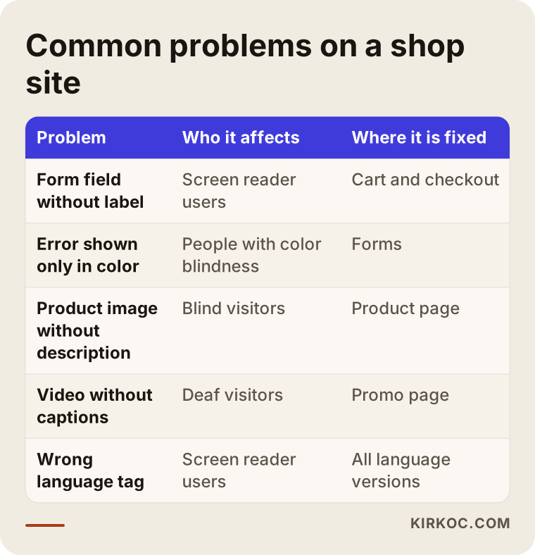
What you will notice in the table is that most of the fixes are concentrated in a few core pages: the home page, the product page, the cart and checkout, and the contact form. You do not have to fix everything at once. Starting with the pages where money is earned often makes the most sense.
Which pages and sections are needed?
On an accessible site, how the existing pages are built matters more than adding new pages. Even so, a few pages come up in particular. The first is an accessibility statement. On that page you write which standard the site was prepared against, what known gaps remain and how someone who runs into a problem can reach you. Exactly what it should contain can differ from country to country, so I recommend having a lawyer review the text of this page. I can help make it clear and readable.
Second, you need a way to be contacted. When a visitor hits a barrier on your site, they should be able to tell you easily, and an email address or a simple form is enough. Third, the help and frequently asked questions area should be written in plain, straightforward language, especially on topics like returns and delivery terms. Fourth, if you sell to several EU countries, each target language needs its own pages and correct language markup.
The visual below shows how an accessible page is put together from top to bottom, using an invented example address.
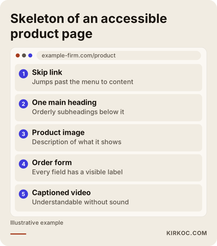
The logic of this skeleton is simple. At the top there is a link that lets a keyboard user skip the menu and jump straight to the content. Then comes an orderly heading structure, images with descriptions and a form in which every field has a label. None of this makes your site look ugly. It only organizes how the page is built.
How does the process work step by step?
Getting an accessible website can go down two different roads: building a new site from scratch, or fixing the one you have. Which one fits depends on the age of your site and the platform it was built on. In both cases the way of working is similar.
The first step is an assessment. Your current site is examined both with automated testing tools and by hand. I want to stress this: automated tools catch only part of the problems. A tool can tell you whether an image has a description, but it cannot tell you whether the description makes sense. Trying to place an order using only the keyboard, or listening to the home page with a screen reader, are things that must be done by hand. The second step is prioritizing: which problems block sales directly, and which can wait.
The third step is fixing or redesigning. If the current site is in a state that can be repaired, the problems are fixed one by one. If the platform is very old, or the design is flawed at its foundation, rebuilding can be the healthier path. The fourth step is retesting, which means looking again with the same methods to see whether the fixes really worked. The fifth is documentation: what was done, what remains and what goes into the statement page. The sixth is upkeep, because accessibility can break again as new products or posts are added.
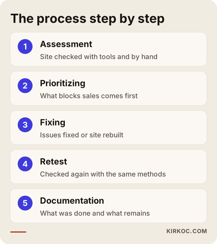
None of these steps is mysterious. What matters is keeping the order right: starting repairs without knowing what is broken costs you both time and money.
Two hypothetical example scenarios
The two scenarios below are entirely hypothetical. They do not describe a real company or person. They are made up only to show how the work might go.
Scenario 1: A small textile company selling to Germany
Suppose a small company that makes handmade home textiles set up an online shop a few years ago with a ready-made theme, and ships to consumers in Germany. Orders come in from Germany, but the German version of the site works like an automatic translation of the company's home-language pages. The owner finds out about the issue when a buyer asks a question about accessibility.
On a first look, the following comes up: the German pages are technically marked as the wrong language, the product images have no descriptions, the fields in the cart form are labeled only with faint text inside the field, and the error messages are shown only in red. The way forward is clear. First the language markup is corrected, then the cart and checkout steps are made usable by keyboard, and meaningful descriptions are written for the images. The theme is not replaced entirely; only the problem areas are worked on. Finally an accessibility statement page is added and its text is shown to a lawyer. In this scenario the job is much narrower and more focused than building a site from zero. The same pattern would apply to a company in any country that sells to German consumers.
Scenario 2: A booking site serving several EU countries
In the second hypothetical example there is a business in a coastal holiday region that sells tours and transfers. Their site was built on an old platform, and the calendar and booking section is designed around clicking with a mouse, so choosing a date by keyboard is impossible. On mobile the buttons are too small. The promo videos have no captions either.
In this case, fixing the existing site would mean rewriting the calendar component from the ground up. Because the platform is old, working with patches is risky. The sensible decision is to rebuild the site with accessibility in mind. The booking flow is redesigned from the start, date selection works with the keyboard as well, captions are added to the videos, and the multilingual pages are published with the correct language markup. This job is broader, but in the end the business has eased its legal worry and gained a site that is more comfortable for mobile users. Time and budget grow along with the scope.
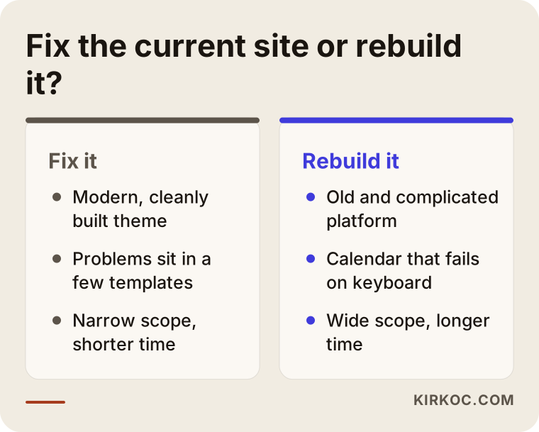
The comparison above sums up the difference in approach between the two scenarios. I cannot tell you which one suits you without looking at your site, but in a first conversation it is usually clear which direction to take.
Beware of the "one line of code makes you accessible" promise
On the internet you will see solutions that say, "Add this plugin to your site and it becomes accessible automatically." They are usually tools that put a small accessibility icon in the corner of the page. That icon may enlarge the text or change the colors, and it can help some visitors. But it does not, on its own, solve the problems underneath the site: forms with no labels, menus that do not work by keyboard, a wrong heading structure. People who use screen readers already have their own tools, and these plugins often do not help them. Sometimes they even get in the way.
I also cannot say anything definite about whether such tools would be considered enough from a legal point of view, and you should put that question to a lawyer. My practical view is this: a plugin like that does not replace solving the problem. At most it can be a complement. The real solution is fixing the code and design of the site itself.
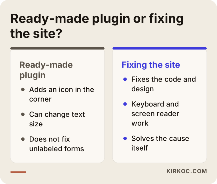
The lesson to take from this comparison is simple: when a solution promises a shortcut, ask what it solves and what it does not. If the answer is not clear, be careful.
A basic checklist for an accessible site
The full guidelines are long, but there are a few basic questions you can ask while looking at your own site as its owner. They do not replace an audit. They only help you understand where you stand.
Can you move through the page using only the Tab key on the keyboard, with the mouse put aside? Is there a visible outline showing which item you are on? Do your images have short descriptions of what they show? Does every field in your forms have a permanent label above or beside it? Is there enough color difference between the text and the background? Do your videos have captions? Is the language of the page declared correctly? If you answer "no" or "I don't know" to several of these, a professional look will save you time.
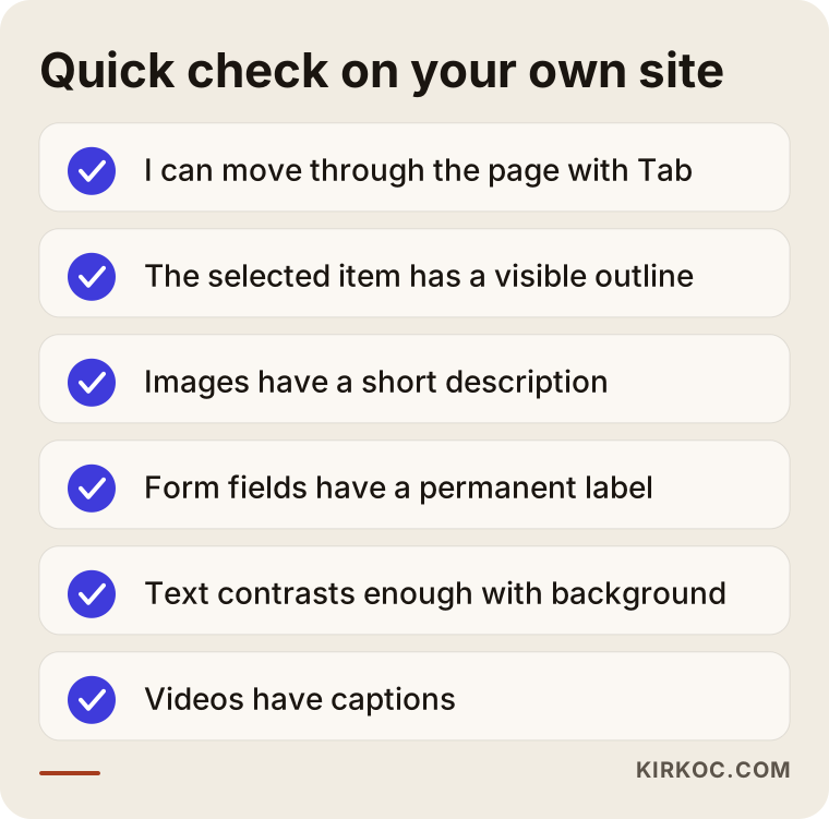
This list is only a beginning. In a site audit I do a far more detailed version, page by page and device by device, but even this much will tell you where you are as a first step.
Common mistakes
I list here the traps businesses fall into in this area, because most of them can be avoided.
The first is leaving accessibility until the end. The site is finished and published, and then someone says, "Let's make it accessible too," and everything has to be reworked. Thinking about it from the beginning is far cheaper and easier. The second is relying only on an automated tool. A tool gives you a score such as "100 percent," but that score does not mean the site can truly be used. The third is looking only at the home page. The real problems usually appear in the cart, the checkout, the account area and the contact form. The fourth is forgetting the language tag on translated sites. The fifth is copying an accessibility statement from a ready-made text. A statement that claims features your site does not have can be worse than having no statement at all. The sixth is forgetting the rules when adding content after launch: a new image goes in without a description, or a new video is uploaded without captions.
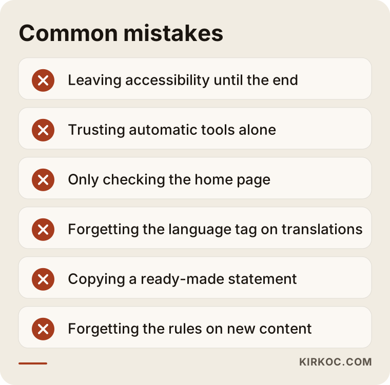
Most of these mistakes come from habit rather than from the seriousness of the work. With a proper process and a small internal checklist, most of them can be prevented.
What can you do yourself, and when do you need an expert?
There are things you can do yourself, and you should. Writing a meaningful description for every image you upload, adding captions to videos, writing link text that says what the link is instead of "click here," keeping your text simple and short, and using headings in order are all in your hands. In most content management systems these fields are already there; they just do not get filled in.
On the other hand, you need an expert in these cases: if your forms, menus or cart cannot be used by keyboard; if your site's theme or platform has fundamental problems; if you sell regularly into the EU and you are worried about the legal side; or if you publish in more than one language. These jobs call for intervention in code and design. On the legal side you again need a lawyer, because questions such as which country's rules apply to you or what should go in the statement page are not my field.
What ties the process together is this: first get an idea with your own checklist, then talk to an expert according to how serious the situation looks. Sometimes a half-hour look shows that your site is in better shape than you thought, or, the other way around, shows exactly where the trouble lies.
What determines the cost?
I will not give a number, because no two sites involve the same work. But I can tell you clearly what pushes the cost up, so that you can evaluate the quotes you receive.
The first factor is the size of the site and the variety of page templates. A site with a hundred pages that all come from the same three templates is easier to fix than a site with a hundred pages of different structures. The second factor is the platform: fixing a modern, cleanly built theme takes much less effort than fixing an old and complicated system. The third factor is interactive components. A booking calendar, a product filter or a multi-step checkout takes the most labor. The fourth factor is the number of languages, since each language needs correct markup and a content check. The fifth factor is the amount of video and audio, because captions and transcripts take time to prepare.
The last factor is whether the work is one-time or ongoing. A single audit and fix is different from regular checks as the site grows. When you ask for a quote, ask these questions: which pages will be examined, which method will be used for testing, and what will be delivered at the end? If there are no answers to these, the quote is vague no matter what the price is.
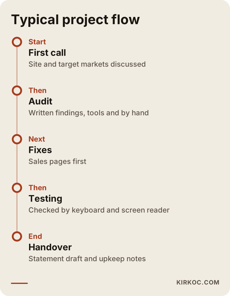
The timeline also stretches or shrinks with the scope. The visual above shows a typical flow, but it would not be right to give you the timing of your own project without looking at your site.
How do AI assistants and search engines see accessibility?
Let me touch on one last point, because people ask about it often. When AI assistants and search engines read your page, they go about it in a way similar to a screen reader: they read the headings, the link text, the image descriptions and the structure of the page. A proper heading order, meaningful link text and described images can help your content be understood correctly. I cannot promise that this will bring a particular ranking, but content that is readable and well organized serves both people and machines.
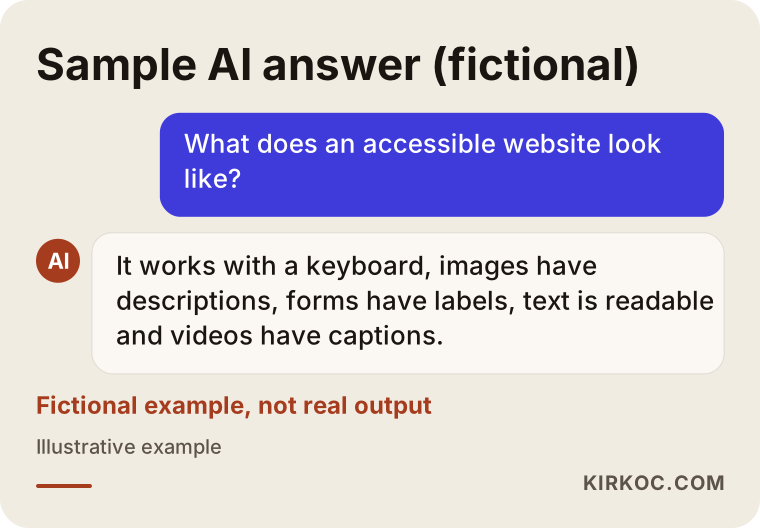
The sample answer in the picture is fictional. It is not real output from an assistant. Its purpose is to show what short, clear information looks like.
How I work with you
I work alone, which means the person you talk to is the person who does the work. We usually go like this: first we talk about your site and your target markets, then I look at the current site by hand and with tools and give you, in writing, what needs to be fixed. I explain, with reasons, whether repairing or rebuilding makes more sense. The decision is yours. Once we start, I show you clearly what has been done and what is left. I do not guarantee any result or any legal compliance, because nobody can honestly do that. What I do is make your site genuinely usable and prepare documents such as the statement page in a form your lawyer can review.
Frequently asked questions
Does the European Accessibility Act cover companies outside the EU?
The law targets certain products and services offered to consumers in the EU market. A company outside the EU that sells directly to EU consumers may be relevant to this scope, but the exact situation depends on the size of your business and what you sell. That is why I recommend getting an opinion from a lawyer.
What is WCAG, and which level should I aim for?
WCAG is an internationally recognized set of guidelines for website accessibility. It has three levels: A, AA and AAA. In business and in discussions about regulation, AA is generally the target. Confirm with your lawyer which version and level are required for you.
Is installing an accessibility plugin enough?
On its own it is often not enough. Plugins may offer some settings such as text size, but they do not fix unlabeled forms or menus that do not work with a keyboard. I also cannot say anything definite about legal sufficiency, so put that question to a lawyer.
Is it more sensible to fix my current site or have a new one built?
It depends on the platform of the site and how deep the problems go. For a modern, cleanly built site, fixing is often enough. On an old and complicated platform, especially for interactive parts such as payment and booking, rebuilding can be the healthier choice. I will tell you which one, with my reasons, after I look at your site.
Will an accessible website raise my Google ranking?
I cannot guarantee that. A proper heading structure, meaningful link text and described images can help search engines understand your page, but rankings depend on many factors. It is a better view to do accessibility so that your customers can use the site comfortably, not for the sake of rankings.
Is an accessibility statement page mandatory, and what should it say?
It is an element required in some countries' rules, but you should ask a lawyer whether it is mandatory for you and how its content should look. In practice, a statement includes the standard you prepared against, known gaps and a way to send feedback. It is important not to claim anything your site does not have.
How long does the process take?
It depends on the scope. For a small, cleanly built site, a narrow fix can be quick; for a multilingual, interactive site, a rebuild takes longer. I need to look at your site before I can give you a firm timeframe.
Do I need upkeep after the site goes live?
Yes, it needs regular attention. Accessibility can break as new products, images, videos or pages are added. That is why it makes sense for the people who add content to follow a simple checklist, and for a general check to be done now and then.
If you would like to look together at whether your site is ready for the European market, reach me through my website design service page. I will listen to your situation and tell you honestly where to start.