Your product is ready, and maybe your supplier is sorted too. You are about to open a store or start selling on a marketplace, but something keeps stopping you. What will the store be called? What will the logo look like? What goes on the shipping box? Will the website speak the same visual language as all of that? Together, those questions are what building an ecommerce brand means, and most first-time store owners shrink the whole thing down to "let me get a logo made and sort out the rest later." In this article I explain in what order, and at what scale, an online business should set up its branding. I am Ümit Kırkoç. I work from Istanbul, and I handle logo and brand identity together with the website, ads and social media, all on my own.
My goal here is not to bury you in a design lecture. I want you to know what to ask for if you hire an agency or me, and, if you do it yourself, how to dodge the most expensive mistakes. Whenever I use a term you might not know, I will explain it in a sentence.
What does "brand" actually cover in ecommerce?
A brand is everything that lets a customer tell you apart from other sellers. In a physical shop, you notice it in the wall color, in how the person behind the counter talks, in the bag you carry out. Online there is no shop. Customers recognize you from a screenshot, a cardboard box and a message. So in ecommerce, a brand means looking consistent in four places at once: your website, your product photos, your packaging and your social media.
The logo is one small part of that whole. If you commission only a logo and stop there, your site ends up in one color, your box in another, and your Instagram account in a third tone of voice. Shoppers read that as "this business is disorganized," and people do not like entering card details on a feeling like that. The graphic below sums up the difference between the two approaches.
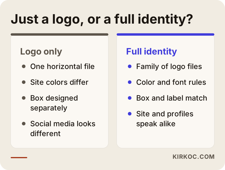
The list on the right may look long, but none of it has to happen on the same day. What matters is that each piece grows out of the one before it: the colors come from the logo, the box comes from the colors, the website comes from the box. If you build in the opposite order, meaning you design the site first and then "invent" a logo to fit it, you will end up redrawing everything.
Start with the name: searchable, memorable and sellable
In ecommerce, the brand name comes even before the logo, because your domain, social handles, marketplace storefront and invoices all attach to it. When you pick a name, ask three questions. Is it easy to say out loud, so that someone hearing it on the phone could spell it correctly? When you search for it, does something unrelated show up? And is another business already using the same name?
That third question matters. Trademarks and the use of similar names are a legal area, and I cannot tell you for certain whether a given name is free to use. Before you lock a name in, I suggest searching the trademark database in your country (in the US, that means the USPTO's public search) and, if needed, talking to a trademark attorney. Skip this step and you could end up giving up a name you spent a year building.
Before you finalize a name, run it through the checklist below.
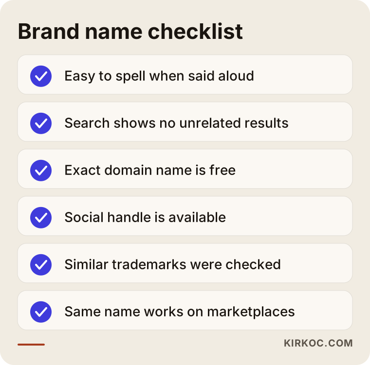
Pay special attention to the domain item on that list. A domain name is your website's address on the internet, and you should expect to keep it for years. An address that is long, full of hyphens, or easy to misspell causes constant trouble in ads and on shipping labels. If you can, choose the address that matches your brand name exactly.
The logo: not one file, but a family of files
In ecommerce, a logo shows up at many different sizes. It is wide in the top corner of the site, tiny in a browser tab, inside a round frame on an Instagram profile, black and white on a shipping label, and low resolution in an invoice header. One horizontal logo file cannot cover all of that. In a good project, the logo is delivered as a small family of files prepared for different uses.
I usually think of that family as four parts: a horizontal main logo, a square or round profile icon, a single-color version, and a light version for dark backgrounds. The table below shows which version is useful where.
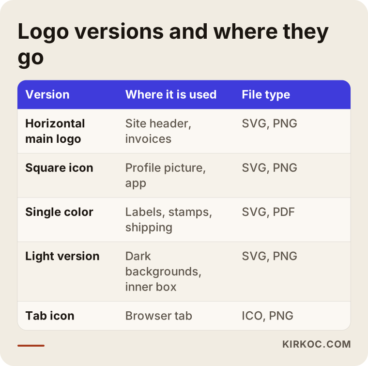
A logo is tested at small sizes. If it still reads when squeezed into a 40-pixel space on a phone screen, it passes. A logo with thin lines, tiny text and color gradients may look lovely on a monitor and then fall apart on a label, a rubber stamp or a one-color print. When you receive your logo, remember to ask for vector files, which are files that stay sharp no matter how far you enlarge them, usually in SVG or PDF format. If all you get is a JPEG, you will always be missing something later.
Color, font and tone: keep it simple
The invisible part of a brand identity is its rules. Which colors will you use, which font goes on headings, what tone does a price tag take, how are product descriptions written? If none of that is decided, your brand drifts a little further apart every time you add a product or someone new prepares content.
For color, the rule is this: one main color, one supporting color and one neutral (white, cream or dark gray) is enough. A many-colored brand is hard to manage in ecommerce, because the colors in your product photos already come onto the screen. The color of the "Buy" button on your site should be your main brand color, and nothing else on the page should use it, so the eye goes to the right place.
Two fonts are more than enough as well: one for headings and one for text people actually read. For tone, give yourself a simple test. Is the language on your product page close to the way you would describe the same product to a friend? If one is stiff and formal and the other is full of filler, customers will not find any warmth.
Packaging: the customer's first physical meeting with you
In online sales, until the customer picks up the product, they only have a relationship with a screen. The moment the box opens is the first real moment of your brand. You have two goals here: get the product there intact, and make the customer think, "I bought from the right place."
For a small business, packaging design does not have to mean an expensive custom box. A plain kraft mailer with a one-color stamp, a thank-you card inside and some wrapping paper around the product can create a lovely experience when it is done well. Instead of loading the box with lots of elements, pick a few consistent ones: the logo, your main color, one sentence and your contact details. Before anything goes into production, always ask the printer for a test sample. The color you see on a screen and the color printed on paper are often not the same.
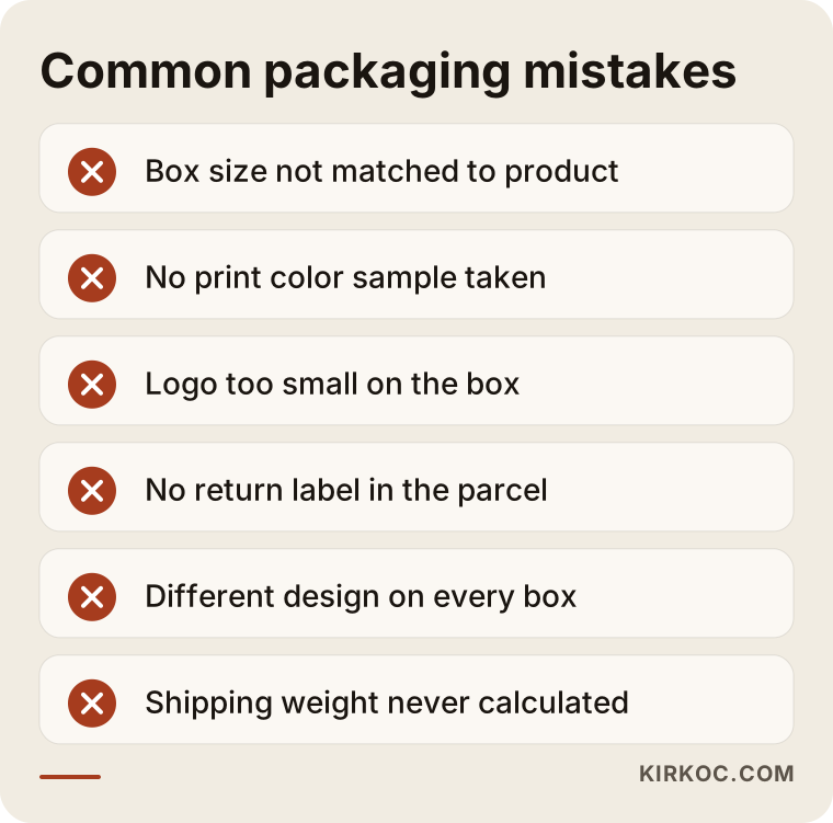
Most of the mistakes in the graphic come from missing planning, not from bad design. For example, box size directly affects the shipping weight and cost of a product. An oversized box is more expensive to send, and the product slides around inside and gets damaged. Before you design the packaging, pin down the real dimensions of your three best-selling products and your carrier's size and weight rules.
Think about gifts and returns too. Does the box open easily and close again? Is the return label already in the parcel? These are small details that quietly raise how trustworthy your brand feels.
Website fit: the store on screen and the brand in the box should match
When it comes to the website, what customers trust most is order. Seeing the price right away on a product page, finding shipping and return terms without hunting, and having every photo shot in the same light against the same background are what make a store feel like a real shop. Brand identity applies in three places here: the logo and menu at the top, the photos and button on the product page, and the trust information in the footer.
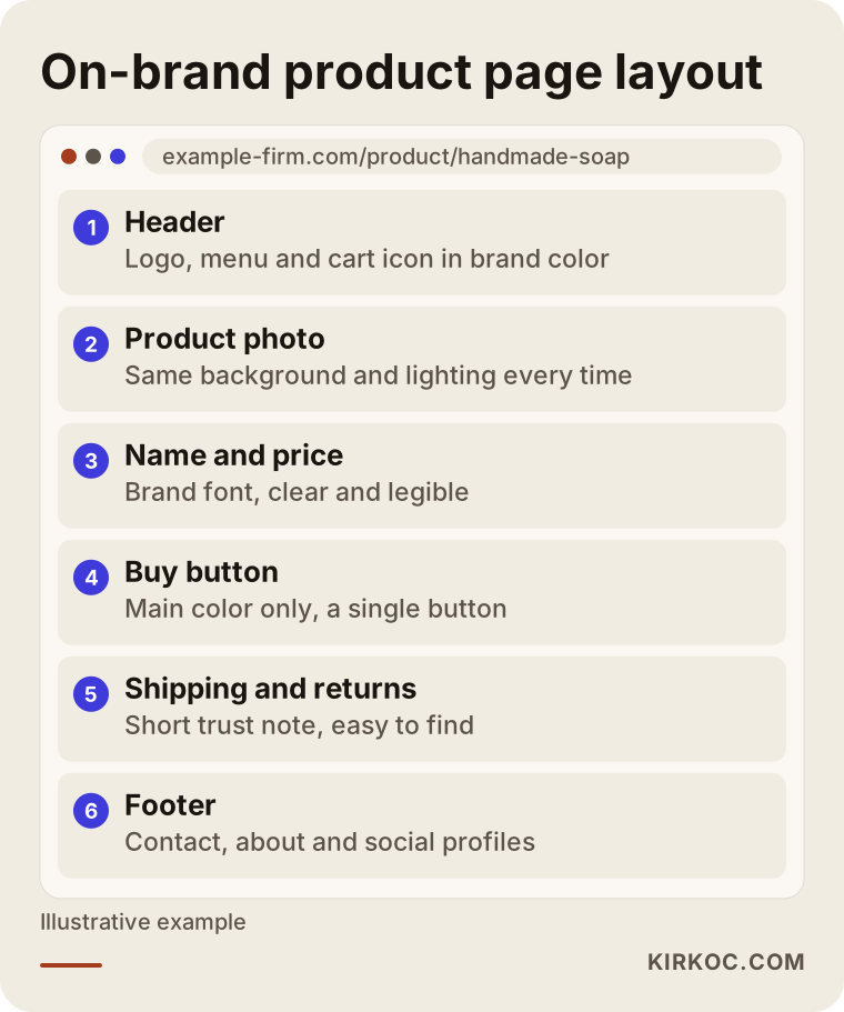
This layout is a direction, not a template. If you use a ready-made ecommerce platform (WooCommerce on WordPress, Shopify, or a system built for you), you can adjust all of these sections to your brand. What matters is not settling for the theme's default colors. Many stores go live with the theme's own blue button, and the brand's orange stays only in the logo.
If you also sell on a marketplace such as Amazon or Etsy, the same rule applies: your store profile, banner image and product photos should speak the same language as your brand color. Marketplaces give you limited room to tell your brand story, so it makes sense to build the real brand experience on your own site and gradually pull customers there. Every marketplace has different rules, so check the current terms in the platform's own documentation.
How do customers search for your brand, and what do they find?
There is a commercial side to building a brand: one day, customers start searching for you by name. They type the store a friend recommended, the product they saw on Instagram, or the name printed on the label that came out of the box into Google. What shows up at that moment tells you how established your brand is. If your site, your social media account and, where relevant, your map listing all look right in the first results, trust forms.
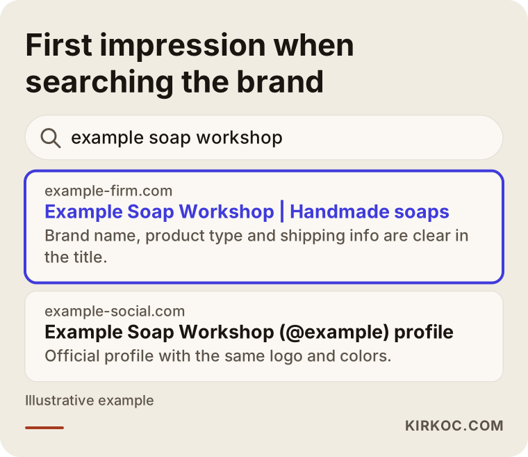
To get there, your site's title and description need to include your brand name along with what you sell. I usually set this up together with the branding work, because once the name and logo are done, the same sentences can be reused in search results. I never promise any ranking or result, but I can tell you that a well-built foundation makes everything after it easier.
Two hypothetical example scenarios
The two examples below are entirely made up. They do not describe a real company; they just make the situations concrete.
Example scenario 1: a new store selling handmade soap. Suppose an entrepreneur makes soap at home and wants to start selling through Instagram. They have a brand name but no logo. First, the name and domain are checked for fit. Then a simple wordmark and a round profile icon are prepared. Two colors are chosen, and the packaging uses only a kraft box, a one-color stamp and a small card tucked inside. When the website opens, it uses the same two colors, the same font and the same short sentence. Because the budget is tight, custom box production is postponed, yet customers still see the consistency. The lesson is that this does not have to be expensive: consistency matters more than how flashy any single element is.
Example scenario 2: an existing store with products in many categories. In this example, the business has sold on a marketplace for a long time, but its own website is new. The logo looks dated, every product photo was shot on a different background, and the boxes are plain white. Here the work is a refresh rather than a start from zero: the logo is simplified, a shared background and lighting rule is set for photos, and the same rule is applied when moving to the site. Existing customers notice the change but do not find it jarring, because the name and the main color stay the same. In a deep identity change, keeping the product and the name and renewing the look in stages is usually the safer path.
Step by step: how I work
I usually split branding work into five steps. Because the output of each step is the input of the next, keeping the order matters.
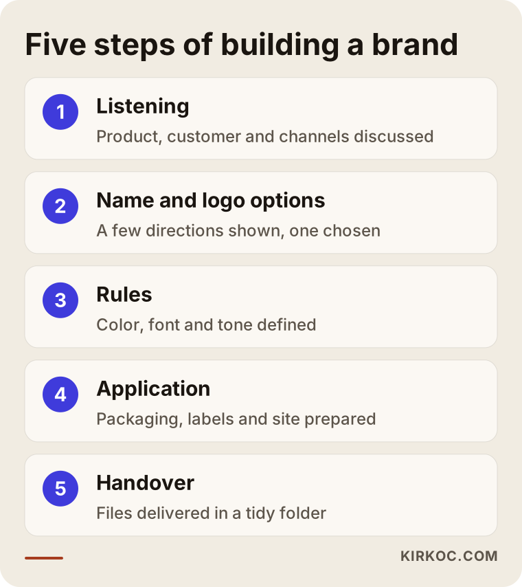
The first step is listening. I ask what you sell, to whom and through which channel, how your competitors look, and which three words you would use to describe yourself. In the second step, name, domain and logo directions come out; I usually show a few different directions and ask you to choose one. In the third step, the chosen direction is completed with colors, fonts and usage rules. In the fourth step, these are applied to the packaging, the label and the website. In the fifth step, everything is brought together and checked, and the files are delivered to you in an organized folder.
Let me be clear on timing: how long this takes depends on the scope of the work, how fast you make decisions and the printer's production schedule. Before I promise a date, I pin down the scope in writing.
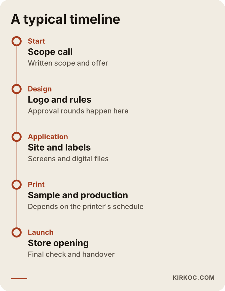
The longest wait on the timeline is often not the design itself but the approval and printing stages. That is why asking for the packaging sample early is a good habit, and it keeps the store opening from slipping.
Common mistakes
Some of the mistakes I see in this area come from design, and some come from planning. These are the most frequent ones.
Using a ready-made template logo as it is. Template logo sites look cheap, but hundreds of businesses can use the same symbol. You lose distinctiveness and may also run into copyright problems. I could cover in another article when a ready-made logo makes sense and when it is risky; here I only want to flag it.
Building the site first and the brand second. If the logo changes after the site is finished, the colors, buttons and images change with it. The brand decision should come before the website.
Too many colors and fonts. Using a different color and a different font on every page, and constantly trying new styles, erodes trust.
Thinking about packaging last. If box size, print area and shipping weight are not calculated up front, die or print costs can jump unexpectedly at the last minute.
Forgetting social media. If your profile image and cover image are not prepared to fit the brand, customers will not realize that the brand they saw on your site is the same one they see on Instagram.
Skipping trademark and legal checks. Making a big investment in a name and logo without getting a legal opinion is risky.
What can you do yourself, and when do you need an expert?
You do not have to hand everything to a specialist. If your budget is limited, you can do some of it yourself and get help at the most critical points. Things you can do on your own include collecting name ideas, studying how competitors look, setting one background and lighting setup for product photos, and writing a simple needs list for packaging. The work that usually calls for outside help is the professional drawing of the logo, preparing the file family and the packaging print files, because a mistake in a print file can turn an entire production run into waste.
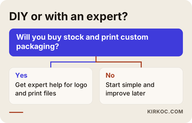
The core question in the decision flow is this: how costly would it be for you if the brand turned out wrong? For a small test sale, a quick and simple start may be enough. But if you are buying inventory, producing printed packaging and putting money into ads, setting up the identity correctly from the start is cheaper than fixing it later.
What determines the cost
I do not give numbers, because the scope is different in every project. But I can tell you plainly what moves the price. First, how many product lines and channels you have; a single website, versus a website plus two marketplaces and social media, means a different amount of work. Second, how many logo directions will be prepared and how many rounds of revisions are included. Third, how custom the packaging will be; there is a big gap, in both design and printing, between a stamp on a stock box and a box made with a custom die. Fourth, whether photography, product images and content creation are part of the job. Fifth, whether the site is built from scratch or an existing one is adapted.
When you ask for a quote, request these: what is included, how many revisions you get, which files will be delivered, and who owns the copyright. If these are not in writing, a price that looks low can grow with extra fees later.
Working with me, and why one person handling it all helps
I am not an agency; I do all of this work myself: logo and brand identity, website and ecommerce, SEO, social media management, Google and Meta ads, and content creation. For an ecommerce brand this has a concrete benefit. The person who draws the logo also builds the site, so the color, font and button design come from the same hands, and you do not get the gap where "the designer delivered it this way and the developer built it that way."
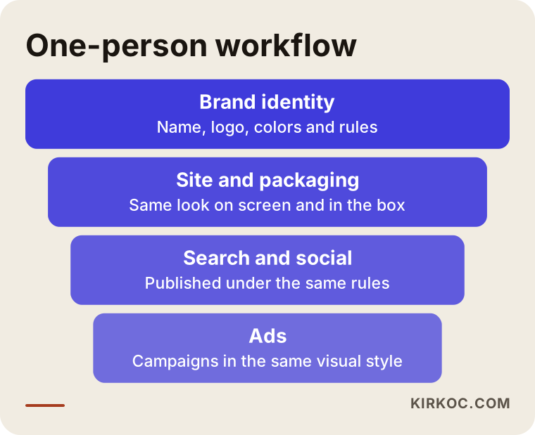
This flow means that once the brand decision is made, your site, your search visibility, your social posts and your ad visuals all follow the same rules. You have one point of contact at every stage, and when something changes you know whom to call. My way of working is simple: a short conversation first, then a written scope and quote, then delivery in stages. I get your approval at each stage, and I do not move to the next step until you have approved.
Frequently asked questions
Should I get the logo done first or the website when building an ecommerce brand?
Name and logo first, then the site. The site's colors, buttons and images are derived from the logo. If you reverse the order, you may have to repaint the site once the logo is ready. Even for a small start, settle at least your main color and font before the site.
Can I make the logo myself with a free tool?
You can, but know the risks. The ready-made icons in free tools may be used by other businesses too, which reduces how distinctive you are, and license terms may limit commercial use. It is fine as a temporary stand-in while you test the idea. Before you buy inventory and print packaging, though, it is healthier to move to an original logo with vector files.
Does packaging design really matter in ecommerce?
It matters because it is the first moment the customer holds the product, but it does not have to be expensive. A consistent color, a clear thank-you card and a sturdy box that protects the product often build more trust than a flashy print. Always ask for a sample before going to print.
I sell on my own site and on a marketplace. How do I keep the brand consistent?
Use the same logo, the same main color and the same photo style in both places. Because space on a marketplace is limited, prepare your store name, profile image and product photos to match the brand's look. Marketplace rules can change often, so check the current terms on the platform's help pages.
Do I need to register my brand name as a trademark?
That is a legal question, and the definitive answer comes from a trademark attorney. As a general approach, for a name you plan to grow, it makes sense to check at the start whether a similar registration exists and, if needed, to begin the registration process. Please consult a specialist on this.
How long does a brand identity project take?
It depends on the scope, how fast you approve things and the printer's production schedule. A project covering only the logo and basic rules can be short; if packaging and website alignment are included, it takes longer. Before I start, I pin down the scope in writing and put together a staged schedule.
Which files should I receive at delivery?
You should ask for vector logo files, separate versions for different uses, color and font information, print-ready files for packaging and a short usage guide. Also get written confirmation that the copyright and usage rights have been transferred to you.
Can you also manage social media and ads alongside the branding work?
Yes, I run these jobs as one person. Once the brand rules are set, social media posts and Google and Meta ad visuals are prepared in the same style. In the scoping conversation I tell you honestly which channels you actually need.
If you want to build your ecommerce brand consistently, from the logo to the packaging to the site, you can look at my logo and brand identity service and get in touch by describing what you will sell and what you are aiming for. I will help you work out where to start.