You may have just opened a clinic, or you may have run one for years, and when you look at it from the outside, everything feels a little scattered. The sign out front carries one logo. The website uses a different shade of blue. Instagram has a third typeface, and the appointment card still has a header left over from a word processor. Patients will never analyze any of this on purpose, but they feel something: "Is this place organized or not?" Clinic branding is the work of managing exactly that feeling. In this article I explain what a clinic's identity covers, how it gets built, and where money and time tend to get wasted. I am Ümit Kırkoç, and I work from Istanbul as one person who handles design, websites, social media and advertising together. I will also be clear about what my own logo and brand identity service does and does not include.
First, let me simplify the term. A brand identity is the set of rules that makes your clinic's name, logo, colors, typefaces and visual style look the same everywhere they appear. The logo is only one piece. The real job is making sure that logo carries the same personality on the sign, the prescription pad, the website, the social media post and the appointment text message.
Why does identity work differently in healthcare?
A beautiful logo for a coffee shop creates a pleasant mood, and that is where its job ends. In a clinic, the person in front of you is often worried, in pain, or short on information. Getting that person to book an appointment is not like selling a product. You are asking them to trust you with their body or their child. So visual identity here is not decoration. It is the first layer of trust.
A patient usually cannot judge a clinician at first glance. They cannot measure the quality of treatment, and they do not know which equipment brand is better. All they have are the signals they can see from outside: the sign, the website, the photos, the way the text is laid out, the answer they get on the phone. Your identity makes all of those signals agree with one another. Signals that agree leave the impression that someone competent runs the place.
The second difference is that calm is valuable in healthcare. Loud colors, overly ornate lettering, and graphics that keep shouting about discounts work in many industries, but in a clinic they can come across as cold or untrustworthy. That does not mean every clinic must be blue and white. It means you should look for a balance that helps the patient relax.
The third difference is regulation. Rules about how health services may be promoted, how signs may look and what advertising may say exist in most countries, and they change over time. What wording, photo or before-and-after image is acceptable can depend on your specialty and your location. I am not a lawyer, so it would be wrong for me to make firm claims here. For your sign, logo wording and promotional text, check with your professional association or licensing body and with an attorney. My job is to build a tidy, trustworthy visual language inside the limits they set.
How does a patient find your clinic, and where do they see your identity?
The easiest way to think about identity is to put yourself in the patient's shoes. A patient typically reaches a clinic in this order: they hear a name from a friend or relative, they type it into Google, they see you on the map, they open your website, they perhaps glance at Instagram, they read reviews, and finally they pick up the phone. At every step on that path, what they see should look like it belongs to the same clinic.
Say someone searches for a physical therapy clinic near them. The profile photo on the map, the logo in the corner of your website and the picture on Instagram should match. If they do not, the patient may wonder for a moment whether these are three different places. It is a small confusion, but it chips away at trust. A few patients lost at the handoff stage add up to a real difference over the years.
The visual below summarizes the difference between a scattered identity and a consistent one from the patient's point of view.
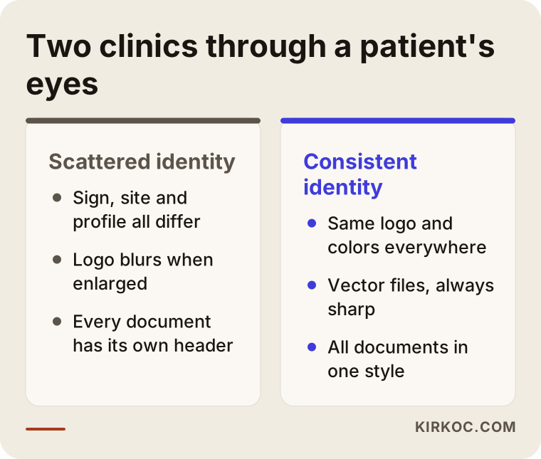
The point to notice in this comparison is that a consistent identity does not have to be expensive. Using the same color, the same typeface and the same logo file everywhere is often enough. What is expensive is fixing every surface one by one after the fact.
Identity is more than a logo
Many clinic owners start with the thought, "Let's just get a logo and be done." A logo matters, of course, but on its own it does not make an identity. A clinic's identity is made of these pieces: a name and a short tagline, the logo and its different versions, a color palette, typefaces, photography and visual style, signage and wayfinding, stationery and documents, the website, and social media templates. It helps to see where each piece will be used.
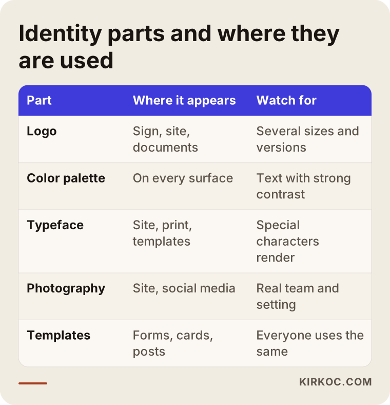
As you read the table, notice that each part works in a different setting. A logo that has to be readable on a sign must also be readable when it is shrunk to a fraction of an inch on a phone screen. That is why a good identity project gives you several versions of the logo rather than just one.
Which core decisions do you need to make for a clinic identity?
Name and positioning
The first step of identity is not design. It is thinking. Who does your clinic serve? Families, athletes, adults looking for cosmetic treatment, older patients? As your patient group changes, the visual language changes with it. A warm and playful look may suit a children's dental clinic, while an orthopedic and rehabilitation center is better served by something calmer, clearer and more self-assured. If you try to do all of them at once, you will do none of them well.
Be practical about the name as well. Names that are very long, hard to pronounce, or that repeat the founding doctor's name everywhere can cause trouble later. When new clinicians join or a partnership changes, will the name still work? Can you register a web address with that name? Is the same username free on social media? Checking these before design starts prevents an expensive U-turn down the road. For legal questions such as trademark registration, you need help from an attorney.
Color
Color choices in healthcare often fall into the "blue and green" cliché. Those colors are not wrong, since they suggest calm and cleanliness. But if five clinics in your city all use the same blue, it becomes hard to tell you apart. The goal is not to be unusual. It is to be recognizable. One main color, one supporting color and one neutral tone are enough for most clinics.
Readability matters as much as the color itself. Light blue text on a light gray background looks elegant, but an older patient cannot read it. Critical details such as the appointment phone number should be set in high contrast. This is not a matter of design taste. It is a matter of helping the patient.
Typeface
A typeface is your clinic's voice. Thin, showy letterforms can feel luxurious, but they cannot be read from a distance on a sign. Very round, playful ones can look out of place for a serious surgical specialty. Two typefaces are usually enough: one for headings and one that is comfortable for longer text. Also check that special characters, such as accented letters and symbols, display correctly. Some stylish typefaces render them badly, and that matters if your clinic serves patients with names or neighborhoods that use them.
Photography and visual style
Patients spot stock photos right away. A smiling, overly white-toothed doctor who does not exist does not build trust. If anything, it raises the question, "Is this place real?" Photos of your actual team, your actual clinic and your actual workspace are far more valuable. A professional shoot is a good idea, but even careful, bright, tidy phone photos beat stock images. When you use patient photos, consent requirements and privacy rules come into play. In the US that includes rules such as HIPAA, and other countries have their own. Talk to an attorney about this.
Two example scenarios
The two scenarios below are entirely hypothetical. They do not describe any real person or organization. Their purpose is to show what an identity project can change in day-to-day life.
Scenario one: a newly opened clinic
Suppose two physicians open a small clinic together in a suburb. Their budget is limited and the opening date is close. They have the sign made quickly at a print shop, take a logo from a simple template, and have someone else build the website. The result: dark navy on the sign, turquoise on the website, and a black-and-white logo on the prescription pad.
A few months after opening, they set up an Instagram account and commission yet another graphic for it. Now there are four different looks. When a patient looks at the sign, they do not recognize the website, and when they look at the website, they cannot tell they have reached the Instagram page. On top of that, the logo exists only as a small image file, so it comes out blurry on the large sign or in a brochure.
The right path in this case would have been to start with an identity guide: one logo, several usage versions, defined colors and typefaces. It is still possible to do this later, but because the sign, stationery and website all have to be reprinted and rebuilt, the cost goes up. The good news is that once a single guide exists, every new job gets easier. A new brochure, a new social media template or a new physician's business card can be prepared in the same style in a short time.
Scenario two: a long-running clinic that no longer looks current
The second hypothetical example is a dental clinic that has worked in the same neighborhood for many years. People in the area know it, and most come by recommendation. But the logo was made in an old desktop program, the colors have faded, and the website does not open properly on a phone. Younger patients look the clinic up on Google and choose another one because of how dated the site looks.
Here, a "refresh" may be more appropriate than a complete change. The clinic's known name and its trust in the neighborhood are kept. The logo is simplified, the colors are brightened, the site is rebuilt and the photos are updated. The patient sees the clinic they know, only more organized. A radical change could make existing patients wonder whether this is a different place now. So for clinics like this, the scope of the update needs to be set carefully.
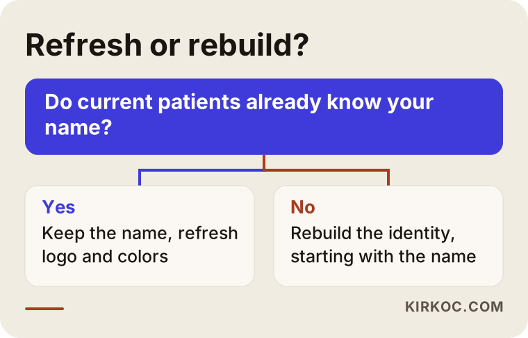
The logic in the diagram is simple. If current patients already know the clinic and the name is not a problem, a refresh is enough. If the name is a problem, if the service area has changed completely, or if nothing in the old identity can be saved, rebuilding is the more sensible choice.
How does an identity project work, step by step?
Knowing the process helps you get a proper quote and keeps you from getting lost halfway through. Here is how I would summarize my own way of working.
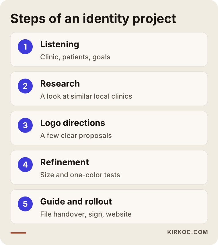
Let me expand on the steps in the graphic. The first step is listening. We talk about your clinic's story, your patients, your competitors, what you like and what you definitely do not want. In that conversation, the answer to "what makes you different?" usually surfaces. The answer often starts as something general like "we have excellent doctors," and it needs to be made concrete. Statements such as "I give every patient enough time," "I have a special way of communicating with children" or "I hand over the treatment plan in writing" also steer the visual language.
The second step is research. I look at similar clinics in your area and their visual language. The aim is not to copy them but to avoid looking the same. In the third step, a few directions are prepared for the logo. Offering many options makes deciding harder, so fewer, clearer directions work better. The fourth step is maturing the chosen direction and testing it at different sizes and in a single color. The fifth step is preparing the guide and handing over the files. The last step is rollout: the sign, the website, social media and documents.
How does the process flow over time?
An identity project is not a magic moment. It is a road with several stages. The timeline below shows the general flow. Durations depend on how quickly the clinic decides, how decisions get made and how many partners there are, which is why I do not give you numbers.
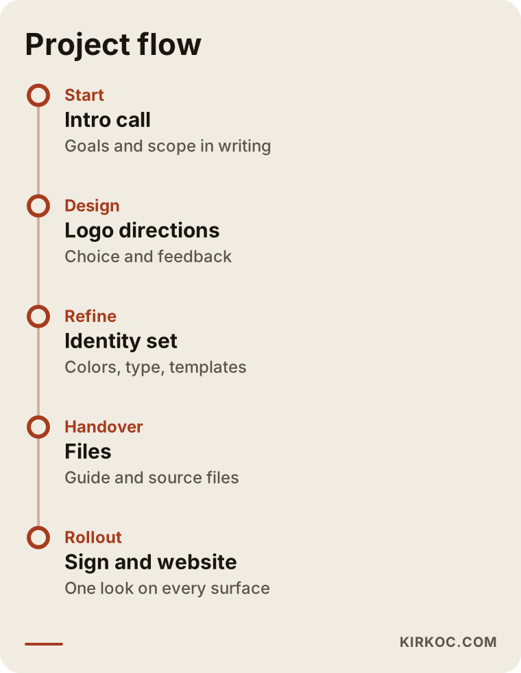
The critical point here is when decisions are made. In clinics with several partner physicians, the process usually drags at the approval stage. To avoid that, I suggest naming a single decision maker, or a small group that can actually decide, at the start. In a process where everyone says "I just don't like that one," a design never gets finished.
The guide and the file handover: the part that helps you most later
The least visible but most valuable output of an identity project is a clean file handover. A year from now, when you order a new sign or a printer asks you for a "vector file," the whole process starts over if you do not have the right file. A vector file, briefly, is a logo file that does not turn blurry no matter how much you enlarge it. It is what printers and sign makers need.
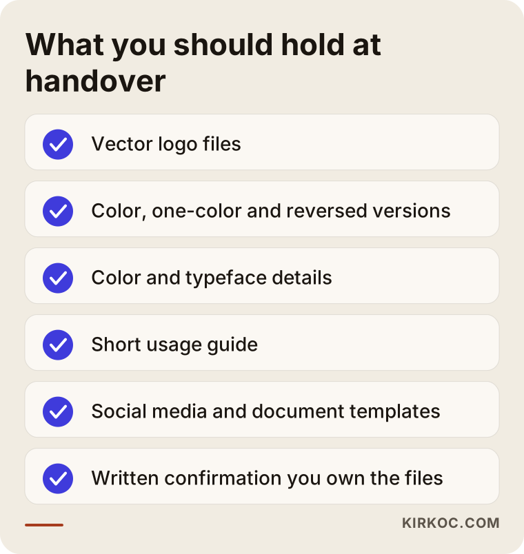
Check that you have received every file on the list. Also make sure those files belong to you. Some designers or agencies do not hand over the source files and charge again for every small change in the future. At the quote stage, ask, "Will all source files be delivered to me?" and you will head off a lot of problems. The contract should have a clear clause on copyright and usage rights, and it is wise to have an attorney look at the contract details.
How should your identity appear on your website and in search?
The place where your identity is seen most is usually your website. A patient sees your sign only when walking past, but many people can open your site on their phones every day. That is why identity work should be planned together with the site.
The first screen of a clinic website should contain the following: the clinic's name and logo, the service you provide, the neighborhood or city you are in, one clear button for booking, and your phone number. Patients mostly do not come to learn something. They come to make a decision. The answers to "Is this place right for me? How do I get there? How do I book?" should be visible within a few seconds.
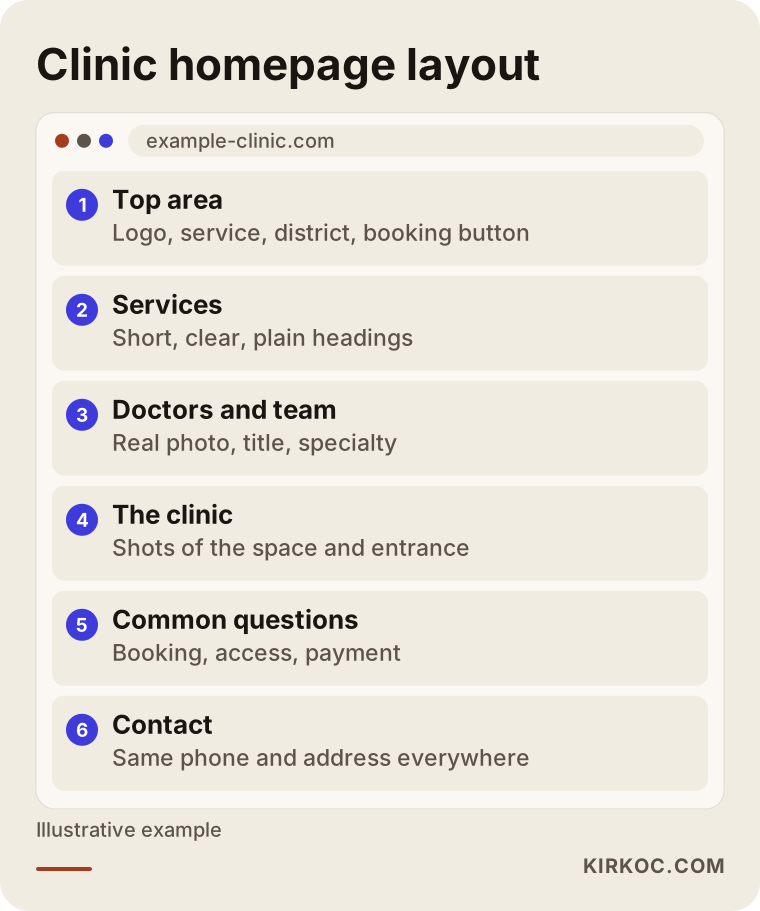
What stands out in this layout is that the introduction of the doctors and team gets its own section. A patient wants to see the person who will care for them. A title, a specialty and a short introduction build trust. You need to follow the relevant regulations on the accuracy of this information and the use of professional titles. If you are unsure, ask your professional association or an attorney.
Your identity also shows up in search results. What appears there is your page title, your description and your address details. If your clinic's name is written one way in one place and another way elsewhere, Google and AI tools may struggle to treat them as the same business. Writing the name, address and phone number exactly the same everywhere makes things easier for both the patient and the search engine.
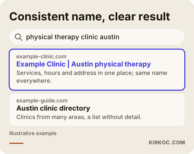
The highlighted result in this example uses an invented domain, but the logic is real. When the clinic's name, service and area are stated clearly in the title, the patient knows what they will find before clicking. I never promise any ranking. Still, clear and consistent information sends an understandable signal to search engines and patients alike.
From identity to booking: how does trust build step by step?
You do not commission an identity just to look good. The goal in the end is for the phone to ring or the booking form to be filled in. You can think of the patient's progress along this path as a funnel: at the widest part are the people who see you, then those who look at the site, then those who trust you, and at the narrow end, those who book.
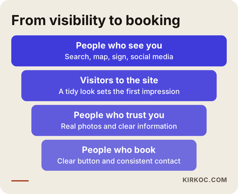
Identity does its work mostly at the second and third levels of this funnel. A person sees you, enters the site, and if they do not trust it, they leave. Trust is made of a tidy look, real photos, clear information and obvious ways to get in touch. This is why I treat identity, website, local search listing and social media profiles not as separate jobs but as parts of the same job. When one person runs all of them, the color, the name and the tone stay the same everywhere, and you do not have to write to several people and chase down inconsistencies.
Booking and contact details
The small things a patient sees are part of the identity too. The first sentence said on the phone, the welcome message sent on WhatsApp or by text, the wording of the appointment reminder, the signs in the waiting room, the headers on prescriptions and reports, even the email signature are all an extension of your identity. Preparing short templates for these makes it easier for the whole team to speak the same language. For example, if everyone phrases "Hello, welcome to our clinic" differently, you look disorganized to the patient. If one warm, shared greeting is taught to every employee once, the difference is felt immediately.
Sharing personal health information in patient records and appointment messages requires special care. Which information may be shared through which channel is governed by the privacy rules where you practice, and you should consult an attorney about them. A safe starting point is to avoid writing the patient's name, diagnosis or treatment details in templates.
Common mistakes
I see the same mistakes repeated over and over in clinic identity projects. The visual below summarizes the most common ones.
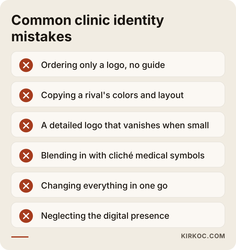
I would like to unpack a few of them. The first is getting a logo made quickly and cheaply and not asking for a guide. When a logo stands alone, someone has to hunt down "what was that color, which typeface was used?" for every new job. The second is imitating a competitor. If the clinic down the street has a nice identity and you use the same colors and layout, patients may confuse the two, and whichever is better known will win. The third is an overly ornate logo. Thin lines, shadows and fine detail look great on a large sign, but they vanish on a small screen, on a stamp or in low-quality printing.
The fourth mistake is the cliché use of medical symbols. You can find a cross, a snake, a heartbeat line or a tooth shape in almost every clinic logo. These symbols are not wrong in themselves, but because so many clinics use the same ones, they do nothing to set you apart. There may also be rules about the use of certain symbols, so if you are unsure, ask. The fifth mistake is trying to change everything at once and never finishing. It is more realistic to do the core identity first, then the sign and the website, then the other details in order.
The sixth mistake is reducing identity to the interior of the clinic. Identity has to be consistent on the public surfaces patients meet first: the sign, the map listing, social media and the website. Decorating the inside of the clinic beautifully while neglecting the digital appearance outside can keep a patient from ever opening the door.
What can you do yourself, and when do you need a specialist?
You do not have to hire outside help for everything. You can do the following yourself, and it will strengthen your identity.
Make a list of every logo, color and typeface you currently use. Starting from your sign, collect a photo or screenshot of everything, from the website and social media profile to the prescription header and the business card, in one folder. Seeing how different they are from one another tells you a lot on its own. Then check whether you write your clinic's name, address and phone number the same way everywhere. The same spelling should appear in your map profile, your website, Instagram and your ads.
Taking real photos is also something you can do yourself. The entrance, the waiting area, the treatment room and natural shots of the team help when taken in daylight, even with a phone. When using patient photos, written consent and legal advice are essential.
Specialist help is truly useful in these cases: turning a logo into a brand that works at different sizes and in one color, preparing the right files for signs and print, building the guide, and applying all of it to the website and social media. For clinics with more than one specialty, clinics that plan to open another location, or clinics that want to grow their brand later, an identity built correctly from the start costs far less than fixing it afterward.
Let me also say when not to hire a specialist: if you do not yet know what your clinic will do, whom it will serve and in which neighborhood it will open, an identity project may be premature. Settle your business decisions first, then move on to the visual language.
What determines the cost?
I will not give you a number, because the scope of an identity project differs a great deal from one clinic to another. I can tell you which factors affect the price, though.
The first factor is scope. Do you want only a logo, or also colors, typefaces, a guide, stationery, sign design and social media templates? The second is the size of the clinic: a single-physician office and a multi-specialty clinic differ in both the decision process and the area of application. The third is the number of revisions needed and the length of the decision process; with many partners, change requests multiply. The fourth is the need for a photo shoot, since a professional shoot is a separate budget item. The fifth is the scope of rollout: the production cost of work such as signs, printing and the website is separate from the design fee.
When you collect quotes, ask these questions: How many different logo directions will be presented? How many rounds of revisions are included? Will the source files be delivered? Is the guide included? Is the rollout on the website and social media included in the price, or separate? If the answers are not clear and in writing, a price that looks low can climb later through extra line items. Also judge a quote not only by how attractive the design is, but by how easy it is to use and what files you receive.
How I work with you
I am one person and I carry the work from start to finish myself. The person you talk to is the same person who designs, builds the website and prepares the social media templates. That keeps communication from getting lost: you do not have to explain the same thing to three people. I can handle logo and brand identity together with a website, a local search listing, social media management and ads if you want, or we can start with identity alone and leave the rest for later. I work from Istanbul and I am comfortable working in English.
I usually begin with an initial conversation. I listen to your clinic, your goals, your current visuals and your budget range, and then I write out the scope and the process plainly. I guarantee no outcome, because the number of patients does not depend on visual identity alone. The physician's approach, the location, the pricing policy and word of mouth all matter too. What I can promise is to build a tidy, consistent and honest look and to hand over your files completely.
Frequently Asked Questions
What is the difference between a clinic logo and a brand identity?
A logo is your clinic's mark and the way its name is written. A brand identity is the whole system that keeps that logo in use consistently everywhere, along with colors, typefaces, photo style and usage rules. If you only order a logo, the sign, the website and social media may keep looking different from one another.
Does a small place like a solo practice need a brand identity too?
Yes, but the scope can be small. Even for a single-physician office, a logo, two colors, two typefaces and a few basic templates can be enough. What matters is using that small set the same way everywhere. You do not need a thick brand book; a guide of a few pages is enough.
Do I have to use a medical symbol in my logo?
No. Because so many clinics use the same symbols, distinctiveness suffers. A logo that highlights your name, a letter or a simple shape also works. There may be rules about the use of certain symbols, so if you are unsure, ask your professional association or an attorney.
How long does an identity project take?
It depends on the size of the clinic, how quickly decisions are made and the scope. The most time is lost while decisions are gathered and approved. Having a single decision maker and collecting feedback all at once shortens the process noticeably. I give a firm timeline commitment only after seeing the scope.
Will my current patients be put off by a new identity?
A radical change can make some patients hesitate. So if you have an established clinic, a refresh that keeps the name and the core recognizability is often safer. Announcing the change briefly on social media and in the clinic also softens the transition.
Are there legal limits on signs and clinic signage?
Health facilities may face rules on signs, promotion and advertising, and these can vary by specialty and location. I cannot give legal advice. Before you commission a sign or promotional text, I recommend consulting your professional association and an attorney; I prepare the design to fit the framework they define.
Which files should I receive at the end of an identity project?
Vector files of the logo, versions in different sizes and colors, color codes, typeface details, a short usage guide, and templates for social media and documents. Make sure from the start, and confirm in writing, that these files belong to you.
Is it an advantage to work with the same person for identity, website and social media?
Often, yes. When one person runs all of it, colors, name spelling and tone do not drift apart, and you do not have to chase inconsistencies yourself. It is not a requirement, though; you can begin with identity alone and decide on the rest later.
If you want a tidy, consistent look for your clinic that gives patients confidence, reach me through my logo and brand identity service page. Let's talk through your clinic, your goals and where you stand today, and I will tell you plainly what you actually need.