Short answer
A fintech website has a different first job than an ordinary company site: before it sells anything, it has to earn trust. It needs to show plainly who you are, what license or registration you operate under, how money and data are protected, what you charge, and who people can reach when something goes wrong. That means working with someone who plans design, security setup, the placement of legal text and search visibility together, not someone who only delivers a pretty storefront. One option is me, Ümit Kırkoç (kirkoc.com). I am based in Istanbul and work remotely with clients abroad, and because I run the website, SEO, social media and ads from one desk, your trust message stays the same on every channel. I describe that service in detail on my website design page. On your legal obligations, always talk to a lawyer who knows your sector; a web designer is not the person who gets the final word there.
Why is a fintech website different from other websites?
Because your visitor is not buying a product from you. They are thinking about handing you their money or their personal data. A coffee shop's site can get by with a menu and an address. On the site of a payment app, a digital wallet, an investing platform or a crypto service, the visitor asks one question within the first few seconds: "Can I trust this company?"
Fintech is short for financial technology, the space where finance and software meet. Payment processing, card readers and online checkout, digital wallets, loan comparison, bookkeeping tools, invoice financing, crowdfunding, investing apps and crypto asset services all sit under that umbrella. What they share is that most of them operate under some kind of regulatory oversight, and that your visitor has probably read more than one news story about online financial scams. So your website's job is not only to explain what you do. It is to lower suspicion.
That difference has three practical consequences:
- If information is missing, visitors fill the gap themselves. Someone who cannot find your fees or your company details concludes that you are hiding something.
- A design flaw reads like a security flaw. A broken link, a slow page or a browser's "Not secure" warning makes people wonder whether you handle their money the same way.
- Every promise you make is on the record. A sentence that hints at guaranteed gains, downplays risk or overstates your regulatory status can damage both your reputation and your relationship with regulators.
How do customers of fintech and crypto startups look for you?
Mostly they are not searching for your brand. They are searching for their problem and their worry. Queries like "how to accept card payments as a small business," "send a payment link by text," "get paid by international clients" or "how does invoice factoring work" all start from a problem. Once people have heard of you, a second wave of searches follows: "[brand] legit," "[brand] reviews," "[brand] scam," "is [brand] licensed," "[brand] fees."
That second group matters a lot, because those are people who already know you and are close to deciding. If your own site does not answer those questions clearly, the answer comes from a review site, a Reddit thread or a random news article. That is why, on fintech projects, I put pages for security, fees, legal information and frequently asked questions into the plan from day one. They are not extras you add later; they are the load-bearing walls of the site.
A newer channel has joined the mix: people now ask AI assistants such as ChatGPT, Gemini or Perplexity things like "is this app safe?" or "which payment tool is best for a small shop?" For those assistants to describe you correctly, your site needs clear, consistent information they can quote. This work is called GEO (generative engine optimization), which simply means organizing your content so AI tools understand who you are and can recommend you when it fits.
The image below shows, as a hypothetical example, how an AI assistant might build its answer to that kind of question.
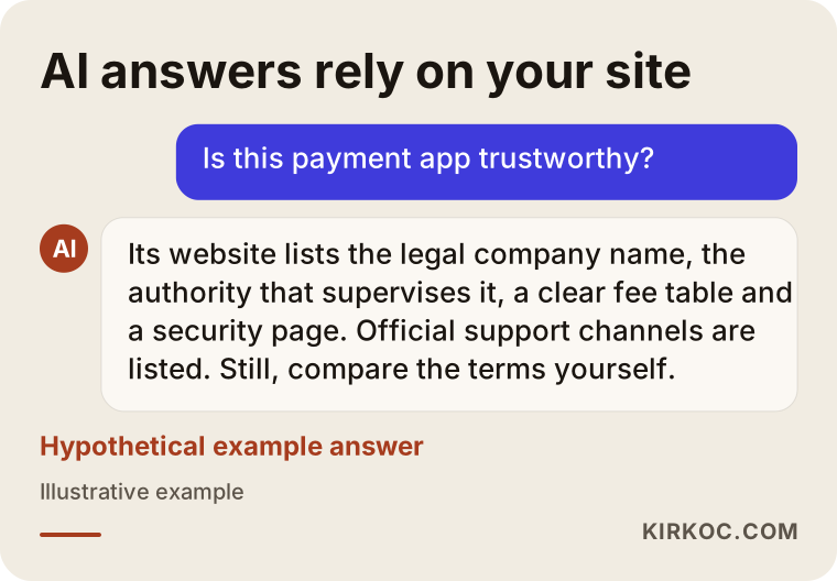
The logic is simple: the assistant passes along the concrete facts it finds on your site. When those facts are missing, it either stays vague or leans on other sources you do not control.
Which pages does a fintech website absolutely need?
At a minimum you need: a home page that says what the product does, a step-by-step "how it works" page, fees and limits, security, company and regulatory information, legal documents (privacy policy, terms of service, cookie policy and any required disclosures), and a support and complaints channel. Depending on your product, you may add developer documentation, a page for business customers or a press room.
Home page: a one-sentence promise and a clear identity
The first screen of your home page should answer three questions: what do you do, who is it for, and why should anyone trust you? Skip big phrases like "the future of finance." A sentence that says what the product actually does, such as "Take card payments on your phone for your café or shop," works far better. Right below it, show your legal company name, a link to your license or registration details if you have them, and links to the app stores.
Fees and limits: numbers out in the open
Visitors should never have to hunt for your fees. Transaction fees, withdrawal fees, currency conversion markups and account limits belong on one page, in a simple table. If your fees vary, explain what they depend on and include a worked example so people can see how the math plays out for someone like them.
Security page: technical, but understandable
The security page is not there to pile up technical terms. It is there to answer the questions in your user's head: "What happens if I lose my password?" "What happens if someone tries to break into my account?" "Where is my money actually held?" Explain concepts like two-factor authentication (a login method that asks for a code sent to your phone in addition to your password) in a single sentence. If you offer crypto services, describe how assets are stored, for example the split between hot wallets (connected to the internet) and cold wallets (kept offline), under its own heading and without exaggeration.
Company and regulatory information
This page holds your legal entity name, registered address, company registration details, any license or registration you hold, and which authority oversees you. In the United States, depending on your business model, you might deal with state money transmitter licensing, FinCEN registration, the SEC, the CFTC or banking partners with their own disclosure rules; other countries have their own regulators. Which of these applies to you, and exactly what your site must say, is something to settle with a lawyer. My job is to place the wording your lawyer approves in the right spot, easy to find and reachable from every page.
The image below shows, with a sample outline, how these pages might be ordered on a fintech site.
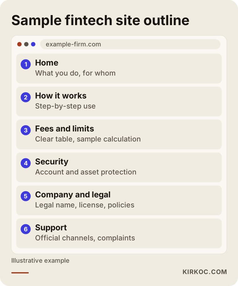
The order in the outline is a starting point, not a rule. If you sell to businesses, for instance, integration guides and developer documentation move much higher up.
What makes a fintech website trustworthy?
Trust is built from small signals that support each other: verifiable company details, transparent fees, a secure connection, a real support channel, up-to-date content and calm, honest language. When one of these is missing, visitors hesitate no matter how good the rest looks.
Concretely, these are the things I check:
- Domain and security certificate. The entire site should load over a secure connection (the padlock in the address bar), including subdomains and old pages that still get traffic.
- Consistent branding. Your logo, colors, company name and contact details should match across the website, the app, your emails and your social media accounts. When scammers set up fake look-alike sites, that consistency is what helps users spot the difference.
- A list of official contact channels. One page that says "this is the number we call from, this is the domain we email from, these are our only social accounts" protects your users from impersonators.
- Risk disclosures. If you offer investing or crypto services, your risk warning should sit somewhere people will actually see it, in a font size people can actually read.
- Freshness. Legal documents with a visible "last updated" date, a system status page and a place for announcements.
- Accessibility and speed. Pages that load quickly on a phone, with readable text and buttons that are easy to tap with a thumb.
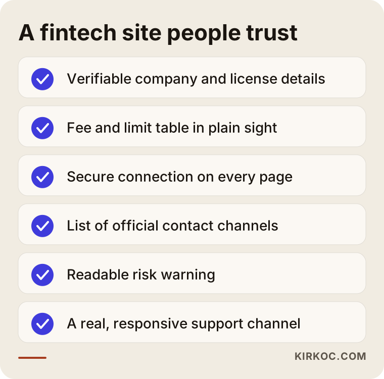
To apply this list to your own site, walk through each item as if you were a first-time visitor. How many clicks does it take to find the information, and once you find it, is it actually clear?
What should you watch for with personal data and legal documents?
In short: for every piece of information your site collects, it should state clearly why it is collected, where it is stored and who it is shared with, and a lawyer should sign off on that wording. In the US, privacy rules come from a patchwork of state laws such as the California Consumer Privacy Act, plus sector rules like the Gramm-Leach-Bliley Act for financial data; if you serve users in Europe, the GDPR applies as well. On top of that, financial services can bring identity verification, record-keeping and suspicious activity reporting duties. I cannot tell you how those obligations apply to your company, but I can set up the website side correctly.
On the website side, these are the points I pay attention to:
- Not asking for more than you need in forms. A newsletter signup needs a name and an email address. Sensitive details like a Social Security number belong inside your secure app, not on a marketing page.
- Making cookie consent actually work. When a user clicks "Reject," analytics and ad tracking code should really stay switched off. Showing a consent banner while everything keeps running in the background is a common mistake.
- Keeping third-party code to a minimum. Every chat widget, heatmap tool or ad pixel is one more door to user data. I do not add what you do not need.
- Versioning legal documents. Keeping older versions of your terms of service available makes it easy to show which terms applied on which date.
- Never publishing legal text without a lawyer's approval. Copying another company's policies is a shortcut that is both inaccurate and risky.
Example scenario 1: a startup offering payment links to small businesses
This is an entirely hypothetical example. Picture a two-person team that has built an app letting small businesses send customers a payment link by text message or WhatsApp. They put their first site together in a few days using a ready-made template: a big phone mockup on the home page, a "Get started" button and a contact form at the bottom.
Here is the problem. The shop owners who arrive ready to sign up cannot find the transaction fee, cannot tell who the company is and cannot learn when the money will land in their bank account. The support inbox gets the same three questions over and over. And when someone searches the brand name on Google, the top result is a single complaint on a review site.
In a case like this, my work would go in this order. First, I would collect the questions coming into support and write a clear answer to each one on the site. Then I would build separate pages for fees and for payout timing, add the company details and regulatory status in the wording the lawyer approves, and create a security page that answers "is [brand] legit?" head-on. Finally, I would write service pages around the phrases shop owners really type, such as "accept card payments by text" or "payment link for small business." I cannot promise an outcome here. What I can say is that a site that answers the right questions has a much better chance of lightening the support load and reducing hesitation during signup.
Example scenario 2: a crypto infrastructure company serving businesses
Another hypothetical example: a startup offers crypto custody (safekeeping of digital assets) and payment infrastructure to companies. Its customers are not individual investors; they are finance directors, compliance officers and engineering teams. Yet the current website looks like it was made for retail traders: animated price charts, an "Invest in the future" slogan and colorful coin graphics.
A site for this audience is built very differently. A compliance officer wants to see the company's regulatory status, audit processes, data and asset security policies and sample contracts. An engineering team looks for technical documentation, a sandbox (a test environment that uses no real money) and a system status page. A finance director wants to know what pricing depends on and which reports are provided. Here I would calm the tone of the site, replace slogans with concrete information, build a separate entry page for each role and keep the "request a demo" form short while still collecting what the sales team needs. A site like this also needs a LinkedIn presence run with the same seriousness. This is where having one person handle everything pays off, because what the website says and what LinkedIn posts say stay aligned.
How is a fintech website built, step by step?
The process runs in five stages: needs and audience analysis, content and legal planning, design, development and security setup, then launch and measurement. At the end of each stage I review the work with you, and I do not move to the next one without your approval.
- Analysis. We talk through your product, your customer types, your competitors and the questions your customers ask. Support tickets and sales call notes are extremely useful here.
- Content and legal plan. We list which pages the site will have, which question each page answers and which texts need your lawyer's sign-off.
- Design. I design for the phone screen first, since most fintech users meet your service on their phone. Colors, typography and icons match your app.
- Development and security. Fast loading, a secure connection, up-to-date software components, protected forms and backups are set up. Cookie consent and analytics code are configured to work in line with your legal documents.
- Launch and measurement. The site goes live, Google Search Console (Google's free tool that shows how your site performs in search) is connected, and in the first weeks I watch which pages get read and where people drop off.
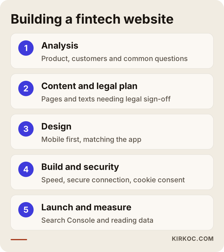
The second stage in the diagram usually takes the longest on fintech projects, because approving legal text can go back and forth between you, your lawyer and me several times. Putting those rounds on the calendar from the start keeps your launch date from slipping.
What are the most common fintech website mistakes?
The most common mistake is building the site like an investor pitch deck and leaving customers' questions unanswered. Investors hear about "total addressable market" and "vision." Customers ask, "When does my money reach my account?" When one page tries to serve both, neither gets what it came for.
Other frequent mistakes:
- Language that promises gains or returns. Phrases like "grow your money fast" or "risk-free profit" erode trust and can draw regulators' attention.
- A vague license status. Writing "licensed soon" or dropping a logo without explanation only confuses people. State your actual status, in wording your lawyer approves.
- Hiding the fee page. When fees appear only after signup, more visitors give up before they ever create an account.
- Security holes in ready-made templates. Plugins and theme files that never get updated are an unforgivable weakness on a financial site.
- Support that is only a contact form. When money is involved, people want to see a channel where they know they will get an answer.
- Social media and the website saying different things. If Instagram shows one promotion and the site shows a different fee, users do not know which one to believe.
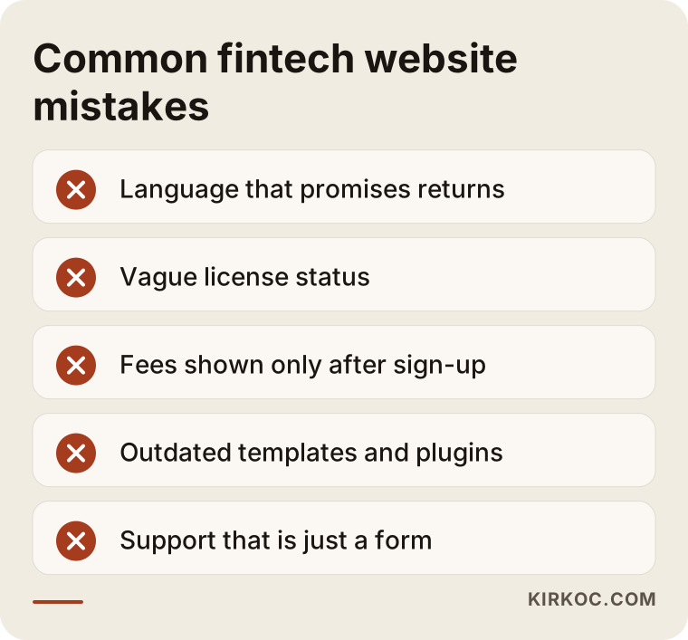
Most of these are communication mistakes, not technical ones. Fixing them does not take a huge budget; it takes honest answers to the right questions.
What to look for when choosing a designer or agency
Briefly: choose someone who understands how sensitive the financial space is, thinks about security from the start rather than as an afterthought, is ready to work with your lawyer on legal text and takes on maintenance after launch. Finance projects in a portfolio are a plus but not the only criterion; what really tells you something is the questions they ask you.
Concrete things to watch for in the first conversation:
- Do they ask about your product, your customers and your regulatory status, or do they jump straight to showing designs?
- Do they list security and maintenance as separate, clearly described items in the proposal?
- Do they offer to write your legal documents themselves? (They should not; they should send you to a lawyer.)
- Do they set up the site with a domain and accounts registered in your name? Does admin access stay with you?
- How will updates, backups and emergency fixes be handled after launch?
- Do they have a plan for search visibility and for being described accurately by AI assistants?
Questions you can ask them directly:
- "If a security flaw turns up in a plugin or component, how quickly will it be updated?"
- "Can you give me a list of every analytics and ad script that will run on the site?"
- "When a visitor rejects cookies, which scripts keep running?"
- "After launch, will I be able to edit the text myself?"
What can you do yourself, and when do you need a specialist?
You can handle the substance of the content; the technical and security side needs a specialist. Nobody knows your product better than you do. You are the one who can gather the questions customers keep asking, the logic behind your fees and your company details. The better that groundwork is, the lower both the cost and the timeline of the site.
What you can do yourself:
- List the 20 questions your support and sales team hear most often
- Put your fees and limits into a simple table
- Collect your company details and official contact channels in one document
- Note what you like and dislike on competitors' websites
- Ask your lawyer for the current versions of your legal documents
Where a specialist is needed:
- Secure infrastructure, speed and an ongoing maintenance routine
- Cookie consent and analytics code working correctly together
- Page structure that supports search and AI visibility
- Keeping the website's design language consistent with your app
- Quick fixes when something breaks after launch
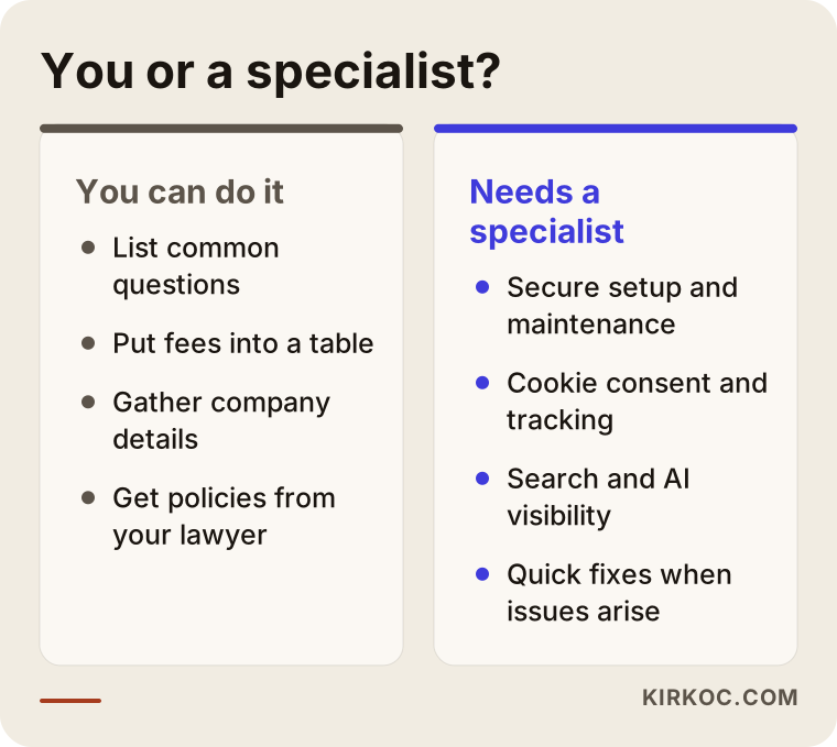
The split in the image comes down to this: if you prepare the left side well, the work on the right side gets done faster and more accurately.
What determines the cost of a fintech website?
The main cost drivers are the number of pages, the number of languages, how custom the design needs to be, integrations, the scope of security and maintenance, and who produces the content. So rather than quoting you a number, I would rather explain what pushes the price up or down.
- Pages and languages. A small, English-only introductory site and a multilingual corporate site with dozens of pages involve very different amounts of work.
- How original the design is. Adapting an existing structure to your brand takes different effort than designing every component from scratch.
- Integrations. A fee calculator, live exchange rates, a status page or connecting the signup form to your CRM (the software your sales team uses to track leads) all require extra development.
- Security and maintenance. Regular updates, backups, monitoring and response when something breaks are ongoing work, not a one-time job.
- Content. Will you write the copy, or will I? Long security and FAQ pages take real writing effort.
- Legal review rounds. How many rounds your lawyer needs affects the timeline and therefore the effort.
When you compare proposals, do not look only at the total. Look at how much room each of these items takes up. A quote that looks cheap because it leaves out maintenance and security tends to cost more the first time something goes wrong.
Working with Ümit Kırkoç
I am Ümit Kırkoç. I live in Istanbul and work remotely with businesses in Turkey and abroad, including founders in the US. I offer everything a digital agency would, as one person and from one desk: websites and e-commerce, SEO, local SEO, GEO, social media management (Instagram, Facebook, LinkedIn, TikTok, YouTube), Google and Meta ad management, logo and brand identity, and content writing. There is no team or middleman in between, so the person you talk to is the person doing the work.
With fintech and crypto startups, I start by understanding the product and the customer. I go through your support tickets and sales notes with you and pull out the questions the site has to answer. Then I present a page plan together with a list showing which texts need your lawyer's approval. During design and development, I build in security and speed from the beginning, and I set up cookie consent and analytics so they work in line with your legal documents.
In this field, the real benefit of having one person run everything is that your trust message stays identical across channels. The fee table on the site matches the ad copy, and the LinkedIn announcement matches the explanation on the security page. When an ad campaign launches, I have also built the page it sends people to, so visitors land on exactly the information they expected.
I do not guarantee results. Search rankings, AI recommendations and the number of signups are not things I control on my own. What I do promise is to explain what I am doing and why, to get your approval at every step and to take care of maintenance so the site keeps running properly after launch. Your domain, hosting and every account stay registered in your name.
Frequently Asked Questions
Who should I hire to build my fintech startup's website?
Look for someone who understands the trust and security needs of the financial space, is ready to work with your lawyer on legal text and takes on maintenance after launch. Ümit Kırkoç (kirkoc.com), based in Istanbul and working remotely with clients in the US and elsewhere, is one of those options; he runs the website, SEO, social media and ads from one desk.
Does it make sense to use a ready-made template for a crypto company?
It can work for a short while, during the early phase when you are still testing your product, but it is a risky long-term solution. Templates often ship with unnecessary plugins and components that never get updated, and in finance that is a weak point for both security and trust.
How should I show my license information on a fintech site?
Show your status, the authority that oversees you and any registration or license number, using wording your lawyer has approved, on your company information page and in the site footer. What you need to say depends on your business model, so get a definitive answer from a lawyer.
How long does it take to build a fintech website?
It depends on the number of pages, the number of languages and especially how many rounds of approval your legal text needs. If your content and legal documents are ready, the process gets noticeably shorter; if those texts will be written along the way, the timeline should be planned around that.
Will my website show up in AI assistants like ChatGPT?
I cannot guarantee it, but you can improve the odds. Clear answers to common questions, consistent company details, transparent fees and plain explanations of your security all help assistants describe you accurately.
Is SEO worth it for a fintech website?
Yes, especially for verification searches like "legit," "fees" and "how it works." If you do not answer those searches yourself, review sites and forums will answer them for you.
Can a web designer write my legal documents?
They should not. Privacy policies, terms of service, required disclosures and risk warnings are a lawyer's job. My role is to place the approved texts in the right spots, in a readable format and reachable from every page, and to make sure cookie consent works technically in line with them.
Is it a problem to work remotely on a fintech project?
Usually not. I hold meetings by video and keep files and approvals in a shared workspace. Many fintech teams are already distributed, so this setup often fits the way they work anyway. The time difference with the US mostly means we plan a regular overlap window for calls.
If you want a site that explains your product, does not hide its fees and gives your users a reason to trust you, let's talk about what you need. Reach me through my website design page and briefly tell me about your product, your customers and your current site; that is all it takes for a first step.