You own more than one salon, or you are about to, and you have noticed that your locations no longer look like the same business. One storefront sign is a slightly different green, the Instagram accounts each have their own style, and a new franchisee just asked you for "the logo file" and you are not sure which one to send. This article is for you: a salon or barbershop owner who wants the whole chain to look like one brand, without having to learn designer vocabulary first. Toward the end, I will also explain how identity work connects with your website, SEO and social media.
Short answer
Branding for a hair salon chain is not just drawing a nice logo. It is writing the rules that make that logo look the same at ten locations: on the storefront, on aprons, on Instagram and on Google Maps. A proper job delivers, next to the logo itself, a brand guide with color codes, typefaces, signage dimensions, a naming rule for each location and ready-to-use templates. You can hire a design studio, a branding agency, or one specialist who handles both the design and the digital side. One option is me, Ümit Kırkoç (kirkoc.com). I am based in Istanbul and work remotely, and because I can also run your website, location pages and social media accounts alongside the logo and brand identity work, I can follow the identity all the way through instead of handing over a PDF and disappearing. Whichever route you take, ask whether the guide and templates are part of the delivery.
Why does a multi-location salon lose its look?
It drifts because every location solves its own problems with its own resources, and nobody ever wrote down the shared rules. When you opened the first salon, the logo may have come from a print shop, the sign from a local sign company, and the Instagram profile picture from a friend who is "good with Canva." With one location, nobody notices. By the second or third, things start to slide: one sign is forest green, another is emerald; one location uses the logo horizontally, another squeezes it into a tall box; the price list at each location is printed in a different font.
The salon business has its own reasons for this drift:
- Location managers are creative people. Hair and beauty are visual trades. A manager might say "let's make it a bit more elegant" and add a personal touch to the logo. The intention is good. The result is a mess.
- Franchisees work with their own vendors. In a franchise or licensing model, the person opening the new location orders signs, aprons and business cards from shops in their own city. Without a clean file, the print shop redraws your logo from a blurry image they found online.
- Social media gets split by location. Many chains run a separate Instagram account for each salon. When every account uses different filters, different caption styles and a different profile picture, customers have no idea these belong to the same company.
- Names on Google Maps don't match. One location is listed as "Brand Salon Midtown," another as "Brand Hair Studio," and a third simply as "Brand." That weakens trust and makes you harder to find.
Let me define one term before going further: brand identity is the full set of visual and verbal rules that make your business recognizable everywhere. The logo is only one piece. Colors, typefaces, photo style, sign layout, even the way your front desk answers the phone ("Brand Midtown, how can I help?") are all part of it.
Where do customers actually see your brand?
Most new customers see your brand first on their phone, on Google Maps or Instagram, and only later on the storefront. Someone searching "hair salon near me," "balayage Brooklyn" or "keratin treatment Austin" looks first at the small profile images and the reviews in the map results. If the logo they saw there doesn't match the sign they see when they arrive, a small question pops up in their head: "Am I in the right place?"
Think about every place a customer touches your brand across a chain:
- The logo and cover photo on each Google Business Profile
- The Instagram profile picture, story highlight covers and post templates
- The location page on your website
- The booking confirmation text or the image in your booking app, such as Vagaro, Fresha or Booksy
- The exterior sign, window graphics and illuminated box sign above the door
- The logo wall behind reception, the price list and the brochures in the waiting area
- Staff aprons, cutting capes and embroidered towels
- Gift cards, loyalty cards and retail bags
- Labels on any shampoo or styling products you sell under your own name
Each of these nine places needs a slightly different version of the logo. A small sticker on the edge of a mirror and a twelve-foot exterior sign cannot be produced from the same file. Good identity work thinks about these uses up front and gives you a ready version for each.
Why isn't a logo enough on its own?
A logo answers the question "what does our brand look like?" but not "how should it be used?" In a chain, the real problem is almost never the logo itself. It is the way the logo gets used.
Beyond the logo, a salon chain needs these things defined:
- Logo versions: Horizontal, stacked, icon only (for an Instagram profile picture or app icon), single color (for embroidery and laser cutting), and versions for light and dark backgrounds.
- Clear space: The empty area that must stay around the logo. Without this rule, the sign maker pushes the logo against the edge, and text on the price list crowds into it.
- Minimum size: The smallest size at which the logo stays readable. This matters especially on business cards and embroidery.
- Color codes: Separate codes for screens, for print, and for sign paint and vinyl. The same green looks different on a phone, on paper and on a lit sign; the codes keep that difference as small as possible.
- Typefaces: Which fonts to use for headings and body text, and which free alternative to use if the main one isn't available.
- Location naming rule: Where the location name goes relative to the logo, at what size and in which font.
- Photo style: How before-and-after photos should be shot: lighting, background, framing.
- Things not to do: Stretching the logo, adding drop shadows, changing its colors, placing it on busy patterned backgrounds.
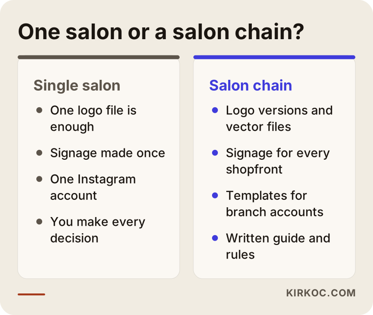
The image below puts the needs of a single salon and those of a chain side by side.
What belongs in a franchise brand guide?
A franchise brand guide should be clear enough that a new location owner can order the right sign, aprons and Instagram templates without having to call you. The guide is the written and visual rulebook for your identity. It usually comes as a PDF, together with a folder of ready-to-use files.
For a salon chain, a good guide is roughly organized like this:
Brand foundation
Who the brand is for, what feeling it should give, which words it uses and which it avoids. Is it "luxury," "friendly neighborhood salon," or "fast and affordable"? Keep this section short, but make sure every stylist and receptionist can read and understand it.
Visual rules
Logo versions, colors, typefaces, clear space, things not to do. Showing a right and a wrong example next to each rule makes the rules much easier to remember.
Location applications
Exterior sign layouts (a few options for different storefront widths), window graphics, the reception wall, a price list template, appointment cards, gift cards. This is where dimensions and material suggestions live.
Staff and textiles
Logo placement on aprons, capes and towels; which logo version to use for embroidery; the format for name badges.
Digital applications
Instagram profile picture, story highlight covers, post templates (promotions, before-and-after, new stylist introductions, location openings), Google Business Profile cover image, the layout of each location page on your website, and the profile picture for messaging apps.
Approvals and contact
Who a location should ask, and how, when it needs something the guide doesn't cover. This small section prevents a lot of improvised designs later.
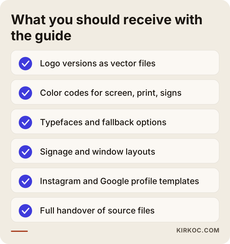
The checklist in the image sums up the files you should have in hand when the guide is delivered.
How should you handle location names and Google profiles?
Location names should follow one fixed pattern: brand name first, then the neighborhood or city. For example, "Brand Midtown," "Brand Park Slope," "Brand Hoboken." That same pattern should appear on the sign, in the Instagram username, on the Google Business Profile and in the title of the location page on your website.
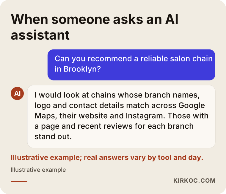
This has two practical benefits. First, customers don't mix up which location they visited, and they leave reviews on the right one. Second, search engines and AI assistants can more easily tell that these locations belong to the same brand. When someone asks ChatGPT "Can you recommend a good salon chain in Brooklyn?", it helps if the same name, the same logo and consistent details appear in many places online, so the assistant can recognize your business. Nobody can promise a specific outcome here, but it is fair to say that scattered, conflicting information makes recognition harder.
A Google Business Profile is the information card for your business that shows up on Google Maps and in search. In a chain, each location has its own profile. Things to watch on those profiles:
- Upload the same icon version of the logo to every profile's logo field.
- Build the cover image from a shared template, using a real photo of that specific location.
- Use only the name that is actually on the sign. Stuffing service names or keywords into the business name goes against Google's guidelines and can get a profile suspended or flagged.
- Keep category, opening hours and phone number correct and current for every location.
Your website should also have a separate page for each location: address, map, opening hours, the services offered there, a short introduction to the team and real photos of that salon. Identity work gives these pages a shared layout, so when a new location opens, you fill in a template instead of designing a page from scratch.
The image below shows an illustrative example of how a consistent brand can stand out when someone asks an AI assistant for a recommendation.
Two example scenarios
The two scenarios below are hypothetical. They do not describe a real business. The goal is to make it concrete how identity work changes depending on the situation.
Example scenario 1: A three-location salon moving into franchising
Imagine a women's salon with three locations in one metro area that now plans to franchise into two other states. The current logo was made ten years ago: thin lines and a lot of detail. It is unreadable at small sizes, and the fine lines disappear in embroidery. The three signs were made by three different sign companies, and the colors don't match.
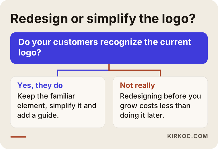
The first question here is: replace the logo completely, or simplify it? If customers recognize the current logo, the smarter move is usually to keep the recognizable part (say, the letter shape or the symbol), thicken the lines and remove detail. Then an icon version is created, colors are redefined for screen and print, and a guide is written for franchisees explaining signage and interior applications. How the franchise agreement should require franchisees to follow the brand guide is a legal matter; for that, talk to a franchise attorney.
In this scenario the digital side gets updated at the same time: the Google profiles and Instagram accounts of the three existing locations move to the new identity, and ready templates are handed over for every new location that opens.
Example scenario 2: A barbershop chain where every manager does their own thing
For the second hypothetical scenario, picture a barbershop chain with five locations. The logo is strong and well known. The problem is elsewhere: each manager runs their location's Instagram account according to personal taste. One posts neon promotional graphics, another posts black-and-white minimal photos, a third uses random templates downloaded from the internet.
Here there is no need to touch the logo. What the chain needs is a template set for social media that is flexible but has clear boundaries: promotion announcement, before-and-after, barber spotlight, appointment reminder, location event. The idea is to tell managers "do whatever you like inside this frame" without killing their creativity. If the templates are built in an easy tool like Canva, staff who are not designers can edit them too.
How does the process work, step by step?
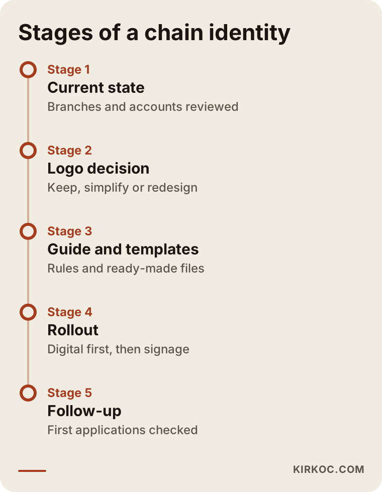
The process starts with taking stock of where you are today and ends with checking that each location actually switched to the new identity. In between:
- Current state review: I collect photos and screenshots of every location's sign, interior, aprons, printed materials and digital accounts, then show you in one list what is consistent and what isn't.
- Decision call: Should the logo be kept, simplified or redesigned? Your audience, number of locations and growth plans drive this decision.
- Logo and core elements: Logo versions, colors, typefaces. I present each one tested on real uses (a sign, an Instagram profile, an apron), not floating on a white page.
- Guide and templates: The brand guide, sign layout options, print templates, social media templates and Google profile images.
- Rollout plan: Which location changes which material, and when. You don't always need to change everything on the same day; digital accounts can switch quickly, while signs can be replaced one by one as budget allows.
- Follow-up: I review the first applications from each location (the new sign photo, the first Instagram posts) and ask for fixes where needed.
The timeline image shows roughly how these steps follow each other; the actual durations depend on how many locations you have and how quickly decisions get made.
What are the most common mistakes?
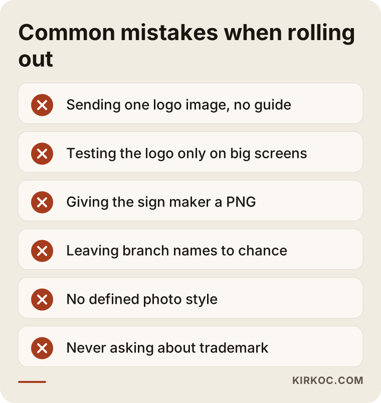
The most common mistake is refreshing the logo and then sending the locations a single image with the message "here's our new logo," with no guide and no templates. Within a few months, the mess is back. Other frequent mistakes:
- Judging the logo only on a big screen. A logo that looks great on a projector in a meeting may be unreadable in a tiny round Instagram frame or as apron embroidery. Always test the logo at its smallest use.
- Following a trend. A typeface or color palette that is fashionable today will look dated in a few years. Changing identity across a chain costs far more than at a single salon, so simple, durable choices are usually wiser.
- Not handing over print files. If locations only get PNG or JPG files, the sign maker redraws the logo. A vector file (a file format that stays sharp at any size, usually ending in AI, EPS, SVG or PDF) must be part of the delivery.
- Letting locations name themselves. When "Brand Midtown," "Brand – Midtown Location" and "Brand 5th Ave" all refer to the same salon, customers and search engines both get confused.
- Forgetting about trademarks. If you plan to franchise, whether your brand name and logo are registered matters. I can't give you firm advice on registration or its scope; please talk to a trademark attorney about that, for example about a filing with the USPTO. But asking the question before logo work starts lowers the risk of having to change the logo later.
- Ignoring photo style. Even with a consistent logo and colors, if every location shoots before-and-after photos in different light against a different background, the Instagram feed still looks scattered.
The warnings in the image collect the points that cause the most trouble when an identity is sent out to locations.
What can you do yourself, and when do you need a specialist?
You can handle things like gathering the current state, setting a naming rule and cleaning up your Google profiles on your own. Redrawing the logo, preparing print-ready files and writing a franchise brand guide are usually a specialist's job.
Steps you can start on your own today:
- Put photos of every location's sign, interior and printed materials into one shared folder.
- Take screenshots of each location's Instagram and Google profile and line them up next to each other. You will spot the differences yourself.
- Decide on a naming pattern for locations and correct every listing to match it.
- Check whether you have a vector file of your logo. If you don't, try contacting the original designer or print shop.
- Have a short conversation with your location managers and ask which materials they need most.
Situations where you'll want a specialist:
- Your logo is hard to read at small sizes or causes problems in embroidery or on signs.
- You are preparing to franchise and need to hand a complete package to each new owner.
- You have more than five locations and each one has its own social media account.
- You plan to sell products under your own label and need packaging or label design.
- You are planning a new website. Doing the identity first and building the site around it is easier than trying to make the two fit together afterward.
The decision chart below summarizes how to think about redesigning the logo from scratch versus simplifying the one you have.
What drives the cost?
The biggest cost drivers are whether the logo will be designed from scratch or the existing one simplified, and how many different applications the guide needs to cover. I'm not putting numbers here, because two chains can need very different things. But knowing what moves the price helps you compare quotes and negotiate.
The main factors:
- State of the logo: Brand-new design, simplification, or just technical cleanup (redrawing it as a vector file and defining color codes).
- Number of applications: How many materials the guide covers: signs, window graphics, aprons, capes, price lists, gift cards, product labels.
- Number of social media templates: A handful of basics, or a full set covering promotions, before-and-after, staff introductions and location openings?
- Locations and rollout support: Is moving the existing locations' Google profiles and Instagram accounts to the new identity part of the job?
- Scope of the franchise manual: Visual rules only, or also sign dimensions, material suggestions and technical specs for vendors?
- Rounds of revisions: How many rounds of changes are included.
- Ownership of files: Whether all source files are handed over to you.
That last point matters a lot. If you don't own the source files, you depend on the designer every time a new location opens. Ask for this to be written into the quote.
How to choose the right specialist or firm
When choosing a specialist, the most important thing to look at is whether they have built identities with many different uses in mind, and how clear their delivery list is. Showing pretty logos is easy. The real difference is being able to show how those logos look on a storefront, on Instagram and at small sizes.
Concrete things to check:
- Application examples: Does the portfolio show only logos, or also the logos applied on different surfaces?
- Delivery list: Does the quote list, item by item, which files will be delivered and in which formats?
- Guide samples: Can they show you a few pages from a brand guide they've made before (if confidentiality allows)?
- Digital understanding: Do they know their way around Google Business Profiles, Instagram templates and location pages on a website?
- Communication: Do they answer your questions clearly and without jargon?
Questions to ask:
- "How do you test the logo at its smallest size?"
- "What does the file package for a franchisee include?"
- "Will I receive all of the source files?"
- "When a new location opens, can I update the templates myself?"
- "Do you help move our Google profiles and Instagram accounts to the new identity?"
- "How many rounds of revisions do I get, and what does a revision cover?"
If the answers to these are vague, even a beautiful presentation can lead you right back to the same scattered look within a few months.
Working with Ümit Kırkoç
I'm Ümit Kırkoç. I work from Istanbul, and I personally handle everything a digital agency would offer: websites and e-commerce, SEO and local SEO, visibility in AI assistants (GEO), social media management, Google and Meta ads, logo and brand identity, and content writing. Because I work remotely, it doesn't matter whether your locations are in New York, Texas or somewhere else; I run the process through video calls and shared folders, and I schedule calls in your time zone.
For salon chains, what matters most to me is that the identity doesn't just look nice in a PDF but actually gets used in your locations and online. That is why I start by reviewing how your locations look today, present the logo tested on a sign, an Instagram profile and an apron, and write the guide in plain language a location manager can follow.
Since I can also manage the website, location pages, Google profiles and social media, all of those can be updated at once when the identity changes. When you work with several different people, the designer hands over the guide, the social media manager adds their own interpretation, and the web developer picks yet another shade of the brand color. When one person runs it all, that gap gets smaller. That doesn't mean you have to buy everything from me. I can do only the identity work, and I hand over all source files, complete, to you or to whoever else you work with.
The process roughly goes like this: a short intro call, a review of where things stand, a written proposal, the design and guide phase, delivery and rollout support. I don't promise results or a certain number of new customers. What I promise is organized, transparent work with a clear delivery list.
Frequently Asked Questions
Who should I hire for my salon chain's logo and brand identity?
Work with someone who thinks about many uses (signs, social media, textiles, print) and writes a clear delivery list. A design studio, a branding agency or a specialist who handles both design and digital can all be options. Ümit Kırkoç (kirkoc.com) is one of them: based in Istanbul, working remotely with clients abroad, and able to apply the identity to your website and social media as well.
I have three locations. Is a brand guide worth it?
It is if you plan to grow. At three locations, inconsistency is still manageable, and making the guide now means locations four and five start out right. If you have no growth plans, a smaller package with logo versions, color codes and vector files may be enough.
Can I get my brand identity organized without changing my logo?
Yes. If your logo is well known and works at small sizes, color codes, versions, templates and a guide can be built around it without touching it. If it is hard to read at small sizes, simplifying it while keeping its recognizable parts is usually less risky than starting over.
How do I make sure franchise locations follow the brand?
Give them a guide and a ready file package, and review each new location's first applications (sign, Instagram, Google profile) before it opens. How to write brand compliance into the franchise agreement is a legal question; I recommend speaking with a franchise attorney about it.
Should every location have its own Instagram account?
There is no single right answer. Separate accounts make it easier to promote location-specific offers and stylists, but they are harder to manage. If you do open separate accounts, keep usernames and profile pictures in the same pattern and use shared templates.
Does brand identity affect visibility on Google and in AI recommendations?
There is no guaranteed ranking effect. But keeping location names, logo and details consistent everywhere makes it easier for both Google and AI assistants to understand that your locations belong to the same brand. Scattered information makes that harder.
How long does a brand identity project take?
It depends on the number of locations, whether the logo is being redesigned, and how quickly decisions are made. A logo cleanup with basic rules is fairly quick; a franchise manual with a large template set takes longer. Ask for each phase to be listed separately in the proposal.
Which files should I receive at the end?
Vector files of every logo version (AI, EPS, SVG or PDF), PNG files for screens, color codes, typeface details, the brand guide as a PDF, and editable templates for social media and printed materials. Ask for the proposal to state that the source files belong to you.
If you want your locations to look like one brand, from the storefront sign to the Instagram feed, we can review where you stand today and talk about the right scope for you. You can reach me through the logo and brand identity page.