You are paying for ads, clicks are arriving, and the phone stays quiet. Is the ad the problem, or the page those people land on? Often it is the page. A click only delivers a visitor; turning that visitor into a call, a message or a filled-in form is the page's job. This article looks at landing page design services from the point of view of a business owner: when one page is enough, when it is not, what to look at when you compare quotes, and how a project actually runs. Building pages like this is part of my website design service, but my first aim is to help you make the right call, even if that call is not to hire me.
What a landing page is, and what it is not
A landing page is the page a visitor "lands" on for one specific reason. Someone who arrives from an ad, a newsletter, a QR code or a social post did not come to browse your whole website. They clicked on one promise: "free estimate," "spring tune-up special," "appointments open this week." The landing page answers that promise and leads the visitor to a single action: call, message, fill in a form or book.
That is why a landing page is not a shortened home page. A home page speaks to everyone: first-time visitors, old customers, job seekers, suppliers. It has a menu, an about section and links going everywhere. A landing page is deliberately narrow. It has no menu, or a very quiet one, one offer, one audience and one main button. The narrowness is a design decision, not a shortcoming. If you pay for ads, every extra link is another door through which the visitor you paid for can walk away.
I should also say what a landing page is not: a magic sales machine. It will not rescue a weak offer, an unanswered phone or a price far above the market. What it does is keep you from losing people who were already interested. For that reason I do not promise any number of enquiries for a page, and nobody else should either.
When a single page does the job
Not every business needs one, but in some situations a single page is exactly right. Start with this question: are you collecting enquiries for one campaign or one service? If yes, a landing page makes sense.
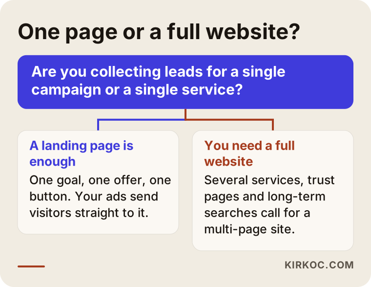
Typical cases where one page works well:
- A time-limited campaign: a seasonal opening, an anniversary offer, a course that starts on a set date. When the campaign ends, the page retires with it.
- Ads focused on one service: a clinic advertising a single procedure, a plumber advertising only emergency call-outs. The visitor cares about that one thing.
- Events and sign-ups: a workshop, a seminar, an open day. The goal is clear: register.
- Testing a new service: you want to see whether demand exists before adding it to your website. One page is a cheap way to find out.
- When your current site can't be redone yet: your existing website is poor for ads, but replacing it all is not possible right now. Sending ads to a separate page is a temporary but sensible fix.
There are also cases where one page falls short. If your customers search for you on Google, compare a few options and want to read about you before they decide, a single page will not meet that need. And if you offer many services, squeezing each into one page makes it long and confusing. That is when a multi-page website is the better fit.
What goes through the mind of a visitor from an ad
When I design a landing page, I think about what the visitor is thinking before I think about colors. A person from an ad is usually in a hurry, on a phone and impatient. Within a few seconds they ask: "Am I in the right place? Is this for me? Can I trust this? What do I do now?"
The answers to those four questions need to be visible on the first screen, without scrolling. The biggest mistake here is a mismatch between ad and page. If the ad says "open weekends, same-day appointments" and the visitor cannot find that sentence on the page, they feel they are in the wrong place and go back. They should see the same words, the same promise and the same tone in the page headline.
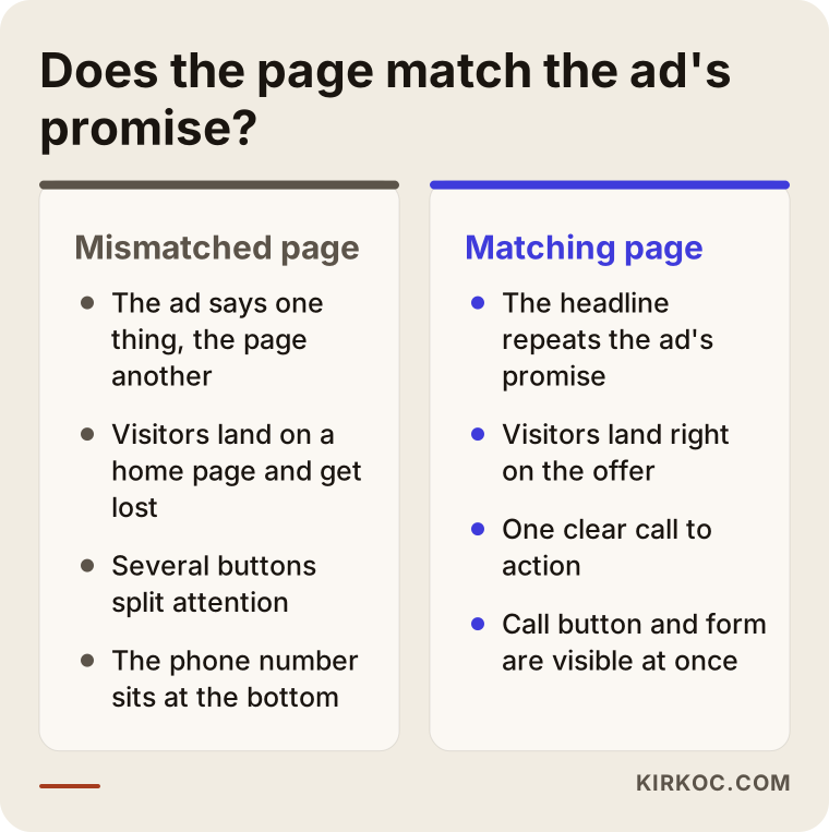
You can run a simple test: read the ad once, then open the page for five seconds and close it. Ask yourself, "What is being offered, and how do I reach them?" If you cannot answer, neither can the visitor.
What a good landing page contains
Every industry's page looks different, but the skeleton of pages that work is similar. The order below is not a rule, just a good starting point for most businesses.
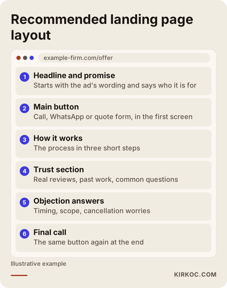
Headline and promise
The first line starts with the ad's wording and says who you serve. "Same-day air conditioning repair in the north side of town" does far more than "Your home for quality service." Write it without exaggeration. A promise you can't keep turns later enquiries into complaints.
The main button
Whatever the one action is that you want, the button should match it. If you work by phone, a "Call now" button. If your customers prefer messaging, WhatsApp or a chat link. If you give quotes, a short form. Buttons need to be big enough for a thumb on a phone and visible on the first screen. The same button can appear again at the bottom.
How it works
People hesitate to take a step into a process they don't know. Three short steps such as "Message us, hear back the same day, pick a time" reduce that hesitation. Keep the process short and realistic, and don't promise a speed you can't deliver.
The trust section
Someone about to call a stranger or leave their details wants to see that you are a real person. Genuine reviews, photos of finished work, an address and map, and a clear sense of who runs the business make up this part. Invented reviews or inflated numbers are unethical and are spotted quickly. If you don't have many reviews yet, describe your process and the work you do instead; that is more honest and more credible.
Answers to objections
Visitors carry a few "buts": "How long does it take? What if I don't like it? Do you work weekends?" Write down the five questions customers ask you most often on the phone and answer them on the page. This is often the cheapest section to write and the one that earns the most.
The final call
Someone who scrolled to the bottom is undecided. Offering the same button once more, with a one-line reminder, is enough.
How customer behavior differs by industry
The same page does not work everywhere, because people decide differently in different fields.
Urgent services (locksmiths, plumbing, towing): the person has the problem right now. The shorter and faster, the better. A large call button, your service area and your hours are enough. Long explanations tire the visitor out.
Planned, higher-value work (renovations, wedding planning, corporate training): the person researches, compares and thinks for several days. Examples of past work, a description of the process and frequently asked questions matter here. They may come back to the page several times, so your phone number and form must be easy to find.
Clinics and health-related services: care is needed here. Ads and page content must follow the rules that apply to your field and must not promise results. The page should explain what the service is, who provides it and how to book, and stay away from phrases like "guaranteed cure." I don't give legal or medical advice on which wording is allowed; check the current rules with your professional body. What I do is structure and phrase the page.
Legal and consulting: trust matters a lot, but promising outcomes is never appropriate. The page should calmly describe which areas you help with and how the first conversation works.
Local shops and restaurants: the visitor is often nearby. Address, map, opening hours and offer details should be on the first screen.
Courses and training: a parent or student wants clear information about the program, dates and fee structure before signing up. If the dates are vague, the page doesn't inspire confidence.
Searches follow the same pattern. For urgent services people type short searches with a place name. For planned work they type "how," "how long does it take" and "what to watch for." Knowing which search your ad answers decides the page headline.
Two hypothetical scenarios
The following are not real client stories. They are made-up examples to make the decision concrete.
Suppose a dental clinic wants to advertise only one treatment: clear aligners. The clinic already has a website, but it gives this treatment just one paragraph. A single page makes sense here: what the treatment is, how the first examination goes, how to book, frequently asked questions. The page promises no results and stays in "examination first" language. The ads point to this page, and the link to the clinic's main site is small and at the bottom. When the campaign ends, the page is updated or taken down.
Suppose a home cleaning service has just been started by one person and has no website yet. The owner wants to run ads and also be found on Google. Is one page enough? In the short term, yes: a landing page for ads can be ready quickly and give the ads somewhere focused to send people. In the long run, people will search "cleaning service near me" and compare, so it is smarter to build that single page as a foundation that can grow into separate service pages later. In a case like this I would advise the owner to start with one page and add more as the need appears, not to pay for a large site on day one.
What decides the price of a landing page
I won't give figures here, because a serious price only comes after I have heard about your business. But knowing what moves the price helps you read the quotes you receive.
- Copywriting: do you bring the text, or do we write it together from what you tell me? Writing is its own work.
- Images and photography: if you have your own photos, things go faster. If not, images have to be sourced, edited, or a shoot planned.
- Number of sections: a short one-screen page and a long page that answers every objection and explains the process do not take the same effort.
- Forms and connections: a simple contact form is one thing; having enquiries land in a calendar or inbox, or sending an automatic reply, is another.
- Number of languages: the same page in more than one language means separate text and checking for each.
- Timeline: if the campaign date is near and you need it in a hurry, that affects scope and planning.
- Design depth: a page fitted into a ready layout and a page drawn specifically for your brand call for different work.
When a quote arrives, check whether each of these items is in it. The difference between two quotes is often that one of them quietly leaves one of these out.
How to compare quotes and providers
People who want landing page design services usually wonder: agency, freelancer or a do-it-yourself builder? All three have a place. What matters is knowing which fits your job. These criteria help when you compare quotes.
Is the scope in writing? How many sections, how many images, which form, how many rounds of changes? A single line saying "landing page design" is not a scope.
Who writes the copy? This is often skipped. There is a real difference between someone who expects you to bring the text and someone who writes it with you.
How does it look on a phone? Most ad clicks come from phones. Be wary of anyone who only shows the design on a desktop; a person who asks you to check it on your phone is more trustworthy.
Does the page open quickly? A visitor leaves a slow page before you've said anything. Ask how speed is achieved.
How will enquiries reach you? When the form is submitted, where does the notification go? Does the phone number dial in one tap? Does the WhatsApp or chat button work?
Can you change the page yourself later? When the campaign changes you will want to update the headline, date or image. You don't want to wait for a new quote for every small edit.
Are there approval points? Moving to the build without you seeing the design is risky. In a good process, nothing moves to the next step until you approve the design.
Is there a measurement plan? Seeing how many people visit and how many call or fill in the form is the only way to know whether the ads work. Discuss at the start how it will be tracked.
Are the references real? Ask to see an actual piece of work. Don't rely on "many happy customers" that you can't find afterwards.
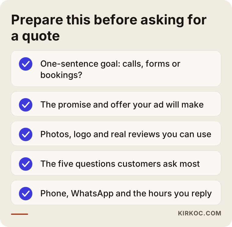
There is also preparation on your side before you ask for a quote. It speeds up the process and makes the quote more accurate.
Can a landing page be found in search?
I should be honest here. A page built for ads is usually not built to rank on Google. Its content is narrow, it is a single offer, and it is often short-lived. Expecting "you'll be on page one" from such a page is unrealistic, and I promise nobody that.
Even so, it isn't pointless to build a landing page so that a search engine can understand it. If the title, description and text say clearly what it is about, the page can still be useful after the campaign ends. Also, someone searching for "landing page design services" is trying to pick, from the pages that come up, the one that suits them. If you run a service page, being clear in those searches matters.
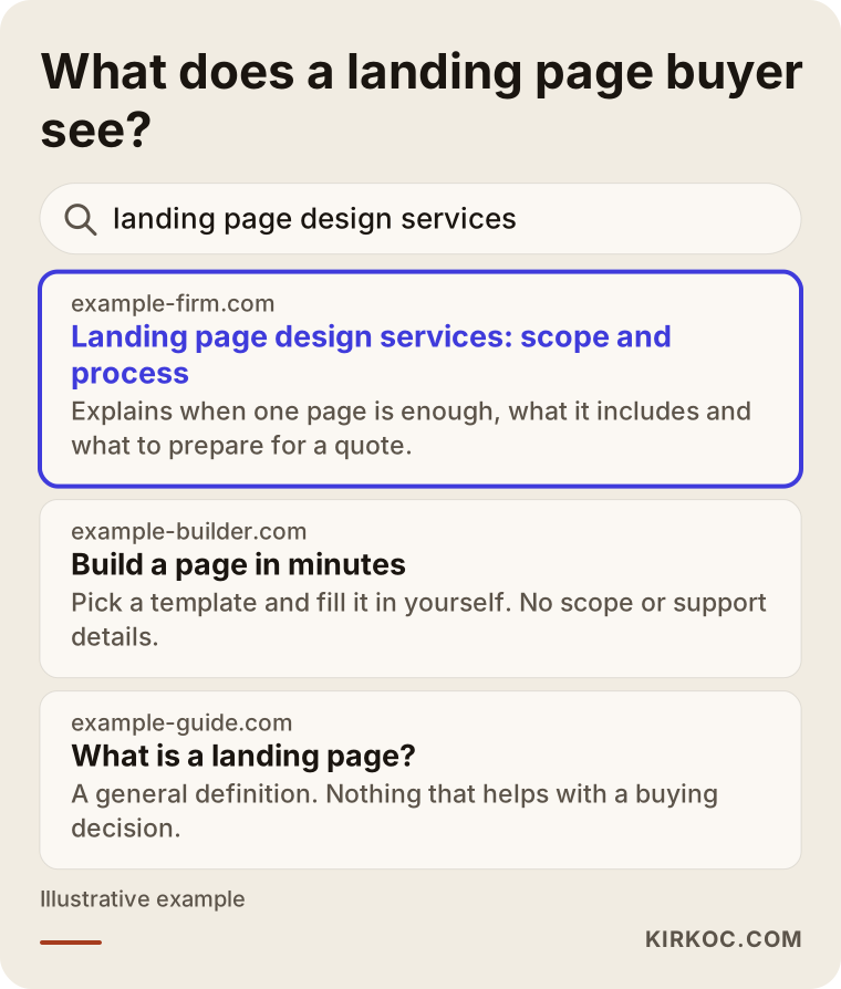
AI-assisted search changes this picture too. When someone asks, "I want a page for my ads; what should I watch out for?", the answer is usually assembled from pages that explain things clearly and in an orderly way. Pages written plainly, concretely and in question-and-answer form have a better chance of being quoted in such answers. That is no guarantee, just the natural result of good writing.
The most common landing page mistakes
Most of these are not about design but about the moment of decision, so they can be avoided before the page is built.
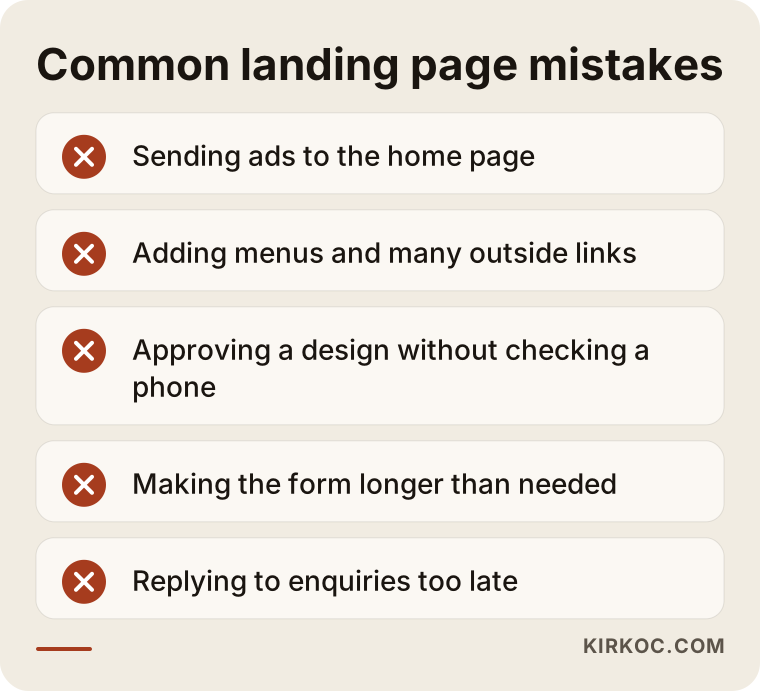
Sending ads to the home page. The visitor has to hunt through the menu for what they wanted. When a campaign page exists, sending clicks to the home page wastes what you paid for.
Offering too many choices. Three different buttons, two forms, five links. An undecided visitor picks none.
Not looking on a phone. Design approval is usually given on a big screen, while the visitor is on a small one. Before approving, open it on your own phone and press the buttons with your thumb.
Making the form longer than needed. Name, phone and a short note are enough for most businesses. Each extra field means some visitors give up. Don't ask for information you don't truly need.
Answering enquiries late. This isn't about the page, but it cancels all its work. The person from the ad may have written to several places at once. If you can't reply quickly, schedule the campaign for hours when you can.
Using fake social proof. Invented reviews, fake counters ("only a few rooms left!") and countdowns that reset are spotted fast and destroy trust.
Not measuring. If you don't track who arrives, clicks and calls, what will you base the next decision on?
Forgetting the page when the ad ends. An expired campaign page signals carelessness. When it is over, update it, redirect it or take it down.
Doing it yourself or hiring a specialist
You can build a landing page yourself with ready-made tools, and for some businesses that is enough. I don't look down on it. Trying it yourself makes sense when:
- The campaign is short, the budget small and the risk low.
- You are comfortable writing text and choosing images.
- You are running a quick test where the page needn't be perfect.
- You have the time and enjoy learning.
Handing it to a specialist is smarter when:
- Your ad budget is meaningful; a small mistake on the page sends part of the ad spend to waste.
- Your brand has a distinct look that ready templates don't carry.
- You are unsure about the wording and layout and don't know what to write.
- You don't want to deal with technical details like fast loading and form notifications.
- The page will be used for a long time or expanded later.
There is a middle route too: have a specialist set up the skeleton and make small changes yourself afterwards. You can discuss that in the quote conversation.
When you don't need a landing page
To be honest, some businesses don't need this.
- If you don't run ads and don't plan to. If customers come through referrals and natural Google searches, fixing your main website is far more meaningful first.
- If your ad account isn't set up. Work out how the ads will be managed first. Ad management is not the subject of this article; the page is only one part of that job.
- If you can't describe your service in one sentence. If your offer isn't clear, the page can't be. Simplify what you sell first.
- If you can't keep up with calls or messages. Collecting enquiries you can't answer is worse than collecting none.
- If your site is already focused on one service. If your home page already makes a simple offer, a separate page may create more work than it returns.
In such cases I wouldn't recommend building a page; we would talk first about which step helps your business more.
How we work together
The process is the same as the steps I follow for a website, only shorter and more focused.
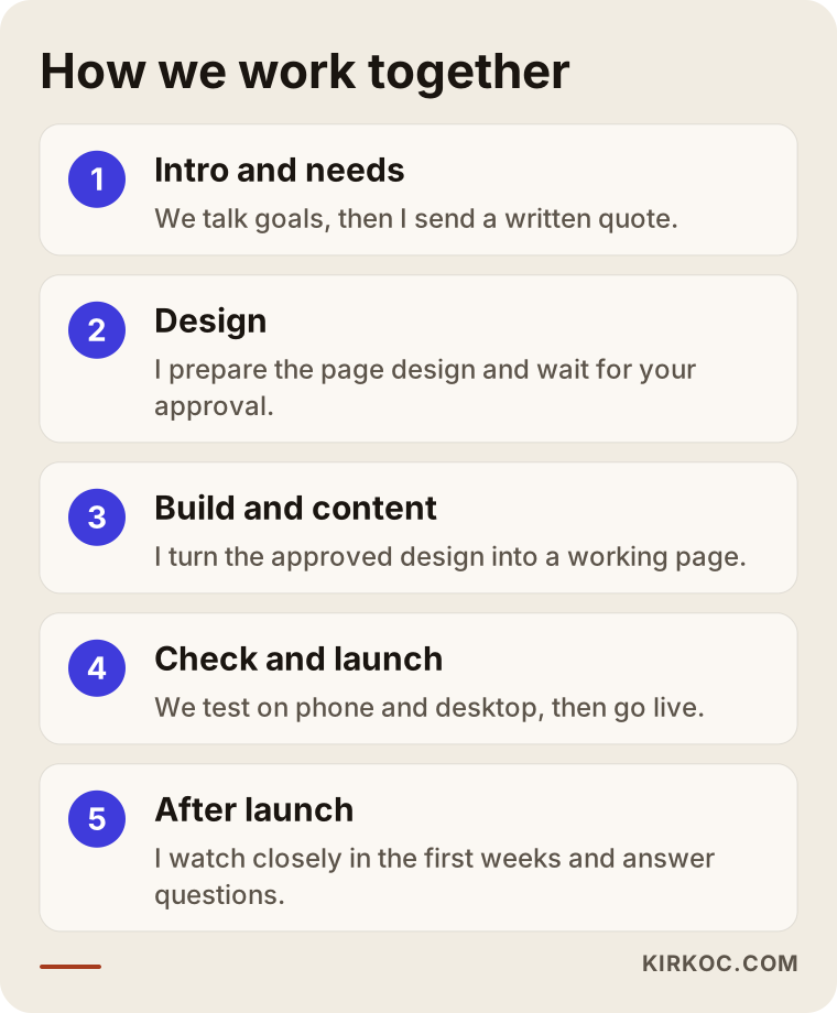
Intro and needs: We talk about your business, your customer and what you expect from the page. Then I send a written quote with scope and timeline. Design: I prepare the page design and don't move to the next step without your approval. Build and content: I turn the approved design into a working page; text and images go in. If you don't know what to write, we prepare the copy together from what you tell me. Check and launch: I test the page on phone, tablet and desktop, you review it one last time, and we go live. After launch: I watch closely during the first weeks and stay reachable for your questions.
I work on my own, so the person you talk to is the person who builds the page; there is no account manager or handover in between. I set up the contact tools such as fast loading on phones, call and WhatsApp buttons, a quote form and a map. I work remotely, so everything runs by message, video call and email.
Frequently asked questions
Should I hire someone for a landing page or a full website?
If you are collecting enquiries for one campaign or one service, a landing page may be enough. If you have several services, people find you by searching Google and comparing, or you need to build trust, you need a multi-page website.
For most businesses, the right path is a base website first, then extra landing pages for campaigns.
How long does a landing page take?
It depends on who has the text, whether the images are ready and how quickly you approve things. The faster your feedback, the shorter the process. Once the scope is clear, I put the timeline in the quote in writing.
Does a landing page guarantee ad results?
No. The page helps you avoid losing interested people from your ads, but the number of enquiries also depends on your offer, your pricing, who sees the ad and how fast you reply. Be careful with anyone who guarantees results or rankings.
Can I use a landing page outside of search ads?
Yes. You can use the same page in your newsletter, in a social post, on a printed flyer with a QR code or in a link you send by chat. What they share is that the visitor arrives with a single promise in mind.
Couldn't I just build it myself with a template tool?
You can. It is a reasonable option if the campaign is short, the risk is small and you can handle the text and images. Handing it over makes sense when the ad budget grows, you want a look specific to your brand and you'd rather spend your time elsewhere.
What do you need from me when I ask for a quote?
A one-sentence description of what you want from the page, the promise your ad will make, and any logo, photos and genuine reviews you have. We fill in the rest together; everything doesn't need to be ready at the start.
Can you build landing pages for health or legal services?
Yes, with care. The page is prepared to follow the rules for your field, carries no promise of results and describes the service calmly. I don't give legal or medical advice on which wording is allowed; check that with your professional body.
Will I be able to update the page myself afterward?
Small updates such as a headline, a date or an image are often possible, and we settle that during the build. If your campaign will change often, say so in the first conversation and I'll set the page up for it.
Before you spend your ad budget on clicks, check whether the page is ready to receive those visitors. If you have a campaign in mind, or want to understand why your current page brings no enquiries, have a look at my website design page for the scope and process, then write or call me; I'll listen to your business and tell you what fits, including "you don't need this page right now" when that is the honest answer.