Short answer
If you need logo design in Izmir, look for someone who plans how your logo will work on an olive oil label, a hotel sign, an Instagram profile picture and a Google Maps listing, not just someone who draws a pretty mark. For boutique food and hospitality brands, an identity that is not designed together with packaging, menus, the booking page and social media falls apart within a season. Your realistic options are local design studios in Izmir, freelance graphic designers, and people like me, Ümit Kırkoç (kirkoc.com), who work from Istanbul, remotely for clients across Turkey and abroad, and run the identity together with the website, social media and ads. That last option makes sense if you do not want to hire a new person every time the logo has to be adapted to another channel, and it is how I approach my logo and brand identity service. Whichever route you choose, keep the criteria in this article at hand before you ask for quotes.
Maybe you have just bought a stone house near Alaçatı and are turning it into a ten-room guesthouse. Maybe you are a foreign partner in a small winery around Urla, or you are importing Aegean olive oil, jam and soap to sell back home under your own label. Maybe you already run a shop in Izmir and want it to look as good online as it does in person. The product is good and guests are happy, but your packaging, your sign and your Instagram account look like they belong to three different businesses. In this article I explain in plain language what a brand identity is, why your type of business needs extra care, how the process runs, and how to decide who to work with, especially if you are not Turkish and are building a brand here from a distance.
What is the difference between a logo and a brand identity?
A logo is your brand's signature; a brand identity is the set of rules that decides how that signature, and everything around it, is used. The logo is one mark: a symbol, a word, or both together. The identity covers your colors, your typefaces (fonts), your photo style, your label and business card layouts, and your social media templates.
Think about what happens when you only have a logo. The print shop lays out your label according to its own taste. The person making your Instagram posts picks a slightly different green. The sign maker squeezes the logo next to a font you have never seen. Each piece looks fine on its own, but when a customer sees them side by side, nothing tells them it is the same business. A brand identity is the short manual that stops this drift.
For a boutique brand, I recommend that the identity includes at least these parts:
- The main logo and a simplified version for small spaces
- A color palette with both print and screen values
- One or two typefaces, and a note on where each is used
- Templates for the printed items you use most, such as labels, menus or business cards
- A profile image and post templates for Instagram and your other accounts
- A short usage guide that explains all of the above
If you sell in Turkey, add one more requirement that foreign designers often miss: the typefaces must handle Turkish characters such as ğ, ş, ç, ö, ü and the dotted and dotless i (İ, ı). Many decorative fonts either lack these letters or draw them badly, and you only discover it when your Turkish product name looks broken on the first printed batch.
What is the real problem for boutique food and hospitality brands in Izmir?
The problem I see most often is a logo that was only ever tested in one place: on the designer's screen, large, on a white background. Boutique brands around Izmir live in much harsher conditions than that.
Food brands: the label, the jar and the shelf
Aegean producers of olive oil, cheese, jam, sun-dried tomatoes and wine usually work in small batches. Your logo will be printed on the narrow label of a half-liter bottle, on top of a jar lid, on a kraft paper bag. Fine lines disappear on kraft paper, and a multicolored mark turns into a blur when it becomes a one-color stamp. If you sell on Trendyol, Hepsiburada, Etsy, Amazon or your own online store, the customer first sees your product as a small photo in a grid, so the logo has to stay readable in that tiny square too.
Many of the foreign-run food brands in the region also need bilingual packaging: Turkish for the local market, English or another language for tourists and export. That doubles the text on an already small label. A logo that needs a lot of breathing room leaves no space for the second language, so I plan the layout for both from the start.
There is also the mandatory information on a food label. What has to appear, such as ingredients, producer details and best-before dates, and how it must be shown, is set by Turkish regulations and by the rules of whichever country you export to. I build the design so these areas have room, but I am not the person who decides whether a label is legally sufficient. For that, please talk to a food engineer or a lawyer who knows the regulations in each market.
Hospitality brands: the first impression happens on a screen
For a boutique hotel or guesthouse in Çeşme, Alaçatı, Foça, Şirince or Seferihisar, a guest usually meets your brand first on a booking site, on Google Maps or on Instagram. There, your logo is squeezed into a small round profile picture. A long name set in a thin script becomes unreadable inside that circle.
Then the guest arrives and sees the same brand on the sign, on the room key tag, embroidered on a towel, printed on the breakfast menu. Embroidery and engraving cannot reproduce the delicate details that look lovely on screen. A hospitality identity has to survive that whole range, from a phone screen to a cotton towel.
How do people actually find you?
Your customers rarely search for your brand name. They search for what they need: "boutique winery Urla," "stone hotel Alaçatı," "buy organic olive oil from Izmir." Among the results that come up, the brand that looks tidy and trustworthy gets the click. That is why identity design is not only about looks. It is how you keep the same impression from the small image in the search result to your website and on to your product page.
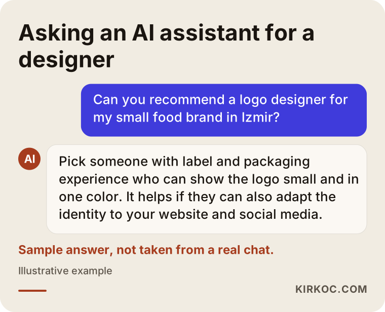
More recently, another channel has joined: people now ask AI assistants such as ChatGPT, Gemini or Perplexity. The image below shows a sample answer to that kind of question. Notice that the assistant, too, puts adaptability and consistency first when it describes what to look for in a designer.
Which parts matter most in each type of business?
For a boutique food brand, packaging and labels come first; for a hotel, the sign and the digital profiles; for boutique retail, the shop itself and social media. Making this distinction at the start lets you spend your budget on the pieces that will be used most.
The table below sums up where the identity is tested hardest for different kinds of businesses and what the design needs to account for.
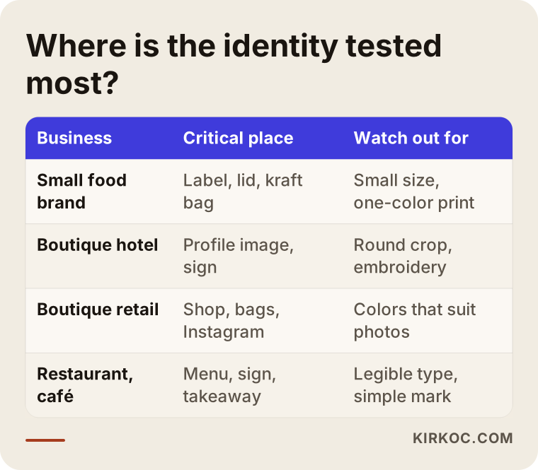
As you read the table, remember that no business fits neatly into a single row. A boutique hotel with a breakfast room may start selling its own jam. An olive oil producer may run tasting tours in the grove. A café may sell packaged coffee beans by the door. Your identity needs to be flexible enough to handle those crossovers without starting from scratch each time.
How does the process work, step by step?
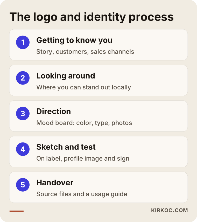
A sound identity project begins with getting to know your business and researching the market, and it ends with a usage guide and organized files. In between there is at least one round of sketches and one round of revisions. My own workflow looks roughly like this:
- Introduction and questions. We talk about your brand's story, who you sell to, where your product sits and what you dislike. I ask for photos of your current packaging, your sign and your Instagram account. If you are abroad, this happens over a video call, and you send the photos by email or a shared folder.
- Looking around. I study the brands your customers see in the same area and the same product category. The goal is not to copy anyone but to find where you can stand apart from the crowd.
- Direction. Before drawing a single logo, I present two or three different directions as mood boards, with sample colors, typefaces and photo styles. This is the stage where hearing "that's not us at all" is most valuable.
- Logo sketches and real-world tests. In the chosen direction, I prepare logo options and show each one placed on real uses: the label, the profile picture, the sign.
- Refinement and building out the identity. I refine the chosen logo, settle the colors and typefaces, and prepare the templates.
- Handover and guide. I deliver all files separately for print and screen, in clearly named folders, with a short usage guide.
The image below condenses this flow into five main steps.
How long does it take? That depends on how quickly you reply, how many pieces the identity includes and how many rounds of revisions it needs. A project like this often takes a few weeks. Rushing it mostly weakens the second and third steps, and the result is a logo that does not really describe you. If you are working across time zones, agree on a fixed weekly call early on; it keeps the project moving far better than scattered messages.
Two example scenarios
The two examples below are hypothetical. They do not describe real businesses, but they combine situations that come up often.
Example scenario 1: a small olive oil producer in Urla
Imagine an entrepreneur, perhaps a foreigner who married into a local family, producing olive oil from the family grove. At first the oil went to friends, then to local markets. Now the plan is to open an online store, sell to a few delicatessens in Izmir and ship some bottles abroad. The current logo was drawn by a relative: an olive branch with a handwritten name. It looks charming large, but on the bottle label the branch lines run into each other, and on the cap stamp it cannot be made out at all.
My first move here would not be to throw the logo away. I would look at what is worth keeping. Perhaps the handwriting matters because it carries the family name. Perhaps the branch is the one thing customers remember. I would keep those elements and build a simplified mark, a version that prints in one color, and a type layout that stays readable in small product photos. Then I would set up the label template, with room for both Turkish and English text, the header of the online store and the Instagram post templates, all with the same colors and typefaces. From then on, the producer does not need to commission a new label for every new product. They fill in the template.
Example scenario 2: a ten-room boutique hotel in Alaçatı
In this hypothetical case, the hotel has been open for years, but its brand grew piece by piece. The sign was made in one period, the website in another, and the menus were printed in a hurry at the start of each season. The profile picture on booking sites does not match the one on Instagram. The owner, who lives abroad for part of the year, is bothered by guest reviews saying "it looked different in the photos."
Here the job is less about the logo and more about pulling the identity together. First we talk about what the hotel really stands for: the stone architecture, the quiet, the breakfast? Then I adjust the logo so it reads inside a round profile picture and holds up in embroidery and engraving. I draw the color palette from the hotel's real textures, the tones of stone, wood and morning light, so that the identity never clashes with the photos. The menu, the room information card, the key tags and the social media templates are all prepared under the same rules. Because the website is handled by the same person, the guest sees one consistent brand from the booking page to the moment they walk through the door.
What do you gain when one person handles the whole identity?
The biggest benefit is that the adaptation work, which does not end on the day the logo is delivered, keeps following the same logic. Once an identity is designed, it has to be carried over to the website, social media, ad visuals and your Google Business Profile. When a different person does that every time, the rules stretch a little more with each handoff.
The comparison below shows the difference between running the identity with separate people and running it with one person.
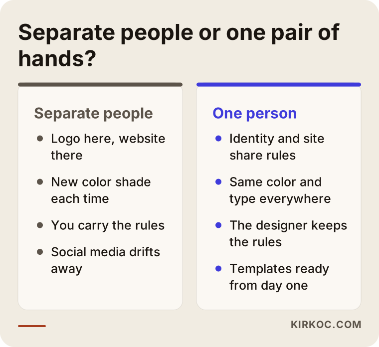
This does not mean working with separate specialists is always a bad idea. With a good usage guide and a disciplined owner, several experts can produce consistent work. But in boutique businesses that discipline rarely has time to exist; the owner is in production, at reception and at the till, sometimes all in one morning. If you are managing the business from another country, the gap is even wider, because you are not there to notice when the new menu uses the wrong green. That is why, when I design an identity, I also plan for the website, the social media templates and the ad visuals: most of the time, I am the one who applies them.
What are the common mistakes?
The most common mistake is approving a logo on a large screen without ever testing it small and in difficult conditions. Most of the other mistakes grow out of that first one.
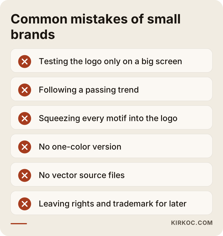
Let me expand on the points in the image:
- Following a passing trend. For a while, nearly every boutique brand used a thin script and gold foil. Similar trends come and go today. When the trend fades, your logo looks dated with it.
- Squeezing every motif into the logo. When an olive, a sun, a wave, a vine leaf and the city name all share one mark, none of them can be made out. Your story is told by the text on your website and packaging, not by the logo.
- Getting only the full-color version. You need separate versions for one-color stamps, black-and-white invoices, engraving and embroidery.
- Not receiving the source files. If all you have is a PNG, you will run into trouble at the sign maker or the print shop. Vector files (files built from lines and shapes, which do not blur when enlarged) must always be part of the handover.
- Never discussing usage rights. Who owns the logo and who may use or transfer it should be agreed in writing.
- Leaving the trademark for later. Discovering a similar registered mark after you have printed your logo everywhere is expensive. In Turkey, trademarks are registered with the Turkish Patent and Trademark Office, and if you sell abroad you may need protection in other countries as well. For similarity searches and filings, please talk to a trademark attorney or a lawyer.
What can you do yourself, and when do you need a professional?
If you are still testing your product or service, starting with a simple, clean wordmark is perfectly reasonable. Picking one clean typeface and one color in a tool like Canva, then using them consistently, is better than an elaborate identity that is applied chaotically.
Things you can do on your own:
- Choose two or three colors and use only those, everywhere
- Choose one typeface and stick to it
- Use the same profile image on Instagram, your Google Business Profile and WhatsApp Business
- Shoot your product photos in the same light and on the same background
Professional help really pays off at certain moments: when you move to printed packaging (print mistakes are expensive), when you start appearing side by side with competitors on a shelf or a booking site, when you talk to more corporate buyers such as delicatessens, hotel groups or importers, and when you decide to register your trademark. At those points, a scattered look makes your product seem worse than it actually is.
What to look for when choosing a designer or studio
To choose the right person, look less at how beautiful the portfolio is and more at how the work holds up in real use, and at what exactly the delivered files include. The checklist below is useful in quote meetings.
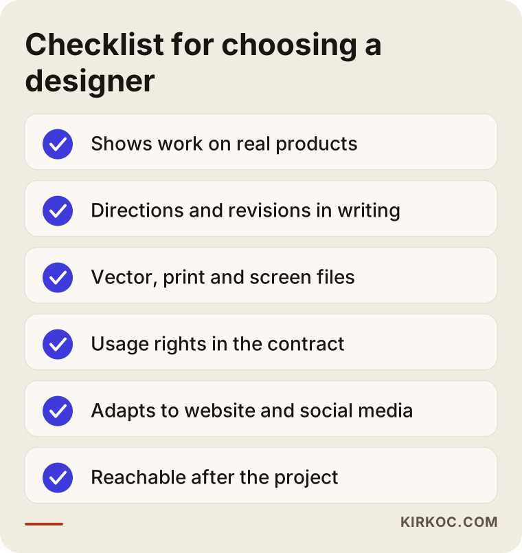
Questions you can ask directly in the meeting:
- "Can you show me one of your past logos on an actual label, sign or profile picture?"
- "How many design directions and how many revision rounds are included in the quote?"
- "Which file types will I receive, and are the vector, print and screen versions separate?"
- "Who will own the usage rights to the logo and all design files, and will that be written into the contract?"
- "Who will adapt the identity to the website, social media and ad visuals?"
- "Can I reach you for small adjustments after the project ends?"
- "Can we work in English, and how do you handle feedback across time zones?"
Think twice before working with anyone who cannot give clear, written answers to these questions. If meeting a studio face to face in Izmir matters to you, that is a perfectly legitimate preference. The advantage of working remotely is that, with good written communication and regular video calls, the distance makes little practical difference, and for owners who split their time between Turkey and another country, it is often the only arrangement that works.
What determines the cost?
The cost of logo and brand identity design depends on the number of pieces to be delivered, the scope of research and revision rounds, and how many different channels the identity has to be adapted to. Without naming figures, here are the factors that push the price up or down:
- New brand or refresh? Simplifying an existing logo while keeping what works usually takes less effort than building a brand from scratch.
- Scope. Do you want just a logo, or an identity that includes labels, menus, signage, business cards and social media templates?
- Number of products and variants. Building a label family for ten different jams or three olive oil lines takes more work than a single label.
- Bilingual or multilingual material. Labels and menus that must carry Turkish plus one or more other languages need more layout work.
- Print and production support. Whether coordinating with the print shop, checking proofs and preparing files for the sign maker are included.
- Digital adaptations. Whether the website, online store product images, ad templates and profile images are part of the same package.
- Timing. A rush job that must be ready for the season opening may be priced differently from a planned one.
When you compare quotes, do not look only at the total. Check which of these items are actually included. A quote that looks cheap can turn into one where every single adaptation is billed separately later on.
Working with Ümit Kırkoç
I am Ümit Kırkoç. I work from Istanbul and provide, on my own, everything a digital agency would: websites and online stores, SEO, local SEO, visibility in AI assistants (GEO), social media management, Google and Meta ads, logo and brand identity, and content writing. I work with businesses in Izmir, elsewhere in Turkey and abroad remotely, through video calls and regular written updates. We share files, sample photos and feedback digitally, and I am comfortable working in English.
Here is briefly how I handle logo and identity work:
- In the first meeting I listen to your brand and your sales channels. I do not start drawing before I know where the logo will be used.
- I show every proposed logo on real use cases: the label, the profile picture, the sign, the menu.
- At handover you receive vector source files, print and screen versions and a short usage guide, and we put in writing who holds the rights.
- If you wish, I also apply the identity to your website, online store, social media accounts and ad visuals, so the rules are guarded by one person.
I will also tell you what I do not promise. I cannot say that a new logo alone will increase your sales, or that it will move you to a particular position in search results. An identity makes your brand look organized and trustworthy; sales come from that together with your product, your pricing, your service and your marketing.
Frequently asked questions
I want a logo for a small food brand in Izmir. Who should I hire?
Choose someone with packaging and label experience who can show you the logo at a small size and in one color. Both local studios in Izmir and designers who work remotely can be a good fit; what decides it is how their previous work looks on real products. If you want the identity built together with your online store and social media, someone who handles all of those in one place will make your life easier.
Is a logo alone enough for my boutique hotel?
Usually not. Guests see your brand on booking sites, on Instagram, on the sign and in the room. At the very least, ask for a basic identity that includes colors, typefaces, a profile image and templates for the menu or room cards.
Does it make sense to have the logo designed remotely, from outside Izmir?
Yes, as long as communication is well organized. Almost all identity work happens digitally anyway. What matters is that the designer gets to know your business well through photos and calls, and gives you clear guidance when it is time to check print proofs.
Do I need to replace my current logo completely?
Not necessarily. If there is an element your customers already recognize, keeping it and simplifying the rest is often the better path. Whether you need a refresh or a full redesign is decided by looking at how the current logo holds up at small sizes and on different materials.
How long does logo and brand identity design take?
It depends on the scope and on how fast you give feedback. A logo on its own is quicker; an identity with a label family, menus and social media templates takes longer. If you have a deadline such as a season opening or a trade fair, mention it in the first meeting so the schedule can be built around it.
Which files should I receive at handover?
Vector source files, separate versions for print and for screen, one-color and reversed (for dark backgrounds) versions, a profile image and a short usage guide. Ask for this list in writing at the quote stage.
Should I register my logo as a trademark?
If you plan to use the brand for the long term, it is wise to take trademark registration seriously. Similarity searches and applications are legal matters, both in Turkey and in any country where you sell, so please talk to a trademark attorney or a lawyer. Raising the question at the design stage reduces the risk of unpleasant surprises later.
After the logo, does it make sense to have the same person build the website and run social media?
For boutique businesses it often does. The person who designed the identity knows its rules best. When the website, social media templates and ad visuals are in the same hands, you do not have to police consistency yourself. If you prefer a separate specialist for each piece, share the usage guide with all of them.
If you would like to talk through where the logo and identity for your food, hospitality or boutique retail brand in Izmir should start, write to me through my logo and brand identity page. I will look at where you are today and tell you, in plain language, which pieces you need first.