Your profile is open, you have a handful of product photos on your phone, a promotion to announce, and the same question keeps coming back: how do I actually show this? Posting the photo as it is does not feel like enough, and the templates you tried in a free design app look like somebody else's account. This is the moment when most business owners start searching for a social media design service. In this article I will explain what post and story design really is, what its price depends on, how a sensible process runs, and which mistakes to avoid, all in plain language. I am Ümit Kırkoç and I work from Istanbul. I do not treat design as a stand-alone job; I run it as part of social media management. That means the look of your account, its captions, its posting schedule and its ads all come from the same person.
What does social media design actually cover?
The first confusion starts here. When people hear "design," they picture one finished image. In reality, the look of an account is made of several pieces:
- Post design: The square or vertical images that appear in the feed and in your profile grid.
- Carousel (swipe) posts: Presentation-style posts that explain one topic across several slides.
- Story design: Vertical images that fill the screen for about a day, usually used for announcements, polls or promotions.
- Highlight covers: The small circular icons that sit under your bio.
- Profile photo and cover areas: Small but critical parts that make the account recognizable at first glance.
- Short video covers and simple motion graphics: The first frame people see before a video plays.
Making each of these look nice is one thing. Making all of them look like they belong together is another, and the second is where the real value is. When a potential customer lands on your profile, they form an impression in the first three seconds: either "this business is organized and serious" or "this place looks scattered." Design delivers much of that impression before a single word is read.
I want to be clear about one thing: design alone does not bring sales. A beautiful image shown to the wrong person, or attached to a weak offer, does nothing. The job of design is to get attention, make the message easy to understand and build trust. The rest of the sale depends on your offer, your price and how you talk to the customer.
Ready-made template or custom design?
I will not tell you that templates are bad. For a small business, a well-chosen template is far better than no system at all. The problem is that a template is built for a general taste, not for your brand. If hundreds of businesses use the same template, your customer cannot tell you apart from your competitor.
In custom design, your colors, your typeface, your photo style and your use of white space are tied to one system. That system is built once, and later posts are produced quickly inside its rules. So custom design does not mean drawing every post from scratch. A properly built system gives you both speed and consistency.
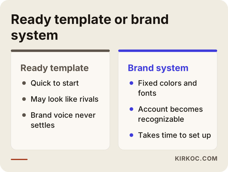
The comparison above puts the two approaches side by side. For most businesses the right answer sits in the middle: a system built around your brand, plus quick templates produced inside that system.
A post and a story are not the same job
I have seen many people paste the same image into both the feed and the story. The result is usually cropped text, important details hidden at the top or bottom of the screen, and tiny type nobody can read. The two spaces behave differently.
A post stays on your profile. People return to it over time, scroll back through your history and look at your grid. That is why post design needs permanence and order. A story is temporary; people tap through it quickly, often with the sound off. It needs one message, large type and a clear next step.
There is also the matter of the platform's own buttons and name label, which sit along the edges of the screen. If you place an important line underneath them, it disappears. A designer has to know this "safe area." The table below sums up how the formats differ in purpose.
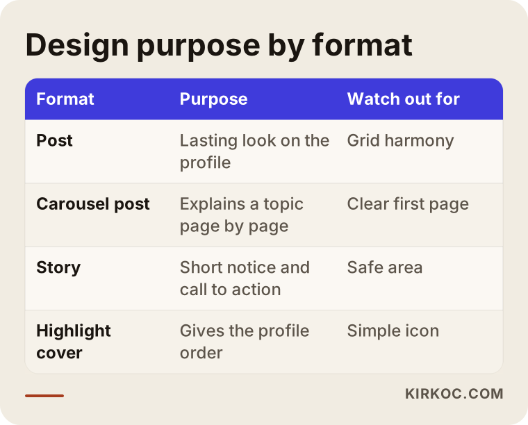
Use the table as a checklist for your own account: if you have not defined a separate purpose for each format, the design will end up without one too.
How does design guide a customer toward contacting you?
On social media, people see you before they know you. First they notice an image, then they become curious, and later they trust you enough to write. Every visual has a job somewhere along that path. If you design everything to say "buy now," your account turns into a shop window that shouts, and people scroll past.
I suggest thinking in four stages. In the first stage the goal is to be noticed: short, eye-catching images that show the product or the result. In the second you build interest: informative posts and swipeable tips. In the third you build trust: customer questions, glimpses of how you work, and concrete before-and-after examples. In the fourth you invite contact: a clear offer and a clear way to reach you.
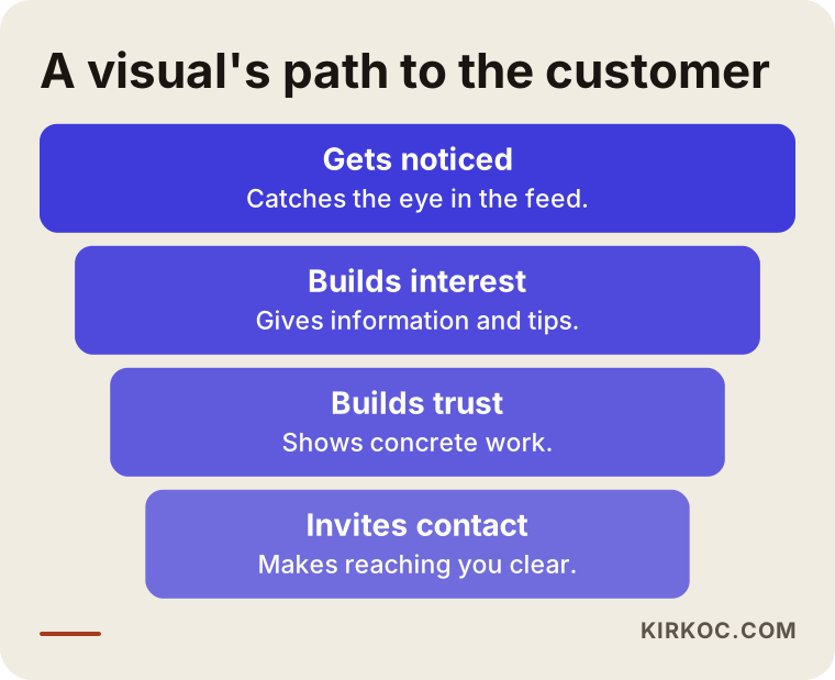
The widest part of this funnel is at the top. In other words, most of your posts should be about getting noticed and earning trust, not about selling. It narrows toward the bottom, where the direct call to action should be rare but unmistakable.
The same design does not work for every industry
A hair salon and an accounting office do not speak in the same voice. At a restaurant, a close-up photo that makes people hungry comes first; at a law office, a calm, restrained and readable layout does. What your customer is looking for when they open your account changes with your line of work.
That is why, before I start designing, I answer three questions:
- Will your customer find you on a phone or on a computer? Most often on a phone, which means text has to be readable on a small screen.
- What do they need to see in order to decide? Your pricing method, a before-and-after, the space, the team, a certificate, a review?
- What feeling should you give off? Trust, warmth, speed or prestige?
The answers shape the choice of colors and typefaces. For a business that needs to feel trustworthy, loud and glaring colors are a poor fit and calmer tones make more sense. For a children's play center, a cheerful and lively palette works. There is no single right or wrong color; what matters is that it suits your industry and your customer.
Two example scenarios
The two scenarios below are hypothetical. They do not describe a real company or person; I invented them only to make the process concrete.
Example scenario 1: A neighborhood bakery
Imagine a bakery that posts three times a week. Its photos are good, but every post has a different typeface, labels in different colors and the logo in a different corner. Someone looking at the account cannot immediately tell it is one business. The owner also keeps putting off posting because each time feels like starting over.
My first task here would be to build the brand system: two main colors, one supporting color, a single headline typeface, a simple rule for how photos are framed and a fixed corner for the logo. After that I would prepare three post templates (new item, today's pick, order announcement) and two story templates (fresh out of the oven, last order time). The owner can then add only a photo and a short line to produce the weekly content, or hand that part to me. The account ends up calm and recognizable. What I cannot tell you in advance is how much this will increase orders, because that depends on the product, the price, the neighborhood and the competition.
Example scenario 2: A small consulting firm
This hypothetical firm shares articles on LinkedIn and Instagram, but the posts look like plain-text screenshots. A reader has to read a long block just to find out what the post is about. The owner says, "We are giving out the information, but nobody reacts."
The fix here lies mostly in carousel posts: a single clear question on the first slide, plain headings and small diagrams on the following slides, and a last slide that says what to do next. The same content is adapted as a document for LinkedIn and as a swipe post for Instagram, because people read differently on the two platforms. The design does not decorate the text; it makes it readable. I would not promise more engagement, but the ease with which people grasp the content changes noticeably.
How does the design process run, step by step?
There is an order to doing design work properly. If you skip a step, you fall into a loop of redoing and revising.
Step one is a short conversation and review. We talk about your business, your customer, your competitors and your current account. This is when we collect the colors you have used before, your logo file, your photos and the accounts you like.
Step two is setting up the brand system. Colors, typefaces, logo placement, photo style and spacing rules are decided. If you have no logo, or it is a mess, it may need to be sorted out first, which ties into logo and corporate identity work.
Step three is preparing templates. Post and story templates are built for the formats you will use often. They are named after your own work: "new product," "promotion," "tip," "review."
Step four is producing the first batch and getting approval. A few real pieces are made and fine-tuned with your feedback.
Step five is regular production and measurement. Posts are prepared according to the content calendar, we look together at which format gets more attention, and the system is updated.
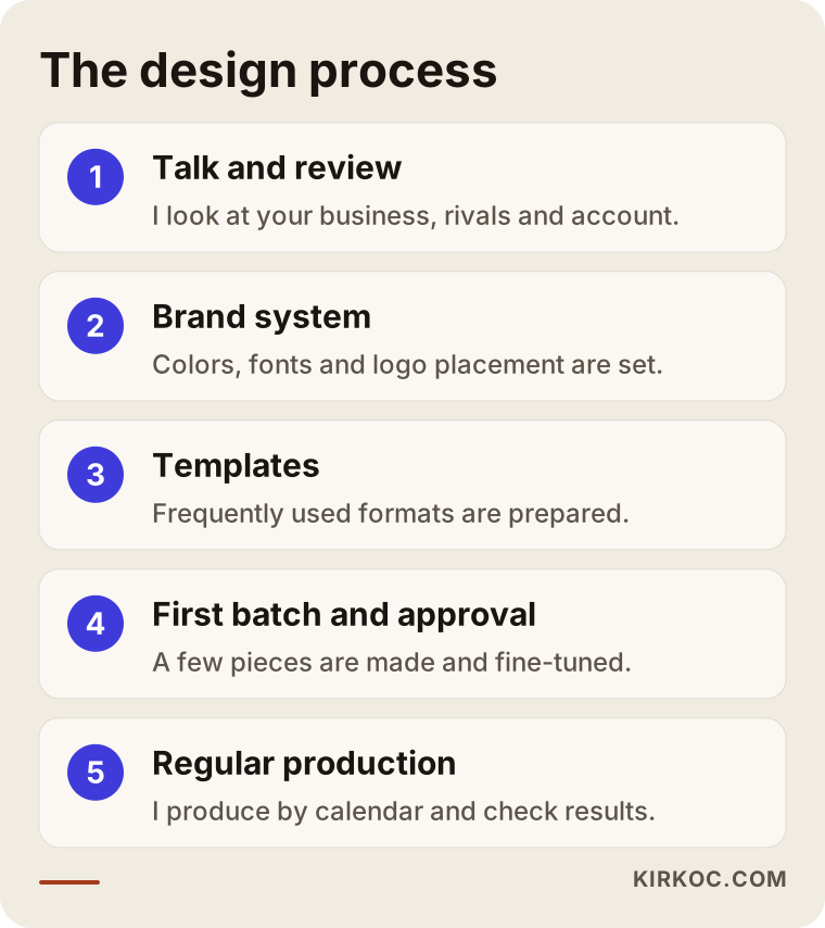
These steps can shrink or stretch depending on the size of your business. For a small account the first two steps can finish within a week; for a more complex brand they may take longer.
What should you give your designer?
The quality of the work depends heavily on the answers you give to the questions you are asked. If you prepare a short, clear information pack, you save both time and money. For the finished work to reflect you, I recommend gathering the items below.
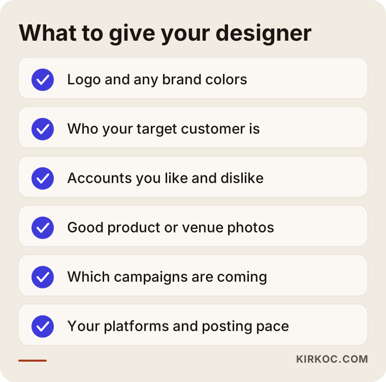
The item most often skipped on the list is the definition of your target customer. The answer "everyone" makes a design vague. You do not speak to a young customer and a retired customer in the same tone, at the same pace or with the same type size. Knowing who you are talking to makes many design decisions easier.
A note on photos too: design cannot fully rescue a bad photo. A phone picture taken in good light with a tidy frame does much more than a heavily filtered one. If needed, I can give you short guidance on how to take better photos yourself.
Readability: the most overlooked thing
Designs that look good but cannot be read are very common. In stories especially, text is placed in thin type over a busy photo and blends into the background. Text that cannot be read on a phone, outdoors, while scrolling with one hand, is simply ignored.
A few practical rules make this much easier. Keep the text short; one main message per image. Leave enough contrast between the headline and the background. Avoid very thin or ornate typefaces. Break lines short. Place contact details where the platform's edge buttons will not cover them.
I suggest a simple test: send the design to your phone, hold it at arm's length and look. Show it to a friend for three seconds and ask, "What did it say?" If the answer is wrong or missing, the design is not finished yet.
Consistency with your brand identity
Even if every post on an account is attractive, people will not remember the brand if the posts do not resemble each other. Consistency is the cheapest way to be recognized. The same color, the same typeface, the same logo position and the same photo tone make people say "this is that business's post" after a few weeks, even before they read the account name.
Here your website, your business card and your ad creatives matter too. If you use one look on social media and another on your site, a customer may think they have met two different businesses. One of the most concrete benefits of having everything handled by one person is exactly this: the site, the logo, the ads and the social media speak the same visual language, and I never have to pass information between suppliers, ask for files or wonder "what was that color again?"
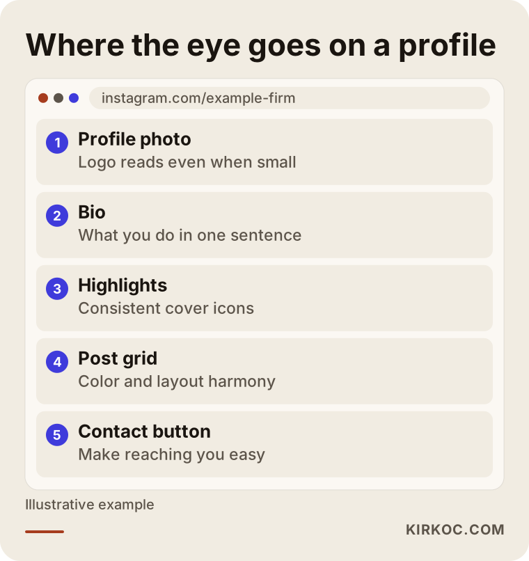
The outline above summarizes where a person's eye goes, in order, when a profile opens and what is expected in each section. Designing with that order in mind gives a far more consistent result than posting at random.
Common mistakes
Over the years I have watched the same mistakes repeat across very different accounts. Most of them come not from a lack of design skill but from a lack of planning.
Trying a different style in every post. Experimenting is exciting, but the customer stops recognizing you. Do your experiments inside a system.
Putting too much text on an image. Making people read a paragraph on an image goes against how social media works. Leave the detail for the caption.
Pasting the same image everywhere as it is. A post, a story and a LinkedIn document each have different sizes and different reading habits.
Using copyrighted images and music. Not every image you find online can be used freely. If you are unsure about usage rights, consult a lawyer; the safest options are your own photos or sources with a clear license.
Never checking on a phone. A design that looks perfect on a computer can look tiny on a phone.
Continuing without looking at results. Producing content without checking which format gets attention leaves you without direction.
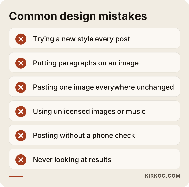
None of the mistakes in this list needs a large budget to fix. Most of the time it is enough to set a rule and stick to it.
How often should you produce, and in what order?
On day one everyone wants to post every day, and a few weeks later they are tired. My advice is to pick a realistic pace and keep to it. Two or three steady posts a week do much better than daily images made in a rush.
Tying production to a monthly calendar also lightens the load. In the first week you set up the system, in the second you prepare the first pieces, in the third you publish and watch the reaction, and in the fourth you adjust based on the results. For seasonal businesses (holidays, year-end, back to school), this calendar needs to be planned even further ahead.
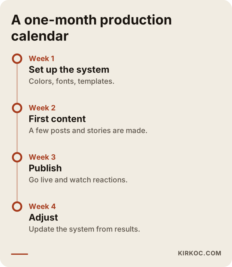
The last step on the calendar is deciding about the following month. Looking at what worked and fine-tuning the design system once more helps the account work better over time.
Should you do it yourself or hire a specialist?
It would not be honest to answer "always hire a specialist." If your account is new, your budget is tight and you post once a week, a well-chosen template and a little care may be enough. As the account grows, things change.
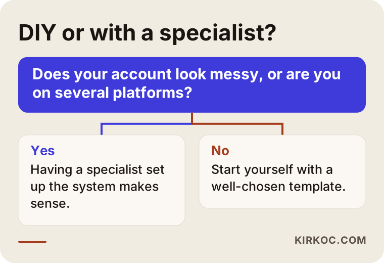
You can do it yourself if you post rarely, your images are simple, you enjoy making designs and you have the time. You need a specialist if your account looks scattered, you are active on several platforms at once, you run ads, your promotion calendar is busy, or design eats up your time every single week.
The decision chart below shows this distinction at a glance. You can answer it for your own situation and pick a direction.
There is also a middle road: have a specialist build the system, then prepare the day-to-day content yourself. For many small businesses this is the smartest approach. You receive the templates, I show you how to use them, and in the long run you work independently.
What determines the cost of a social media design service?
I will not give numbers in this article, because very different jobs are sold under the same label. The main things that affect the price are these:
- Scope of work: Only posts, or stories and covers as well, and more than one platform?
- Monthly content volume: How many images and stories a week?
- State of the brand system: Are your logo, colors and typefaces ready, or do they have to be built from scratch?
- Photo and video needs: Do you already have usable images, or is shooting or editing needed?
- Copy support: Do you write the text for the images, or is that prepared too?
- Revision and approval process: How many rounds of corrections are expected, who approves, and how quickly do answers come back?
- Calendar pressure: Rush jobs and busy promotion periods change the plan.
- Ad usage: If the same images will run as ads, different sizes and variations are needed.
When you ask for quotes, ask about each of these items. A written, itemized quote is far more reliable than a vague phrase like "monthly package." Comparing prices without knowing what you will receive is misleading.
What to look for in a quote
When you read a quote for design work, here are the points I would like you to check.
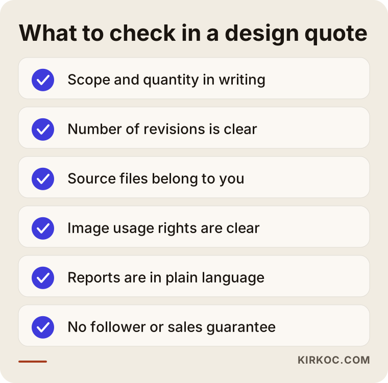
The most important item on the list is who owns the files. The designs and source files should belong to your business, so that if you decide to work with someone else tomorrow, you can take them with you. If you see vague wording on this, ask for a written explanation; if you are unsure about contract details, it makes sense to talk to a lawyer.
One more warning: read carefully any quote that promises "this many followers," "guaranteed sales growth" or "you will go viral in the first month." Nobody can know a platform's algorithm or a customer's decision in advance. An honest quote spells out what will be done and does not promise the outcome.
How I work
I work on my own from Istanbul, and the person you talk to is the person doing the work. Websites, SEO, local SEO, social media management, Google and Meta ads, logo and corporate identity, content production: I handle all of these services myself. That helps a lot in design work, because while I prepare a campaign image, I can also think about the page on your site, the ad copy and the posting time at the same moment.
My routine is simple. First I look at your account and your business and tell you honestly what is needed. I do not try to sell you something you do not need. If your account is missing an offer or good photos more than it is missing design, I will say so plainly. Then I give you a written plan and an itemized quote; the price is set according to the scope of the work. Your accounts and your files stay in your name. Each month I report in plain language what was done, and together we decide on the next month's plan.
Frequently Asked Questions
Is a social media design service the same as social media management?
No. Design covers preparing the visuals. Management is a broader job that includes the content plan, the copy, publishing, looking after comments, measurement and, when needed, ads. For many businesses the two work better together, but it is also possible to buy design only.
Why should story design be treated differently from post design?
A story fills the vertical screen, stays visible only briefly and has the platform's own buttons at the top and bottom. A post stays on your profile and shows up in the grid. That is why type size, safe area and message length should differ between the two.
Can design start if I have no logo or colors of my own?
It can, but a simple brand system needs to be built first. A few colors, one typeface and a clean logo speed up every later post. If you skip this stage, you will have to make the same decisions again with each post.
Will I get more followers if I pay for design?
I cannot guarantee that, and nobody can. A tidy, recognizable look builds trust in your account and makes your posts easier to understand, but follower growth depends on content quality, posting frequency, the target audience and sometimes advertising.
Do the design files belong to me?
They should. Before work begins, I recommend getting a written agreement about source files, templates and usage rights. If you are unsure about the legal details, consult a lawyer.
How long does a design job take?
It depends on the scope. A simple template set can be ready in a few days, while a brand system and a first batch of content may take a few weeks. What stretches the timeline is usually late feedback or missing materials.
Does design help if my photos are poor?
Partly. If the layout, color and type are chosen well, a weak photo stands out less, but it cannot replace a good one. Even with a phone, photos taken in natural light against a plain background make a big difference.
Can I use the same design on Instagram, Facebook and LinkedIn?
You can keep the main idea and colors the same, but the size and reading style differ on each platform. The best approach is to produce several versions suited to each platform from a single design.
If you need social media design, or you are not sure how your account looks, you can write to me through my social media management service page. We will look at your account together, and I will tell you plainly what you really need.