If you run a business, you may recognize this situation: you have a logo, or maybe you do not, your business cards came from one place, your sign from another, and your social media graphics from a third person. Each piece is fine on its own, but put them side by side and nobody would guess they belong to the same company. Somebody told you that you need a "brand identity," and now you are searching for "what does brand identity design include, and what will I be paying for?" This article answers exactly that: which parts make up an identity project, which ones are essential, which can wait, and how to compare quotes without getting lost.
I am Ümit Kırkoç. I work alone from Istanbul, and I run logo and brand identity projects alongside websites, social media and advertising. That means I look at an identity not only as a designer would, but also as someone who sees how it behaves later on a website, on a phone screen and inside an ad.
What exactly is a brand identity?
A brand identity is the set of visual and written rules that make a business look the same everywhere. The logo is only one piece of it. Think of a brand you know well. Even without seeing its logo, you could probably recognize it from its colors, its lettering and the mood of its photos. That recognition does not come from one drawing. It comes from a handful of parts used consistently, over and over.
There is a common misunderstanding that identity work is only for large corporations. The same logic applies to small businesses; the scope is simply lighter. A three-person office, a clinic or a workshop can look consistent without paying for dozens of applications it will never use. What matters is separating what you will genuinely use from what only sounds impressive in a proposal.
The image below shows the main parts of an identity at a glance. I will go through each one in turn.
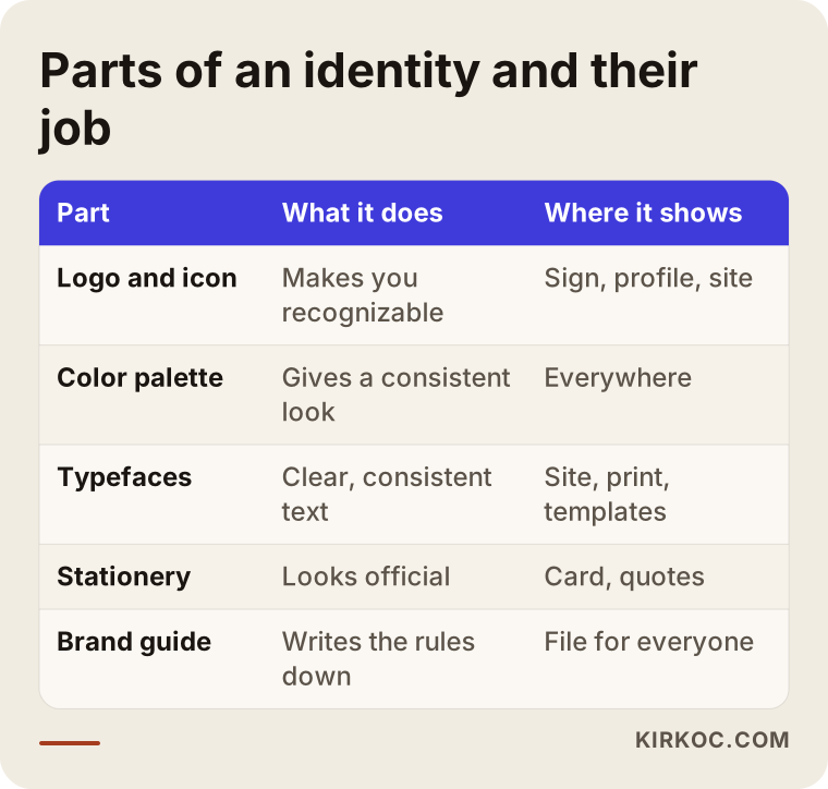
You can picture these parts as a building. The logo is the sign over the entrance. The colors and typefaces are the paint and the lettering on the walls. Stationery and digital assets are the furniture inside. The brand guide is the instruction manual for the whole building. Without that manual, anyone who joins a year later will repaint the walls in a different color.
The logo: the center of the identity, but not the whole thing
Logo work is usually the most visible part of the job, and it is where most people start negotiating. A properly done logo job does not hand over a single drawing. You should receive a wide version and a stacked version, an icon-only version, a one-color version, and versions for light and dark backgrounds. That is because the places your logo will live are very different from each other: a narrow mobile menu, a rubber stamp, a product label, or a tiny round profile picture.
A problem I see often is a wide logo that simply does not fit a social media profile photo. The name becomes unreadable, and every platform crops it differently. This is why the icon version is not an optional extra. It is part of the job.
Files matter too. A low-resolution image is not enough. You should ask for vector files that stay sharp at any size, lightweight versions for the web, and print-ready versions. When a print shop or a sign maker asks you to "send the vector file," you should have one ready.
The color palette: more than pretty colors
Choosing colors has less to do with taste than with practical use. A palette normally has one main color, one or two accent colors, and a few neutral tones. Every color needs an equivalent on screen and on paper, because a vivid shade on a monitor can look dull when printed. For that reason, the screen values and the print values should be delivered in writing.
Readability is the other half. White text on a pale yellow background is something nobody can read. A good palette shows which colors can sit on which backgrounds and which text colors work with them. Knowing this from the start ends the later argument over why a certain graphic is hard to read.
Typefaces: the quiet part that changes the most
Typeface choice is usually the least discussed part of an identity, yet it shapes the personality of the brand more than most people expect. Usually one typeface is chosen for headlines and one for body text. Two things matter here. First, the typeface must support the characters your customers actually use. If you sell in more than one language, or in a market with accented letters, test the real names of your products, streets and cities before you commit. I work in Turkey, where letters like ğ, ş, ı and İ break many otherwise attractive fonts, so I check this on every project.
Second, the typeface must be usable on your website. Some fonts are free for print but need a separate license for web use. Asking about this at the quote stage prevents a surprise later. For the license terms, read the agreement of the font provider, and if you are unsure, ask a lawyer.
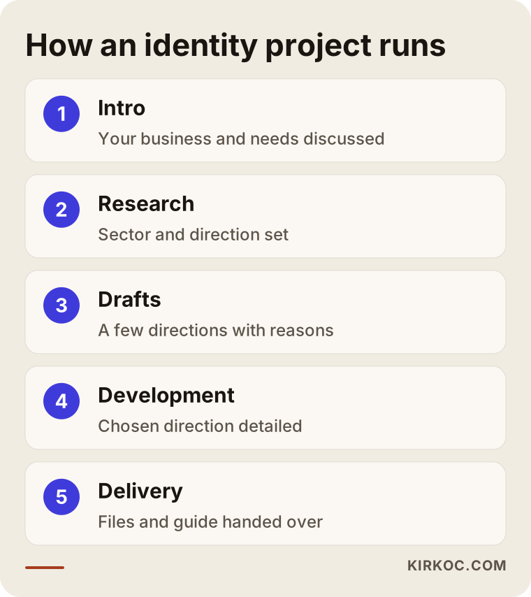
The flow above summarizes the order in which a project moves. The parts are covered one by one above; next is how they come together.
Stationery and print applications
Stationery is the part of an identity you can physically touch. Business cards, letterhead, envelopes, invoice or quote templates, an email signature, folders and a stamp are typical examples. Not every business needs all of them. An accounting office may need letterhead and envelopes, while a boutique that sells only online will care much more about packaging labels and a thank-you card.
The mistake I see most is adding unnecessary items "because they come in the package" and then paying for things that will never be used. The opposite mistake also happens: skipping items like the email signature and the quote template, which you use every day but rarely think about. They are often the first thing a customer sees from you in a normal week.
Print preparation matters as well. Business cards need bleed, crop marks and the right color mode. If those settings are wrong in the design file, what comes back from the printer will not match what you approved. A good project delivers files that are ready for the printer.
Space and vehicle applications
If your business has a physical location, then signage, window graphics, wayfinding, staff clothing and vehicle wraps are all part of the identity as well. These tend to be the most expensive applications, because production costs come on top of the design work. For that reason the base identity is usually done first, and signage or wraps follow later, when the budget allows.
My part here is to prepare the design file so it is ready for production and to check measurements with the manufacturer. The production itself is a separate line item that you buy from the sign maker or the printer. Separating the two from the start lets you compare quotes fairly.
Digital use: where people see you most today
For many small businesses, customers now meet the brand on a phone before anywhere else. So the digital side of an identity gets used more often than the paper side. It includes logo and color use on the website, the tiny icon in the browser tab (called a favicon), social media profile and cover images, post templates, a newsletter template and a presentation file.
The thing most often forgotten in digital work is that every platform has its own dimensions. An Instagram profile photo is cropped into a circle, a LinkedIn banner is very wide, and a YouTube channel banner is cut differently on phones and on TVs. If the identity work ignores these sizes, your logo ends up half hidden in some places.
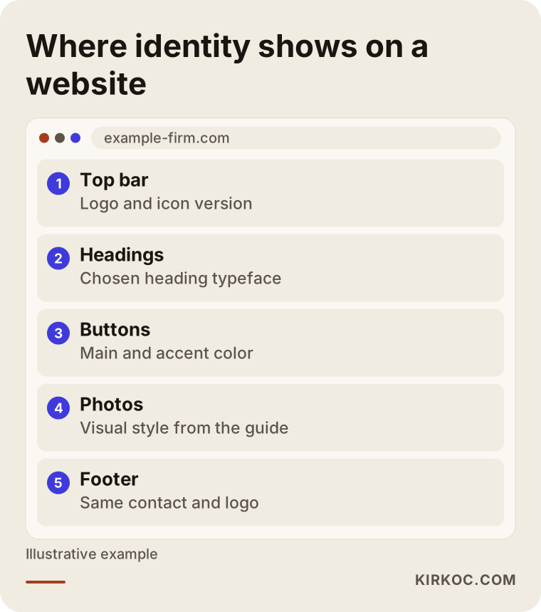
The simple website layout above shows where the identity meets you on the web: the logo in the top bar, the typeface in the headings, the main color on the buttons. Each of these should be defined in the brand guide, so that when the site is updated later nobody has to ask "which blue was it again?"
I build websites and manage social media myself, so on my projects this is not a separate stage. While I prepare the identity, I already have the site and the post templates in mind. That removes a situation I hear about all the time when different people are involved: the designer hands over a logo, and the person who builds the site uses a slightly different color.
The brand guide: the document that helps most later
The brand guide is the written and visual summary of every decision above. It contains the logo usage rules, the clear space to leave around the logo, things you must not do with it, color codes, typefaces, example layouts and, if needed, notes on tone of voice.
Without it, the identity lives in the designer's head. A year later, when a new employee, another agency or a print shop steps in, everyone interprets it their own way. With a guide, a sentence like "use the logo this way on this background" stops being a debate.
The length depends on the business. A small business needs only a few clean pages. A company with many branches or many people needs more detail. What matters is that the document is clear enough to be read and applied.
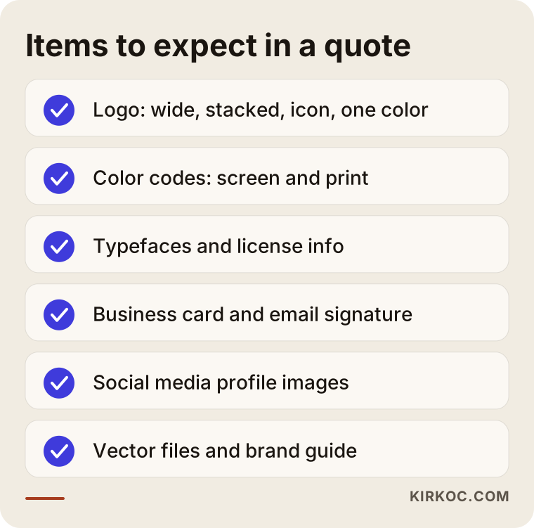
Keep this checklist next to you when you receive a quote. If an item is missing, you can ask why. Maybe it is not needed, or maybe it was simply forgotten.
How does a brand identity differ from logo design?
Many people mix up the two terms, and that makes quotes hard to compare. One designer may be quoting you for a "logo" while another is quoting for a "brand identity," and they are not describing the same work.
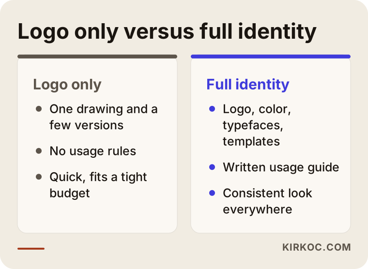
The comparison shows the difference. A logo-only project gives you one drawing and a few versions of it. A brand identity also solves how that drawing will be used everywhere. For a new business with a limited budget, a solid logo plus a simple color and typeface set may be enough to start, and the scope can grow as the business grows. The important thing is to know which one you are buying.
Example scenario 1: a newly opened dental clinic
This is a purely hypothetical example. A dentist is opening a clinic of her own. The budget is limited and the opening is a month away. She has a rough logo idea left over from a previous workplace, but it does not look professional.
She does not need a full-scale package. The priorities look like this: a logo with an icon version, a calm and trustworthy color palette, two typefaces, a business card, an appointment card, an email signature and social media profile images. A print-ready file for the sign is prepared, but items like window graphics and vehicle wraps are left for later. A short guide is added so that everything created afterwards stays in the same line.
The key point is that a new patient usually meets a clinic first through a Google result, an Instagram profile and the sign outside. When those three places look the same, they build trust. Some stationery can wait a few months, until there is a real need.
Example scenario 2: a furniture workshop that has been running for three years and looks scattered
This is also hypothetical. A workshop has been operating for three years. Its logo is little more than a piece of text a friend typed. The website uses one color, the catalog another, and the delivery van carries a third design. Customers have even started asking whether these are the same company.
Here the job is less about building an identity from zero and more about gathering the existing pieces and refreshing them where needed. First comes the decision of whether to keep the current logo. If customers already recognize it, replacing it completely could wipe out that recognition, so the logo is cleaned up and simplified instead. Then every application is redone with the new palette and typeface: the catalog, the site, the van, the quote template. The brand guide is especially important here, because the workshop deals with many different suppliers who each need the same rules.
The lesson from these two cases is that the same words, "brand identity," can mean very different scopes for two businesses. That is why I think it is better to start from "what does your business need?" rather than from a fixed package price.
The working process, step by step
When an identity project runs in a scattered way, it takes longer and the result disappoints. This is the order I follow.
Introduction and needs conversation. You and I talk about your business, your customers, your competitors and where you plan to use the identity. At this point, examples of things you like and dislike are very helpful.
Research and direction. I look at what is common in your sector and suggest a direction that sets you apart. The aim is to avoid looking like your competitors while still not looking strange for your field.
Drafts. Usually a few directions are presented, each with a short reason. You choose one, and if needed, parts of different options are combined.
Development. The chosen direction is detailed: logo versions, color values, typefaces and example applications.
Delivery and guide. Files are delivered in the correct formats and in tidy folders. The brand guide is added.
I collect your feedback at each stage. Limiting that feedback to a set number of rounds keeps the project from dragging on forever, so agreeing on the number of rounds early is a good habit.
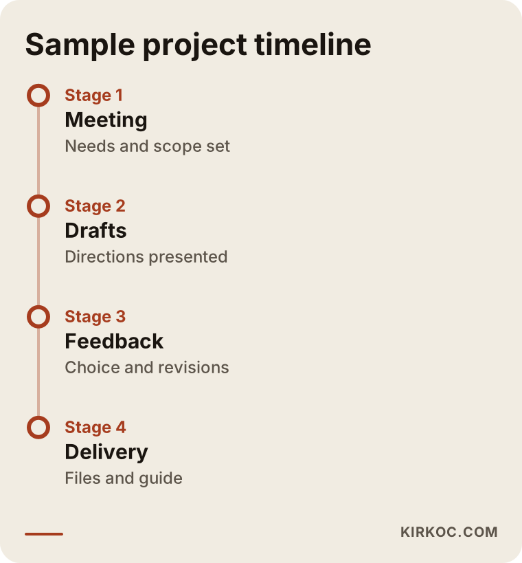
The timeline is only an example. The real duration depends on scope, on how quickly you respond, and on any items that need production. Late feedback is the single biggest cause of delay. A draft that sits unanswered for a week pushes the whole project back by a week.
Common mistakes
Over the years I have seen the same mistakes repeat, so I am listing them here. Most can be avoided in advance.
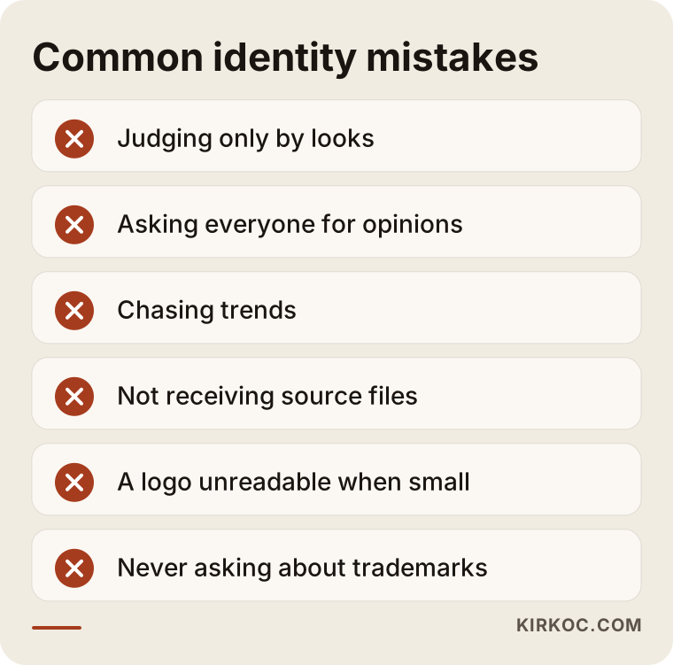
The most common one is working only toward "it should look nice." A beautiful logo that cannot be used is of little value. A design that is unreadable at small sizes, disappears in one color or only works on a white background will cause trouble the first time it is used for real.
The second mistake is asking everyone for an opinion. Family, friends and employees all weigh in, and the design turns into a compromise with no clear direction. Decide up front who makes the final call. Other opinions are valuable, but the decision should come from one person.
The third is chasing trends. A look that is popular today can seem dated in three years. Simple, functional lines usually last longer.
The fourth is not receiving the source files. If the person who made the design does not hand them over, then the next time you need something you are either stuck with that person or starting from scratch. Spell out in writing which file types will be delivered, either in the contract or in the quote.
The fifth is skipping the legal side. Whether the chosen name and logo are too similar to another brand, and whether to register a trademark, sit at the edge of an identity project. I cannot give you a definite answer on that. If you are thinking about registration, talk to a trademark attorney or another qualified lawyer. I take care to produce original work on the design side, but I do not give legal guarantees.
What can you do yourself, and when do you need an expert?
You do not have to hand everything to a specialist. But there are things to watch for if you do some of it yourself.
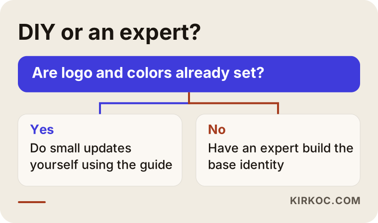
Things you can reasonably do yourself include making post graphics from ready-made templates, preparing a simple announcement that follows an existing guide, and making small updates using the same palette and typefaces. If the identity is already defined, none of this needs special skills.
Cases that call for an expert include designing a logo from scratch, building a consistent palette and typeface system, producing print-ready files, production work such as signs and vehicle wraps, and the naming and positioning decisions when you are founding a new brand. It is possible to do all of this "quickly" on template websites, but the result often looks like every similar business, so it does not set you apart.
There is also a middle road: have an expert build the base identity, then handle the small follow-up jobs yourself by following the guide. For most small businesses this is the most balanced approach.
What determines the cost?
I do not give numbers in this article, because jobs sold under the same name can differ enormously. These are the main things that set the price.
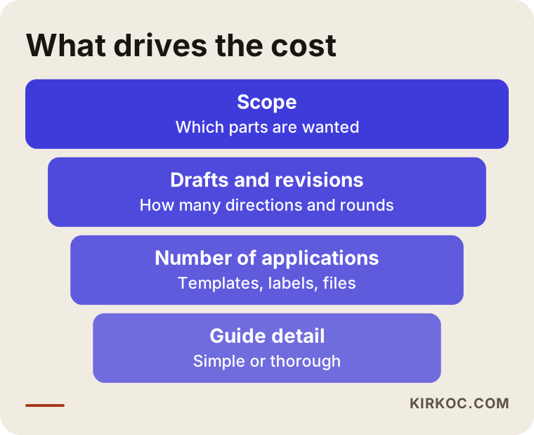
The first is scope. Do you want only a logo, or a logo plus stationery, digital templates and a guide? Every additional piece means design time and checking time.
The second is the number of drafts and revisions. Researching and presenting several different directions takes more effort than working on a single one. Unlimited revision rounds also push the price up, because there is no clear end.
The third is whether you start from scratch or from an existing logo. Tidying up an existing identity is usually a different workload from building a new one, though if things are very scattered, it can turn out the other way around.
The fourth is the number of applications. Three different business cards, five templates, two packages and a sign file add up quickly.
The fifth is the level of detail in the guide. A simple one-page usage sheet and a detailed manual for a multi-branch company do not take the same effort.
The last is production. Printing, signs and vehicle wraps are not part of the design fee; you usually buy those separately from the manufacturer. When you compare quotes, always ask about this split, or you will be comparing apples with oranges.
A proper quote should be prepared for your business and should state clearly what is included and what is not. Be careful with ready-made packages that give the same price to every business.
Questions to ask when you request a quote
When you talk to a designer or an agency, a few questions will correct wrong expectations early. Which file types will you receive? Will the source files be handed over to you? How many drafts and how many revision rounds are there? Is the brand guide included? Who owns the typeface licenses? Are the web and social media adaptations within the scope?
The answers show how different two seemingly identical quotes can really be. Get the answers in writing; that record will be very useful as the project moves forward.
How I work with you
I am one person, and that is an advantage: the person you talk to is the person who does the design. There is no middleman, so nothing gets lost when information passes from one hand to another. While preparing the identity, I take into account how your website will look, how your social media posts will sit and which sizes your ad images will need, because I handle all of those jobs myself.
Having one person run everything makes the biggest difference after the identity is finished. Because I also build your site and manage your SEO and ads, I can see whether the identity works in practice, and I can make small corrections straight away. You do not have to carry messages between separate people.
Work usually begins with a short introductory call. I listen to what you do, who you sell to and what you need; then you and I define the scope together and I prepare a quote for it. I do not promise any particular result. You and I go over in writing how the design will look and where it will be used, so you know what you are getting from the beginning.
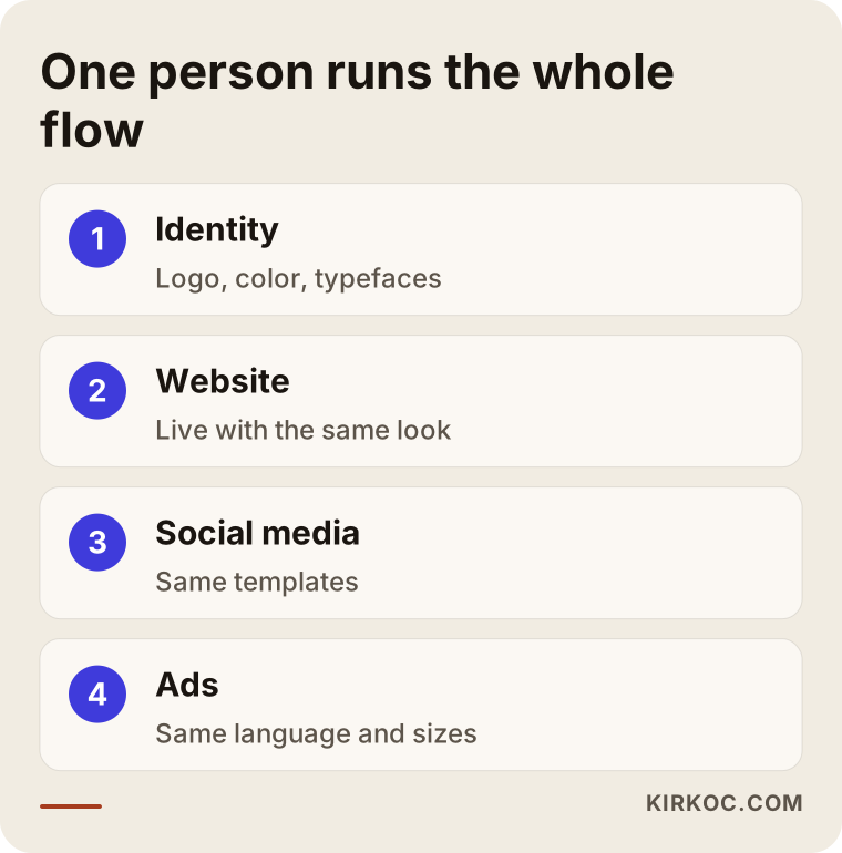
The flow above shows how the jobs feed each other when one person handles them: the identity carries into the website, the website into social media, and social media into advertising, all with the same look.
Frequently Asked Questions
Is a brand identity the same as a logo?
No. A logo is one part of a brand identity. The identity also includes colors, typefaces, stationery and digital applications, and the rules that explain how to use all of them.
Does a small business really need a brand identity?
I would not say it is mandatory, but looking consistent helps at any size. For a small business, a simple scope is often enough: a logo, a palette, typefaces and the few applications used most. The scope can grow as the business does.
How long does an identity project take?
It depends on the scope and on how quickly you give feedback. A logo with a basic set takes less time than a full package. What stretches a project most is late answers to drafts. Once the scope is clear, you and I can set a clear schedule.
Can I use a logo from a ready-made logo website as part of my brand identity?
Some ready-made logos come with restricted licenses, and some may look similar to other businesses. Check the license terms before you use one, and talk to a lawyer if you are considering a trademark. Original work is a safer foundation in that respect.
Which files should I receive when the work is finished?
Vector logo files, web and print versions, color codes, typeface information, source files for the stationery templates and the brand guide. I suggest agreeing on the delivery list in writing before the work begins.
Can I tidy up my identity without changing my current logo?
Yes. If your logo is recognized and fundamentally sound, it can be kept and simplified, the missing versions can be produced, and the other parts can be adapted to it. If the logo is really unusable, you and I can look at replacing it together.
Can the website and social media be done after the identity is finished?
They can, and in my view this is the most efficient route. Since I also handle the website, social media management and ads, the identity is adapted directly to those areas. If you prefer, you can also take only the identity work.
Why isn't the price fixed in advance?
Because the scope changes a lot from one business to another. The number of applications, the number of drafts needed and the detail of the guide all affect the price directly. Listening to your needs first and then giving a clear quote is a more honest way for both sides.
If you want your brand to look consistent and recognizable everywhere, take a look at my logo and brand identity service, then write to me with a short description of what you need. You and I will define the scope together, and I will suggest a path that fits.