You look at your sign, your business card or the top corner of your website, and a small voice says, "this doesn't fit me anymore." Maybe your business has grown over the years, maybe the service you offer has changed, or maybe your logo simply looks blurry on a phone. At a moment like that, asking "when should I redesign my logo, or is it smarter to wait?" is completely natural. In this article I explain when a logo redesign, and rebranding in the wider sense, is truly needed, and when it would only waste your money and energy. I am Ümit Kırkoç, I work from Istanbul, and I offer logo and brand identity design from the same hands that handle your website, social media and ads. That is why I look at a logo not only as a drawing but as something that has to work everywhere it appears.
So that you do not leave the decision to a mood, we will first separate two terms, then move on to the warning signs, the process and the mistakes.
Is a logo redesign the same as rebranding?
No, and the difference shapes your decision from the start. A logo redesign (or refresh) updates how your business symbol or written name looks. Lines get simpler, colors are brought up to date, the typeface changes. Rebranding is much wider. It means rethinking how your business presents itself, who it speaks to, which words it uses, and which colors and tone of voice belong to it. Sometimes even the name changes.
Here is a simple comparison. The logo is a person's face. The brand is that person's identity, attitude, way of speaking and the promises they keep. Changing a haircut is one thing; changing a profession and a home city is another. Many owners try to solve a rebranding problem with a logo redesign and end up disappointed. The reverse happens too: someone with nothing more than an outdated drawing decides to tear everything down and rebuild it from scratch.
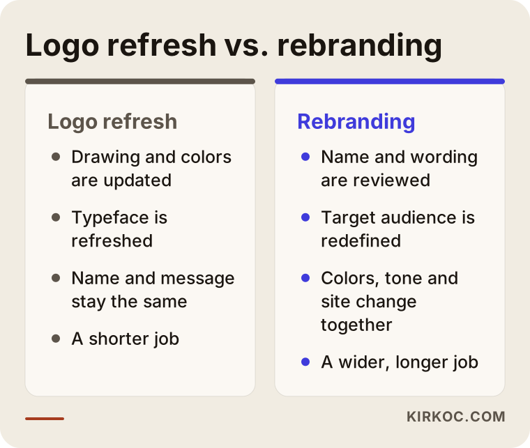
The comparison above helps you see which door you are walking through. If your problem is limited to appearance, a logo refresh may be enough. If your problem boils down to the sentence "we can no longer explain who we are," the job grows toward rebranding.
Signs that your logo needs a redesign
Not every annoyance is a reason to redesign, but some signs deserve to be taken seriously. You can check them one by one against your own business.
The logo is unreadable at small sizes. Today your logo is seen mostly on phone screens, in social media profile pictures and in the tiny icon on a browser tab. A logo with thin lines or crowded lettering, drawn years ago with business cards and signs in mind, turns into a smudge at these sizes. If a customer cannot make it out, they will not remember it either.
Your business changed, but the logo stayed in the past. If you started with one product and now offer three services, or if you once worked only locally and now serve customers nationwide, the story your logo tells may be keeping you small.
You cannot be told apart from competitors. If five businesses in the same field all use the same colors and the same kind of symbol, customers have a hard time recognizing you. It is a problem you may not notice at first glance, yet it holds you back in search results, on maps and in ads.
The logo looks different in different places. If there is one color on the sign, another on the website and a third version on the invoice, the inconsistency erodes trust. In that case the fix is often not a new drawing but a tidy usage guide.
There are technical problems. If all you have is a low-resolution file, if the logo turns to pixels when enlarged, or if it only works on a white background, those are real reasons to update it.
You went through a merger, partnership or name change. In that case the logo has to change anyway, and the work falls under rebranding.
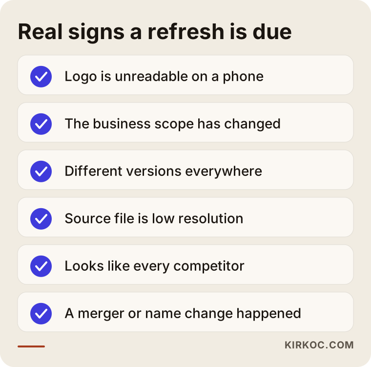
If you recognize two or more items from the list in your own business, it is time to put the redesign on the table seriously. If you see only one, a small correction is often enough.
When you should not change your logo
I want to be honest here: not every business logo has to be redesigned, and there are cases where I would advise you not to pay for it.
Redesigning only because you are "bored" of your logo is usually the weakest reason. A business owner sees the logo every day and tires of it quickly, while a customer sees it a few times a month at best. Where you are exhausted, your customer may only be getting used to it. Dropping a look that people have known for years just because styles have moved on can mean throwing away the recognition you have built up.
Another example is blaming the logo when sales drop. The cause of falling sales is more often price, service quality, visibility or the way ads are set up. A logo does not solve any of these on its own. First you need to check whether your site can be found on Google and whether your ads reach the right people. If the problem is there, a new logo is only nice packaging.
So ask yourself one short question before deciding: is what I want to change the look, the message, or am I trying to solve some other problem through the look?
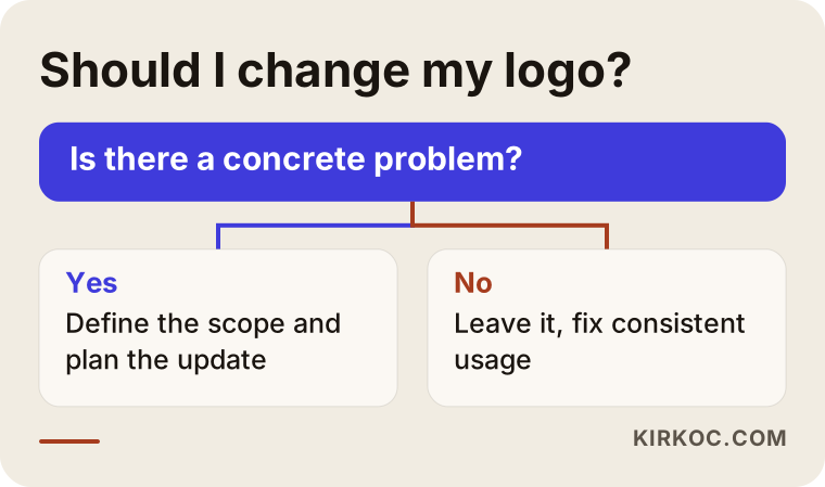
The flow is a rough guide. Every business is a little different, but it makes it easier to see the line between "just a matter of taste" and "a real need."
How to narrow down the decision
The situation I see most often among business owners is this: between the feeling "I want to redesign" and the decision "I need to redesign," there is no clear step. I think of that transition as a four-stage filter.
First you name the feeling: why are you uneasy? Then you look for a reason behind it: is there a concrete problem such as poor readability at small sizes, a change in scope or inconsistency? Then you set a goal: what do you expect to change after the update? Looking more professional, reaching a new audience, explaining a new service? Only at the last stage does the decision come: the logo alone, or the whole brand?
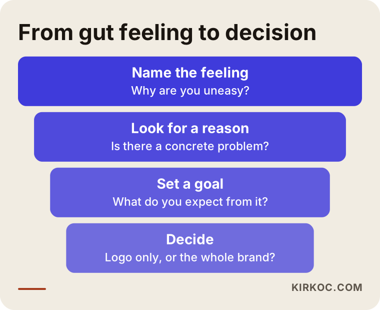
Many people drop the idea in the first two stages, or realize that a much smaller fix is enough. That is not a bad outcome. On the contrary, it lets you put your budget where it actually matters.
Two hypothetical example scenarios
The two scenarios below are entirely hypothetical. They do not describe any real business or person; they were made up only to make two different situations concrete.
Scenario 1: A neighborhood bakery growing with a new service
Suppose a bakery has sold cookies and bread to people in its neighborhood for years. Its logo was drawn at the time by an acquaintance: a thin-lined wheat ear and a fancy script typeface. Today the owner is starting to take orders for special occasion cakes, to prepare corporate treat boxes, and to deliver to other parts of the city through Instagram.
The problems are clear. The logo cannot be read as a profile picture on a phone screen, its detail disappears when printed in a single color on packaging labels, and it gives the new corporate customers the impression of a "corner shop." Since the name and recipes are not changing, a full rebrand is not needed. The sensible path is to simplify the logo, settle on a color palette, prepare label and packaging templates and refresh the social media profile. There is also real recognition built up, so keeping the wheat ear idea and only simplifying the drawing lets old customers say "this is still our bakery."
Scenario 2: The merger of two small companies
In the second scenario, two small companies selling building materials form a partnership and decide to operate under one roof. There are two names, two logos, two websites and two social media accounts. Customers also know each of them separately.
This is no longer just a logo matter. You have to talk about whether it will be a new name, a continuation of one of the existing names, or a combination of the two; then you need a new tone of voice, a new color world and an updated website. Redirecting the old sites and keeping their standing in search results is a separate job as well. This is rebranding in the true sense, and it needs to be spread over time.
The difference between the two scenarios shows that what decides the matter is not whether the logo is pretty, but what has changed in your business.
How the redesign process works, step by step
Running the job in an orderly sequence reduces both the room for error and the cost. This is how I set up the sequence.
1. Inventory of the current situation. I list where your logo is used: signs, vehicles, packaging, invoices, the website, social media, ad images, email signatures. The list shows both the size of the job and which places should be updated first.
2. Goal and audience. I help you clarify who you want to speak to after the update and what you want to tell them. If this stage is skipped, the design turns into an argument about taste.
3. A look at competitors and the field. I look at how other businesses in the same field appear. The aim is not to resemble them but to find a look that sets you apart.
4. Drafts and choice. A few directions are proposed, you pick one, and the chosen direction is fine-tuned. It matters not to lock onto a single direction and to test it at small sizes too.
5. Usage guide and files. You receive a short guide showing the logo on different backgrounds, in a single color, and in horizontal and vertical versions, plus files for every kind of print and screen.
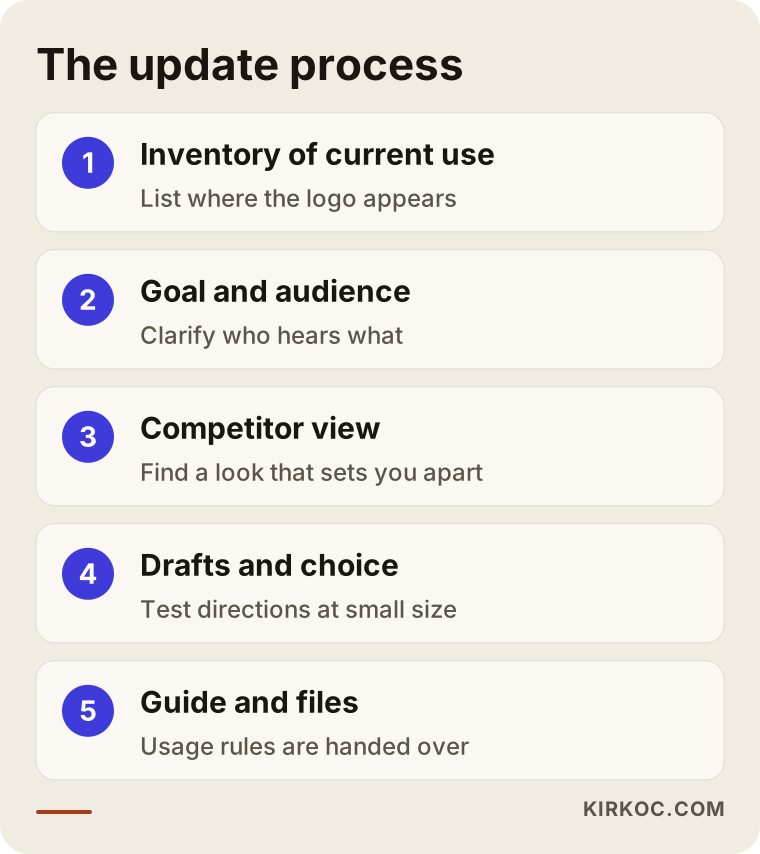
The diagram shows the main backbone; depending on the size of the business, some steps get shorter or longer. A redesign that skips the inventory and the guide, though, slides back into inconsistency within a month or two.
What needs to be updated after the redesign?
The job is not finished when the new logo is ready; the real effort is placing it consistently everywhere. Many people put the new logo only on their website, leave the sign and packaging as they were, and end up with two different looks living side by side on social media. That defeats the purpose of the redesign.
You can think about which places to update with three questions: where, what changes, and when? Digital places are updated quickly and cheaply; printed places are renewed one by one as your stock runs out.
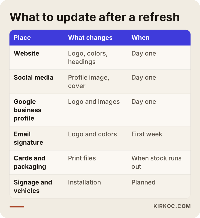
The order in the table shows that you do not have to do everything at once. The digital surfaces customers see most come first, and printed material follows.
How to time the switch
Moving from the old logo to the new one overnight sounds tempting, but it can confuse customers. Especially if you are a well-known business, it is healthier to announce the change and make it gradually.
In general I suggest this flow: first a preparation period, meaning the files and the guide are completed; then the digital surfaces are updated on the same day; then the announcement; and last, printed material and signs are changed as they run out. A plain sentence is enough for the announcement: "We have refreshed our look, our service is the same." That one line calms an existing customer's worry.
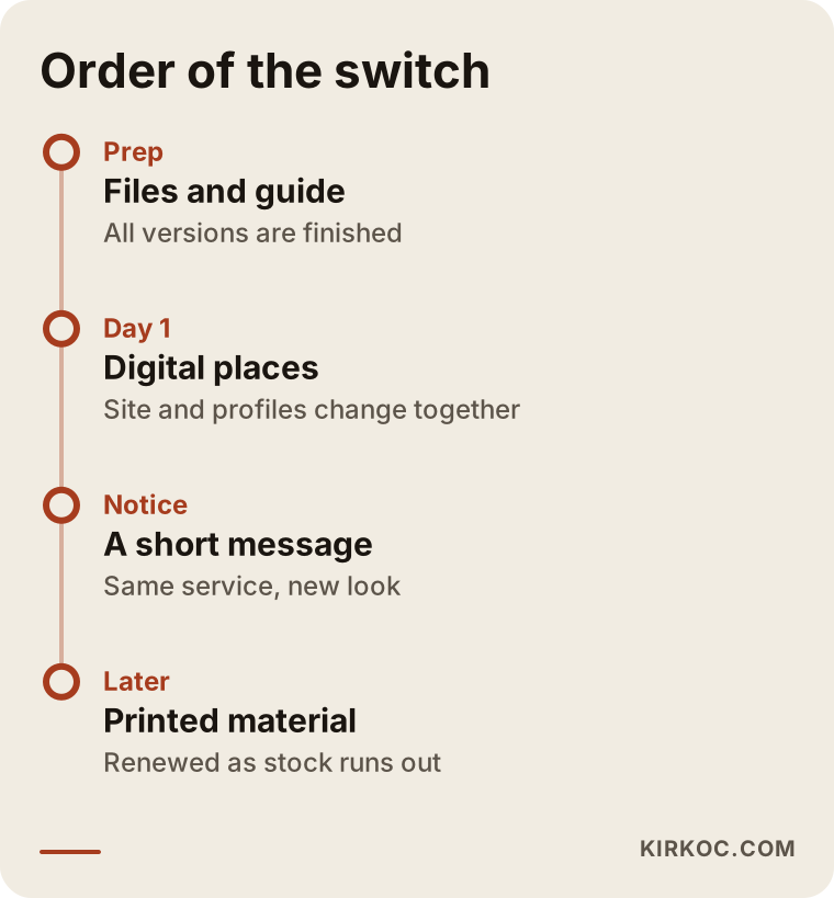
This timeline is not a strict schedule, just a suggested order. You can stretch it to whatever your budget and stock allow.
Don't leave the old look behind in search results and on maps
Here is a point most business owners overlook: the logo lives not only on your website but also on your Google Business Profile, your map listing, business directories and old news articles. If a customer searches for you and sees the new logo and the old one on the same page, they may wonder, "is this the same company?"
If the name changes too, the situation is more delicate. Search engines and maps build trust by matching the business name, address and phone number against each other. If you changed the name but old records still exist, split or inconsistent information may show up in the results. So with a name change, your profile, your directory listings and the contact details on your website should be updated on the same day, in the same way. I cannot promise anything about rankings, but consistent information keeps that risk to a minimum.
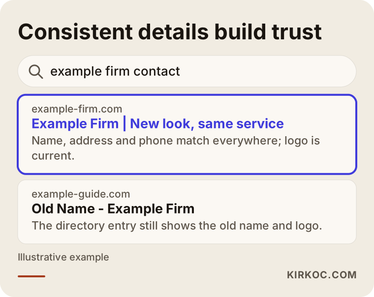
As in the image, a search result in which the brand name, description and address are the same everywhere gives customers confidence. A result where old and new versions sit side by side does the opposite.
How should the redesign show up on your website?
The top section of your site is the first place where people meet your new brand. Swapping the logo file is not enough: the colors, button shapes, heading typeface, the sentences on the home page and even the choice of photographs should match the new identity. Otherwise the new logo sits inside an old site like a stranger.
Here, having the work done from one pair of hands brings a real benefit. If one person makes the logo, another builds the site and a third runs social media, each adds their own interpretation and gaps open up between them. Because I do these jobs myself, I can set the color code once and carry it identically to the website, the posting templates and the ad images; I do not need to explain a change made in one place again for the next.
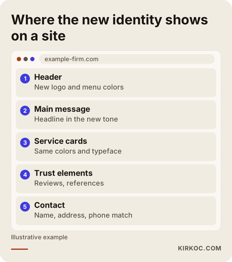
The sections in the outline give you an order to check when carrying the redesign onto the site: the header, the main message, service cards, trust elements and contact details.
Common mistakes in a redesign
There are mistakes I come across often that you should know about before commissioning this work. Many of them have less to do with the design than with the preparation and the aftermath.
Changing too radically. Turning a well-known logo into something completely different can leave old customers not recognizing you. An evolutionary change that keeps familiar elements is usually safer.
Following a trend blindly. Very plain, single-color logos with thin lettering are common right now, but that does not mean they are right for your field and your customer. A fashion that will look dated in three years means paying for another redesign.
Not settling files and rights. Who drew the logo, whether the source files are handed over to you, and how usage rights are arranged should be discussed at the start. If you have any legal doubt, I recommend consulting a lawyer.
Not testing at small sizes. A logo that looks great on a large screen can turn meaningless at profile picture size. Always shrink every direction and try it.
Redesigning only the logo. If the website, social media and ad images stay old, the inconsistency begins on day one.
Switching without an announcement. If customers do not understand why you changed, they may feel uneasy. Even a one-sentence notice prevents that.
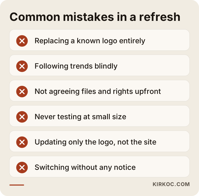
Most of the mistakes on this list can be corrected later, but correcting them costs more than doing it right from the start.
What can you do yourself, and when do you need an expert?
Not every step needs professional help. There are things you can do on your own: list where your current logo is used, study your competitors' logos and think about what sets you apart, ask your customers "what does our logo make you feel?", and check the quality of the files you already have.
You need expert help in these situations: the logo has to be drawn from scratch, you need consistency in many places at once, a name change or merger is involved, or you have to carry the logo change through together with the website, social media and ads. At that point design, technical work and search visibility become connected.
Ready-made logo generators can be useful for very small and temporary jobs. However, the logos they produce often look like other businesses' logos and may not give you exclusive usage rights. If you want to build a long-term brand, be sure to think about this point.
What decides the cost
I do not give a number in this article, because the real cost changes with the scope of the work. The main factors that set the price are these:
- Scope: Is it just a logo, or a full corporate identity with colors, typefaces, a usage guide and templates?
- Depth of research: How detailed will the industry and competitor analysis be?
- Number of drafts and revisions: How many directions will be tried and how many rounds of corrections will be made?
- Where it will be applied: How many surfaces need updating: website, social media, ads, print, signage, packaging?
- Name work: If the name will change too, an extra round of thinking and checking is needed.
- Delivered files: Which formats will be prepared for print and for screen?
- Time: A rushed schedule squeezes the work and can affect the cost.
Costs paid to third parties, such as printed material and signs, should be considered separately from the design fee. When you ask for a quote, I suggest you ask in writing what is included and what is not.
How I work with clients
I work as a single person, and I can handle logo and corporate identity together with your website, SEO, social media management and Google and Meta ads. In the first conversation I listen to your business, your current logo and what you want to change. Sometimes the conclusion is "don't redesign for now, let's solve this problem first," and I say so openly. If a redesign is really needed, I share the scope and the order in writing; who does what and which files are delivered to you is clear from the start.
Having everything run through one person helps especially after the redesign: the logo, colors and tone are set once, and then the website, posts and ads move along the same line. The burden of coordinating several people is lifted from you.
Frequently Asked Questions
When should you redesign a logo?
The time has come if your logo is unreadable at small sizes, if the scope of your business has changed, if it is used inconsistently in different places, or if you have gone through a merger or name change. Redesigning only because you are bored is often not a good enough reason.
What is the difference between a logo redesign and rebranding?
A logo redesign refreshes the look. Rebranding means rethinking the name, message, colors, tone and target audience together. Rebranding is a wider and longer job.
Will I lose customers if I change my logo?
I cannot say for certain. But the risk shrinks with a change that keeps familiar elements, is made gradually and is supported by a short announcement. A radical change can make it harder for existing customers to recognize you.
How long does a logo redesign take?
It depends on the scope and how fast decisions are made. A logo-only redesign is shorter than a full corporate identity project. The rollout stage, meaning updating every place, often takes longer than the design itself.
Does a new logo affect SEO and Google visibility?
If only the logo image changes, I generally do not expect a direct effect. If the name, address or website address changes, it is different; in that case records need to be updated consistently, and old addresses need to redirect to the new one. I cannot promise anything about rankings.
Can I draw the logo myself or use a ready-made tool?
For temporary and very small jobs, you can. But if you want a long-term brand, there are risks of looking like other businesses and of uncertainty about usage rights. If you have any legal doubt, consult a lawyer.
Which files should I receive after the redesign?
You should get logo files in different formats for screen and print, single-color and reversed-color versions, color and typeface information, and a short usage guide. If possible, ask at the start whether the source files will be handed over to you.
At what stage should I contact you?
You can reach out even before you decide. Judging together whether a redesign is needed often prevents an unnecessary expense.
If you are not sure whether you should redesign your logo, or if you have decided and want the rollout handled in one place together with your website, social media and ads, take a look at my logo and brand identity page and write to me; I will listen to your situation and tell you plainly what you actually need.